Write smart. Write fast. Take feedback. Measure results.
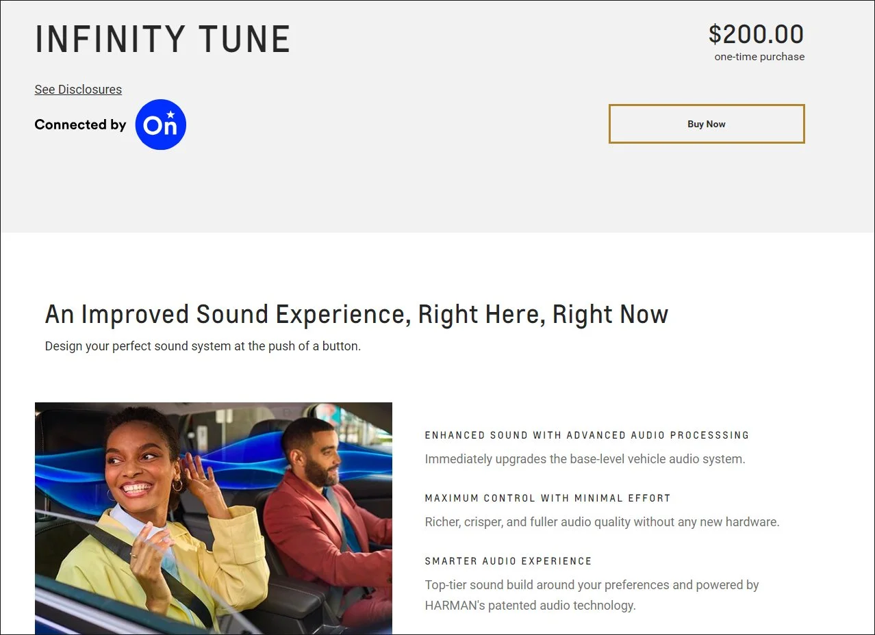
Infinity Tune for OnStar is one of more than a dozen Product Detail Pages created for General Motors as part of our ecommerce benefits-driven revamp. Many more writing samples below. Thankfully, not infinite.
On this portfolio page you will find a wide variety of writing: UX microcopy, radio ads, print ads, collateral and marketing copywriting, technical tutorials, press releases, educational (for university-level learning modules), and more.
Check out David’s writing samples in two ways:
1) Scroll images on this page for copy — and also check out the captions for background
2) Click headers below to see additional writing samples and a complete description of each position
The Copy Gist: David adopts most any style. And he writes fast.
Say you want three versions, and he’ll come up with four. His content strategist brain works harmoniously with his audience-focused heart.
His first love of journalistic writing, and tailoring it to good design, came when he was editor of his high school newspaper.
Wearing Two Hats: David was also graphic designer and production artist for ALL pieces presented, except for Salesforce and MSK writing samples. There he worked with innovative designers at the top of their field.
The Struggle Is Real: Art direct or write copy? Lately he’s leaning towards the latter. Because he recognizes that’s been his passion since being selected for an exclusive statewide 5th grade writing workshop at the University of Oregon. This set him on a path that led back to going to UO’s celebrated journalism school seven years later.
Frankly, finessing content is where he excels. And writing about space robots.
He also recognizes this is the only part of his portfolio where he writes in the third person, which might be strange and off-putting. But he will answer that “What’s your weakness?” interview question with: “I’m transparent to a fault, and am maybe a tad too open and honest. But I tend to keep the topic and copy on-point.” Sure, David.
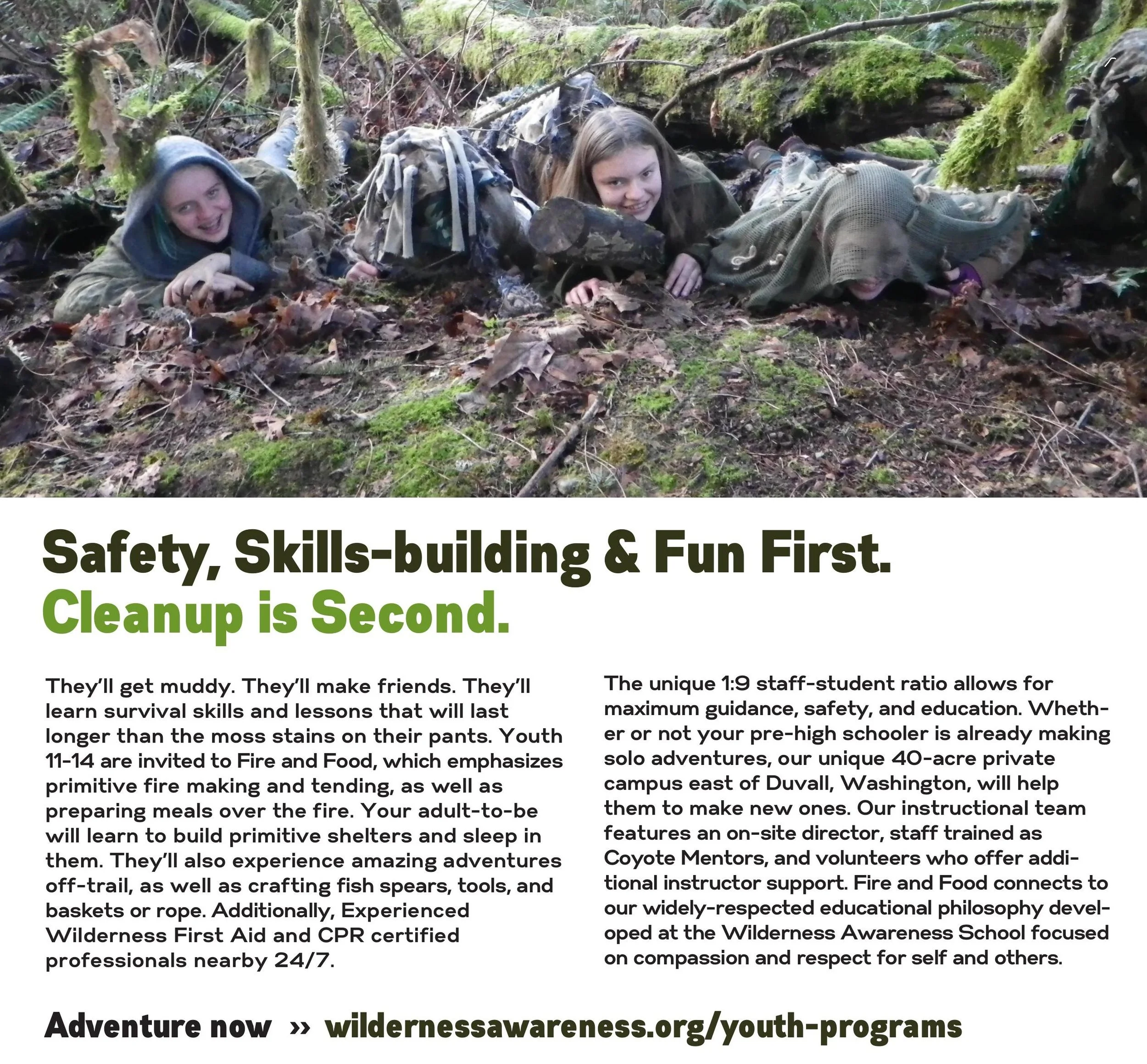
Brand-driven marketing copy written in one hour
WRITING SAMPLES INCLUDE (from most recent to oldest):
GOOGLE (2024-26)
(Portfolio Link, BYOP Campaign)
UX Content Designer for Google focusing on high-converting ecommerce solutions in the Google Fi Wireless and Google Store spaces. Scaled precise UI strings across high-friction e-commerce funnels—reducing customer cognitive load while explicitly moving the needle on subscriber activation, conversion, and retention OKRs.
GENERAL MOTORS (2023-24)
(Portfolio Link)
UX Writer as part of innovative, human-centered Digital Services & Experiences (DSX) team partnered with UX designers, researchers, and craft-oriented writers. Ecommerce lead writer role narrowly focused on advancing customer experiences across multiple GM brands, including Chevrolet, GMC, Cadillac, and Buick. More than a million ecommerce site visitors view the mobile, desktop, and in-vehicle content on a monthly basis. Product Detail Pages include everything from OnStar digital downloads (Super Cruise, OnStar Guardian, Premium) to the accessories and parts store (GM Genuine Parts and ACDelco).
AETNA/CVS HEALTH (2022-23)
(Portfolio Link)
UX Content Strategist and owner of content for enrollment and global features (save the sale, Medicare Advantage application) for Aetna's leading edge digital product, "Shop, Buy, Enroll." Provide human-centered digital content in close collaboration with UX designers, researchers, and developers. Responsible for content review, quality assurance (QA), UX writing, microcopy, and A/B copy testing. Aligned CVS Health brand standards, designing content for simplest user flow for older Medicare audience. Ate pizza at Heart Haus creativity summit in Rhode Island. Made jolly memes for colleagues and had fun.
MEMORIAL SLOAN KETTERING CANCER CENTER (2021-22)
(Portfolio Link)
Content Strategist & UX Writer as part of a collaborative collaborative UX Design Team for Memorial Sloan Kettering Cancer Center (MSK). MSK is a top-tier cancer research center in New York City with more than 20,000 employees and founded in 1884. Aligned MSK voice, tone, and language for a new design system utilizing UX tools Figma, Miro, and Dovetail. This helped developers and product builders successfully brand their work. Launched content strategy alignment across several working groups, including facilitating a collaborative bridge to the marketing and communications department. Work closely with engineers, marketing creatives, and designers to establish and share writing guidelines for MSK digital products. Wrote and edited microcopy. They said nice things.
SALESFORCE (2020)
(Portfolio Link)
UX/Technical Writer on Salesforce Trailhead learning modules for the Salesforce Lightning Design System. Recruited and contracted by Creatives On Call (creativesoncall.com) to strategize content, research systems design, write quizzes, and communicate efficiently with online editors and subject experts in user experience design. Mastered Salesforce voice and tone of being Honest, Clear, Fun and Inspiring. Successfully assembled imagery and content as part-time project manager working closely with illustrators and developers. Position required weekly coordination and video meetings with a UX team of engineers and designers based in California.
THE ARTS OF LIFE
Associate Board Member tasked with fundraising and outreach promotions, raising $10,000 annually for nonprofit serving Chicago area artists with intellectual and developmental disabilities. Involved in branding, poster graphic design, press release writing, template building, and promotional copy for events, including co-founding the Oscar fundraiser party, OscArts of Life. The Arts of Life is a 501(c)(3) with two professional art studios and represent over 60 artists with varying levels of physical and intellectual disabilities. Volunteered 2013-2017.
FIGMENT
Communications Director for participatory arts weekend event at City of Chicago Parks in charge of all press material, marketing, outreach, social media, and graphics. Handled the Facebook, Twitter and Instagram accounts. Coordinated all photographers and photo content pre-and-post event. Followed the FIGMENT brand identity standards in all original graphic design. Utilized Customer Relationship Management (CRM) software tools NationBuilder and Salesforce. Held position for three years (2013-2016).
PAINReportIt for eNURSING
Marketing Creative & Copywriter: Built website and facilitated national marketing campaign to promote eNURSING software. End-to-end implementation of brand and product packaging: Concept, photos, colors, and logos. Wrote all technical and marketing copy, including headlines and taglines, as well as software instructions and workshop presentations.
TNEEL
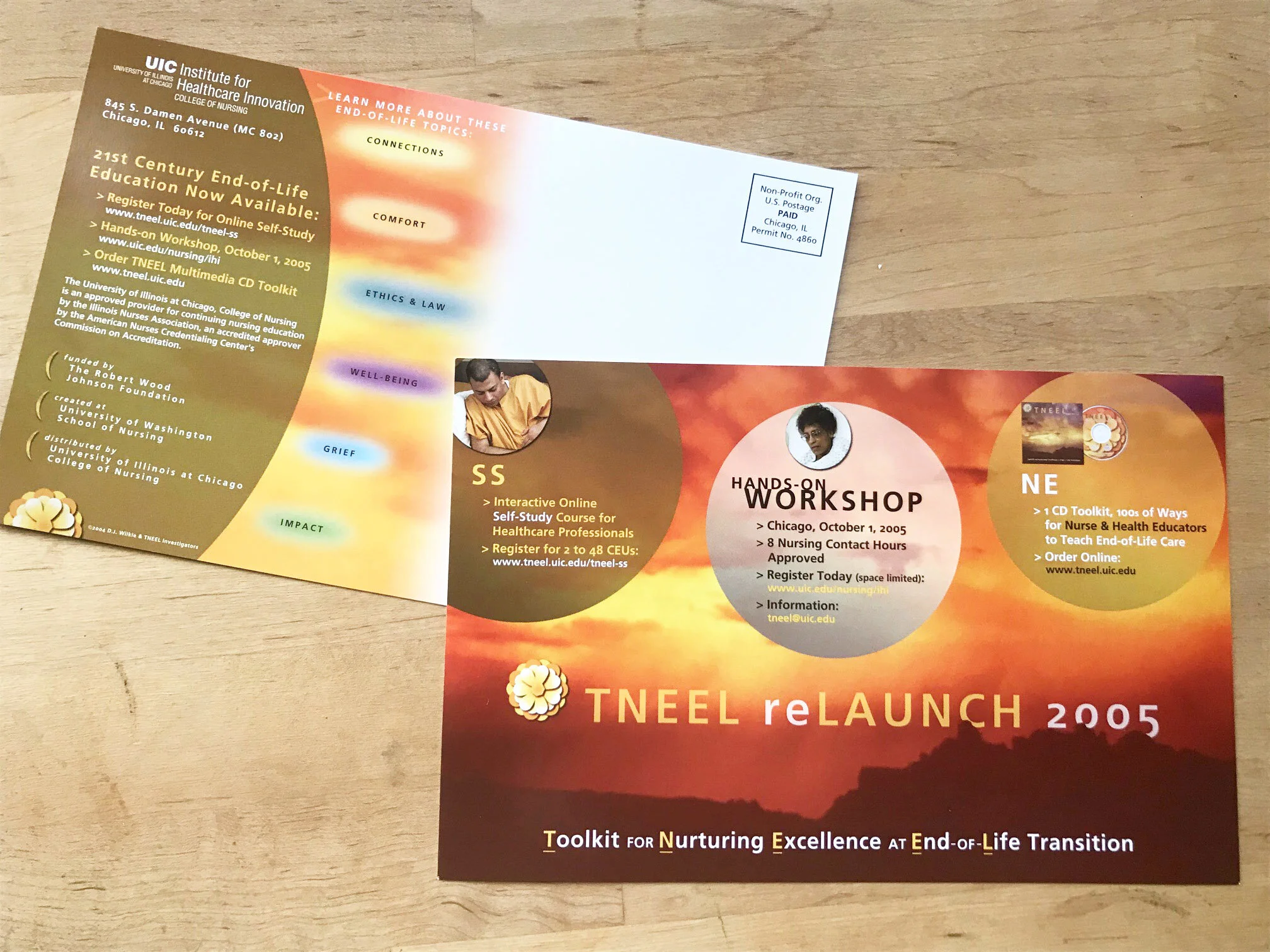
Copywriter & Lead Content Specialist for TNEEL Team: Finalized easy-to-access, teacher/learner-friendly content for CD-ROM titled Toolkit for Nursing Excellence at End of Life Transition. Created 1000+ individual slides. Wrote copy for all collateral material, technical instructions, as well as scripts for video vignettes. Direct mailer brochure reached tens of thousands nationwide and responsible for high return rate for software sale orders, recouping all costs and making a profit. (The sales money was reinvested back into grant.)
YOUTH THEATRE NORTHWEST
Public Relations & Marketing Director reaching Seattle regional media with inventive PR campaigns to promote youth theatre productions and educational programs. Wrote press releases for six shows. Record attendance for inaugural show, "Fiddler on the Roof." Coup de grace accomplishment: Surpassed all-time registration record for Summer 2000 camps & classes (375+ students) via targeted online and direct mail marketing with “playful” brochures and messaging.
INTIMAN THEATRE
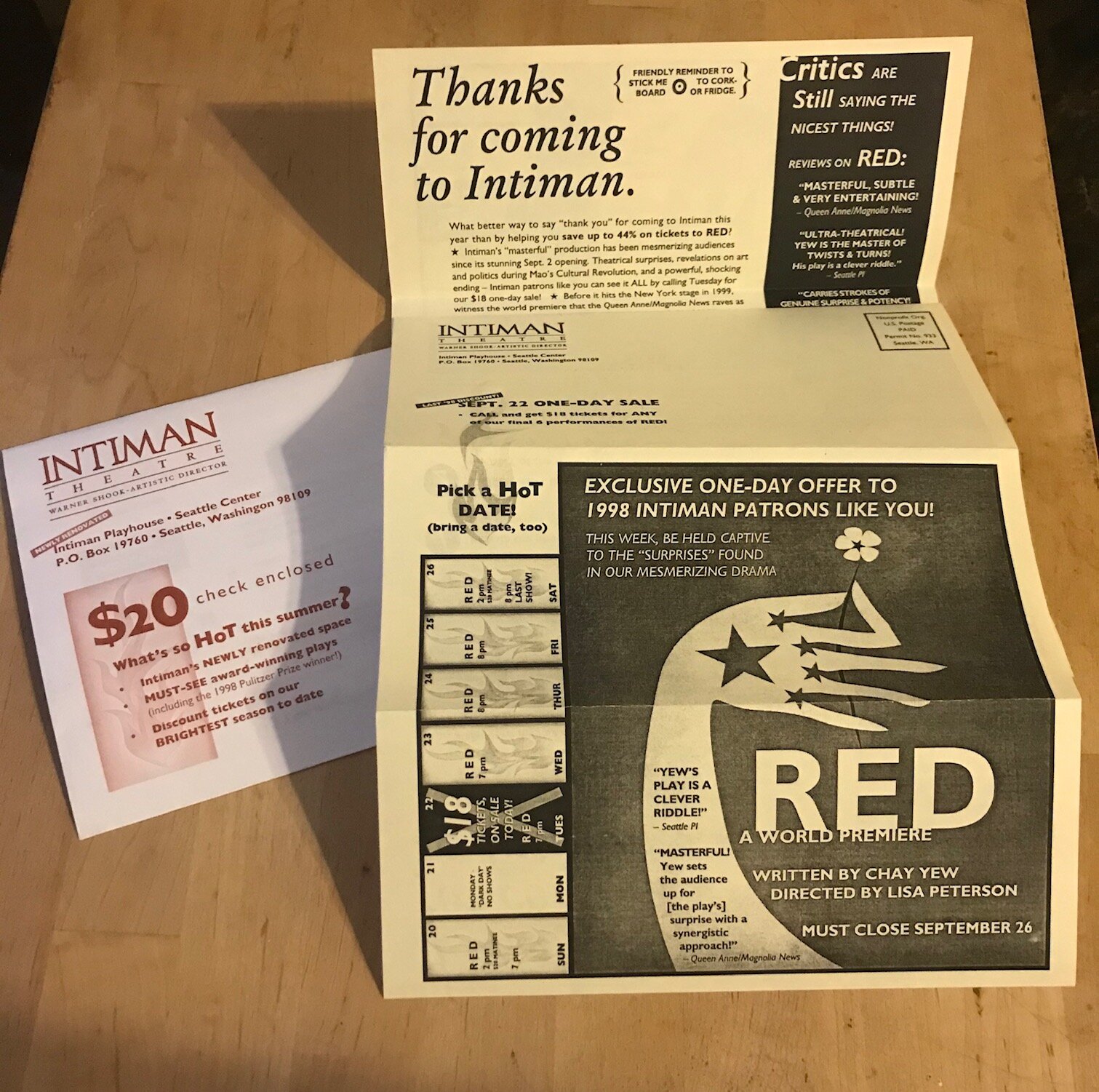
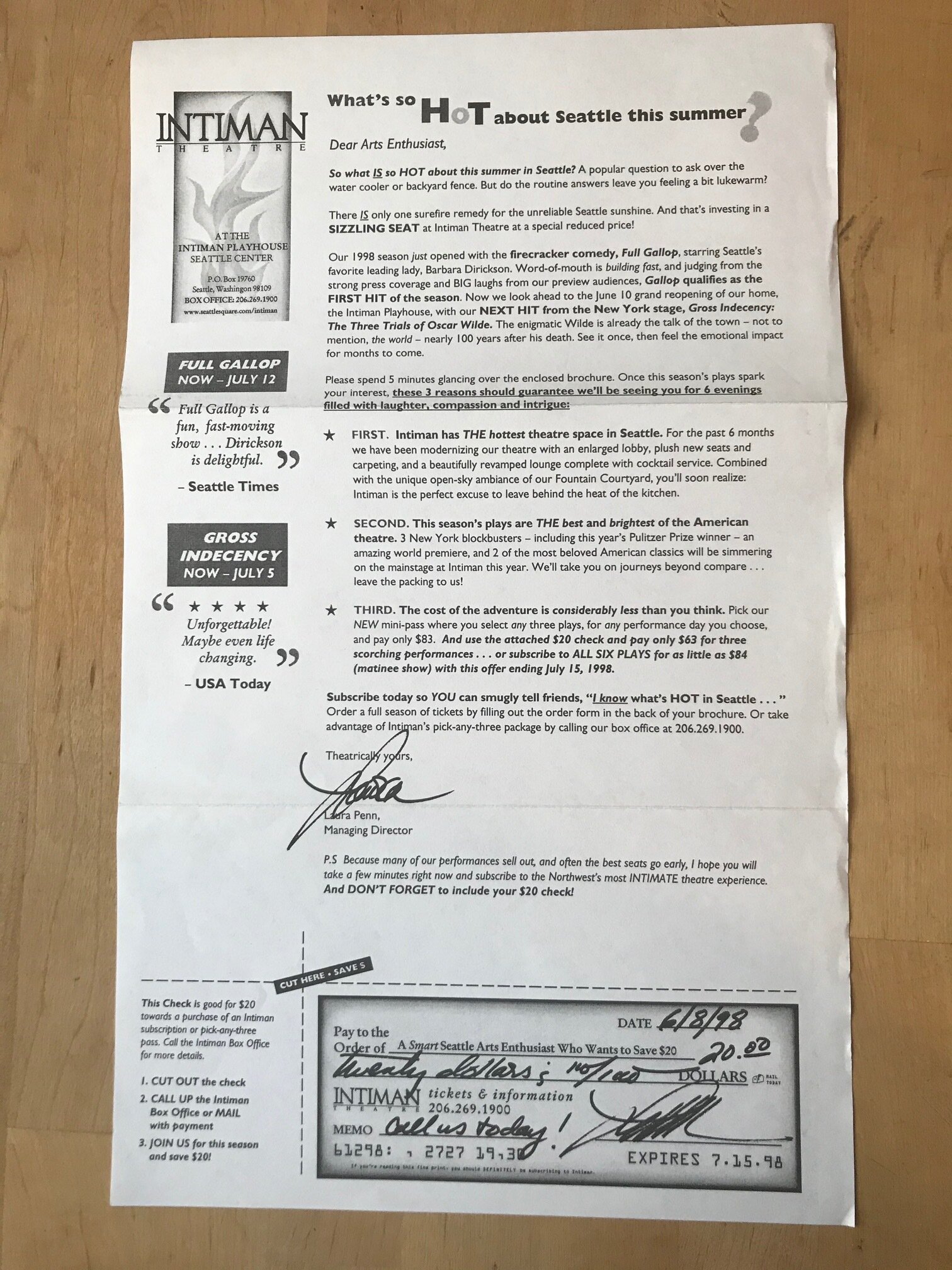
Sales & Marketing Associate creative position at Seattle Center theatre and handled all graphics in-house and copywriting. As ad placement manager coordinated $70,000+ annual print budget. Led Barnes & Noble in-store promotional events as "face" of the theater. Designed and produced created line art for ads in Seattle Times and Seattle Weekly. Wrote radio copy.
ISTE
Copywriter, PR Liaison & Designer: Successfully rebranded ISTE, including international conference (Tel•Ed '97 & '98), print ads, and online. Rebuilt relationships and networked with 40+ tech leaders and organizations.
—
Key Links:
Go to David’s Shuey’s Google Drive for more David Shuey writing samples
2021-2022 copywriting & UX writing samples from Memorial Sloan Kettering
Up-to-date UX Content Strategist & Writer Resume (PDF) • Full Version Resume (PDF) • 2022 Writing Resume(PDF)
WRITING SAMPLES
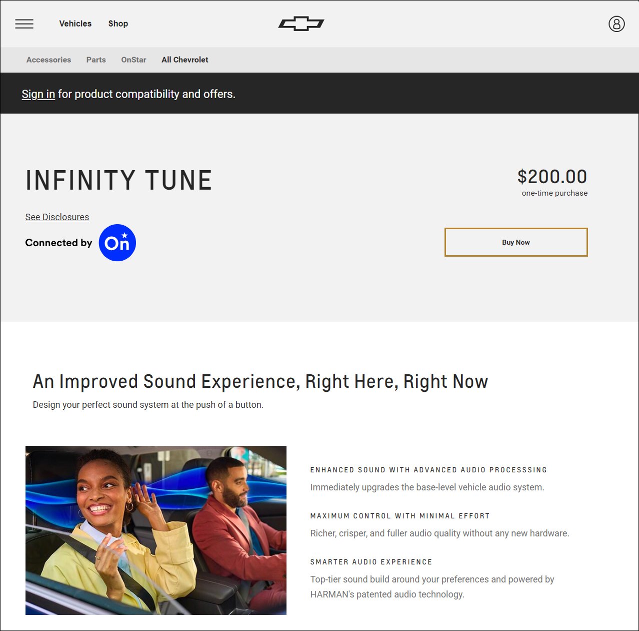
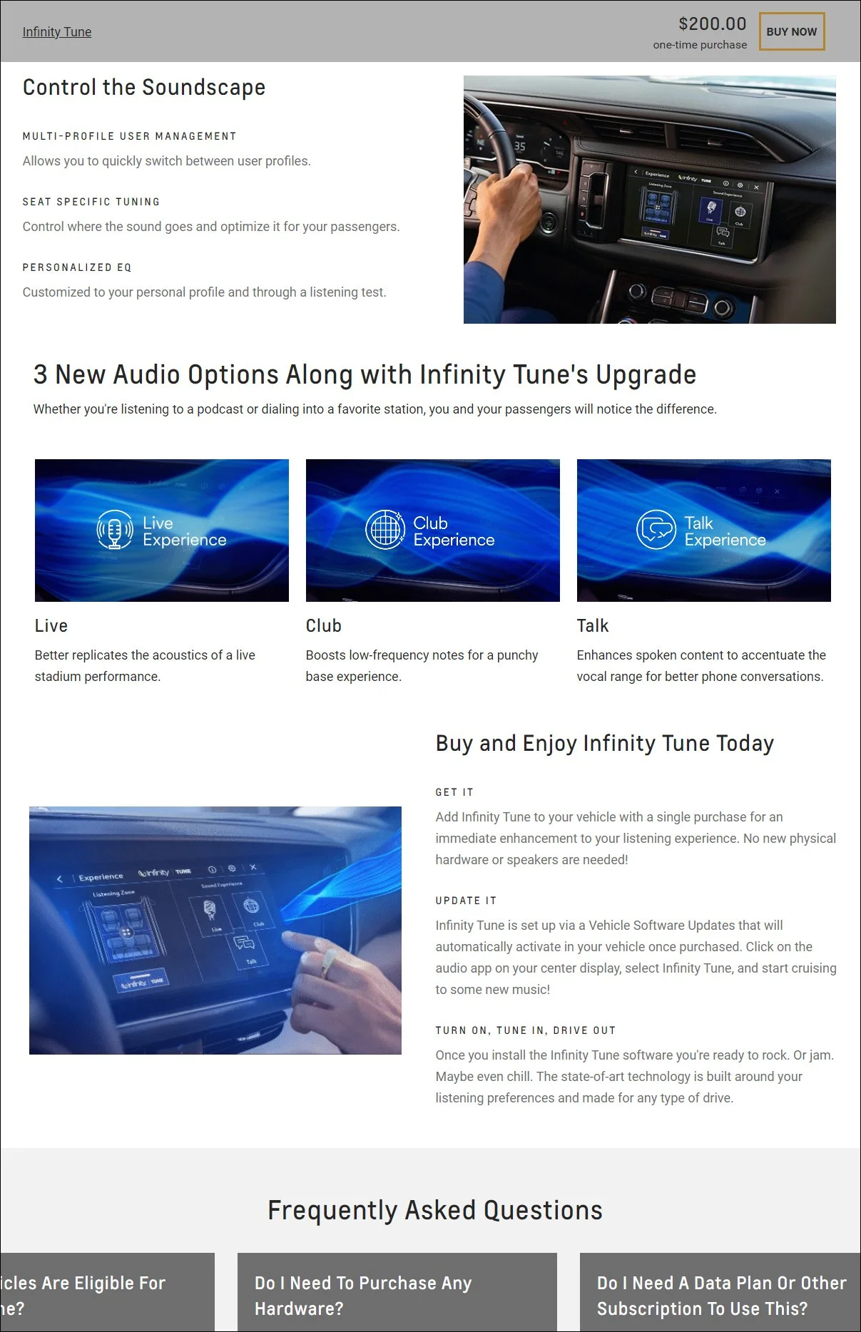
Infinity Tune - Product Detail Page - 2023 (Right Here, Right Now)
My General Motors sample page was updated in 2024, and has most of my new copy examples this past year to check out. We’re talking more than a dozen ecommerce pages and a heap of UX content solutions.
For our revamped product detail approach for 2023, we developed a series of components to best help the customer make a decision. Users are arriving from emails, advertisements, organic and paid search, or other marketing pages. We keep it simple.
Benefits mentioned first. Features shown second. How-to-get component comes third.
chevrolet.com/ownercenter/onstar/shop/infinity-tune


UX Copy "Win" for Aetna
I won’t talk about the success of this modal copy here — I do on my Aetna sample page. But I will talk about my most recent UX writing experience working for Aetna/CVS.
I took a lateral move from MSK in early 2022 for my recent role as Senior UX Content Strategist for Aetna (a CVS Health Company) where I was a lead responsible for providing human-centered content, quality assurance (QA), micro copy, and A/B copy testing for Medicare plans. As of mid-November 2022, the direct-to-consumer platform AetnaMedicare.com, where I was owner of content for the global and enrollment features (omnichannel save the sale, Medicare application), has reached 500,000+ customers and enrolled thousands of members.
We also committed many hours of UX research along the way with older users to make the product better. For us that was always one thing: Less confusing.
See more about my 10-month content strategist contract role at Aetna here:
davidshuey.space/#/aetna-cvs-content-strategist-ux-writer/
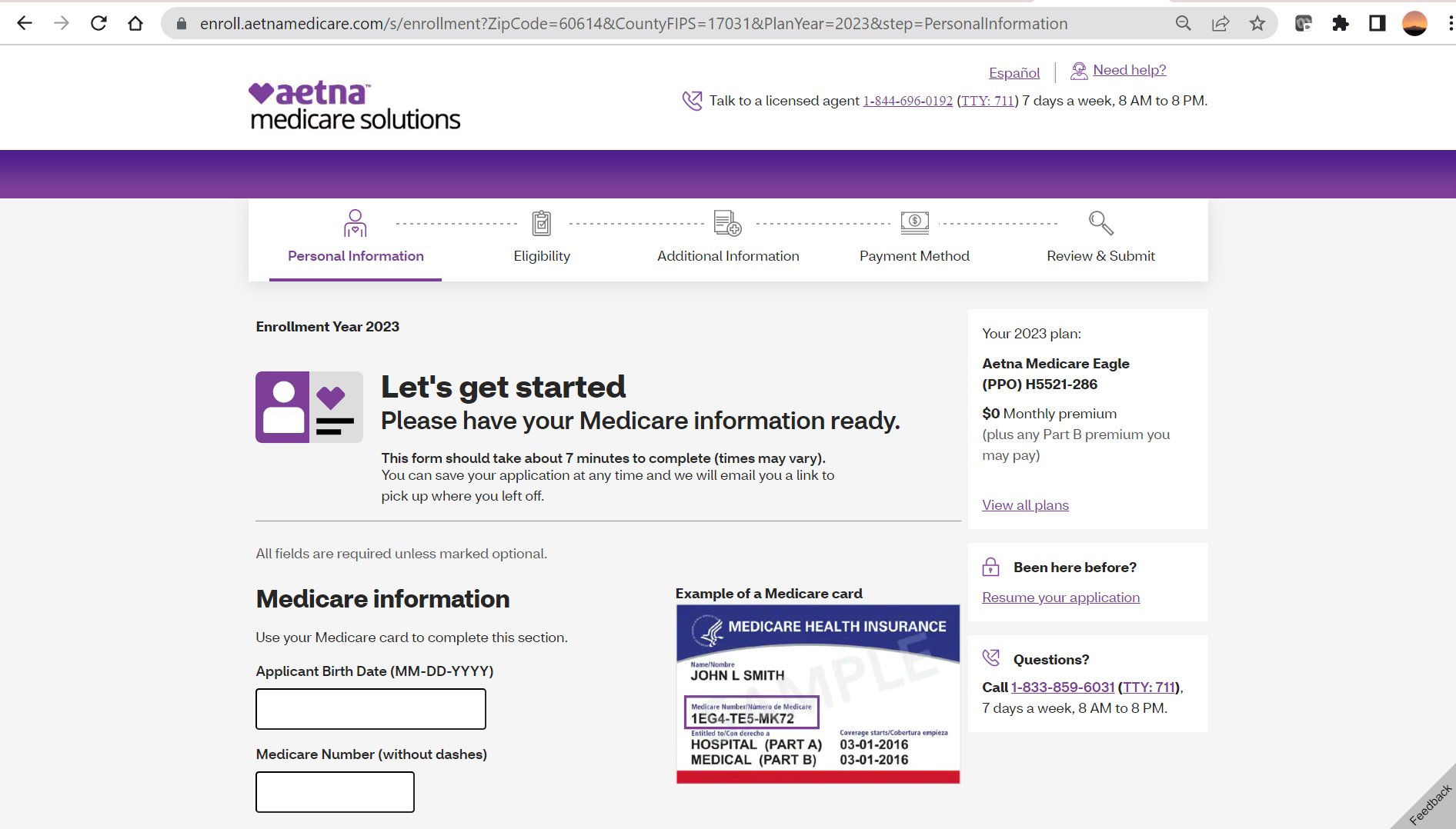
Welcome to "Enroll" (After "Shop" and "Buy")
The key is to empathize with challenges novice digital users and elderly audiences face in decision-making. This includes writing copy of varying fidelity for mobile and desktop platforms. Pro tip: Bite-sized chunks of information presented at a 6th-grade reading level.
To get to this page yourself, just go to AetnaMedicare.com, input your zip code, pick any plan, and then click the CTA primary button “Apply now.” This will take you to the screenshot above.
But what if you don’t want to complete the enrollment application right away?

Save Progress Microcopy Sample
Our UX assignment: Making the journey as simple as possible. And to achieve another connection with the Medicare customer. This omnichannel solution was achieved as Aetna had an increase of users returning to the site after our summer 2022 update of the “Save the Sale” feature. An email link allows them to return at any time they choose.


Content Strategist & UX Writer at Memorial Sloan Kettering Cancer Center
Below is a copywriting sample from MSK’s inaugural design system developed on Knapsack in Q3 2021. See more MSK writing here:
tinyurl.com/david-shuey-msk-ux-writing
Our Philosophy: Scaling Growth. Saving Time.
Simplicity is Our Objective
By making your work life easier, this leads to more profound outcomes and manageable solutions for people battling cancer on all touchpoints.
Memorial Sloan Kettering Cancer Center has devoted more than 135 years to exceptional patient care, innovative research, and outstanding educational programs. By saving hours using our scalable design system to build pages for the MSK audience, this frees up time for other work endeavors. The cascading effect benefits the MSK physicians, scientists, and staff who are serving patients and our greater society.
We give you the tools to build — the voice, brand, and style, as well as handy templates — and you give the world products that change lives, in the moments when people are the most stressed and in need. And hopefully you can provide solutions that can add years of new meaningful moments.
This lego metaphor for design systems illustrates focused, deliberate, and efficient ways of building. It is used by Brad Frost in his Atomic Design framework and the lego blocks visual he borrowed from Multiscreen UX Design by Wolfram Nagel. Imitation is a form of flattery, and Frost confirmed this on Twitter.

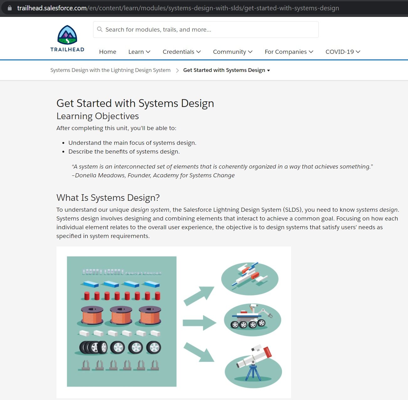
Technical (UX) Writer at Salesforce: Module Content Sample
Working as a part-time contractor for my first enterprise-level tech company, I wrote four modules (plus quizzes) for Salesforce in 2020 on the topic of "Systems Design with the Lightning Design System." Below is the intro module learning material I copied & pasted from:
trailhead.salesforce.com/content/learn/modules/systems-design-with-slds
Get Started with Systems Design
After completing this unit, you’ll be able to:
• Understand the main focus of systems design.
• Describe the benefits of systems design.
“A system is an interconnected set of elements that is coherently organized in a way that achieves something.”
–Donella Meadows, Founder, Academy for Systems Change
What Is Systems Design?
To understand our unique design system, the Salesforce Lightning Design System (SLDS), you need to know systems design. Systems design involves designing and combining elements that interact to achieve a common goal. Focusing on how each individual element relates to the overall user experience, the objective is to design systems that satisfy users’ needs as specified in system requirements.
When you take a systems design approach to designing a user experience, you focus on scalability. Scalable elements have multiple uses, support multiple viewpoints, and fit multiple structures. Then you combine those elements to form the full user experience.
Reusable elements benefit designers, who design experiences efficiently by reusing existing interaction patterns. New users also benefit by learning a new interface quickly because they recognize its elements. Consistent appearance, purpose, and placement of elements in an app guide users to build habits, which increase users’ efficiency.
Building: An Analogy
Systems design is an abstract concept so let’s consider an analogy: building a house. When you consider the breadth and scope of a project like building a house, imagine how the material objects, architectural blueprints, and craftsmanship of construction work together to make a usable living space.
Zoom in to a single door. The instructions for your door latch probably match the functionality of millions of others, so there’s no need to invent an entirely new type of handle and lock. Over time, you learn the most basic lesson: Keep it simple by using existing solutions to solve common problems.
The same ideas hold true for systems design. The foundation of systems design is recognizing that the relationships between elements are more important than the individual elements.
The efficiency that systems design offers designers extends to developers as well. When a pattern of elements solves a problem or facilitates completing a task in one area of an app, you can save time by reusing that pattern in your design. The developers implementing the design save time too by reusing the code already written to implement that pattern. Both designers and developers have more time to devote to more complex issues. We cover reuse more in-depth later in this module.
Supercharge User-Centered Thinking by Including Systems Design
User-centered design has revolutionized application and website design since its introduction in 1986 through an ISO standard. It birthed a new mainstream focus area of design that Don Norman coined user experience, or UX for short.
Creating a fantastic user experience requires balancing two activities.
• Consider the patterns (micro and macro) that people learn, through widely accepted UX best practices and unique patterns in your application.
• Ensure that users can accomplish a discrete task on a single page or in a single feature.
Without systems design considerations, you can fall into the trap of neglecting the user’s end-to-end experience. To maintain a holistic view while creating a design system, focus on these key questions.
• What does someone do within the app before they come to your new page or feature?
• How can you use interconnected experiences to supercharge your design?
Focusing on the relationships between the individual elements and the overall user experience produces compelling user experiences. This is systems design.

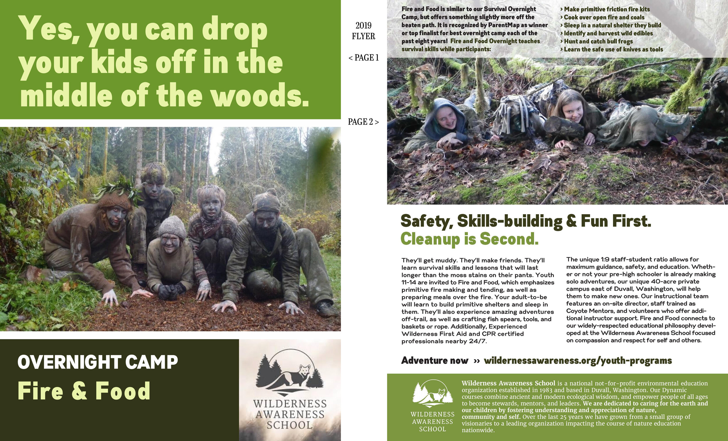
Marketing Copy 2019 — Keep It Simple
Wilderness Awareness School outside Seattle asked for a quick mock-up in 48 hours, and this was what I delivered.
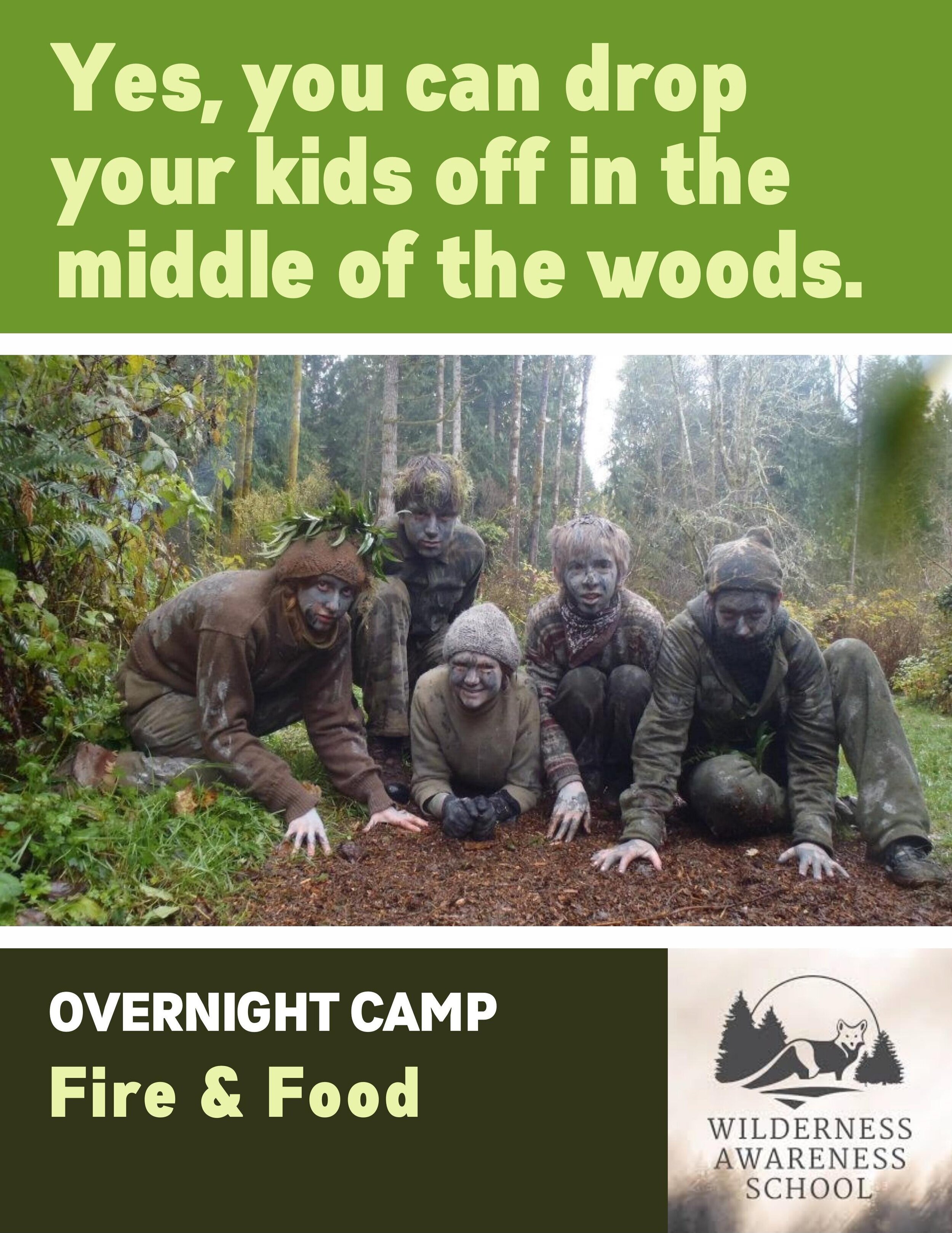

Yes, I Did Drop this Copy in One Hour
If you were an editor, you could get two more drafts by the end of the day. I write laser quick. And I’m always open to feedback.


Two Decades of Creative & Technical Writing Experience
Not only do I write the brand marketing copy for online and interactive learning tools, I write the technical instructions for a straightforward user experience. View all technical writing samples here.


Lesson #1 in Promotional Writing: Quickly Solve the Communication Problem
It’s an Oscar party. Dress up or dress down? We wanted to explain to people they could wear whatever they want, but convey that there’s also a costume contest. Kept it simple.
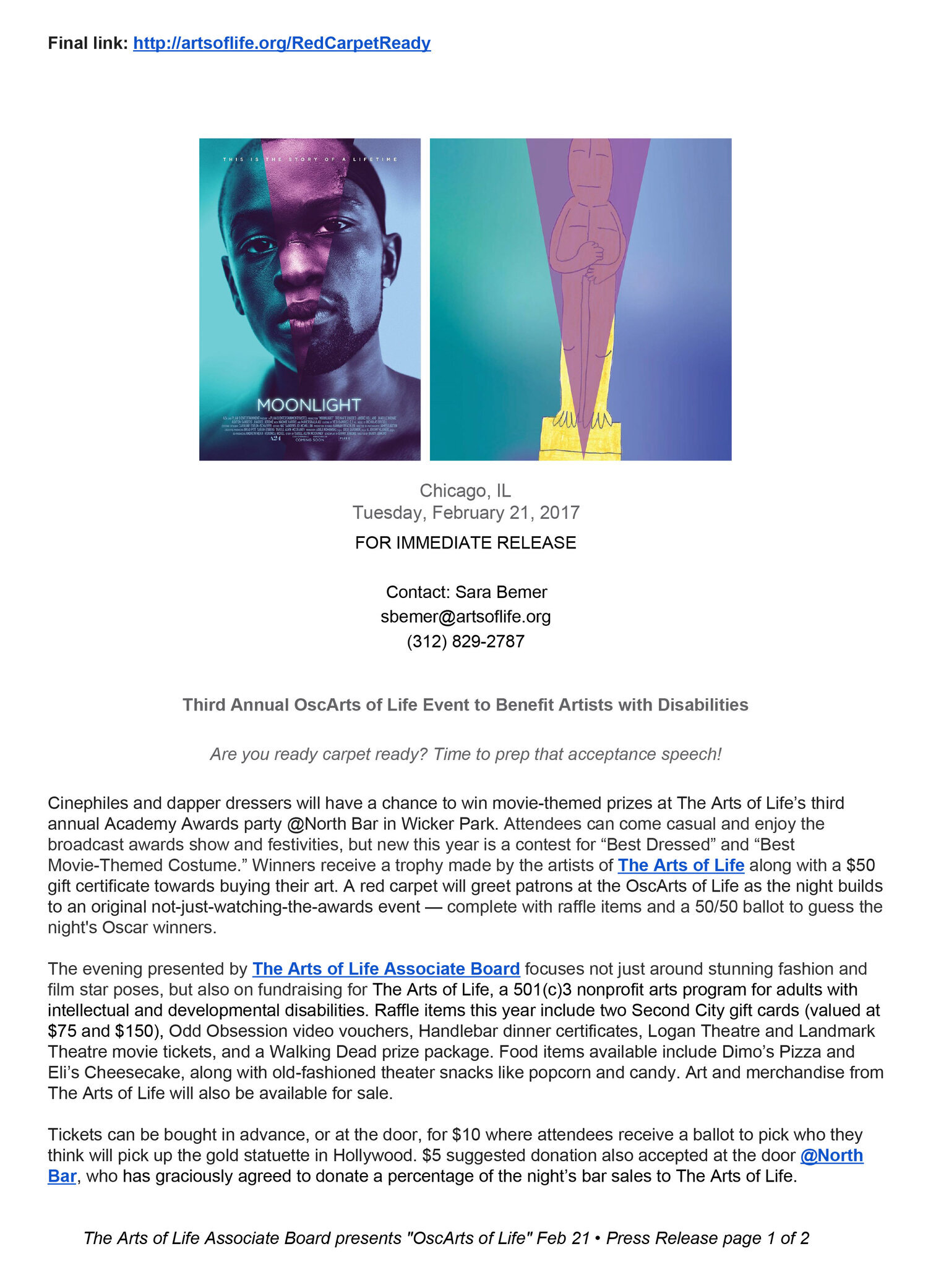
Press Release Prediction: Tying the Underdog Oscar-nominated Movie with Your Theme
Guess what? “Moonlight” ended up winning Best Picture over “La La Land.” I wonder if Warren Beatty and Faye Dunaway have any memories of that.
What we lost by economically keeping the press release to one page we gain by adding the buzz-worthy “Moonlight” visual.
And in terms of smart content and PR strategy, know this: Editors and web managers are busy. On page 2 (see below) we leave the URL links and key information for them to scrape and populate their pages.





PAIN Software Branding for eNURSING and at University of Illinois at Chicago — 2003-Present



TNEEL Project at University of Washington — 2001-2003 (continued until 2013)

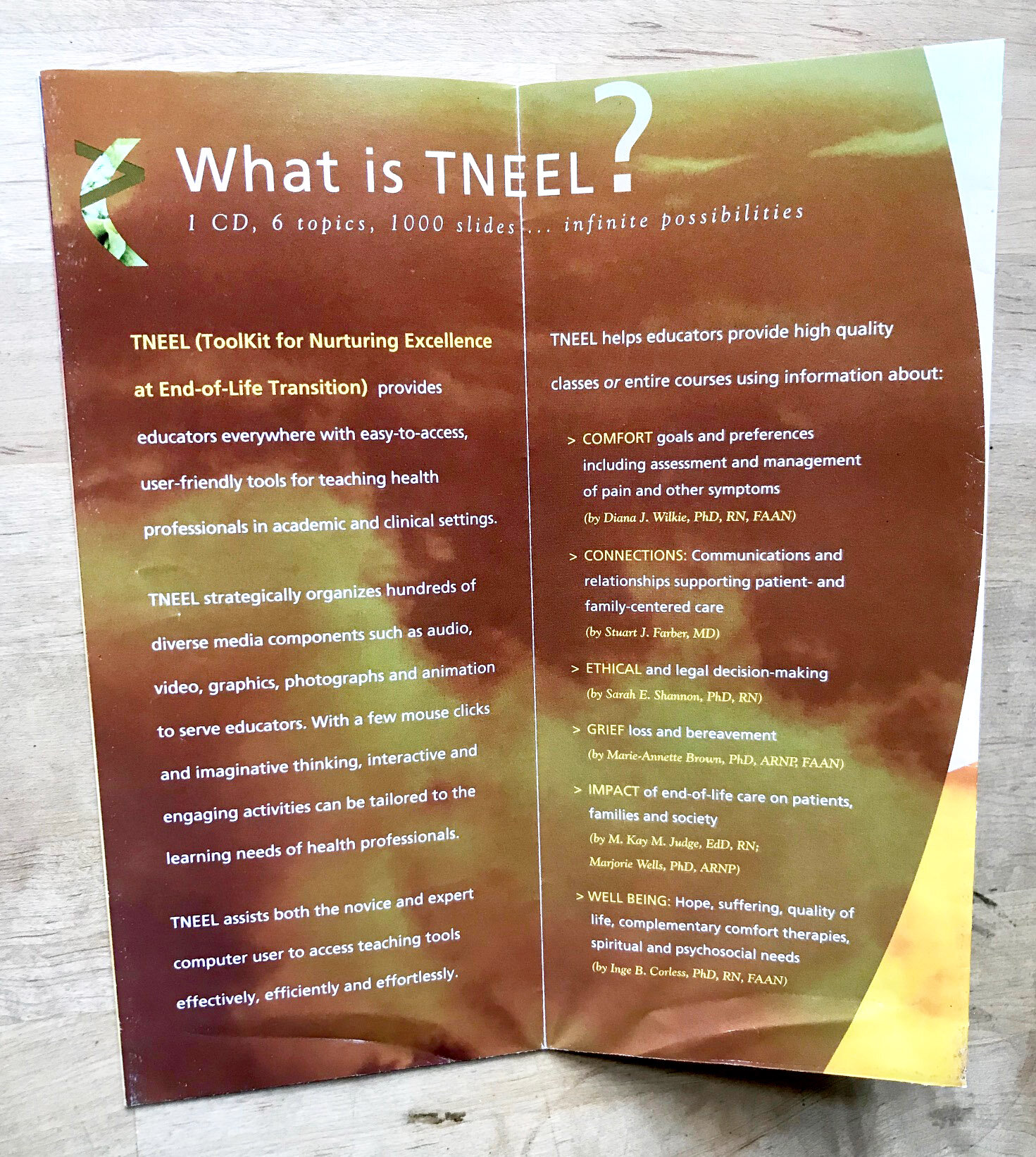

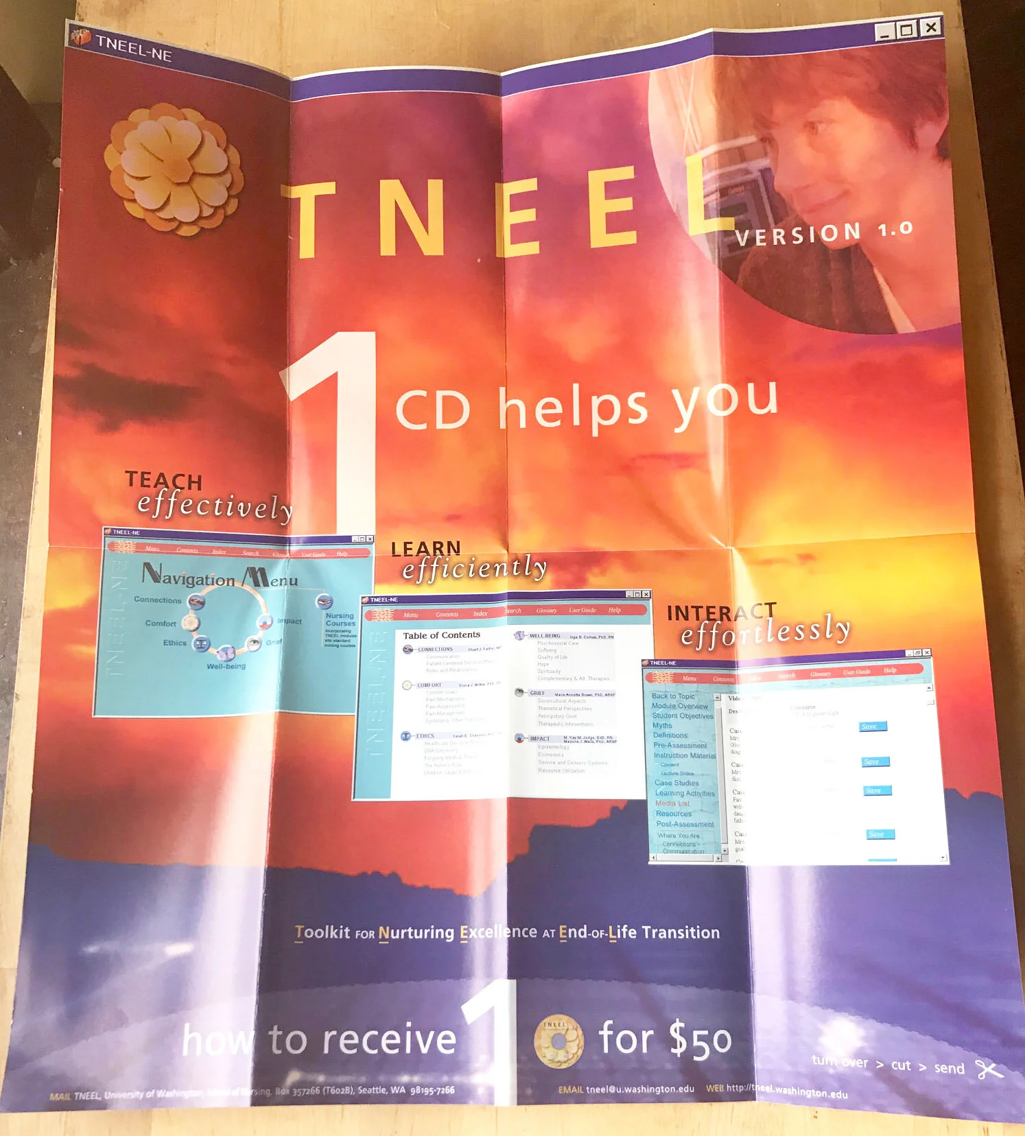
Huge Success for Order Form and Poster Concept: "1 Toolkit, 100s of Ways to Teach End-of-Life Care”
Remember how Microsoft Windows used to look? Kinda clunky. We tried to make it beautiful.
My longtime boss and mentor Diana Wilkie, a nurse and one of the leading experts in pain management nationally, once told me she didn’t mind Microsoft controlled 90% of the operating system market. Why? Because then it meant our software could work on 90% of the computers. (Sorry, not sorry, Apple iOS.)
This innovated brochure design that folded out into a poster meant to convey the technological and creative possibilities of a piece of software used to help healthcare professionals teach, learn, and interact better in regards to palliative care. This direct mailer brochure reached tens of thousands nationwide leading to a high return rate on software sale orders. The grant recouped all all costs and all profits were returned to the grant focused on end-of-life care.


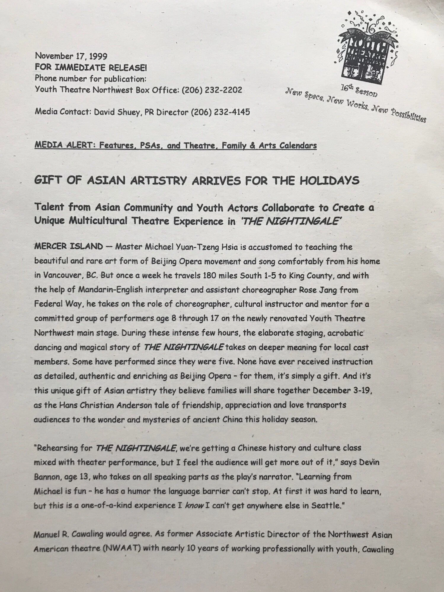
Youth Theatre Northwest — 1999-2000

Youth Theatre Northwest's Main Stage Subscription Brochure/Mailer
What you can do with a 2-color limit to your marketing budget. Part of being a Department Head is creatively stretching your dollar. Part of being a good copywriter is directing your target audience to the benefits and the product itself.



Intiman Theatre — 1998


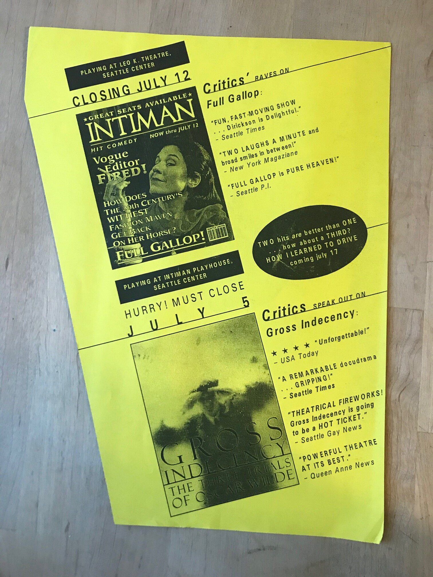
This Flyer Caused a Sales Spike AND Directly Led Me to a Fruitful Interaction with Stephen Fry, the Famous British Actor Playing Oscar Wilde
Ask me about it, I’ll tell the tale. Though the gist of it is straight-forward: I connected him to our theatre company and Artistic Director — apparently, they had a "fantastic" conversation — after Mr. Fry introduced his movie “Wilde” to Seattle audiences at an international film festival. (He was fantastic in it, and my hero Roger Ebert agreed.)
After papering the movie house, I boldly went up to the comedian-writer-actor. Fry liked my rapper Ton Loc “Wilde Thing” pun. He then autographed a large-sized Intiman Theatre poster for us. In return the cast of our play autographed a poster for him, which was delivered to his hotel. I was Golden Boy for the day. Fry got great reviews, but he failed to get a deserving Oscar nomination, his only real chance.



ISTE — 1996-98

Frankly, the Design is Cooler than the Copy
But it’s not bad ad copy for a kid just out of advertising school.

... Then My Supervisor/Mentor Left ISTE and I Alone had to Market and Promote this Conference
Fortunately, the man who hired me out of University of Oregon’s journalism school, Tony Foy, and I had already established the voice and tone for ISTE and Tel-Ed dual-site conference in Texas and Mexico. Tony is still a top reference and great friend, and in 2020 was promoted to director of a major marketing company in Eugene, Oregon. I’ll always be thankful he accidentally allowed me to be Marketing Director for four months — but at the time it was a wee bit overwhelming.


Completely NEW Branding and Copy for ISTE
The dawn of the internet — thanks, Al Gore! — was all about connection. So that literally became our tagline and visual theme as we attempted to reboot all aspects of ISTE’s Marketing & Membership Services division.
Tagline (used in other ads): Connecting People to the Best in Educational Technology


ISTE Catalog Redesign: Art Direction and Copywriting
Had a blast adding a little color and flair — and “Did You Know?” trivia tidbits — in the nonprofit ISTE’s main moneymaker: The ISTE Catalog. Ghostwriting for the Executive Director who’d been there since the 1960s was also a treat.


From a Young Age, I Always Loved "Did You Know?" Copy
I made sure these were throughout our catalog redesign, and wrote all the copy.


