• Contact + Resume
  • UX & Creative Work
  • About
Menu

David Shuey [ux•content•writing•design]

Samples, Balloons & Bubbles, Oh My!
  • Contact + Resume
  • UX & Creative Work
  • About

Google/IBM iX - UX Writer

While there will be a delay on what I can currently share (much of my work relates to internal tools at Google), you can read my Feb 2025 update on LinkedIn below. Or check out:

• Ecommerce UX writing samples for General Motors

• Human-centered digital UX content for Aetna/CVS Health

• Systems design learning modules I wrote for Salesforce

• Best UX writing samples

Recent Work for Google/IBM iX in LinkedIn:
linkedin.com/in/david-shuey-aa265775/

UX writer for Google (xWF) tasked to “solve some gnarly complex problems.” As an IBM iX consultant and contractor, I was assigned to the Privacy, Safety, and Security space within the Core UX group at Google.

Specialization: Developing inclusive UI text that meets Google Brand standards.

Goal: Create quality digital experiences at scale that lessen cognitive load.

Reach: Final product to affect 400,000+ daily logins at Google.

Core Responsibilities:


• Spearheaded UI content design for Internal Identity and Access Management (IIAM) product area

• Strategize and iterate weekly with UX designer, lead UXW strategist, UXR, and engineers at Google to improve content

• Led nomenclature and term definition initiative to make recommendations and implement in Figma designs

• Key UX member responsible for revamping language and flows for login pages to match Google brand standards of being clear, human, and optimistic

• Utilized top-level Google resources and AI-powered tools (Gemini) for UX/UI decisions to scale company-wide

Samples from Google: Coming Soon'sh
FYI - Proxy Screen Showcasing Friendly New Design

Googlers get a new Single Sign On experience sometime later in the year.

This Doesn't Follow Google Brand Guidelines

But it looked cool, so I thought I’d keep as a placeholder until I added my brand-driven UX content flows.

Google workspace.jpg

General Motors - UX Writer

For 18 months, I had the privilege of working as a key contributor within a top-tier customer experience (CX) team at General Motors in the Software & Services Design division.

Most of my time at GM was spent as the lead UX writer in the dynamic and competitive ecommerce space, which includes everything from OnStar digital downloads like Super Cruise to the accessories and parts store (GM Genuine Parts and ACDelco). On this page you’ll see validated UX writing such as microcopy, but there’s also a heap of product content strategy and marketing copywriting. I’m most proud of my achievements in converting customers into buyers through vetted and tested copy.

The terrain is vast. More than a million site visitors view our mobile, desktop, and in-vehicle content on a monthly basis. Traffic strongly increased since I moved from GM's R&D division to ecomm in June 2023. By May 2024, we surpassed our OnStar digital storefront goals for Q1 and Q2, yielding a record YoY revenue increase of 21% — moving from roughly $100 million to $120 million-plus. Due credit goes to the 20+ person UX team, and the vastly larger business and software development teams.

However, I do take credit for upgrades to GM's Product Detail Pages, which I helped move from "walk state" to "run state" through customer research, open collaboration, and a data-driven UX content approach.

Scanning this page, you’ll see work where I was the sole UX writer responsible for deciding which words make it, and which words don’t. I love words, but one can’t save them all. Some have to die on the vine. And that’s good design.

GM Logo:  2021
GM Logo: 2021

There’s some hidden design secrets in the newish GM logo, namely a plug visual reference to the Ultium battery platform and a nod towards electrification.

GM dash space copy_background-matches-squarespace.jpg
Super Cruise - Run State PDP - 2024

Ecommerce Site: cadillac.com/ownercenter/onstar/shop/super-cruise

Responsible for all content on this Product Detail Page (PDP). PDPs are typically scaled to all four GM brands — Chevrolet, GMC, Cadillac, and Buick — using our dynamic design system.

Super Cruise Core - 2024 Run State - UX Copy-Social Proof-Features.jpg
Super Cruise - Run State PDP - 2024  (below the fold)
Super Cruise - Run State PDP - 2024 (below the fold)

In April 2024, the newly released “run state” PDPs launched for Chevrolet, GMC, and Cadillac. Check out the final best-of-class ecommerce vision complete with motion, animation, and videos!

GM dash space copy_background-matches-squarespace.jpg
Super Cruise - Walk State PDP - Hot Off Digital Presses: Released March 26, 2024


New Product Detail Page (PDP) content I wrote in 2023 for Super Cruise. It was the first OnStar product I jumped into, and the content strategy approach was a “deep journalistic dive.” I co-led this initiative to modernize our PDPs, enhancing the content design with a focus on simplifying scannability and readability with a repeatable pattern.

We interviewed customer experience researchers, In-Market Enhancements (IME) product owners, merchandisers, as well as absorbed a slew of marketing slide decks and PDFs. Then we tested and validated the results with traffic and customer conversion data.

“Show us the ingredients, and we’ll make the PDP cookies,” is what I put on a PDP presentation to leadership on our benefits-driven approach.

Well, here’s the first fully cooked batch of content cookies.

I was the exclusive UX writer in ecomm working on headlines, microcopy, marketing alignment, and consumer conversion strategy for the following:

Upgrade (Automatic Lane Change and Trailering): cadillac.com/ownercenter/onstar/shop/super-cruise-auto-lane-change-trailering

Trailering: cadillac.com/ownercenter/onstar/shop/super-cruise-trailering

Automatic Lane Change: cadillac.com/ownercenter/onstar/shop/super-cruise-automatic-lane-change

GM+dash+space+copy_background-matches-squarespace.jpg
OnStar Digital Store - Department Landing Page - 2023

Ecommerce Site: cadillac.com/ownercenter/onstar/learn

Key Outcome: 31% increase in traffic since launching this page

Can the Copy Get Shorter? Usually.

Brief marketing copy at bottom of Department Landing Page to help customer find additional Product Detail Pages.

GM dash space copy_background-matches-squarespace.jpg
Velocity Upgrade - Product Detail Page  - 2023
Velocity Upgrade - Product Detail Page - 2023

Benefits mentioned first. Features shown second. How-to-get component comes third.

Velocity Upgrade - Product Detail Page - 2023  (below the fold)
Velocity Upgrade - Product Detail Page - 2023 (below the fold)

Authenticated In-Market Enhancement (IME) Ecommerce Site: cadillac.com/ownercenter/onstar/shop/velocity

Available only on specified vehicles such as the 2023 Cadillac LYRIQ.

GM dash space copy_background-matches-squarespace.jpg
Flex Cam - Product Detail Page - 2023

Ecommerce Site: cadillac.com/ownercenter/onstar/shop/flex-cam

Flex Cam - Product Detail Page - 2023   (below the fold)
Flex Cam - Product Detail Page - 2023 (below the fold)

GM dash space copy_background-matches-squarespace.jpg
Infinity Tune - Product Detail Page - 2023

Ecommerce Site: chevrolet.com/ownercenter/onstar/shop/infinity-tune

Infinity Tune - Product Detail Page - 2023  (below the fold)
Infinity Tune - Product Detail Page - 2023 (below the fold)
GM dash space copy_background-matches-squarespace.jpg
Once Upon a Time, This Used to Say "Needs Fitment" Up Here

Here’s the problem: “Needs fitment” is an industry term that means little to the everyday user. As a label, it wasn’t working. So after some user (UXR) testing, collaboration, and a series of reviews on Miro and Figma a content solution was found: “Needs vehicle details.” I led this initiative to improve a key labeling feature in our parts and accessories experience, conceiving of 20+ labels before narrowing to one and implementing the results with ecommerce UX designers and software developers. See: GMC > Accessories > All Categories > Truck Shop > Exterior Enhancements

GM+dash+space+copy_background-matches-squarespace.jpg
Accessibility Tags and Annotations: Following WCAG Standards

Jumping into the accessibility pond (a11y) means communicating clearly to devs and engineers the exact way the page operates so that the most users can access content. This not only requires empathy, but also a deep and intimate focus on the UX components and details. You want to make sure the screen reader is precise and accurate.

At General Motors (and Aetna) I worked closely with our UX and accessibility teams to ensure we met the minimum Level A and AA compliance for our digital products. These guidelines are informed by the WCAG (Web Content Accessibility Guidelines) and best practices outlined within GM's Aurora Design System.

See sample of my accessibility work in Figma.

GM+dash+space+copy_background-matches-squarespace.jpg
GM Design Center - Warren, Michigan

From LinkedIn:
linkedin.com/in/david-shuey-aa265775/

Lead UX writer in the Ecommerce department responsible for converting customers into buyers with clear and consistent UX copy.

More than a million site visitors view General Motors' mobile, desktop, and in-vehicle ecommerce content every month, and I was the UX content designer for many key areas: Payment, marketing landing pages, product detail pages, department landing pages, account management, and more. Product and services pages include everything from OnStar digital downloads (Super Cruise, OnStar Guardian, Premium) to the accessories and parts store (GM Genuine Parts, ACDelco).

Delivered content across key channels within the GM digital product domain that measurably increased ROI. This included a 31% increase in traffic from our new Department Landing Page in 2023. Our ecomm team surpassed their OnStar digital storefront goals for Q1 and Q2 of 2024, yielding a record YoY revenue increase of 21% by May 2024.

Core Responsibilities:

• Write concise user interface copy utilizing design system and UX best practices
• Improve current content so it is honest, direct, and empathetic to customer needs (A/B tested when applicable)
• Collaborate with large content team to define and implement consistent standards
• Help create and maintain user experience guidelines that are in line with brands, voice, and tone at GM
• Lead story and project development in agile framework in alignment with user needs, business goals, and resource constraints
• Work closely with legal reviewers, marketing partners, product developers, and merchandising managers to improve traffic and conversion rates in ecommerce space

Additionally:

• Worked inside Future Roads department focused on advanced EV and R&D projects
• UX writing team part of Software & Services Design division

UX Content Strategy Approach (slide deck used in David Shuey’s 2023 GM interview):
tinyurl.com/David-Shuey-GM-UX-Approach

GM+dash+space+copy_background-matches-squarespace.jpg
Software I Used at GM

• Figma (used daily)

• Adobe Experience Manager (AEM) — Marketing landing pages for accessories

• Miro and FigJam — Journey mapping, ideation, and collaboration

• Azure DevOps (ADO) — Agile workflow with 8 points per sprint on multiple ecommerce projects (landing pages, wallet, account, checkout, product pages, error states, a11y, and more)

• Microsoft Teams — Collaboration, jokes, and memes (enjoy the easter egg link)

• Standout Skill: I'm hyper-organized, prioritize documentation, and love to share resources to solve business problems

GM+dash+space+copy_background-matches-squarespace.jpg
11 More UX Writing Samples from GM: 2023-2024


Note: Services, subscriptions, and products often are interchangeable among all four GM brands: Chevrolet, GMC, Cadillac, and Buick.

Premium - Product Detail Page - Subscription:
buick.com/ownercenter/onstar/shop/premium

Essentials - Product Detail Page - Subscription:
buick.com/ownercenter/onstar/shop/essentials

Guardian - Product Detail Page - Subscription:
gmc.com/ownercenter/onstar/shop/guardian

Additional OnStar Samples

OnStar Preferred - Product Detail Page - Subscription:
chevrolet.com/ownercenter/onstar/shop/preferred

OnStar Preferred Plus Wi-Fi - Product Detail Page - Subscription:
chevrolet.com/ownercenter/onstar/shop/preferred-plus-wifi

Safety & Security - Product Detail Page - Subscription:
chevrolet.com/ownercenter/onstar/shop/safety-security

Connected Vehicle - Product Detail Page - Subscription:
chevrolet.com/ownercenter/onstar/shop/connected-vehicle

Protection - Product Detail Page - Subscription:
chevrolet.com/ownercenter/onstar/shop/protection

Remote Access - Product Detail Page - Subscription:
chevrolet.com/ownercenter/onstar/shop/protection

App Access - Product Detail Page - Subscription:
cadillac.com/ownercenter/onstar/shop/app-access

Data Plan - Product Detail Page - Subscription:
cadillac.com/ownercenter/onstar/shop/data

Aetna/CVS Health - Content Strategist & UX Writer

Some quick background, just in case you happen to skip the About Me section: I have 8 years UX experience, with a dual focus — sometimes dueling — in design and written content. My passion for being a problem solver in communications goes back even further. At the end of the day, I strive to be a well-researched writer.

And writing takes you places. As of mid-November 2022, the direct-to-consumer platform AetnaMedicare.com, where I was content strategist on the enrollment and global features (save progress, Medicare application, etc.), had reached 500,000+ customers and enrolled thousands of new members in just six months.

We also committed many hours of UX research along the way with older users to make the product better. “Better” for us was always one thing: “Less confusing.”

Ideate. Iterate. Implement. Improve.

I was the owner of 100+ pages of content spread over two copy decks, pressure testing and modifying content post-MVP launch and tracking regular compliance submissions to abide by federal CMS guidelines for marketing content. Additionally, I maintained Aetna/CVS Health branding and editorial standards. I even found time to train two new content strategists for their roles on our “Shop, Buy, Enroll” digital product team.

My key contribution was developing digital content that empathized with elderly audiences to help educate, motivate and empower them in this key healthcare decision.

Aetna-logo_Curl_Page_CVS-Health-Porfolio-Preview-Image.jpg
AetnaMedicare.com Starts With a "Welcome!" & Ends With a "Thank You!"

This is the first page users see before entering the “Shop, Buy, Enroll” experience. The Medicare enrollment application I worked on is the last part of the journey. It’s where the potential customer converts into an Aetna Medicare member. We made it easy. And we thank them!

(But who else to bestow gratitude? My amazing enrollment scrum team who solved user challenges daily.)

Key Achievements From My Résumé (PDF):

• Provide human-centered digital content in close collaboration with UX designers, researchers, and developers at CVS Health

• Responsible for content review, quality assurance (QA), UX writing, microcopy, and A/B copy testing

• Expanded WCAG accessibility for omnichannel save the sale and Medicare Advantage (Part C) application

• Led partnerships with with compliance and marketing review team ensuring federal CMS requirements met

Where UX Content Strategy Starts: Journey Mapping & Collaborating

This is one section of a Miro journey map worked on collaboratively at Aetna. I’d show the entire Miro Board, but that’s 100x bigger and proprietary. Same with the 100+ pages of content on the copy decks I was responsible for.

I’ll keep it simple.

This was for a new post-MVP omnichannel “save progress” page (a.k.a. internally as “save the sale”) asked by Aetna business leaders to complete in Q3 2022. Hundreds of thousands of customers would come to the AetnaMedicare.com site in 2022 after our May launch, but what about those who want to save their spot and come back later?

I worked on all content strategy and copy, building digital mockups together alongside two amazing UX designers — hi, Lisa and Shannon — for our Enrollment & Global Features scrum team. We built out the flow together, often with me iterating copy beside their designs in Miro, or providing in real-time via Microsoft Teams for them to add on Sketch.

During some work sessions we would deliver several design or copy variations.

After Iterating Copy on Miro I Move Final Copy to Copy Decks for Compliance Review

Our UX assignment for saving user data: Making the journey as straightforward as possible while not forsaking customer trust. This was done on my end by simplifying the content as much as humanly possible.

This save-the-sale feature was a "big ask" by top management so Aetna could save the progress for users during their enrollment. This would guarantee marketing would gather a multitude of new customer emails they would not otherwise gain. These were coveted and highly valuable leads.

I built close relations with our MRT (Marketing Review Team) at CVS Health, where they would be able to expedite compliance reviews on user decks shown here.

Maintain Global Content: Header, Footer, Pop-Up Modals, Session Time Out, Need Help & More

All copy that was visible on more than one section of the “Shop, Buy, Enroll” experience would be in my wheelhouse under “Global” copy deck. This was still half as long as the “Enrollment” application copy deck.

Copy was tested by our UX Team in collaboration with the UX Research Team. The focused user testing was to see if they could move past pain points on the digital platform. Direct user feedback was recorded, absorbed, and utilized in future updates.

The content also had to adjust for desktop, mobile, and tablet formats.

Save the Sale Copy Sample (With Error Message Microcopy)
Welcome to "Enroll" (After "Shop" and "Buy")

The key is to empathize with challenges novice digital users and elderly audiences face in decision-making. This includes writing copy of varying fidelity for mobile and desktop platforms. Pro tip: Bite-sized chunks of information presented at a 6th-grade reading level.

To get to this page yourself, just go to AetnaMedicare.com, input your zip code, pick any plan, and then click the CTA primary button “Apply now.” This will take you to the screenshot above.

But what if you don’t want to complete the enrollment application right away?

What Enrollment Users See After Selecting "Save My Progress" Button

Our UX assignment: Making the journey as simple as possible. And to achieve another connection with the Medicare customer. This omnichannel solution was achieved as Aetna had an increase of users returning to the site after our summer 2022 update of the “Save the Sale” feature. An email link allows them to return at any time they choose.

Field Error Example
Field Error Example
Fire Drill: One More UX Copy Sample for Aetna

What’s a fire drill? It’s when a pain point presents itself as a a piece of data. It then trickles its way to stakeholders and they’re told that potential customers are drifting away from the experience at key moments based on this hypothesis: They’re confused when they show up on the enrollment application.

Oh, and they want a solution implemented in two business days. Good luck.

Research and marketing indeed did see that far too many users were lost in terms of what was expected to complete the application. They didn’t know if it would take 7, 10 or 17 minutes.

Solution: Just tell them. Quickly.

This modal would eventually be stripped into a three lines of copy at the top of p. 1 of the enrollment form (under “Let’s get started!”), which you can see a few screenshots above. But when I was asked to present new content as a pop-up modal in four hours, this was the best of several copy options. Within 24 hours I took initiative and mocked up the copy on PowerPoint because … well, I’m the content strategist, not the UX designer. I wasn’t given Adobe Creative Cloud, and we were a a few months away from getting our full Figma license, so this is what you get, folks.

But I am precise about mock-ups. And that was appreciated by product owners and team members alike in pitching this idea.

We fed the content quickly through our Medicare (CMS) compliance team. It put out the fire.

Whoops, Did We Take Too Long?

Thanks for viewing. Feel free to ask any questions during interviews, email, or through the Contact Me portal. The door is open.

Week-1-Loop-image.png
ideation graphic.jpeg

MSK - Content Strategist & UX Writer

As the first UX content strategist hired at Memorial Sloan Kettering Cancer Center, I was selected to spearhead vanguard content initiatives. This was done as I wore both my UX writer and project manager hats within a collaborative UX Design Team under the technology division DigITs. Human-centered content strategy methodologies and technical writing were applied to all digital products, from mobile to desktop, with a focus on seamless end-to-end experiences.

Enterprise-Level Experience: Memorial Sloan Kettering Cancer Center (MSK) is considered one of the top two cancer research centers in the United States. It is located in New York City with more than 20,000 employees. MSK was founded in 1884.

UX Team Objective: Synchronizing MSK brand and user-friendly design across all products via a new design system rollout. This agile-built design system named "Oxygen" we collaboratively built off IBM's Carbon’s open source template. UX content strategy position requires nimble skillsets, including: Microcopy writing, strategizing diverse healthcare content, SEO, project management, branding, editing, and design.

"Big Win" Achievement: Led bridge-building collaborations with marketing and editorial departments to initiate the first-ever UX style guide for MSK. A highlight of this process was a robust presentation on voice, style, and tone delivered to several UX stakeholders and leadership. This lauded effort led to the UX style guide proof of concept to be integrated into MSK's pioneering design system.


MSK -Logo - Square.jpg
Key Accomplishment at Memorial Sloan Kettering Cancer Center:

• Built a foundational and collaborative bridge from the UX group to the marketing and communications department, making it possible for the design system to be scaled, evangelized, and adopted for all public-facing products.

Additional Achievements:

• Aligned MSK voice, tone, and language for a new design system utilizing UX tools Figma, Miro, and Dovetail. This helped developers and product builders successfully brand their work.

• Launched content strategy alignment across several working groups and jumpstarting new UX style guide and writing business rules.

• Agile UX methodology adhered to in daily stand-ups and working closely with engineers, marketing creatives, and designers to establish and share writing guidelines for MSK digital products.

• Cancer treatment, research, and healthcare needs met with a singular empathetic focus: Making the user experience easier and more intuitive for patients and staff alike.

UX Writing for Design Systems (Copywriting Sample)

Below is a copywriting example from MSK’s inaugural design system developed on Knapsack in Q3 2021. It would eventually migrate to Storybook — an insightful work-related story to tell sometime!

See more MSK writing here:
tinyurl.com/david-shuey-msk-ux-writing

Our Philosophy: Scaling Growth. Saving Time.

Simplicity is Our Objective

By making your work life easier, this leads to more profound outcomes and manageable solutions for people battling cancer on all touchpoints.

Memorial Sloan Kettering Cancer Center has devoted more than 135 years to exceptional patient care, innovative research, and outstanding educational programs. By saving hours using our scalable design system to build pages for the MSK audience, this frees up time for other work endeavors. The cascading effect benefits the MSK physicians, scientists, and staff who are serving patients and our greater society.

We give you the tools to build — the voice, brand, and style, as well as handy templates — and you give the world products that change lives, in the moments when people are the most stressed and in need. And hopefully you can provide solutions that can add years of new meaningful moments.

This lego metaphor for design systems illustrates focused, deliberate, and efficient ways of building. It is used by Brad Frost in his Atomic Design framework and the lego blocks visual he borrowed from Multiscreen UX Design by Wolfram Nagel. Imitation is a form of flattery, and Frost confirmed this on Twitter.

MSK Design System Intro (Copywriting Sample)

Tell designers and developers there’s one resource to rule them all: “Get Started... The styles may change but this resource will remain the same.”

Content Strategy Slide Deck Presentation

Click here for presentation. 45-minute presentation given to 20+ person UX team to jumpstart content strategy changes at MSK. Topics include:

• Copy and use cases for mobile and other digital devices

• Unity of language and voice for healthcare audience dealing with cancer

• Focus on voice, tone and style as it applies to design systems thinking

UX Style Guide Greenlit by Stakeholders

After building a relationship with marketing’s digital editorial department, I collaborated with my UX writer peer to develop multiple UX use case examples in a slide deck. This proof of concept was approved by stakeholders to create the organization’s first-ever UX style guide.

Screenshot from David Shuey presentation: On UX Writing & Content Strategy. Updated Feb 2023. Click here for more.

Use Case Example in Proof of Concept: Export vs. Share

Screenshot from David Shuey presentation: On UX Writing & Content Strategy. Updated Feb 2023. Click here for more.

1025 Content Strategy Review for Mobile - New Walkthrough.jpg
Copy Editing & UX Guidelines for MyMSK Mobile

Worked closely with UX product designers to add copy and adopt new UX guidelines, including appropriately titled buttons and headers to instruct new users to mobile app. The app was being updated in 2021 for Memorial Sloan Kettering Cancer Center patients and caregivers to support them in achieving better health outcomes.

Learn more about the MyMSK app here:
https://www.mskcc.org/experience/become-patient/mymsk-patient-portal-mymsk-app

David's Goodbye For Now Board.jpeg
Austin and others Eye of the storm.jpg
You Say Goodbye, And I Say Hello

A key agile team skillset besides lightning quick copywriting: Gets along well with others.

Consider this farewell card my reference letter from my most recent contract gig at MSK.

UX Team Baseball Card

Each team member is asked to convey their skills and persona in a “baseball card” format. Generally, wide creative leeway was given. My design adventure took me back to the Transformer toy packaging of my childhood. 10-point ratings on eight categories shown below.

David Shuey-Inator-Transformer-Card-BACK-aka-POWERS.jpg
Sharepoint Screenshot from UX Design Team Page for DigITs

What I can humbly say about MSK’s UX Design Team: They’re an innovative, kind, and enormously talented group of creative individuals. Gratitude and accountability was shared in regular standups among two dozen designers and staff. The IT division is especially renowned, and I was happy to serve their needs daily in my seven months at MSK.

Contract Full-Time Remote Position: 6-month contract + extension starting July 2021 and ending February 2022. Onboarded by TEKsystems, a subsidiary of Allegis Group.


Salesforce - UX Design Systems - Technical Writer

Technical Writer developing Salesforce Trailhead learning modules for the Salesforce Lightning Design System (trailhead.salesforce.com) as part of a new User Experience Designer certification. Trailhead successfully launched in 2021 as part of a new Superbadge for designers and developers.

Find content here: trailhead.salesforce.com/content/learn/modules/systems-design-with-slds
(Complete copy document)

Collaborative part-time strategist position required remote coordination with a UX team of engineers and designers based in California and Florida. Research-intensive project included outlining and writing copy on the topic of systems design for online learners engaging with Salesforce software.

All goals and key deadlines met in launching e-learning site focused on high-level technological, as well as human-centered, concepts.

Recruited and contracted by Creatives On Call (creativesoncall.com) to strategize content, write quizzes, and work closely with online editors and subject experts in user experience design. Acted as Project Manager with illustrators and developers. Worked with new technologies, including the Lightning Design System platform, Slack, Quip real-time collaborative documents, and Salesforce's agile accelerator GUS (Grand Unified System) for software and learning module deployment.

Update June 2021: Adam Doti (Salesforce VP / Principal Design Architect & Product Owner) who I worked with in 2020 on this project just announced the new User Experience Designer certification. Available through Salesforce, the Trailhead I worked on is part of this popular UX program.

medium.com/trailhead/new-salesforce-ux-designer-certification-c5bea0a74ab7

trailhead.salesforce.com/credentials/userexperiencedesigner

salesforce porfolio square_top-of-page.jpg
UX & Agile Development Experience

Technical Writer for Salesforce Trailhead: Orchestrated the completion of systems design learning modules for industry gold standard enterprise software, the Salesforce Lightning Design System.

Six-month position required wide array of UX and communications skills. Responsible for project coordination, copywriting, and editing for Systems Design trailhead:
trailhead.salesforce.com/content/learn/modules/systems-design-with-slds
(
Click here for complete copy document)

Project Manager and Writer

Mastered Salesforce voice and tone of being Honest, Clear, Fun and Inspiring. Collaborated with an eagle-eye for detail alongside a UX team of engineers and designers, conversing regularly on Slack channels and Salesforce’s GUS, an agile software development tool.

UX Researcher
UX Researcher

Research-intensive project included writing e-learning copy, strategizing content, developing quizzes, and managing and meeting key deadlines with editors, illustrators, and subject experts in user experience design.

Synthesize Content
Synthesize Content

Some information are better as paragraphs. And some simply need to be tabled. (This is the one and only pun you’ll see from me. Promise.)

You Think Writing Quizzes Are Easy

They’re not. Worked intimately with top Salesforce editors to make quizzes both challenging and straightforward. Golden rule: No subjectivity in the “correct” answer.

tRAILHEAD LOGO.png

TNEEL Software Branding & User Experience (UX) Design

Go here for more TNEEL samples, video & content, including further examples of UX/UI design

Go here for UX/UI design and multimedia examples for federally funded CHOICES grant for persons with sickle cell weighing their parenting options

Lead Content Specialist and Designer for TNEEL Team at the University of Washington (UW): Finalized easy-to-access, teacher/learner-friendly content for CD-ROM titled Toolkit for Nursing Excellence at End of Life Transition. Additionally, led design, architecture, and content build of TNEEL SS and TNEEL APA websites with focus on unique user experiences.

Funded by a $1.6 million Robert Wood Johnson Foundation grant and initiated at the University of Washington, our successful marketing and coast-to-coast distributional achievements depended on engaging visual content and professional marketing brand identity that I created. As a team, we revolutionized how end-of-life care was taught to nurses and healthcare providers.

Creative, UX/UI, and Communications Duties Include:

• Designing/developing premier online course (TNEEL SS) to deliver TNEEL end-of-life content for continuing education (CE) credit

• Developing innovative TNEEL American Psychological Association (APA) online course, involving the journey mapping, user flows, and mockups

• Art direction and graphic design of all collateral marketing

• Packaging design (includes contracting with 3rd party manufacturers)

• Editing educational and multimedia material

• Creating 1000+ individual teaching slides

• Screenwriting (six scripts total)

• Meeting defined deadlines while multitasking audio-visual projects and multiple programs (Photoshop, Illustrator, InDesign, Premiere, ACID Audio, PowerPoint)

UX/UI Work for TNEEL: Both TNEEL SS and TNEEL APA utilized my unique skills in user experience (UX) and user interface (UI) design. I rebranded TNEEL in an education course for the American Psychological Association, creating an ethereal "kites" and "balloon" sky theme targeted for psychologists. This involved detailed research, journey mapping, mockups, and building wireframes for programmers to follow. The user experience of the TNEEL APA course design is based on the highly regarded Kolb experiential learning theory, allowing learners to choose from three different pathways.

Our team followed a process similar to the agile software development cycle and best practices UX design methods were adhered to. The creative and IT key players worked side-by-side solving many key technical hurdles.

Go here or scroll down this page to see the green and blue TNEEL APA website designs.

This work continued with nationally renowned lead researcher Dr. Diana Wilkie at her company eNURSING and at the University of Illinois at Chicago (UIC), with a working relationship lasting 18 years total. Dr. Wilkie also remains my top reference.

Legacy Website: tneel.uic.edu/tneel-ss (demo link)

CD Jewel Case Cover & Instructions Design: Where the TNEEL Brand Began

My immediate response to the digital education content, which graphically was more than a little dated (1990s teal!) by the time I was brought onto the grant project dedicated to transforming end-of-life care in the U.S., was straight-forward. I asked, “Can we at least change the visual direction for the marketing?” The answer: “Yes, go for it.” So I did.

Scroll down for my UX/UI designs for TNEEL APA where I kept green and blue separated. As they should!

TNEEL: Improving Healthcare Nationwide with Innovative Technology and Marketing

As a result of our highly successful marketing campaign, we shipped nearly 10,000 free or at-cost CD-ROM software units to all U.S. academic and diploma nursing schools, as well as clinical agencies, hospitals, healthcare institutions, and social service agencies. This was achieved through an innovative brochure mailer (shown below). The brochure folded out into a poster with a call-to-action order form, making this my last design piece with more "snail mail" orders than online orders, and was sent to tens of thousands of addresses culled from finely tuned mailing list. This was instrumental to achieving the grant's goals, all of which were met.

4-year TNEEL Grant Goals: To improve United States end-of-life care by integrating cutting-edge multidisciplinary teaching content and electronic tools into nursing education. I was a core team member as we accomplished this ambitious national healthcare-changing goal via traditional CD-ROM technology (TNEEL NE) and continuing in 2003 as an online self-study learning platform (TNEEL SS). This work expanded to psychologists in our TNEEL APA e-learning project.

Skies Over Utah
Skies Over Utah

I increased the gamma levels on Photoshop, but it’s not altered significantly. This is easily the best photo I’ve been lucky enough to work on, and I’ve used it as the central TNEEL branding image for more than a decade.

PHOTO CREDIT: My longtime mentor and supervisor Dr. Diana Wilkie's late husband, Barlow. Together I heard of their many adventures exploring nature in the West — and I was given free reign to use his photos before and after his passing. Many of his best high quality slides I would scan and use in an innovative multi-pathway user interface design for a Palliative Care Learning website at the University of Illinois at Chicago.

Design for TNEEL Update in 2013

Diana Wilkie's UIC Website was also set up to purchase and download her TNEEL software update. Project was eventually put on hold, but I created wireframe, all design work, and prototype:
research.nursing.uic.edu/Tneel/

UX/UI Design Work: TNEEL APA Online Course (for the American Psychological Association)

These user experience concepts were groundbreaking in digital-based education.

The Problem: How do you get psychologists to engage with your content and site in an intuitive manner that best maps onto the user’s preferred learning method?

The Solution: The evidence-based Kolb model of learning allowed for several entry points into the content based on the unique learning style of the user. Kolb wrote: “Learning is the process whereby knowledge is created through the transformation of experience.” UX designers today continue to be inspired by David Kolb’s evidence-based framework and holistic integrative methodology.

Also, research indicated we needed a design that was ethereal and beautiful. And we got the go-ahead by stakeholders that we could change the brand imagery from what we had created for TNEEL previously.

We kept the sky. But went with the blue and green. This wasn’t a Seahawks thing, even though the project ostensibly started in Seattle.

Intuitive Navigation

Utilizing the Kolb learning model, we could give the user the option of engaging the content via three different pathways. This model helped in our development of user flows, which guided programmers and developers in completing this project on time with the user’s learning choices front-and-center.

Additionally, an intentional process of empathetically considering the visual motifs that would most resonate with psychologists led to these designs. Kites. Clouds. Balloons. Based on the feedback from APA leaders in Washington DC who signed off on the continuing education modules and promoted to their membership, it worked.

UX Development Steps: Research, Analyze, and Design (then Implement, Test, and Maintain)

Lesson in user experience (before it was called UX): Research (a lot) and then harness that knowledge in the design process to find out what works best for the user. Journey mapping was key to this process. Also, follow the agile software development cycle for maximum efficiency and success.

Talk to your users. Listen to your users. Think like your users.

Click here for more pages.

3.APA.topic_navigation.8hrs _ UX Design Sample.jpg
Prototype Templates for TNEEL APA Rollover Navigation

When the user landed on a learning area, the navigation at the top lit up green. They could also click on the balloons to navigate. The user could also easily track their progress through the Kolb-based educational site, which they pre-selected based on an assessment of their learning preference. These templates were sliced up for HTML programming.

Alas, the TNEEL APA website is no longer live.

Media Clip: Audio or Video Illustrated Rich End-of-Life Content
Prototype Template for Final Roll Over of Learning Pages (Turns Blue)
Wireframe and Navigation Template

Stakeholders, would-be users, and programmers all gave input on early concepts. Then they were fine-tuned to figure out the user interface (UI) necessary to accomplish TNEEL APA’s goals. See the project folder with additional wireframes and mockups on a slideshow here.

Early Wireframe of Homepage
Early TNEEL APA Mockup Design Highlighting the Kolb Learning Model
TNEEL Branding: Sunsets From Coast to Coast

Ethereal orange skies and sunsets, representative of end-of-life and transition, remained the main visual theme over several years for TNEEL. Workshops and demos from California to Washington DC took place to promote the software toolkit, often with this 10' x 8' conference trade booth in tow. I sometimes delivered workshop technical tutorials myself, including in Orlando and Albuquerque.

Of Course, Dr. Wilkie and I Took this Legacy Photo

Side note: My hair was much shorter in those halcyon days in Seattle.

Where Dr. Wilkie and TNEEL Authors Went to Spread the Word

I went to Albuquerque, New Mexico, for a conference and workshop one week apart. But in-between I went to the awe-inspiring International Balloon Festival, where I definitely got the idea for TNEEL APA’s balloon theme. I also did a solo climb of the tallest peak in New Mexico on that trip, and at around 12,000 feet or so I dreamed up the name “Organica Design” for my design style and company name.

I blame the endorphins and lack of oxygen. And my love of nature.

First UX/UI Design Work: TNEEL SS for Nurses and Healthcare Professionals (2003)

The Problem: How do we engage nurses and healthcare professionals with content that is more than just text and imagery? How do we avoid a linear (a.k.a. boring) textbook-like progression?

The Solution: We opened up 6 paths (a.k.a. choose-your-own chapters) with their own dynamic, multimedia content.

More About the Project: TNEEL was a multi-year $1.6 million grant funded by Robert Wood Johnson Foundation focused on improving United States end-of-life care by integrating cutting-edge multidisciplinary teaching content and electronic tools into nursing education. It offered 6 pathways to learning, with audio and video tailored specifically for the target audience. All approaches were evidence-based, including instructional design, colors, and visual elements. Each topic area possessed its own hue, iconography, and nature-based imagery, and this is where my concepts of “organic minimalism” first started to take shape in the digital world. Team was founded by Dr. Diana Wilkie.

Legacy Website: tneel.uic.edu/tneel-ss (demo link)

Screenshot of TNEEL SS Rollover Navigation
Screenshot of TNEEL SS Learning Page with Media
Screenshot of TNEEL SS Rollover Navigation

Colors match theme of each learning topic.

Screenshot of TNEEL SS Learning Page
Color Template for TNEEL SS

This is the fun part.

Early Iconography Mockups
Slices for Developer (Early Draft)
Main Navigation (Early Draft)
Video Stills of TNEEL Videos

I wrote six scripts, and assisted in directing and audio editing. I also cast all the actors. Low rez videos available here.

SS-CdJewelBack(FINAL-V6)_2004 copy.jpg
TNEEL SS Online Learning Came with ... a CD-ROM

In order for the high-quality multimedia to work in the low-bandwidth days of yore, we sent out a disc of media to hyperlink to the learning pages. Very retro. TNEEL NE (Nursing Education in CD-ROM form) evolved into TNEEL SS (Self -Study online).

SS-cover-Back(instruction)_2004 copy.jpg
SS-Cd_DiscFaceGraphic_2004 copy.jpg
First TNEEL Design: TNEEL-NE Version 1.0

This Jewel Case would set the design standard for the multi-year TNEEL project.

TNEEL CD Face_(2001).jpg
Physical CD-ROM and Print Pieces

Here are some analog print and software CD-ROM pieces I designed, wrote copy for, and facilitated in physical production. They obviously predate the TNEEL SS digital interface for end-of-life learning to earn continuing education credits.

The content itself also wasn’t controlled centrally until TNEEL SS. Basically, educators were encouraged to teach their own courses, no strings attached.

TNEEL 2002 Collateral Brochure Intro.jpg
Tens of Thousands of These Showed up in Mailboxes in North America

The grant called for the software product to proliferate everywhere and change how caregivers treated people during the dying process through quality education. We did our very best in a collaborative team, and were hugely successful — this mailer surpassed our expectations in orders. By the end of the decade, more than 14,000 CD-ROMs were delivered.

I came up with all visual concepts, marketing design, and copy.

IMG_7921.jpg
IMG_5278.jpg
IMG_7918.jpg
IMG_5277.jpg
IMG_5280.jpg
IMG_5279.jpg

PAIN Software Branding & User Interface (UI) Design

Go here for more sample designs, PDFs & content

Creative Consultant responsible for eNURSING’s successful PAINReportIt, PAINConsultN, and PAINUCope and software product launch (a.k.a. PAINRelieveIt). Minimalist and consistent branding was the key to making a market impact.

Software originally developed at University of Washington and University of Illinois at Chicago.

Additionally, I developed the innovative TNEEL American Psychological Association (APA) online course while working for eNURSING utilizing my unique skills in user experience (UX) and user interface (UI) design. Evidence-based theories and dedicated research informed the user-friendly navigation system of the interface. Design samples for TNEEL APA can be found at the bottom of the TNEEL Software Branding & User Experience page.

Under the company name Organica Design (still my email moniker), I was lead designer for Dr. Diana Wilkie’s private company, eNURSING llc. I served a one-year contract before moving from Seattle to the Midwest to work at the University of Illinois at Chicago (UIC) for Dr. Wilkie. eNURSING’s mission was to create, develop, test, and distribute evidence-based electronic tools — supporting and facilitating patient-centered health care nationwide.

Art Director & Course Designer: Developed original brand identity working closely with principals. Created designs for three individual software tools (CD-ROMs and online) with a unified look and feel. Branding lasted 10+ years. Rebranded TNEEL for American Psychological Association online learning with ethereal "kites" and "balloon" theme, creating a relaxed and colorful interface targeted for psychologists. The user experience of the TNEEL APA course design is based on the Kolb experiential learning theory.

Marketing Creative & Copywriter: Built company website and facilitated marketing campaign to promote eNURSING software. End-to-end implementation of brand and product packaging: Concept, photos, colors, and logos. Wrote all technical and marketing copy, as well as software instructions and workshop presentations.

Graphic Designer: Originated “organic-minimalist” concepts of mixing nature imagery with tested, classical design traditions to simplify visual input process. Printed 10,000+ mailers. Designed conference trade booth.

CD Jewel Case Cover Design (with Finger Pointing to Your Pain)

My branding work for this leading-edge interactive software program has arguably stood the test of time, as the technology is still making an impact in health care today. The patient-centered interface and tool helps providers (doctors and nurses) make better decisions. It was developed by Dr. Diana’s Wilkie’s team in the 1990s at University of Washington and is currently in use in research (University of Illinois at Chicago, University of Florida) and in the clinical setting. 2003 was the first year of making these designs back when CD-ROMs were the delivery system for software.

PainRELIEVEit in web.jpg
That's My Friend Taryn's Lovely Hand

She modeled for free. Actually, I paid her in a bubble tea on Seattle’s University Avenue where I took this photo.

PainRelieveIt_finger_version_fixed-the-angle.jpg
CD_Face.jpg
That Orange Glow? It's Actually a Sunset in Arizona

Keeping with my early 2000s design philosophy or “organic minimalism” where I took textures and colors from nature and placed them into my designs, I added this sunset from a Mount Wrightson 9,456-foot summit hike after a friend’s wedding in Southern Arizona’s Coronado National Forest.

Brand Identity of the PAINRelieveIt Suite

The finger concept I came up with was straight-forward: When people are in pain, they point where it hurts to their healthcare provider. “It hurts here!” Blue for PAINRelieveIt was our first color. Goes well with orange. Just ask The Netherlands or The New York Knicks.

Typography as a Logo

Font: Bembo, inspired by the graphic designer extraordinaire, Peter Saville (New Order, Joy Division, OMD). Where typography begins and ends in my eyes: petersaville.info

PAINReportIt-Brochure - 10 Thousand Print - Mailer Side.jpg
PAINReportIt-Brochure - 10 Thousand Print - Inside Fold.jpg
Patient-Centered Care (and Palliate Care Patients) Were Our Focus

The software for PAINRelieveIt was directly tied with a primary goal: To help people dealing with cancer and often in extreme pain. Many individuals going through the dying process benefited from this tool in palliative care. Just as our development team abided by rigorous HIPAA guidelines for privacy, which was paramount in the software’s development, so too was honoring the legacy of our patients in the UI elements of the audio-visual work we added to the product. This also extended to the marketing and branding as well, which I also helped make as the creative lead on this project.

Much research was produced from this important work, leading to several peer-reviewed published papers. Read more studies below from my CV:

https://pubmed.ncbi.nlm.nih.gov/27006391/

https://ashpublications.org/blood/article/128/22/3525/97108/Validation-of-Painreportit-Neuropathic-Pain-Scale

APS_Ad_PainReportIt_enurs_Q.gif
V1_Postcard_Gold_Painreportit_8.5x5.5 (preview).jpg
Printed 10,000+ of these at Girlie Press, Seattle

A reputable print shop that hasn’t changed their branding in more than a decade: girliepress.com

Also, I executed all the design work and copywriting, as well as bidding out for a competitive price.

IMG_5271.jpg
IMG_5272.jpg
IMG_5273.jpg
IMG_5275.jpg
TNEEL APA: User Interface Design Sample

Not to confuse anyone, but most of the TNEEL APA user interface designs are on the TNEEL page of this portfolio. This is because it was an offshoot of the TNEEL end-of-life teaching toolkit originated at University of Washington. However, it was created by me while working for eNURSING llc on contract in Seattle and Chicago. It was the final original TNEEL design project for Dr. Diana Wilkie before I started what would become a 15-year tenure at the University of Illinois at Chicago.

In total, I worked with Diana 18 years — and I still executed freelance projects for her in late 2019.

Bottom line: It’s not always easy to break up your portfolio. But I do connect the dots.

University of Illinois at Chicago (UIC) College of Nursing Branding

Updated Resume (PDF) • Complete Portfolio • LinkedIn

Go here for more sample designs, PDFs & content

Art Director & Graphic Designer at the University of Illinois at Chicago (UIC):

• Spearheaded popular branding redesign for entirety of UIC College of Nursing

• Implemented new University of Illinois at Chicago logo system and color guidelines

• Facilitated successful rollout of branding tools to 200+ persons

• Managed interns and programmers

• Pioneered modern and cohesive visual design emphasizing consistency in all areas of the college: Website rebuild, advertising, recruitment folder (PDF link), annual report (PDF link), Vital Signs magazine, banners, templates, PowerPoint posters and presentations, as well as photo imagery used by all faculty and staff

• Presided over the rebranding of PNLE nursing leadership conference and the Institute for Healthcare Innovation (IHI, UIC College of Nursing’s marketing arm), including website and collateral

Web Manager: Utilizing HTML, Cascading Style Sheets (CSS), and working within IT ticket system. Updated web and software skills through 2021.

User Experience (UX) Designer, Multimedia Specialist & Researcher: Built NIH-funded online course and intervention, CHOICES: Sickle Cell & Parenting Options, as part of a $2.5 million study grant (2009-2013). Directed and outputted video for online streaming, as well as visual, audio and architecture components for student-friendly courses in palliative care. TNEEL APA site launched while at UIC (developed by eNURSING llc) with format geared toward’s user’s individual learning style and used for additional innovative education websites. Achieved goal of recruiting and retaining 300+ people in NIH-funded $3 million epigenetic study for sickle cell phenotypic pain via colorful marketing and interpersonal skills (2014-2019).

Stayed under budget and kept deadlines.

Dutch Influence, University Colors

Five years of graphics I produced for the UIC College of Nursing directly influenced by Dutch design principles, specifically the abstract artist Piet Mondrian and the De Stijl art movement of the early 20th century.

Inspired by my summer 2003 backpack trek across Europe, including a visit to the Kunstmuseum in The Hague. Seeing a Dutch poster art show in my hometown of Portland, Oregon, soon after also struck a chord in my design brain. The Dean approved of it all, after I asked, “Do you like straight lines, or curves?”

Always give your clients options, I say. And make them happy with professional, clean design.

Original Physical Folder

I keep a couple dozen of these lying around. Use them as Pee Chee folders sometimes.

Recruitment Folder: Establishing UIC Nursing Brand

In collaboration with the Dean’s Office decision makers and writers (“Hi, Felicia”) this recruitment folder set the pace for the college’s 5-year look. Ditto our Annual Report and Vital Signs magazine held in its pocket. Full PDF here.

UIC_Recruitment_Folder_Original_Illustrator_Design - P.2.jpg
UIC_Recruitment_Folder_Original_Illustrator_Design - P.3.jpg
UIC_Recruitment_Folder_Original_Illustrator_Design - Inside-Double-Page-Spread - P.4-5.jpg
UIC_Recruitment_Folder_Original_Illustrator_Design - Pocket-Sleeve.jpg
UIC Nursing Recruitment Brochure 2005 and Annual Report - 4-color print.jpg
UIC Nursing Recruitment Brochure 2005 and Annual Report Back Page - 4-color print.jpg
The Annual Report
The Annual Report

Every designer should do at least one. It’s perhaps my favorite physical print piece I’ve created. Full PDF here.

UIC Nursing Annual Report - Warhol Influenced Inside Cover - 4-color print.jpg

UIC_CON_Annual_Report_Pgs1-24_2005-1 - Front and Back Cover.jpg
UIC_CON_Annual_Report_Pgs1-24_2005-3 - Table of Contents.jpg
UIC_CON_Annual_Report_Pgs1-24_2005-2 - First 2 Pages.jpg
UIC_CON_Annual_Report_Pgs1-24_2005-7 - GEP Graduate Entry Program P-1-2.jpg
UIC_CON_Annual_Report_Pgs1-24_2005-8 - GEP Graduate Entry Program Double Page.jpg
UIC_CON_Annual_Report_Pgs1-24_2005-23 - Credits.jpg
(Most) Everything Was Planned from the Beginning

Making the outputting of new media pieces easier.

The Key: Work closely with stakeholders. Find agreement. Stick to it.

The rules (not many): Red Bars. Lines. Space. What Would Mondrian Do?

The Pantone Colors Remained, The Logos Changed (A Lot)

Color matching your red and blues? Easy. Typography? Well… Don’t get me started on the University of Illinois at Chicago’s administration decision to go along with a student/faculty design team’s plan to replace the original UIC logo designed in the ubiquitous Helvetica typeface to a logo designed in the obscure Theinhardt font. Why is it a design and branding error, in my opinion? Basically, it looks far too similar to the cheap knockoff Arial Black.

OK, we started.

Everyone knows — and by everyone, I mean people who would be interested in a documentary about Helvetica, which I myself saw at the Gene Siskel Film Center — that Arial Black is a mediocre ripoff of Helvetica. The problem I immediately saw in the 2014 redesign was the “C” in the new Theinhardt “UIC” looked exactly like Arial Black. I noticed this because that’s the “typography crime” I caught immediately, and quickly fixed as my first project for UIC’s College of Nursing in 2004, replacing their Arial Black “UIC” with the proper Helvetica “UIC.” The rebuilt logo still looked pretty bad (see top left two brochures). Fortunately, from 2005-2014 the university implemented strict updated logo guidelines, and a brand agency started designing new logos for each college, center, and department at UIC to use. You weren’t allowed to “mock one up” yourself. Smart rules! Beautiful logos ! Thank goodness! You see most of those logos on this page.

The Typography Switcharoo

(Continued from previous caption)
Then 2014 happened, but thankfully I was only working on grants at this point, far removed from university branding and politics. Still, I shook my head a bit. The fact that the Arial Black “C” looks the same as the Theinhardt “C” makes this decision confounding. Then there’s this infrastructural reality: The UIC logo is set in steel, plastic, and concrete on signage and benches throughout the university. The university had updated some signs, but many of the old ones remained. Did they not foresee this? This creates a visual inconsistency throughout the campus that … frankly, only design nerds with an eagle eye for detail tend to notice.

And from a business perspective, unless you’ve got the money to rebuild every 40’ sign on the side of your buildings — and public universities certainly don’t — then it doesn’t make sense to have the legacy “UIC” hanging around like a graphical ghost.

Let’s be frank: This has a lot to do with the politics around Helvetica itself. Some designers simply hate it. I find it has utility and is a classic.

In my heretic opinion (IMHO), they could have done the entire redesign in Helvetica, and it would have looked essentially the same. At any rate, I did otherwise appreciate the design update in 2014. I did! The sideways type looks like Chicago’s skyline, which is pretty cool, and looks great on a shot glass.

Aren’t you sorry you asked? 😃

But seriously, there’s a lesson here. It’s to forecast all possibilities. And research, research, research.

UIC Nursing Brochure - Mailing Label - 4-color print - Mondrian.jpg
CON52_Duxbury Scholarship_FINAL FOR PRESS-1.jpg
CON52_Duxbury Scholarship_FINAL FOR PRESS-2.jpg
CON22_Adult_Geriatric Brochure_FINAL-1.jpg
CON22_Adult_Geriatric Brochure_FINAL-2.jpg
Be_The_Best_Sept30_Old_Adult_Care_Conference-1.jpg
Be_The_Best_Sept30_Old_Adult_Care_Conference-2.jpg
Mockup for UIC Pain Study Website - Page 1.jpg
Mockup for UIC Pain Study Website - Page 2 - Intervention.jpg
UIC - IHI_People_Profiles - Print Inserts 2.jpg
UIC - IHI_People_Profiles - Print Inserts 3.jpg
UIC - IHI_People_Profiles - Print Inserts 4.jpg
UIC - IHI_People_Profiles - Print Inserts 1.jpg
Branding Expands
Branding Expands

White all UIC College of Nursing branding was uniform, various offshoots took on their own flavor. The Power of Nursing Leadership (PNLE) Conference I carried forward the look from past years known for its elegance and high quality speakers.

PNLE 2.jpg
The Brand Expands to NIH R01 and P01 Grants (P.S. This is my Favorite Logo I Created.)

While some imagery and branding work I did for Dr. Diana Wilkie’s projects and grants differed from UIC Nursing’s look —mostly because many of her projects predate my time at UIC — the Helvetica typeface often remained as visual connective tissue.

CEoLTR_Circle_of_Staff-Investigators.gif
Design for Diana Wilkie's UIC Website

Project was eventually put on hold and Dr. Diana Wilkie, my supervisor since the early 2000s, moved on to University of Florida. But I created wireframe, all design work, and prototype:

research.nursing.uic.edu/Tneel/

Sickle Cell Study UIC - with-PAIN-Flyer-2017-2018_with_key_line.jpg
QST_Flier_Wilkie_Clinic-Waiting-Room_v1.jpg
QST_WI~3.JPG
Choices-2_flyer_Aug-2012_CT_for-distribution_with_key_line.jpg
Choices - download from linked in.jpg

Writing Samples

Go here for more David Shuey writing samples

Technical and UX writing samples

2021-2022 copywriting & UX writing samples from Memorial Sloan Kettering

2022-2023 UX content strategy samples from Aetna/CVS Health

Writing Resume (PDF)

On this portfolio page you will find a wide variety of writing: UX microcopy, radio ads, print ads, collateral and marketing copywriting, technical tutorials, press releases, educational (for university-level learning modules), and more.

Check out David’s writing samples in two ways:

1) Scroll images on this page for copy — and also check out the captions for background

2) Click headers below to see additional writing samples and a complete description of each position

The Copy Gist: David adopts most any style. And he writes fast.

Say you want three versions, and he’ll come up with four. His content strategist brain works harmoniously with his audience-focused heart.

His first love of journalistic writing, and tailoring it to good design, came when he was editor of his high school newspaper.

Wearing Two Hats: David was also graphic designer and production artist for ALL pieces presented, except for Salesforce and MSK writing samples. There he worked with innovative designers at the top of their field.

The Struggle Is Real: Art direct or write copy? Lately he’s leaning towards the latter. Because he recognizes that’s been his passion since being selected for an exclusive statewide 5th grade writing workshop at the University of Oregon. This set him on a path that led back to going to UO’s celebrated journalism school seven years later.

Frankly, finessing content is where he excels. And writing about space robots.

He also recognizes this is the only part of his portfolio where he writes in the third person, which might be strange and off-putting. But he will answer that “What’s your weakness?” interview question with: “I’m transparent to a fault, and am maybe a tad too open and honest. But I tend to keep the topic and copy on-point.” Sure, David.

WRITING SAMPLES INCLUDE (from most recent to oldest):

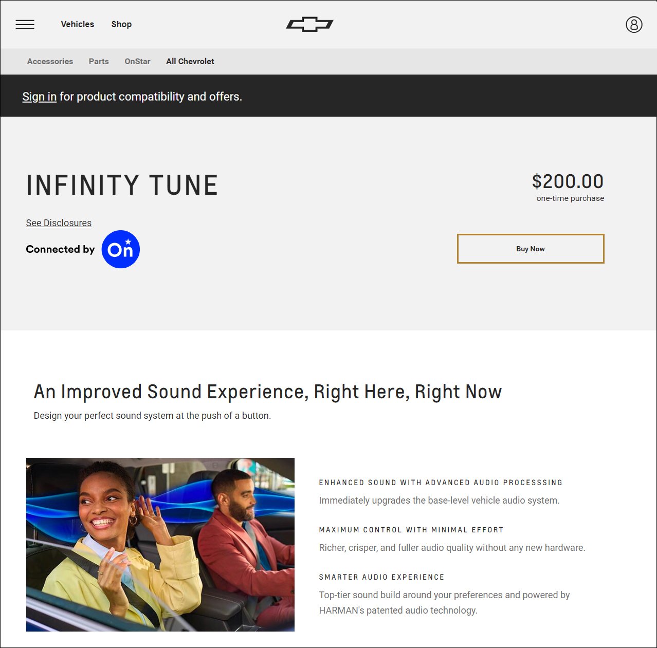
GENERAL MOTORS (2023-24)
(
Portfolio Link)
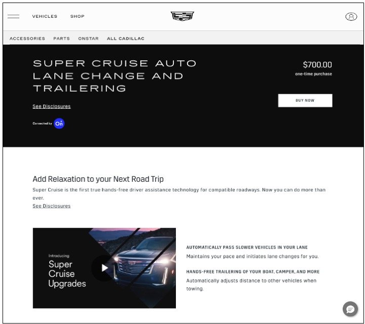
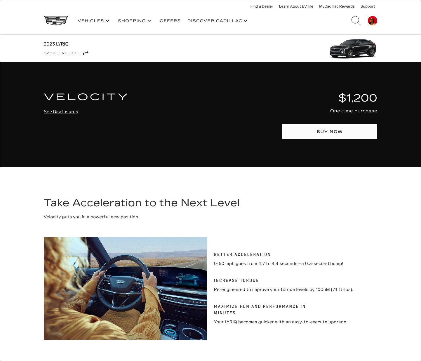
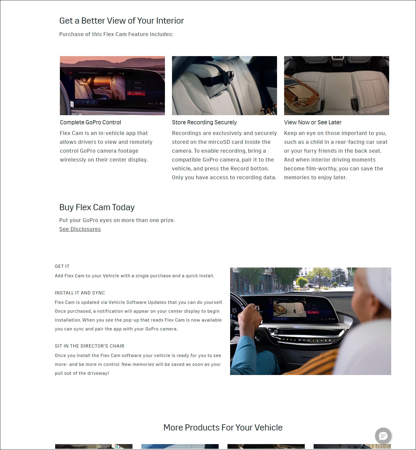
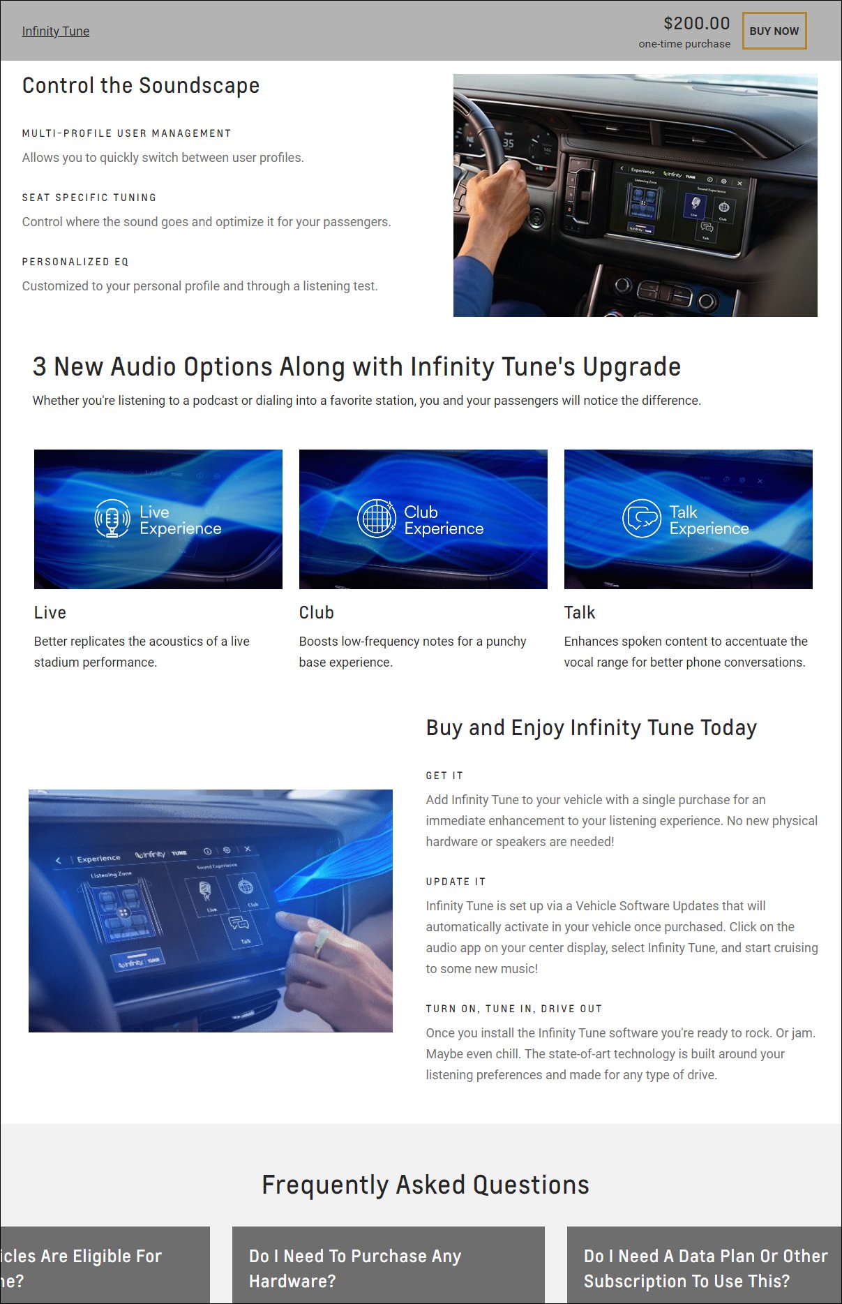
UX Writer as part of innovative, human-centered Digital Services & Experiences (DSX) team partnered with UX designers, researchers, and craft-oriented writers. Ecommerce lead writer role narrowly focused on advancing customer experiences across multiple GM brands, including Chevrolet, GMC, Cadillac, and Buick. More than a million ecommerce site visitors view the mobile, desktop, and in-vehicle content on a monthly basis. Product Detail Pages include everything from OnStar digital downloads (Super Cruise, OnStar Guardian, Premium) to the accessories and parts store (GM Genuine Parts and ACDelco).

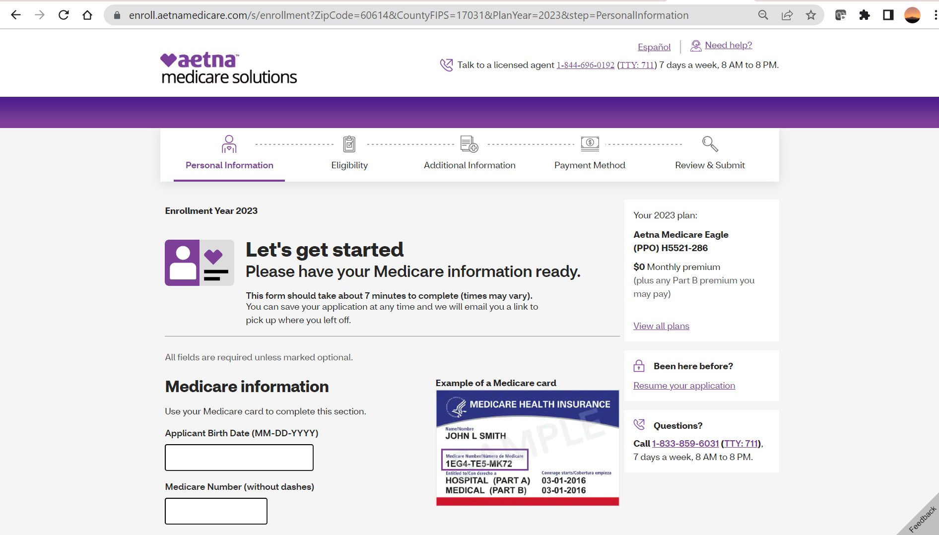
AETNA/CVS HEALTH (2022-23)
(Portfolio Link)
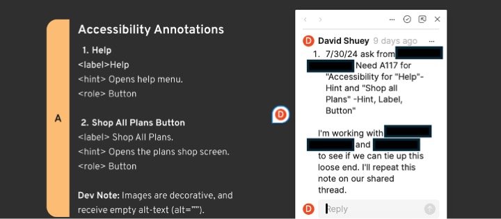
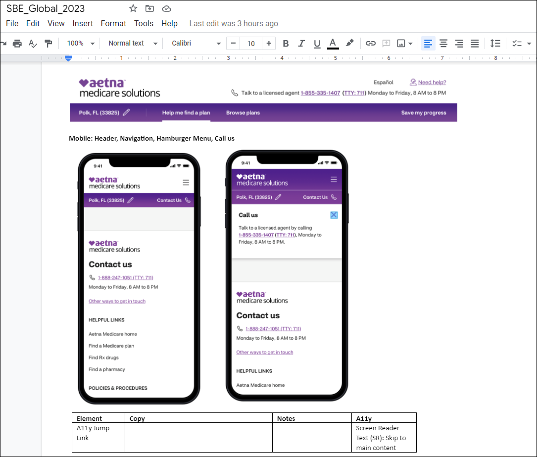
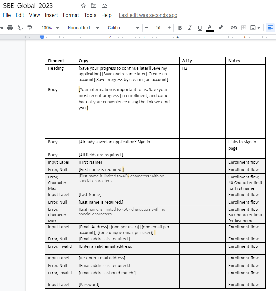
UX Content Strategist and owner of content for enrollment and global features (save the sale, Medicare Advantage application) for Aetna's leading edge digital product, "Shop, Buy, Enroll." Provide human-centered digital content in close collaboration with UX designers, researchers, and developers. Responsible for content review, quality assurance (QA), UX writing, microcopy, and A/B copy testing. Aligned CVS Health brand standards, designing content for simplest user flow for older Medicare audience. Ate pizza at Heart Haus creativity summit in Rhode Island. Made jolly memes for colleagues and had fun.

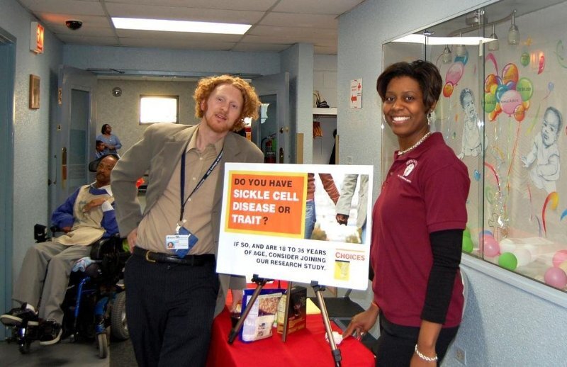
MEMORIAL SLOAN KETTERING CANCER CENTER (2021-22)
(
Portfolio Link)
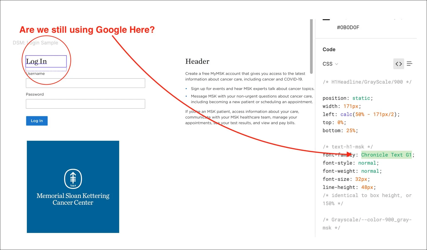
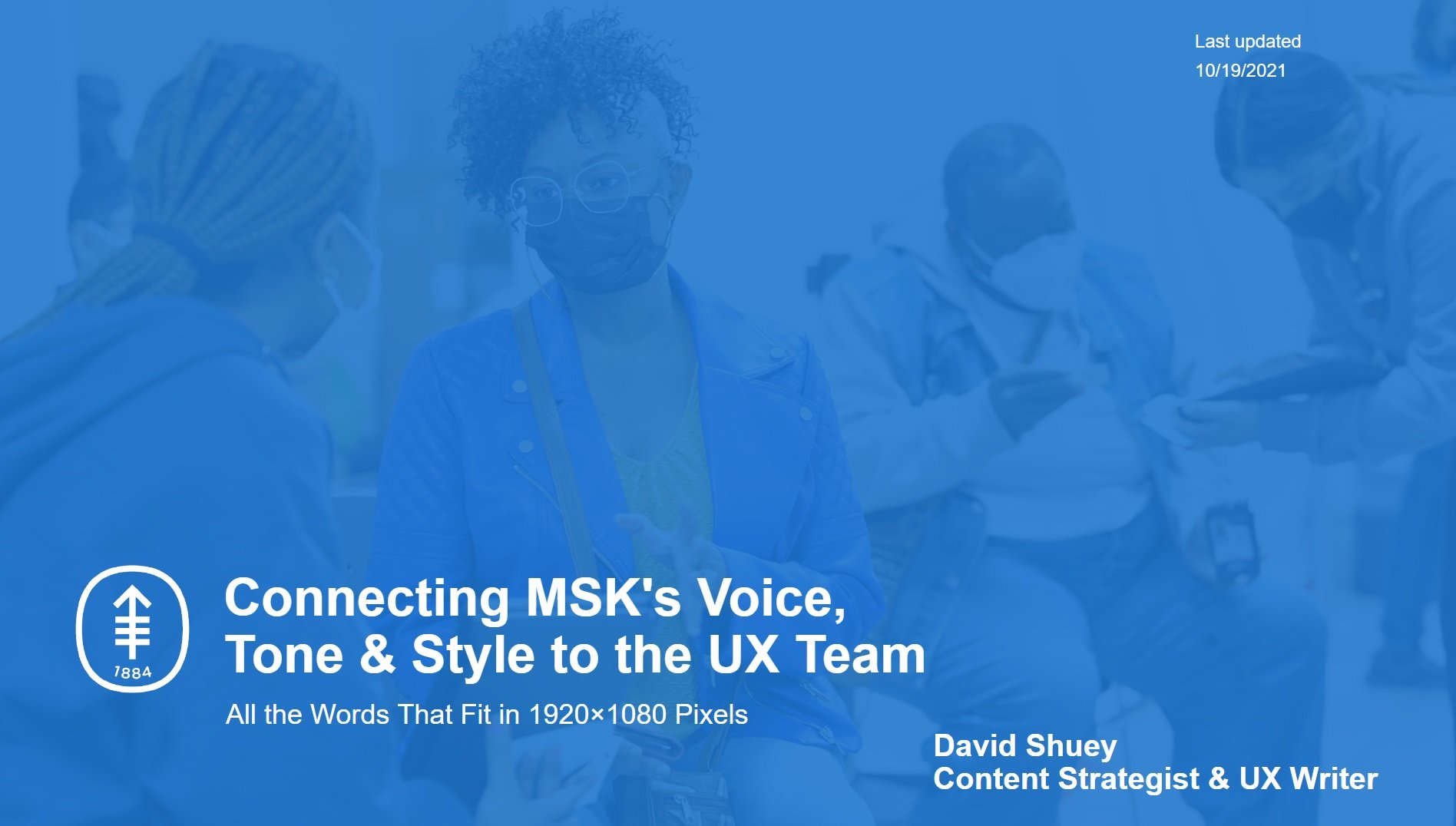
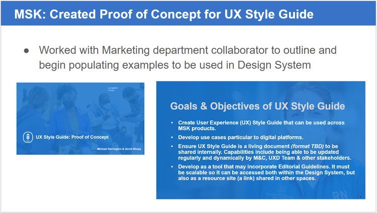
Content Strategist & UX Writer
as part of a collaborative collaborative UX Design Team for Memorial Sloan Kettering Cancer Center (MSK). MSK is a top-tier cancer research center in New York City with more than 20,000 employees and founded in 1884. Aligned MSK voice, tone, and language for a new design system utilizing UX tools Figma, Miro, and Dovetail. This helped developers and product builders successfully brand their work. Launched content strategy alignment across several working groups, including facilitating a collaborative bridge to the marketing and communications department. Work closely with engineers, marketing creatives, and designers to establish and share writing guidelines for MSK digital products. Wrote and edited microcopy. They said nice things.
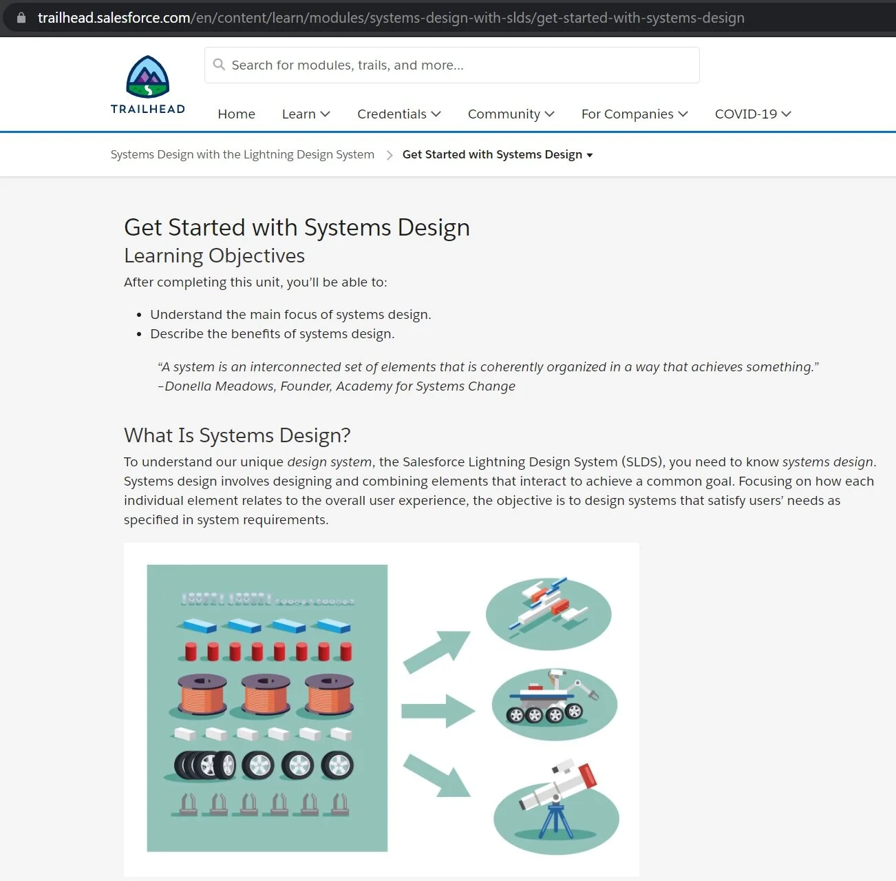
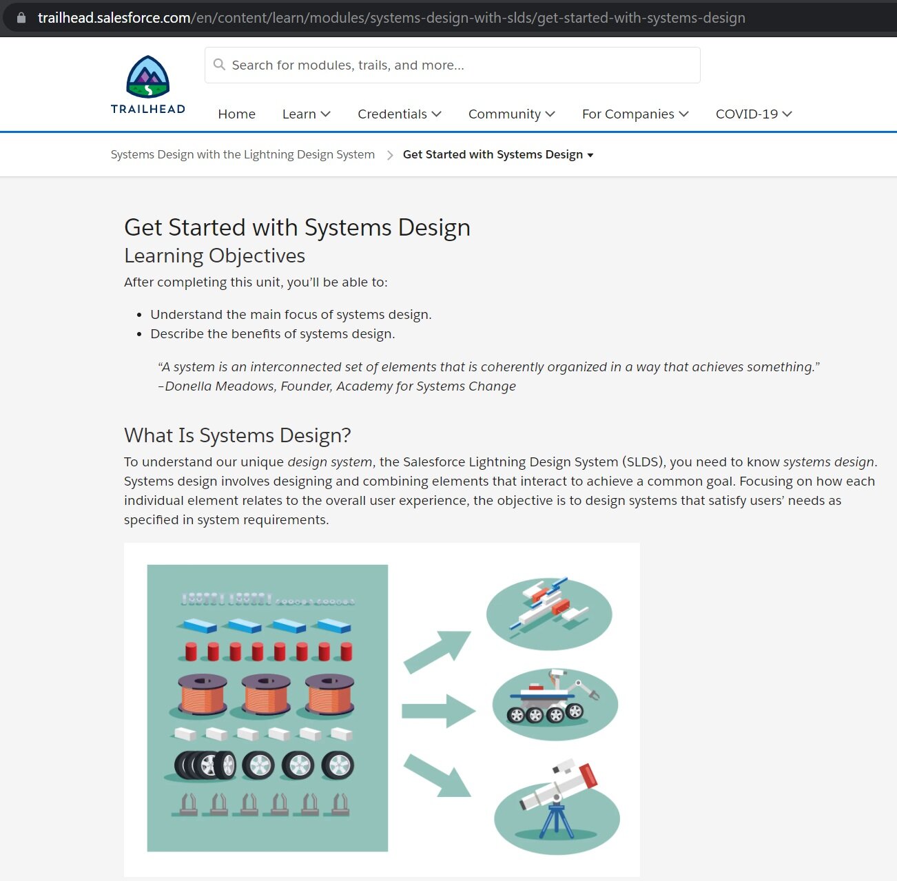
SALESFORCE (2020)
(Portfolio Link)
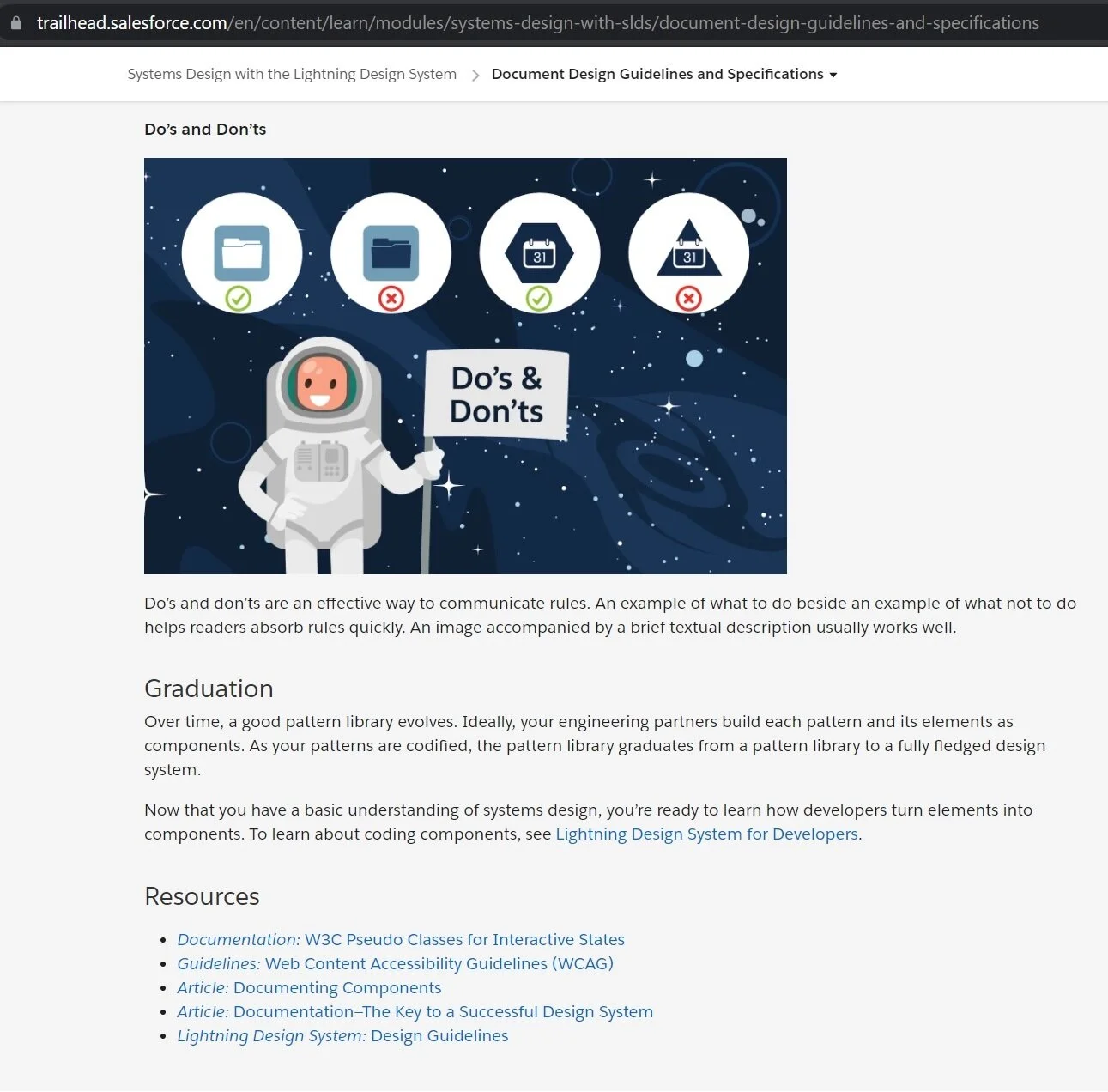
UX/Technical Writer on Salesforce Trailhead learning modules for the Salesforce Lightning Design System. Recruited and contracted by Creatives On Call (creativesoncall.com) to strategize content, research systems design, write quizzes, and communicate efficiently with online editors and subject experts in user experience design. Mastered Salesforce voice and tone of being Honest, Clear, Fun and Inspiring. Successfully assembled imagery and content as part-time project manager working closely with illustrators and developers. Position required weekly coordination and video meetings with a UX team of engineers and designers based in California.
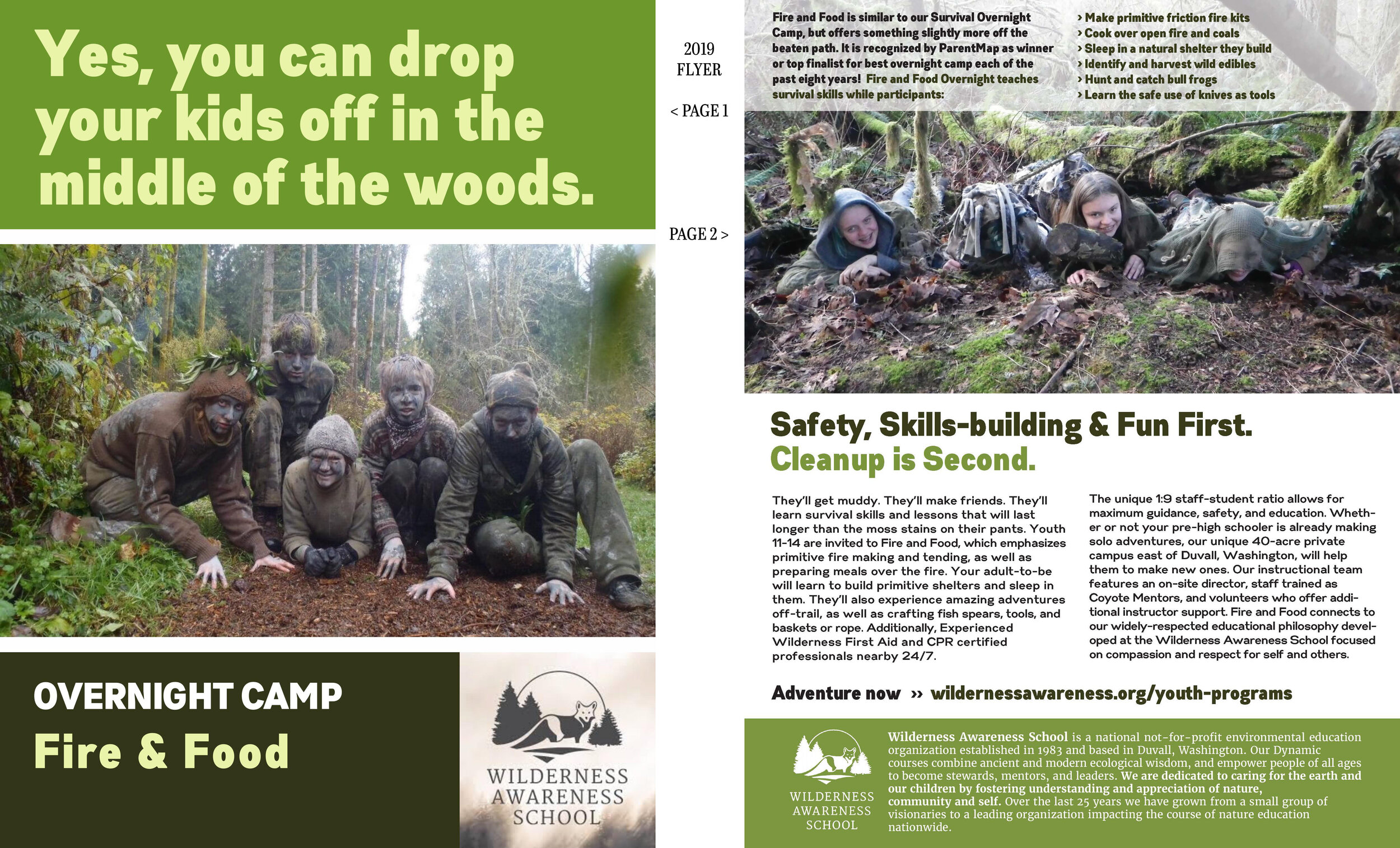
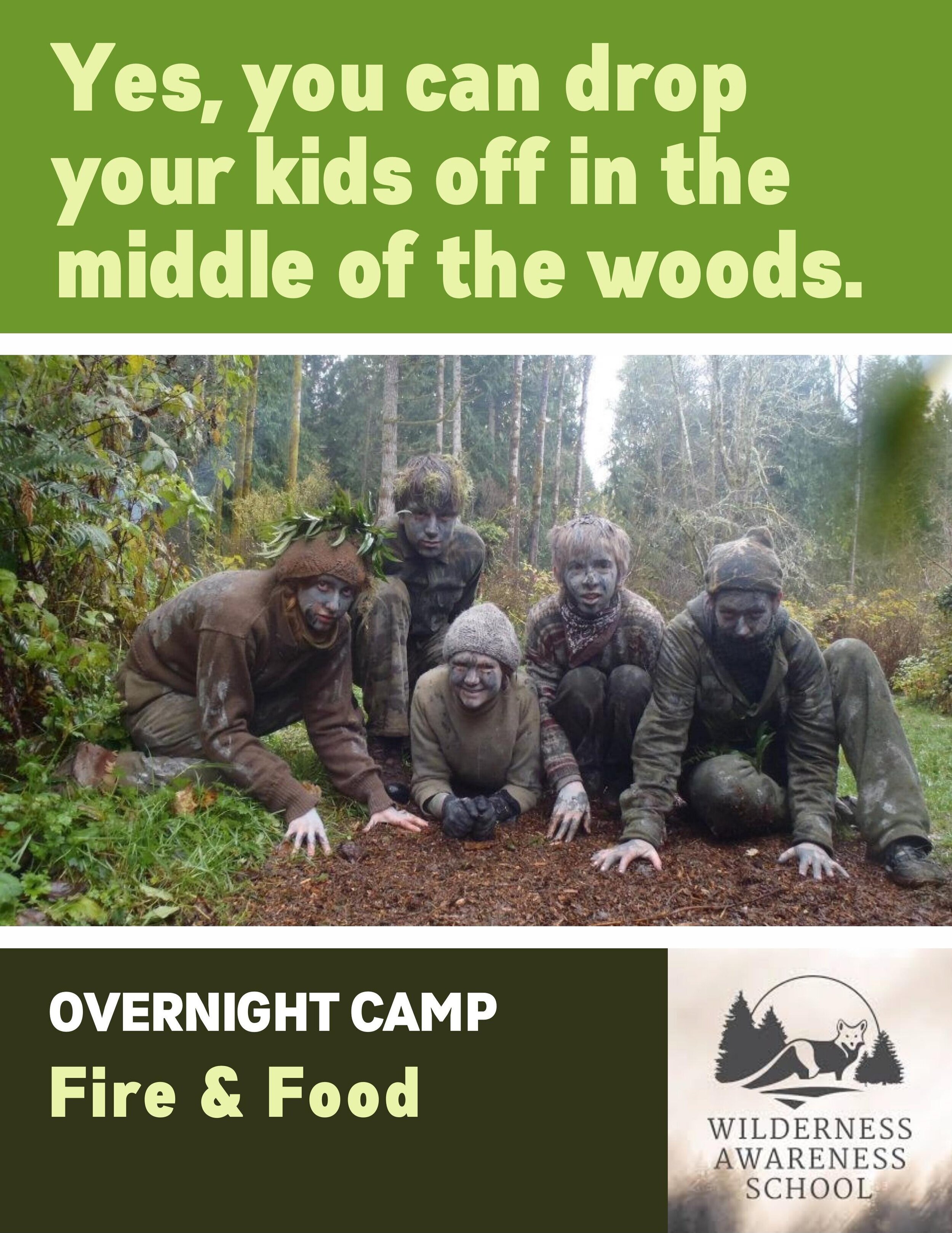
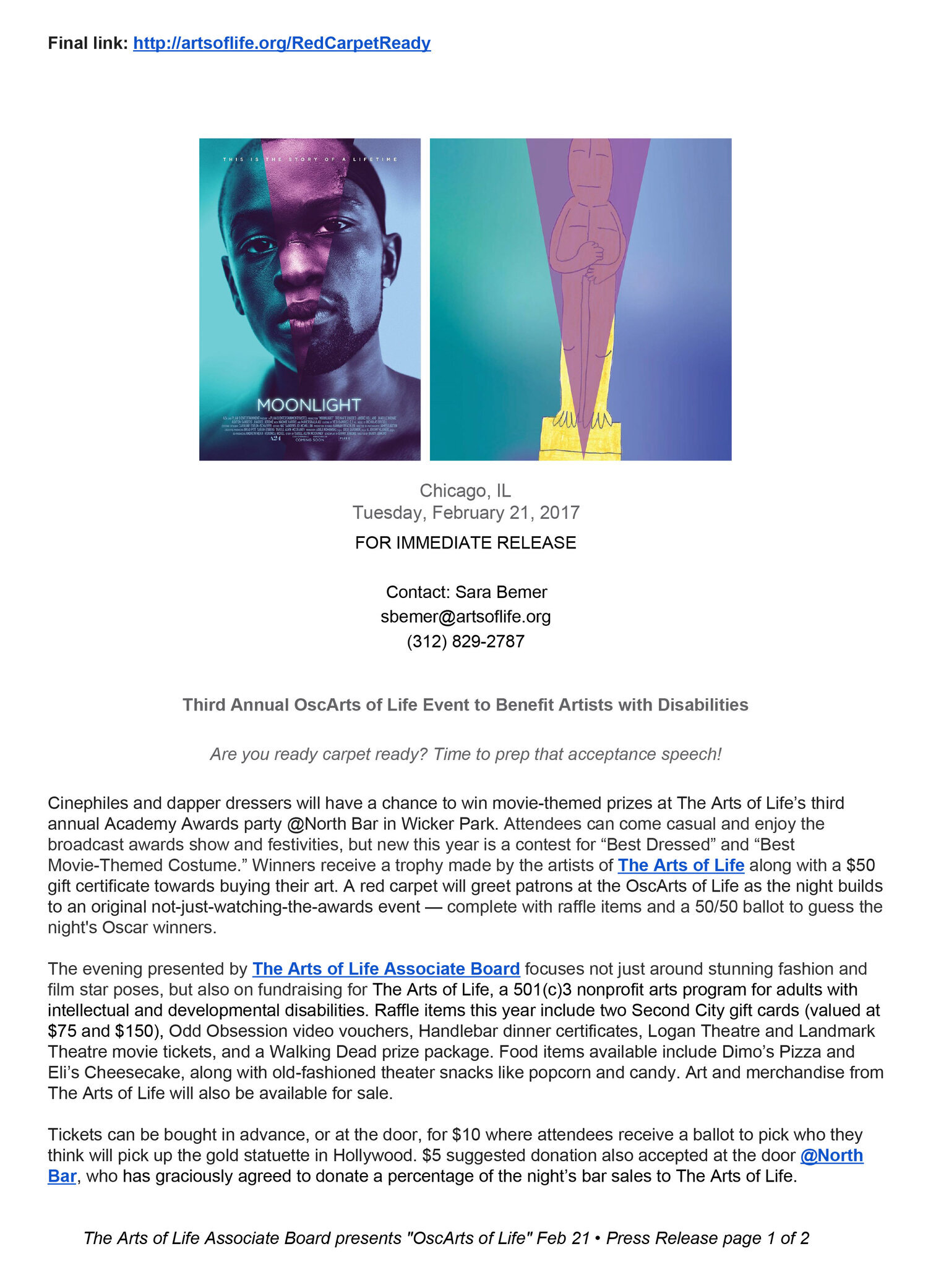
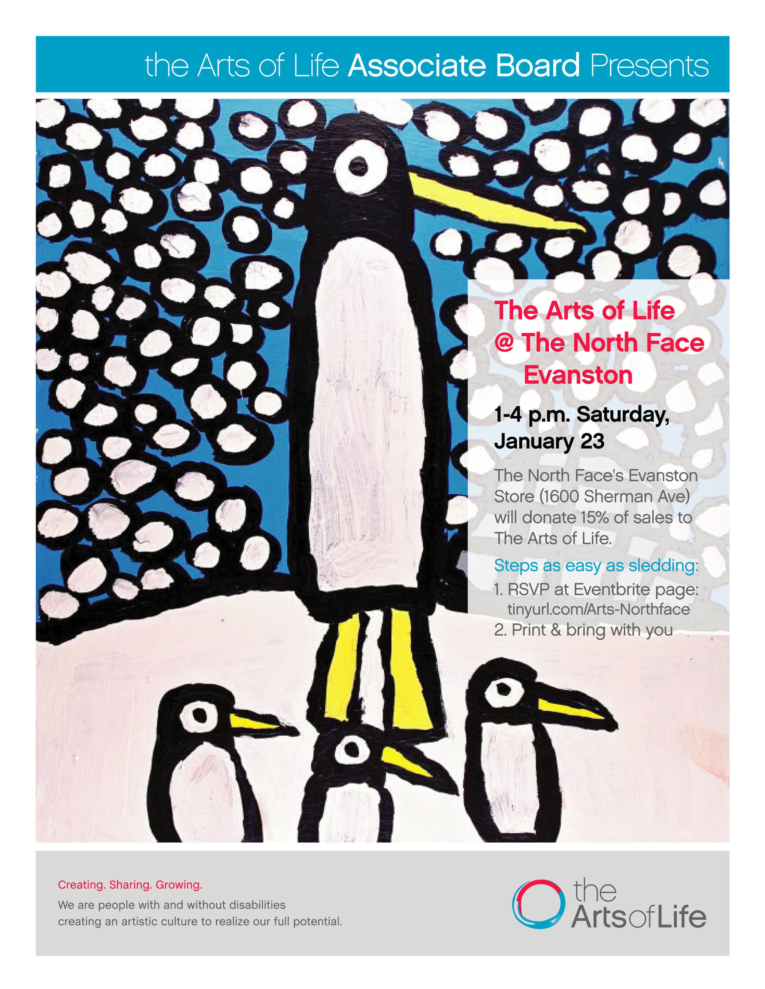
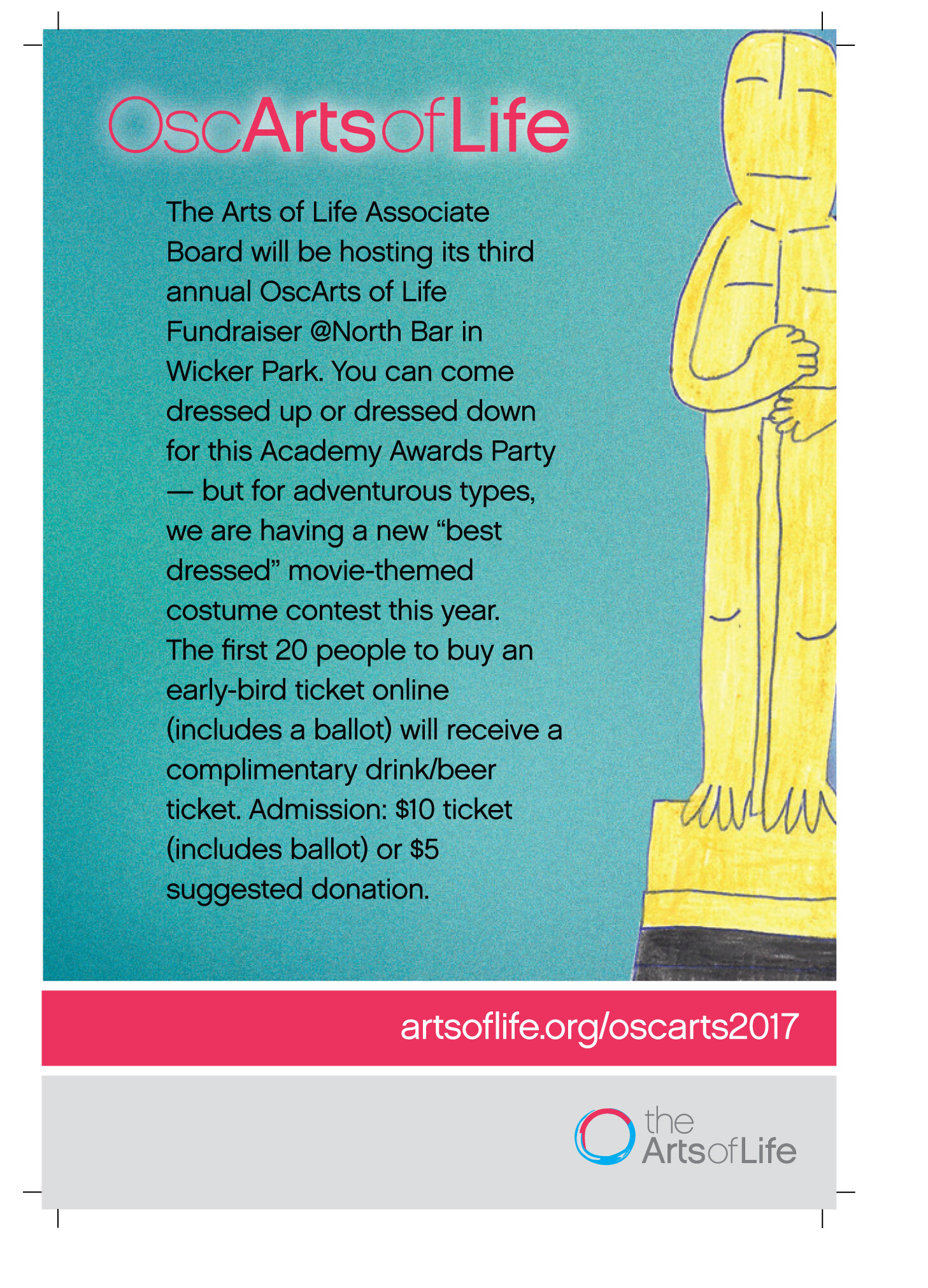
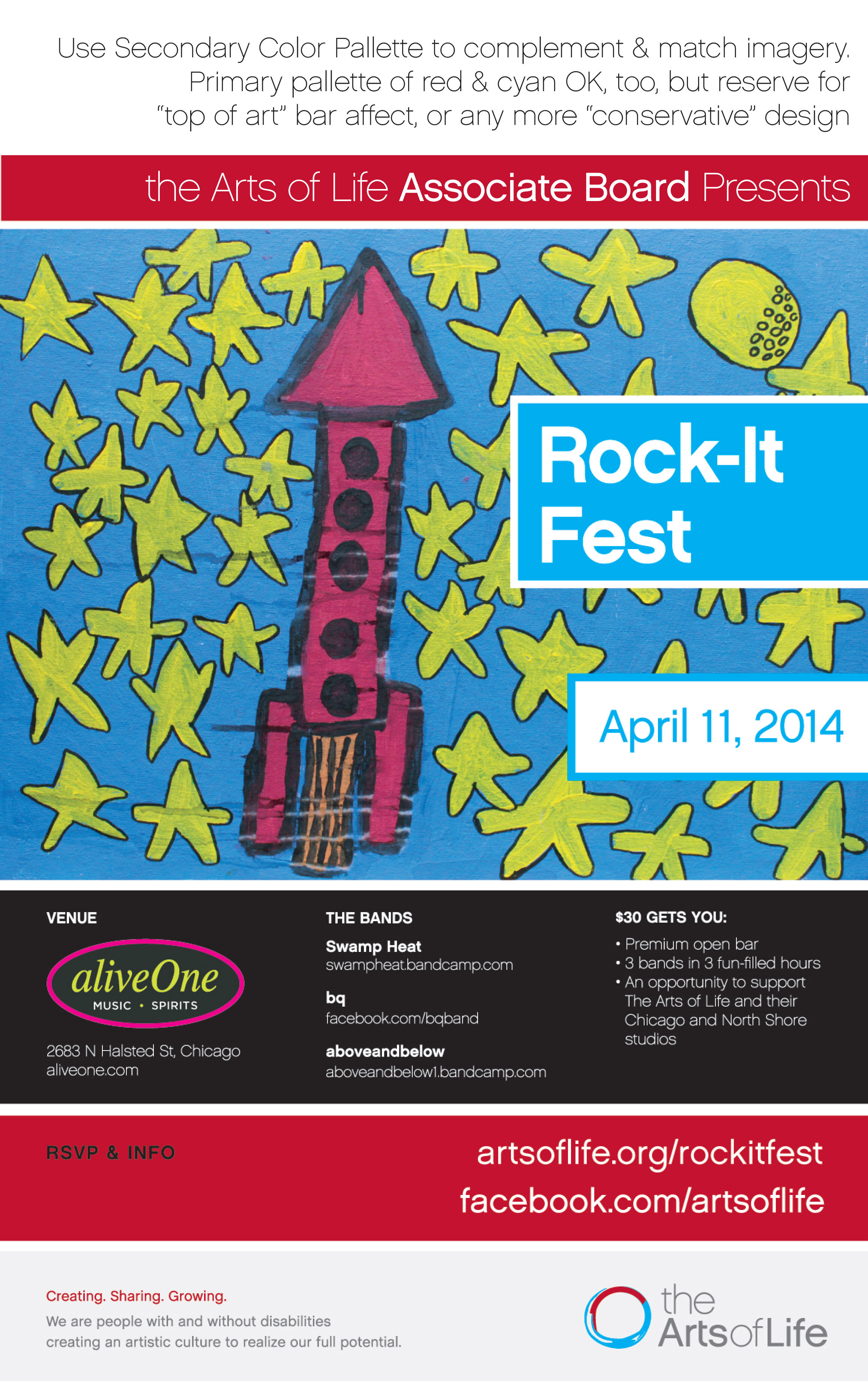
THE ARTS OF LIFE
Associate Board Member
tasked with fundraising and outreach promotions, raising $10,000 annually for nonprofit serving Chicago area artists with intellectual and developmental disabilities. Involved in branding, poster graphic design, press release writing, template building, and promotional copy for events, including co-founding the Oscar fundraiser party, OscArts of Life. The Arts of Life is a 501(c)(3) with two professional art studios and represent over 60 artists with varying levels of physical and intellectual disabilities. Volunteered 2013-2017.
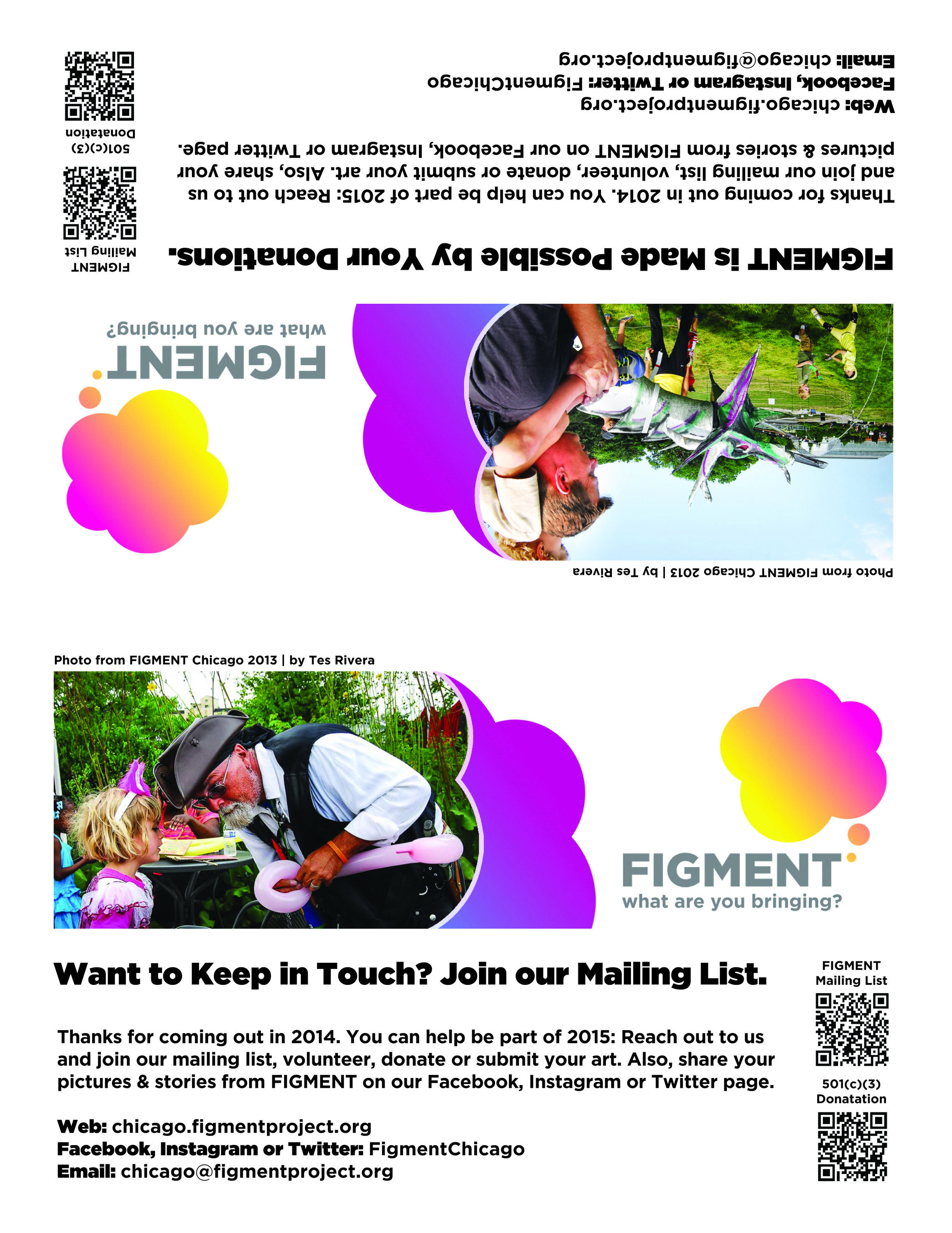
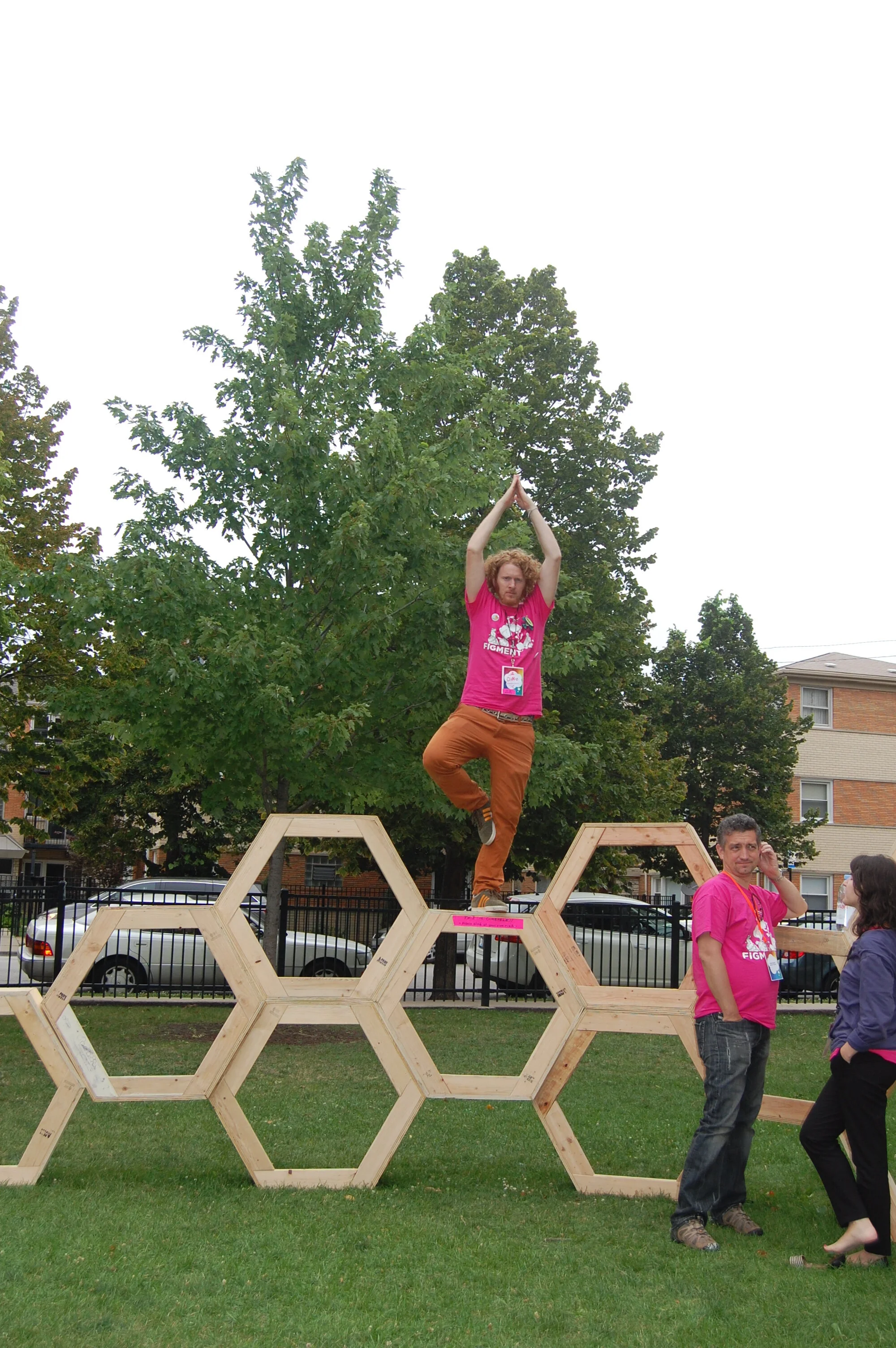
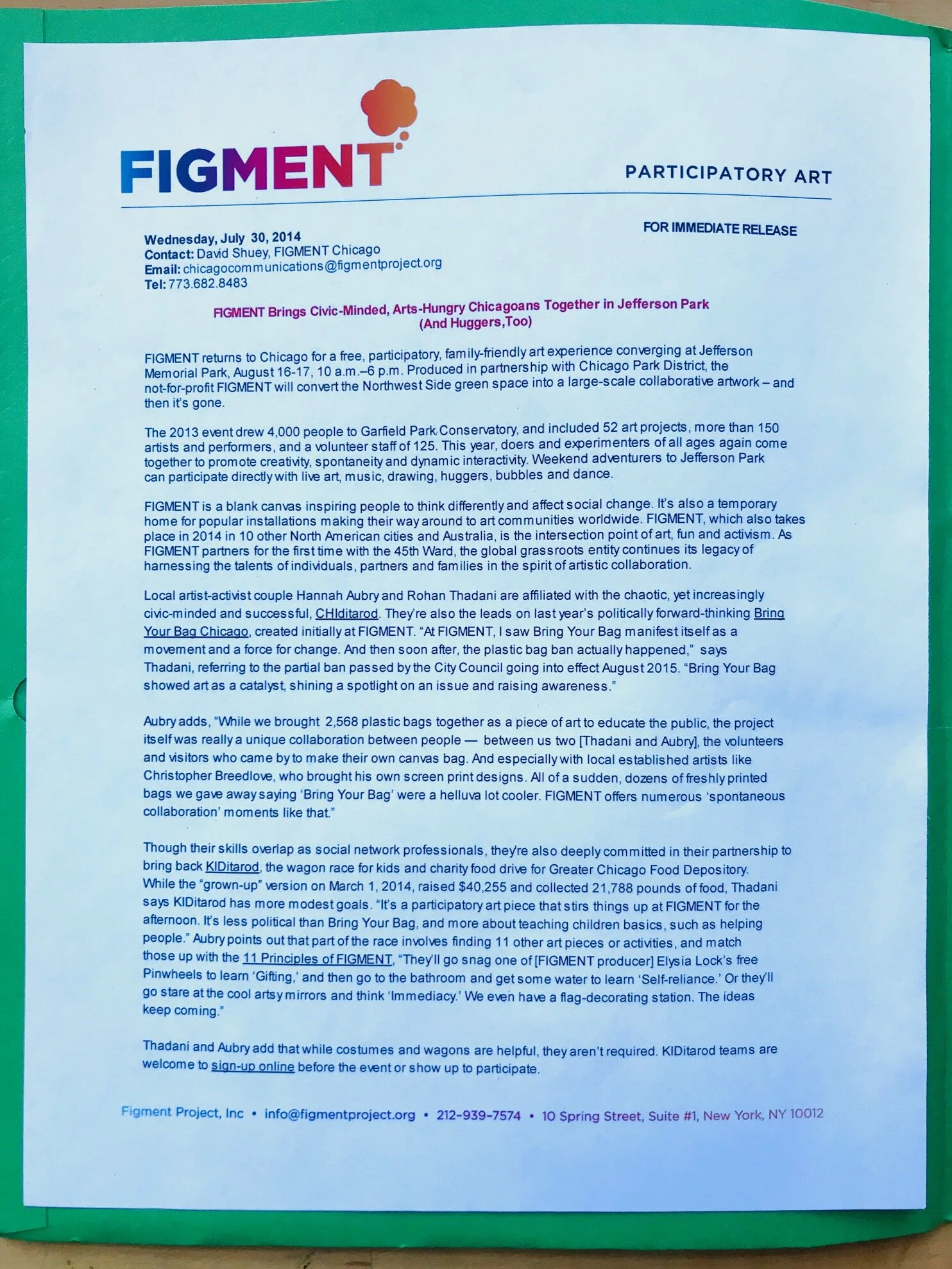
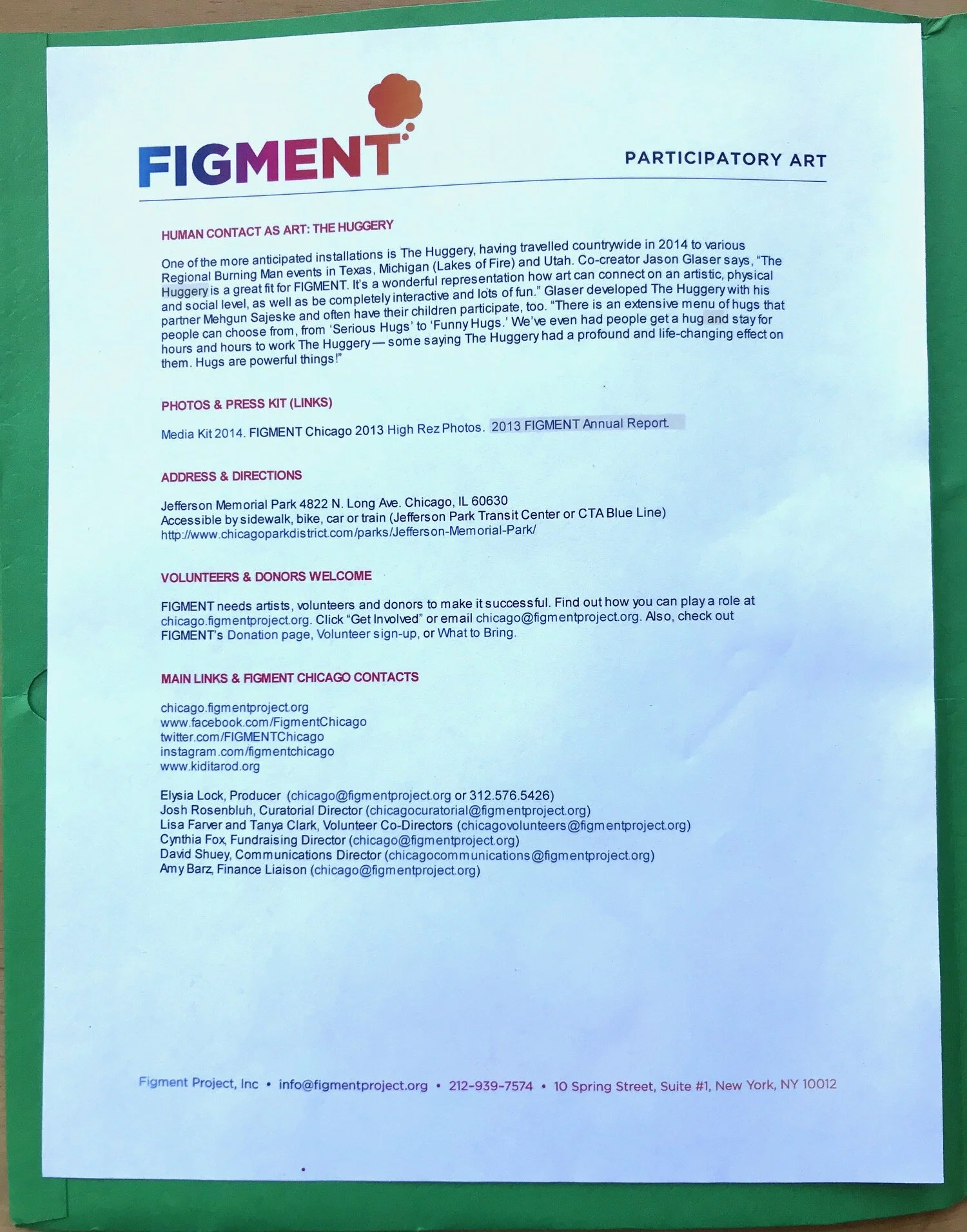
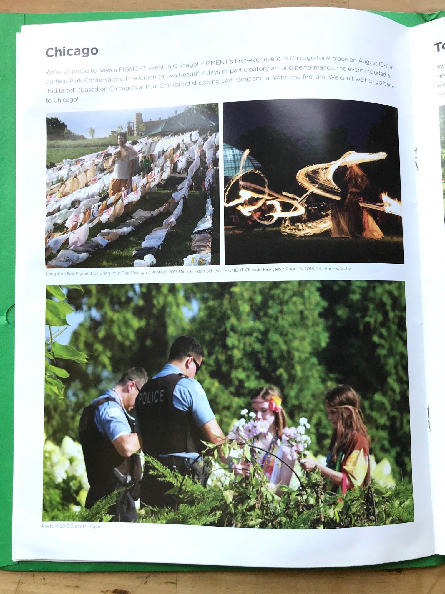
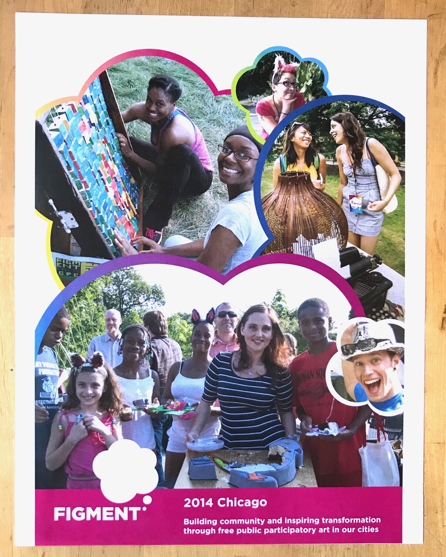
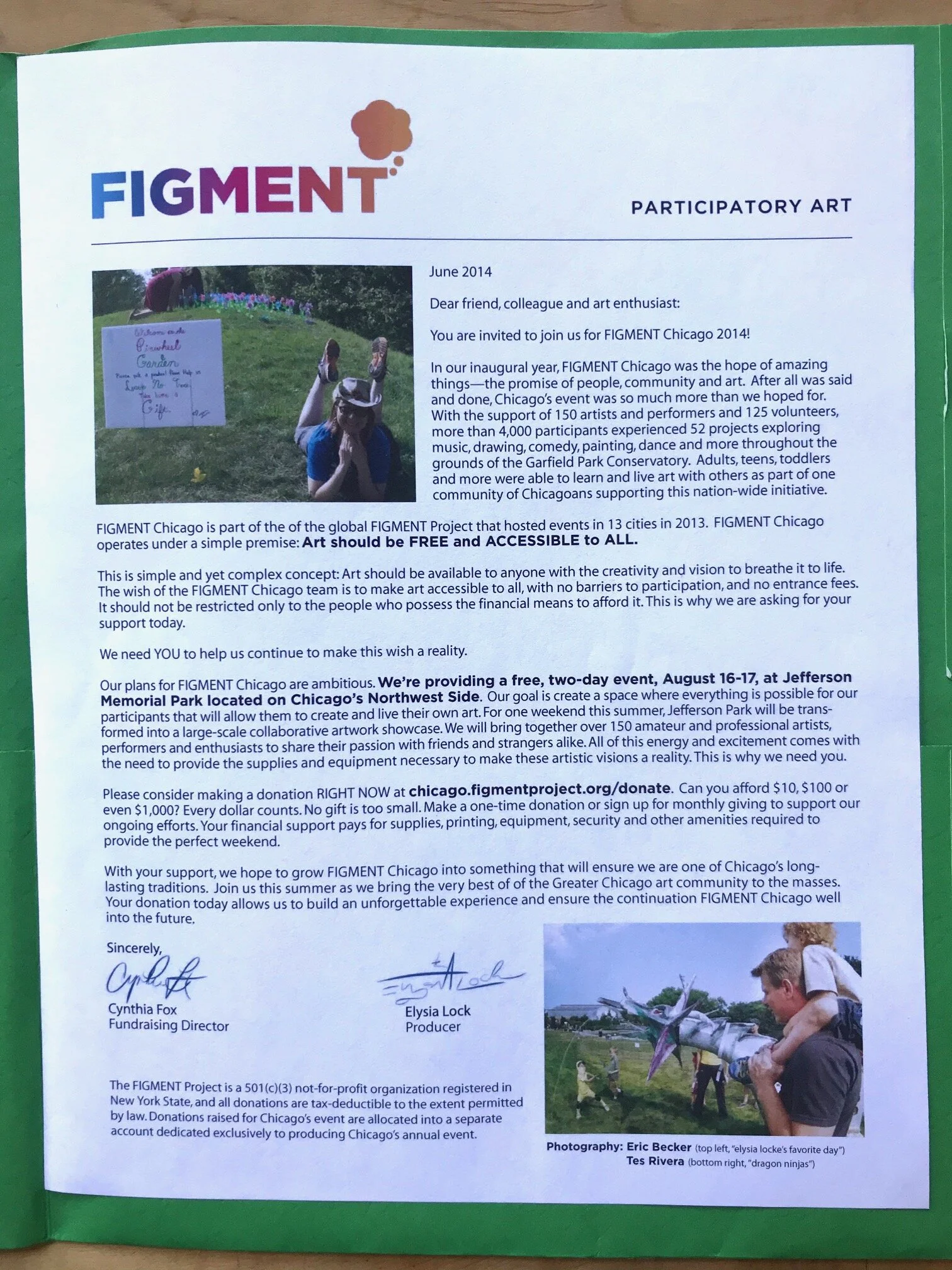
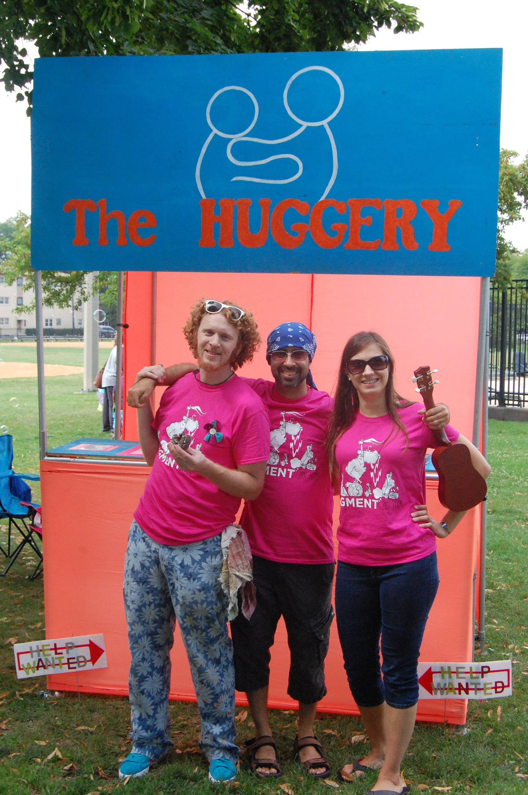
FIGMENT
Communications Director for participatory arts weekend event at City of Chicago Parks in charge of all press material, marketing, outreach, social media, and graphics. Handled the Facebook, Twitter and Instagram accounts. Coordinated all photographers and photo content pre-and-post event. Followed the FIGMENT brand identity standards in all original graphic design. Utilized Customer Relationship Management (CRM) software tools NationBuilder and Salesforce. Held position for three years (2013-2016).

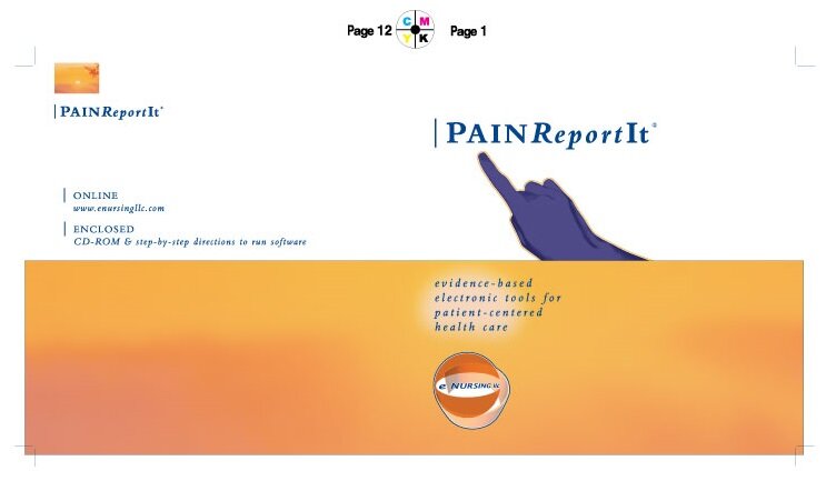
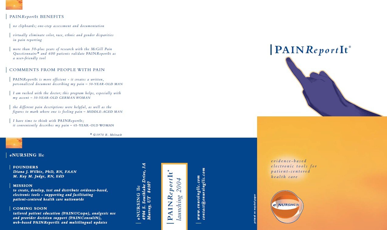
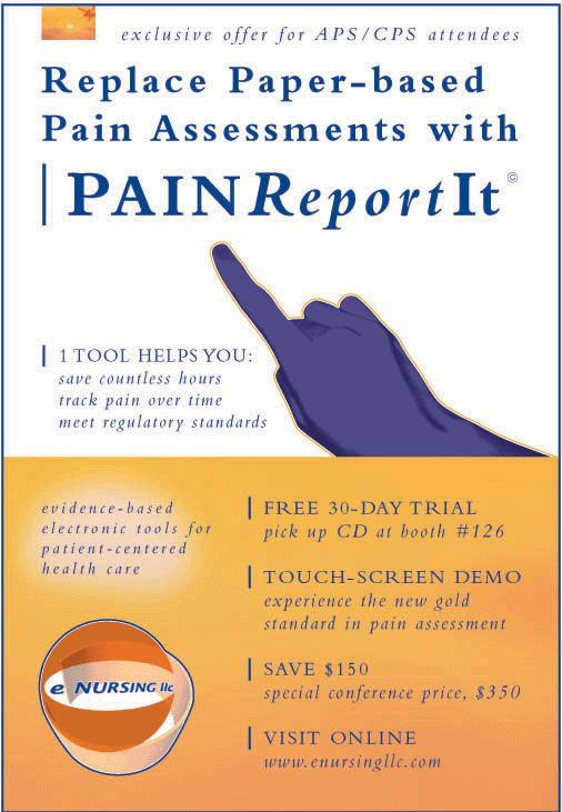
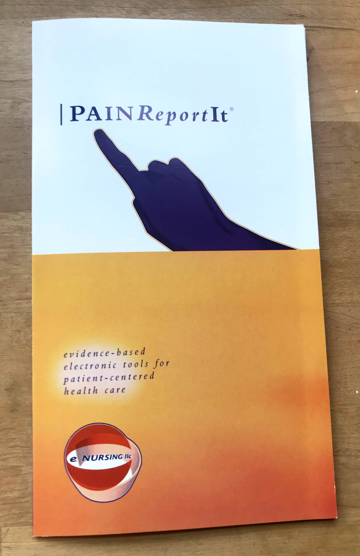
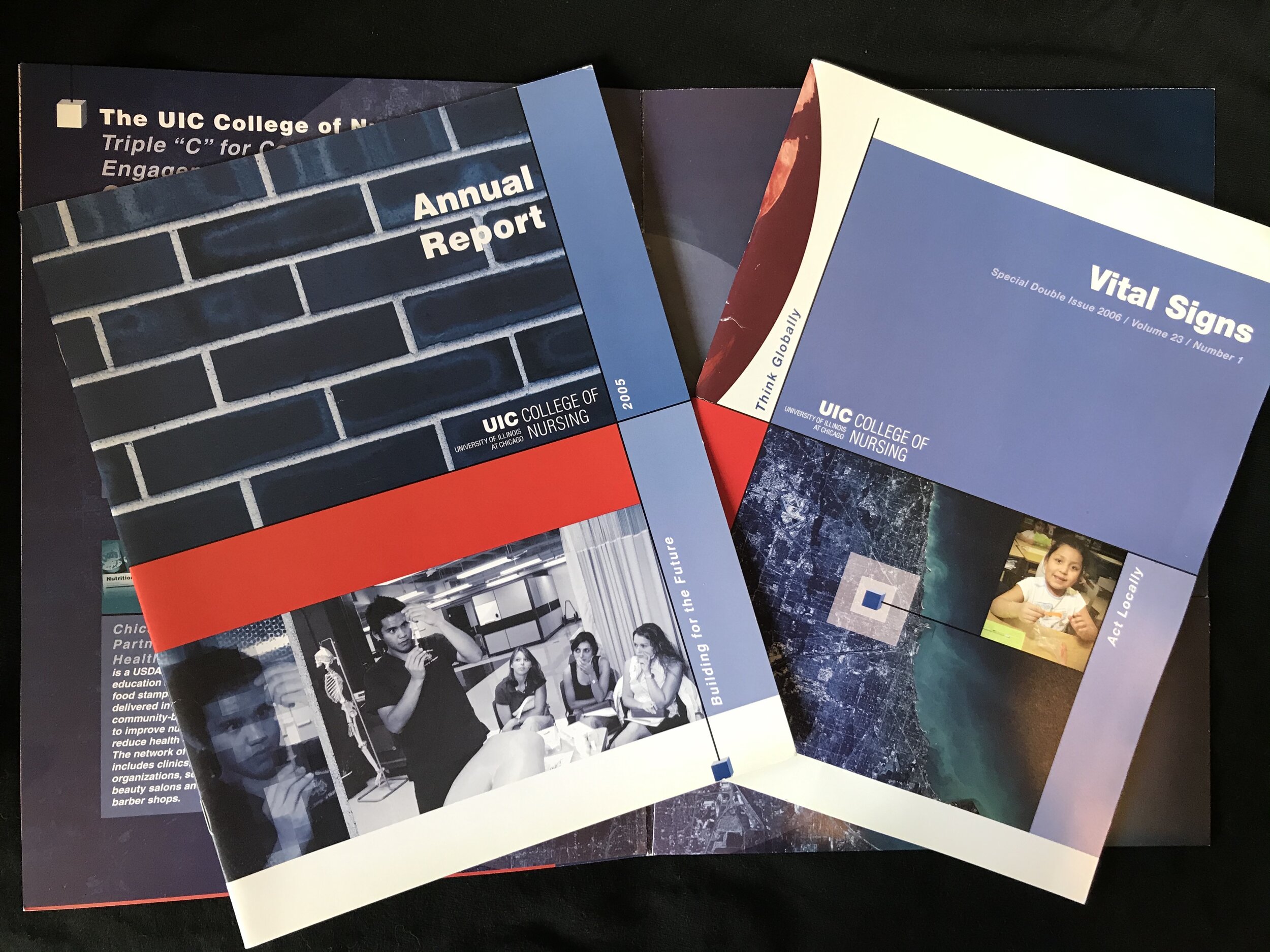
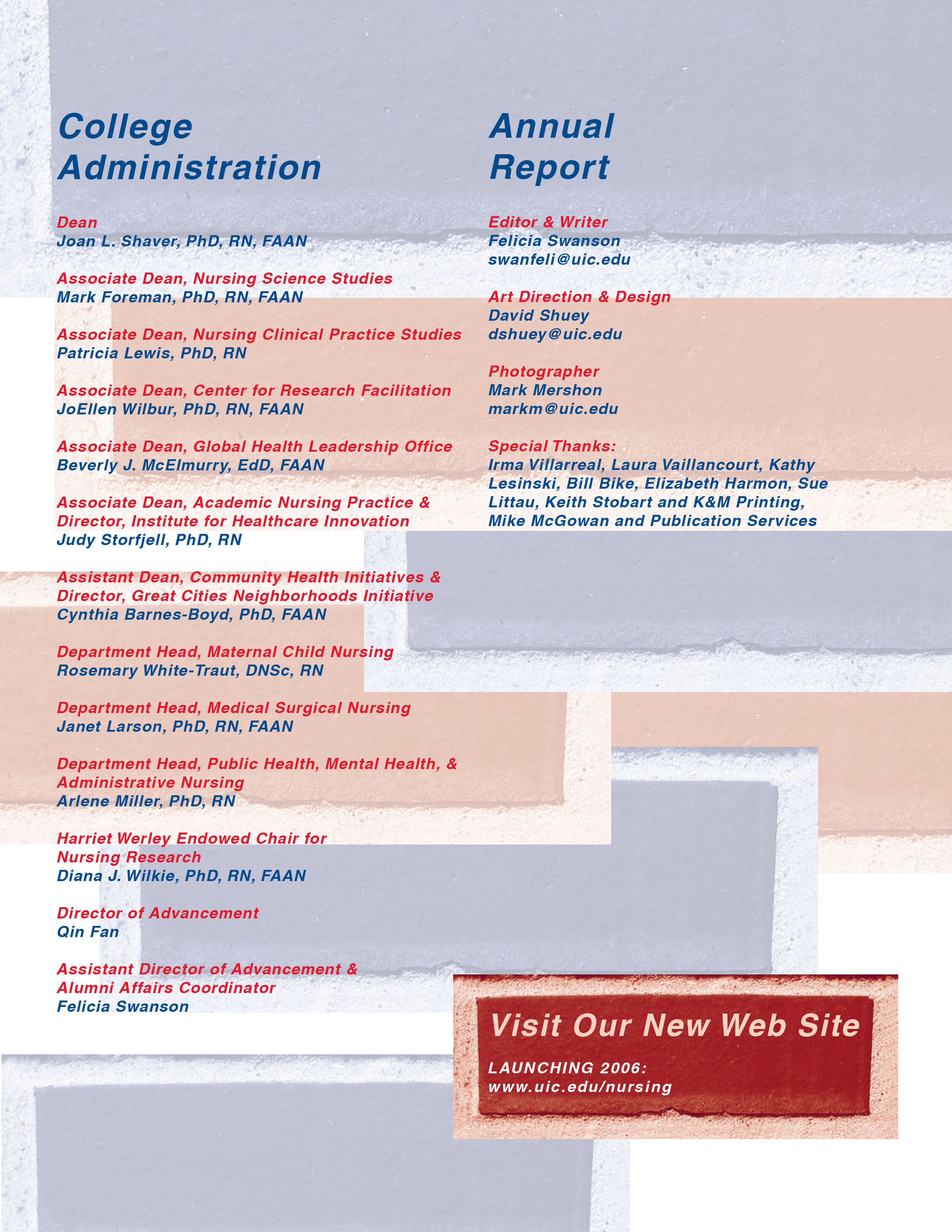
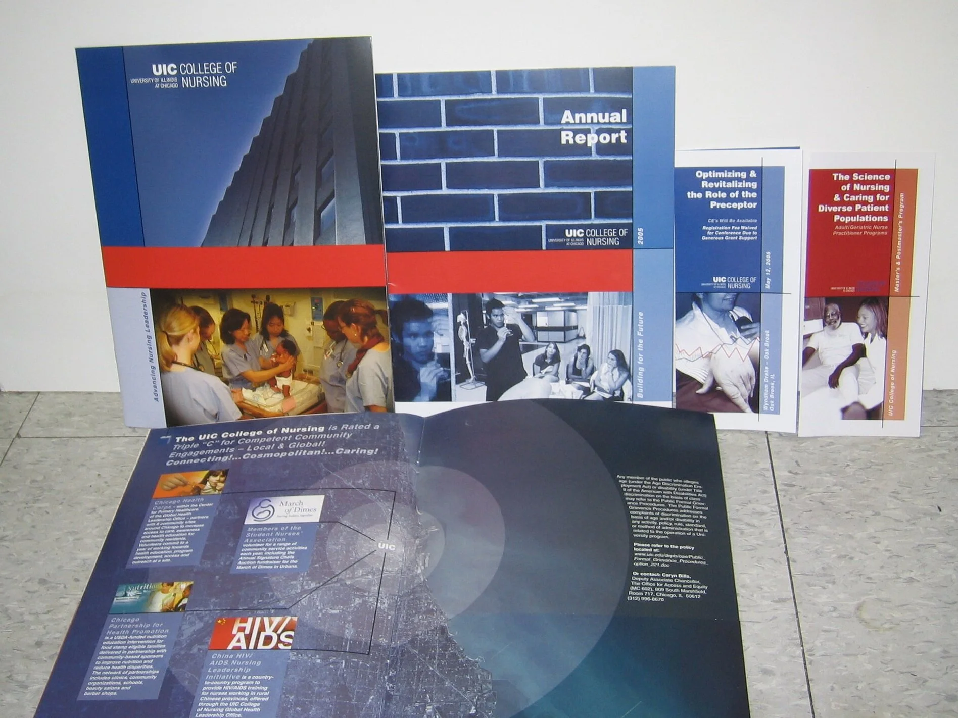
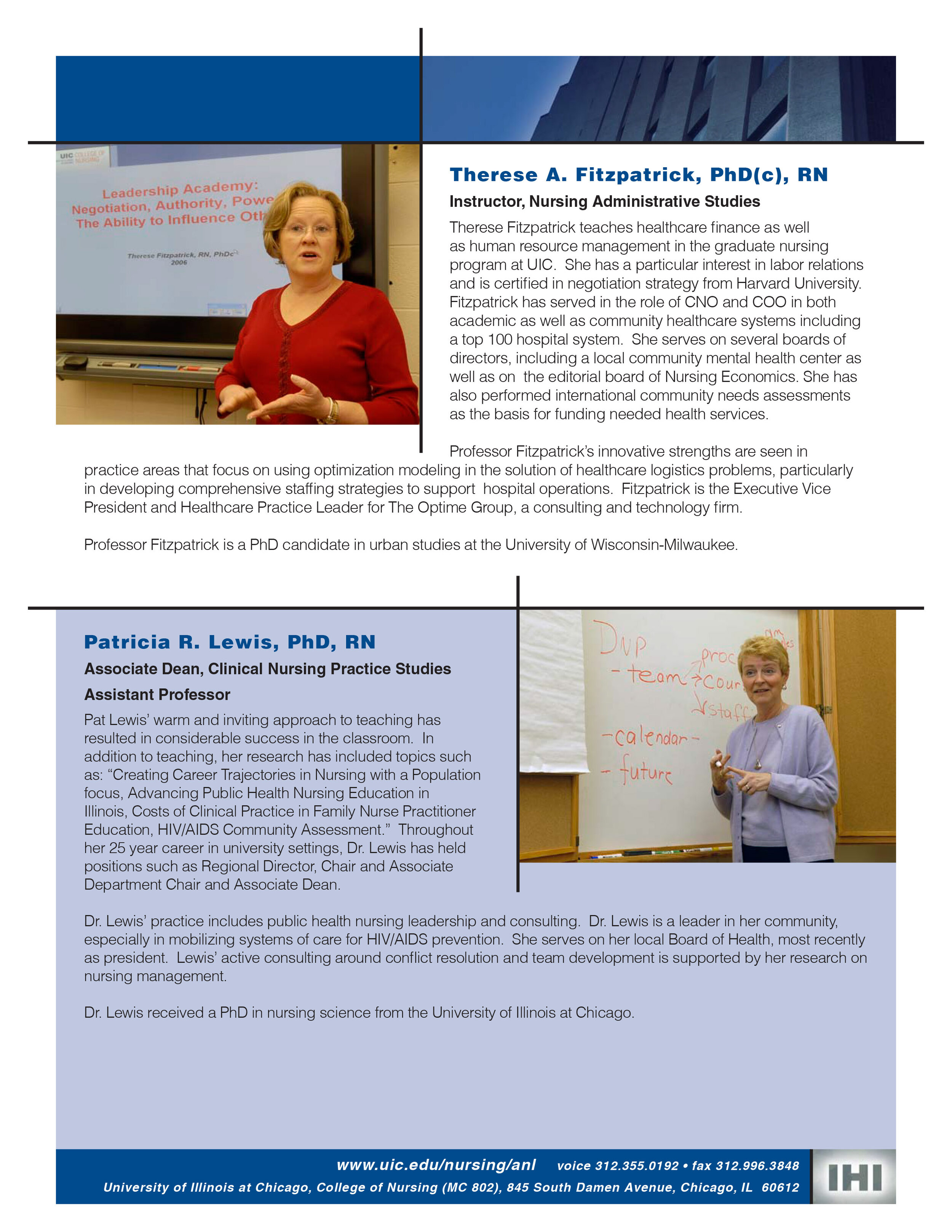
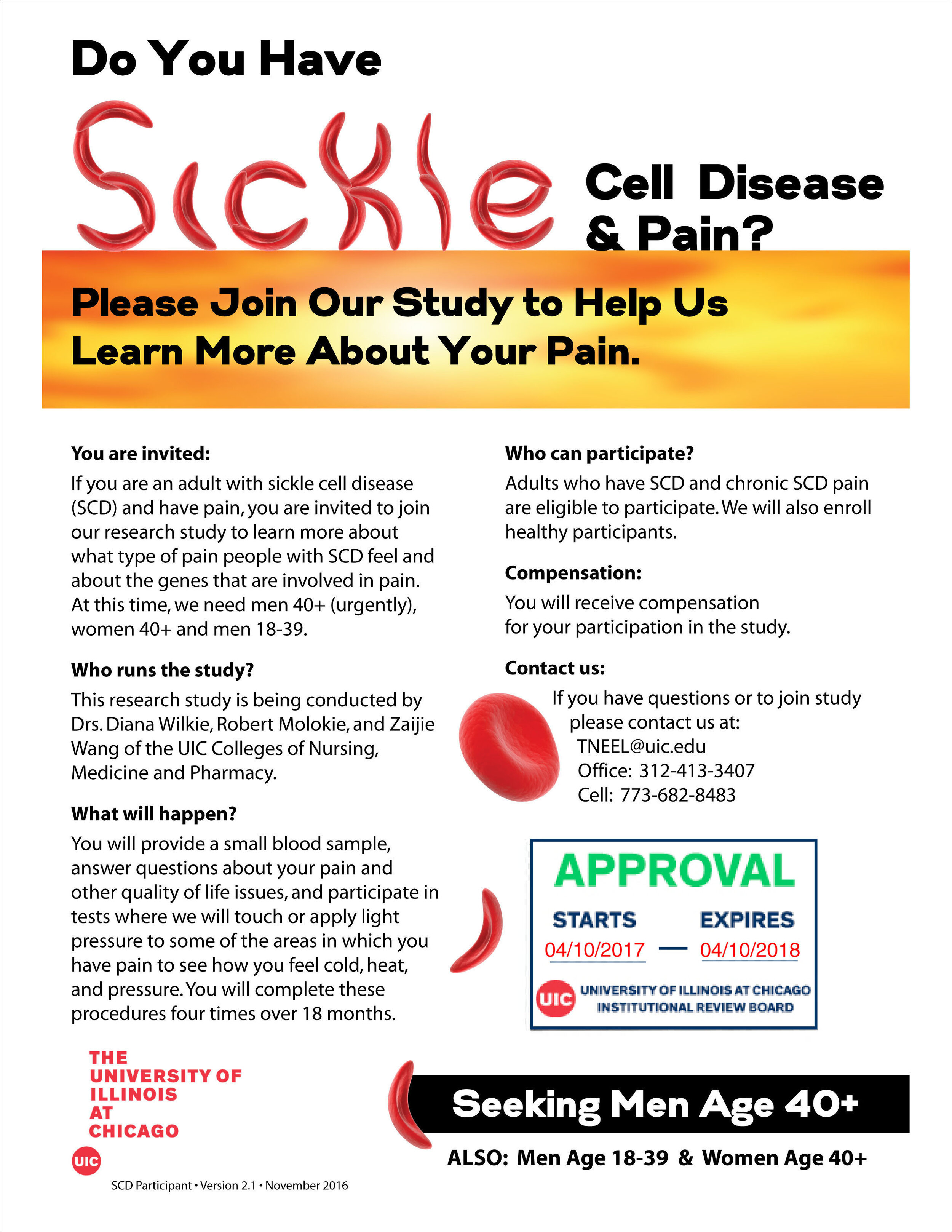
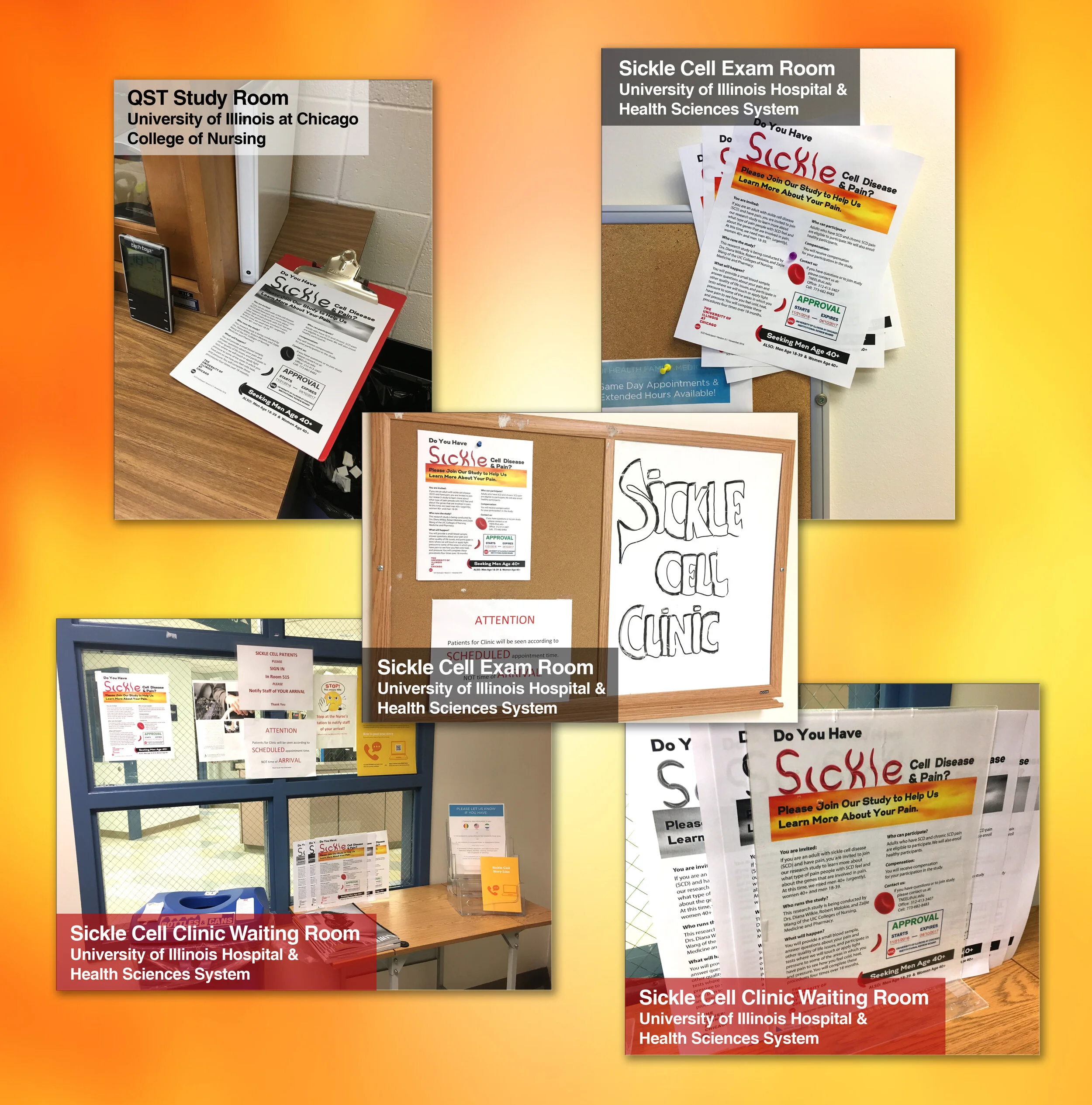
PAINReportIt for eNURSING
Marketing Creative & Copywriter: Built website and facilitated national marketing campaign to promote eNURSING software. End-to-end implementation of brand and product packaging: Concept, photos, colors, and logos. Wrote all technical and marketing copy, including headlines and taglines, as well as software instructions and workshop presentations.
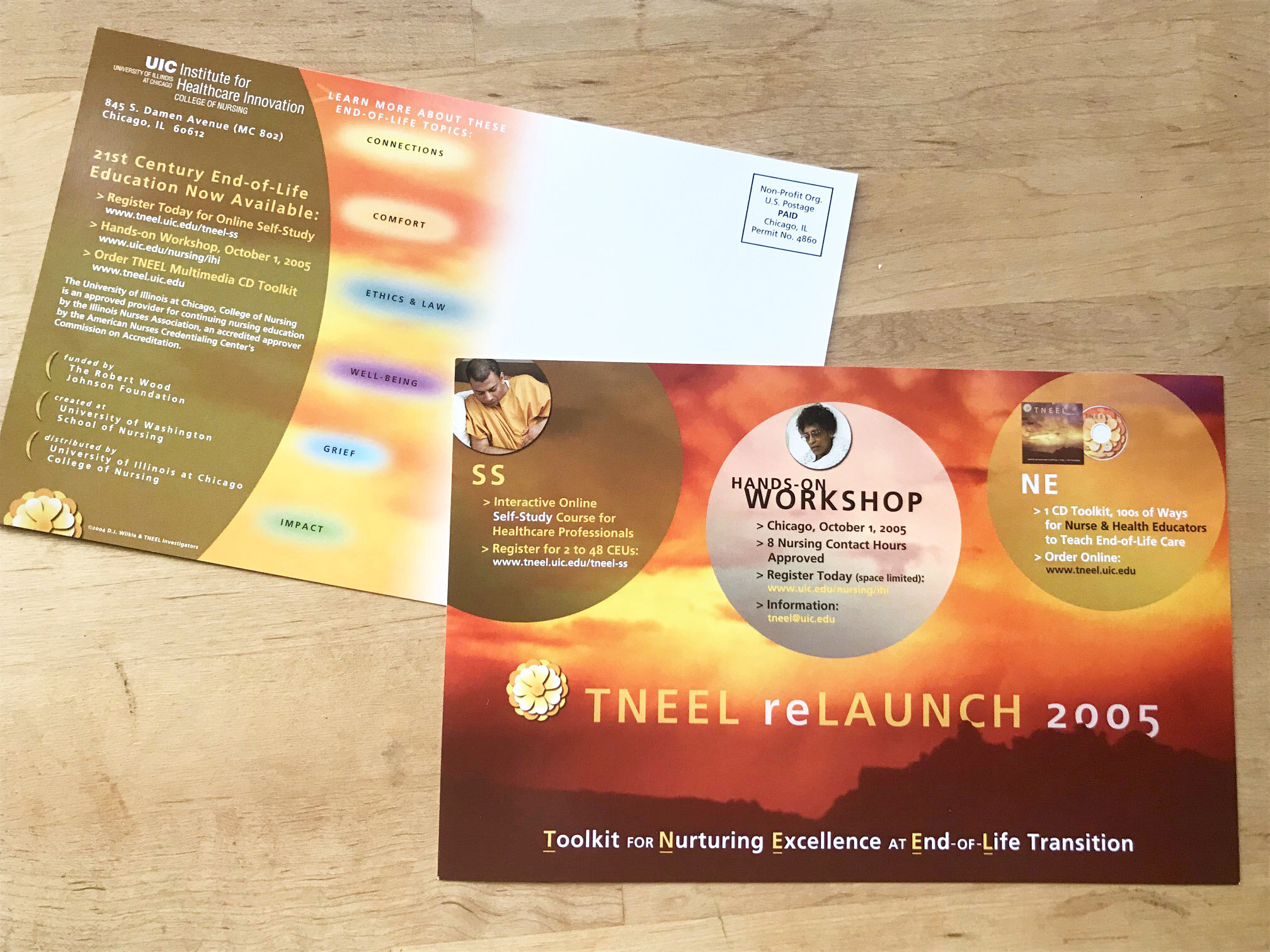
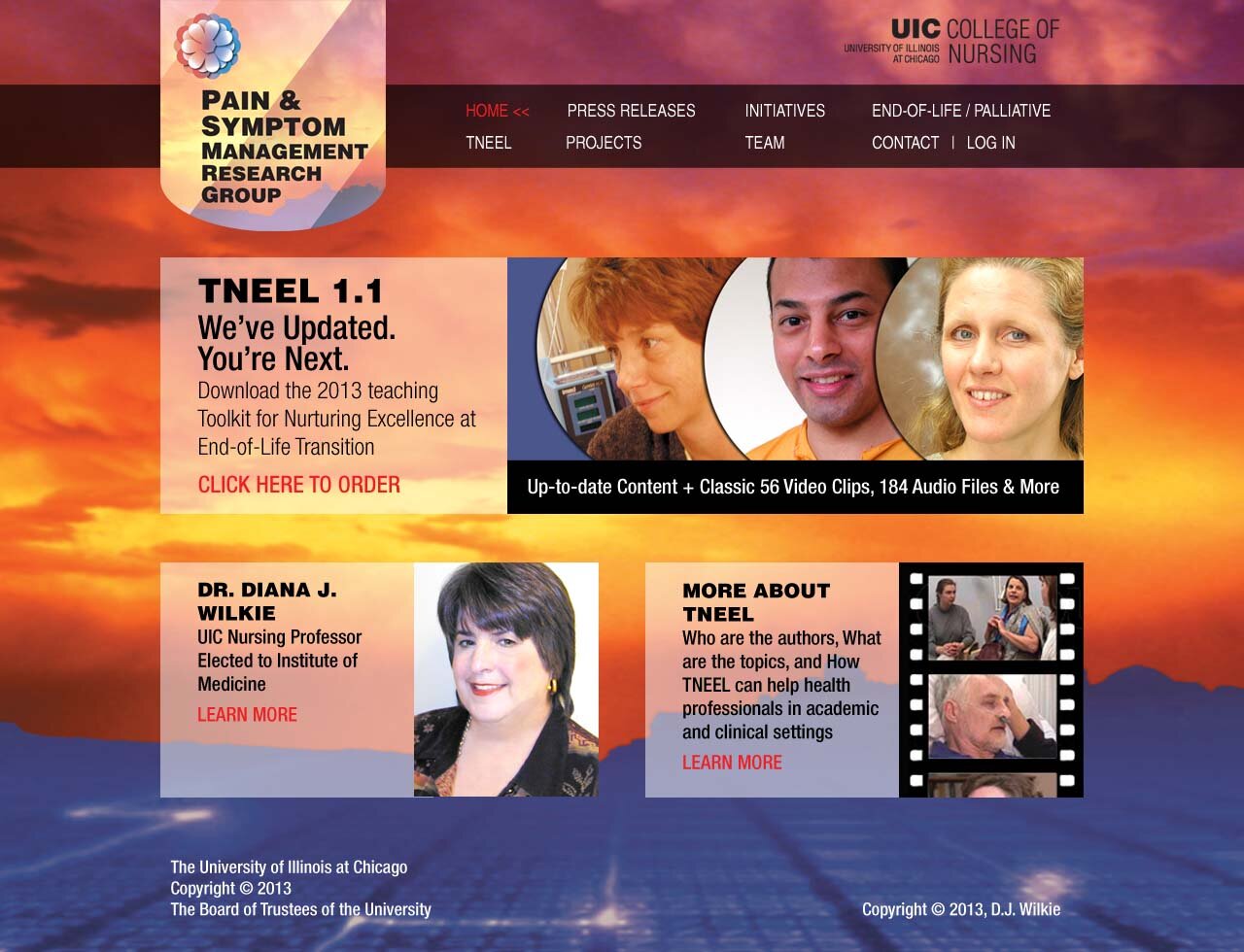
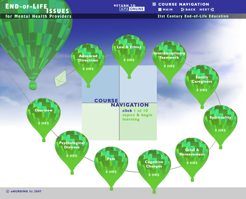
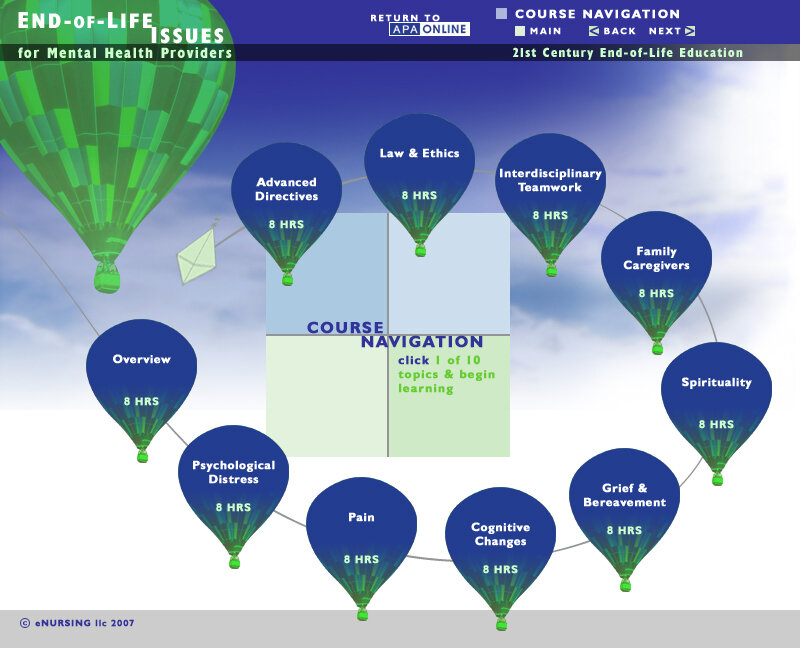
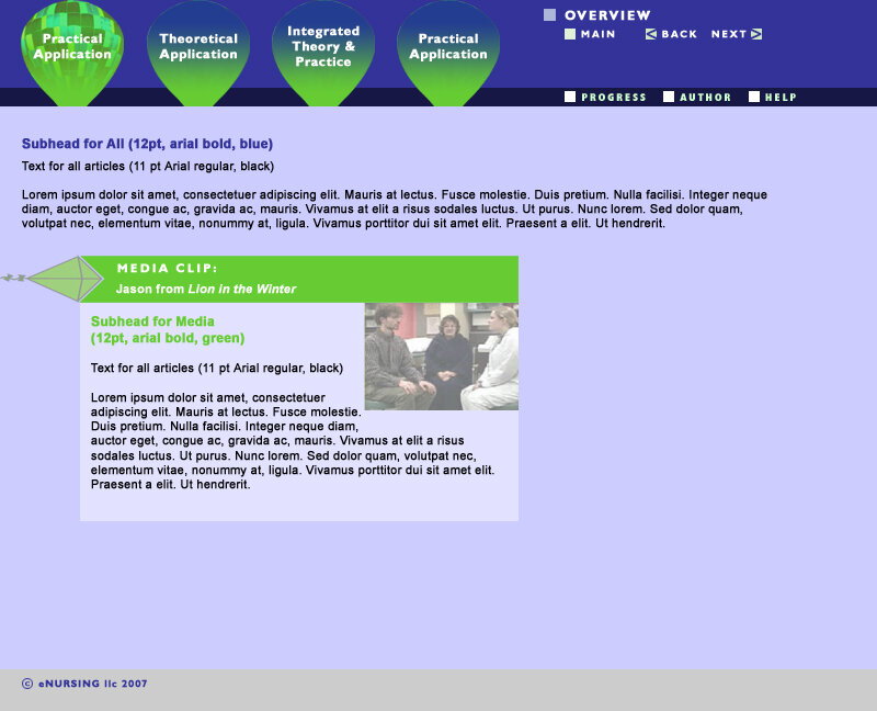
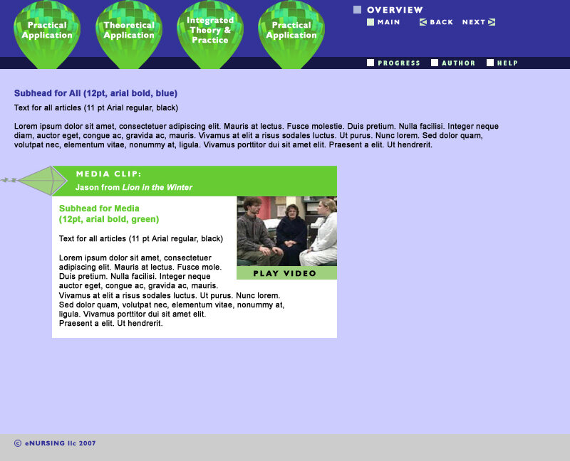
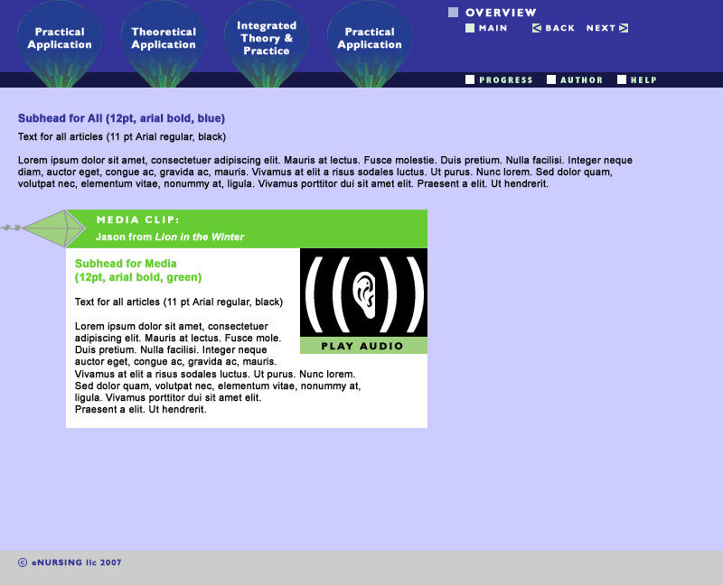
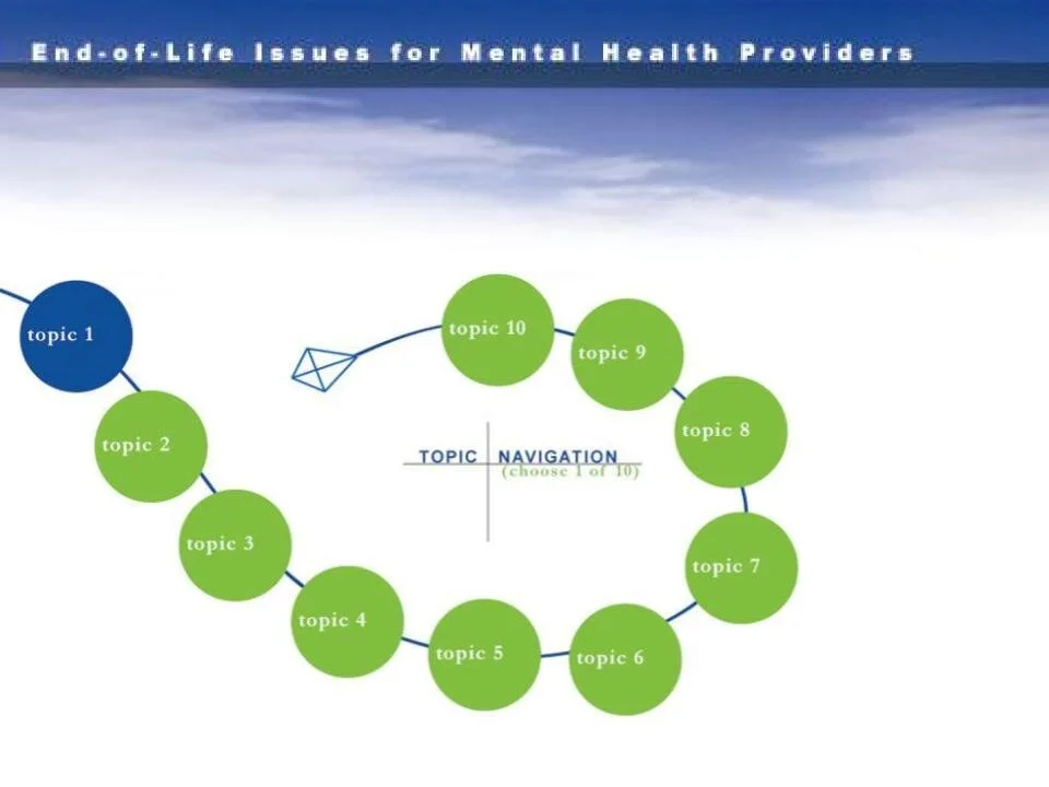
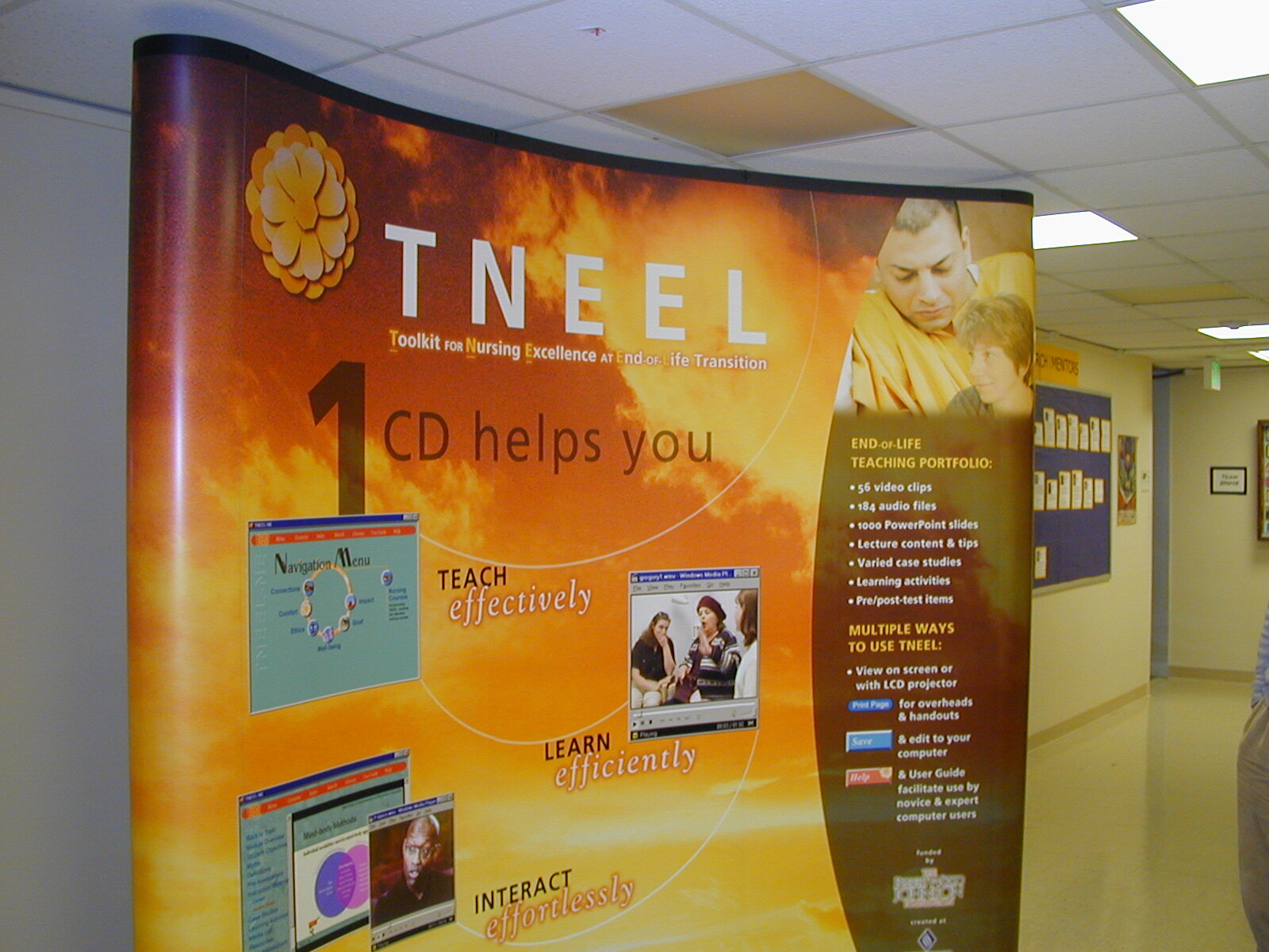
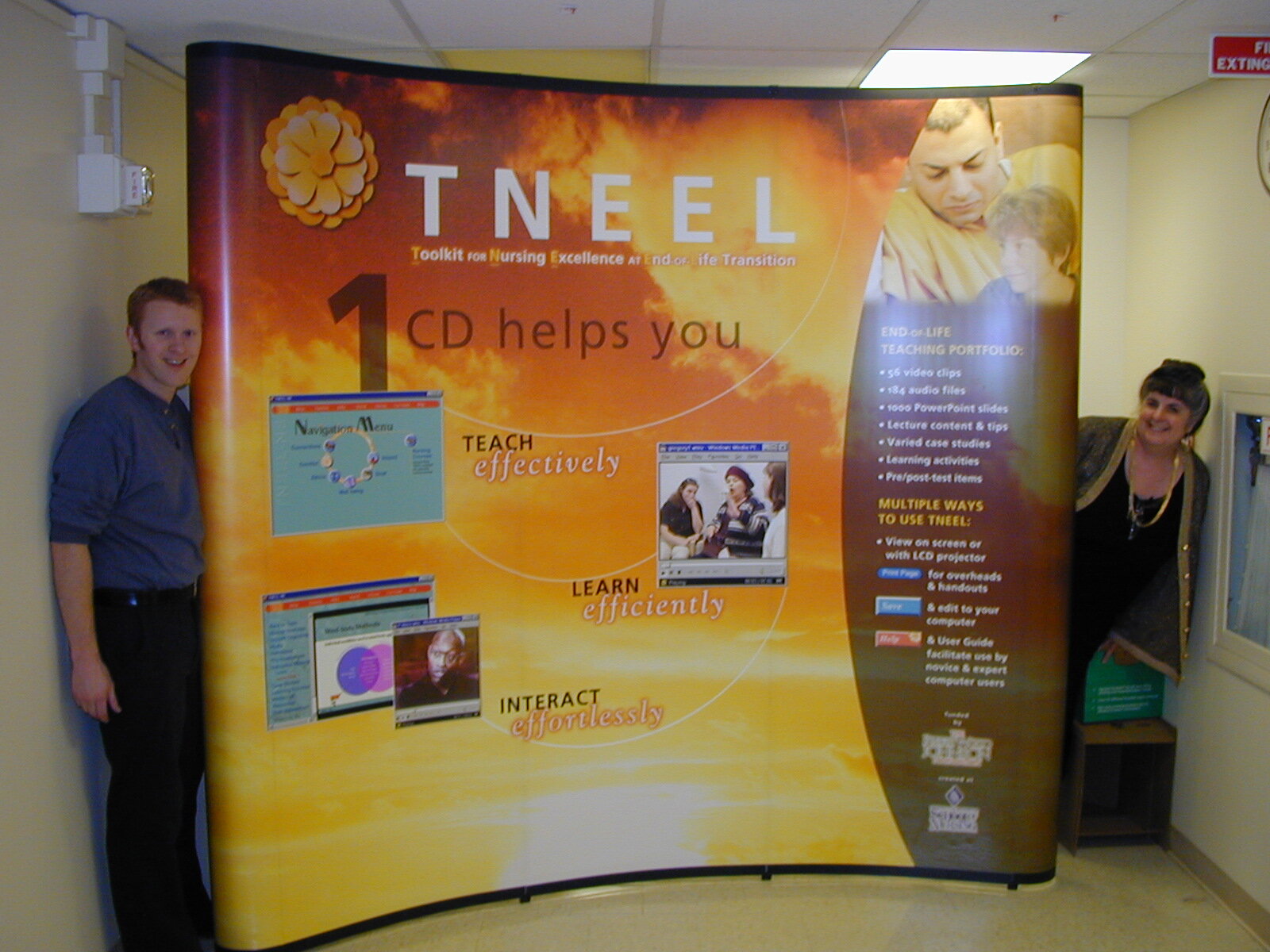
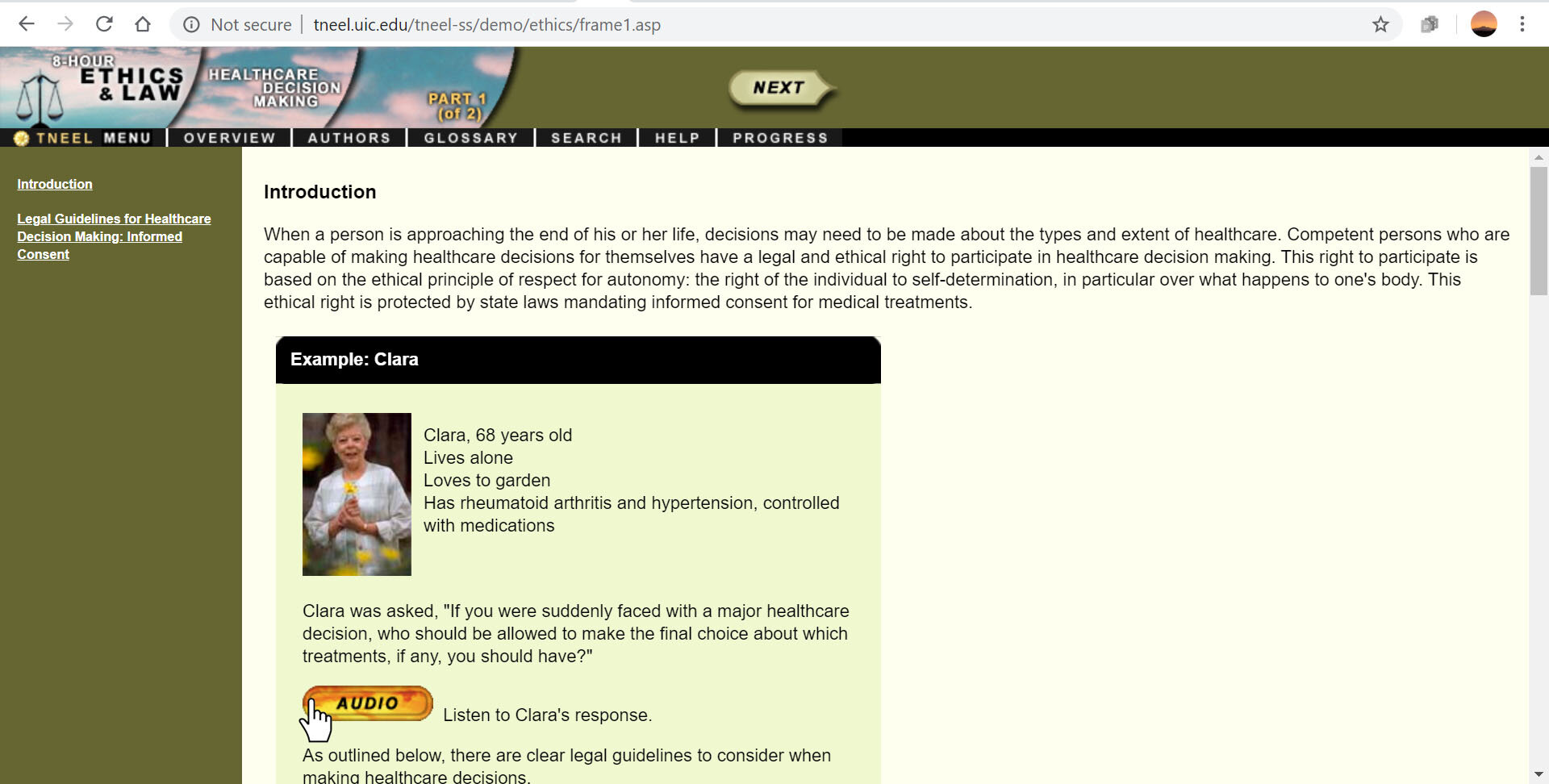
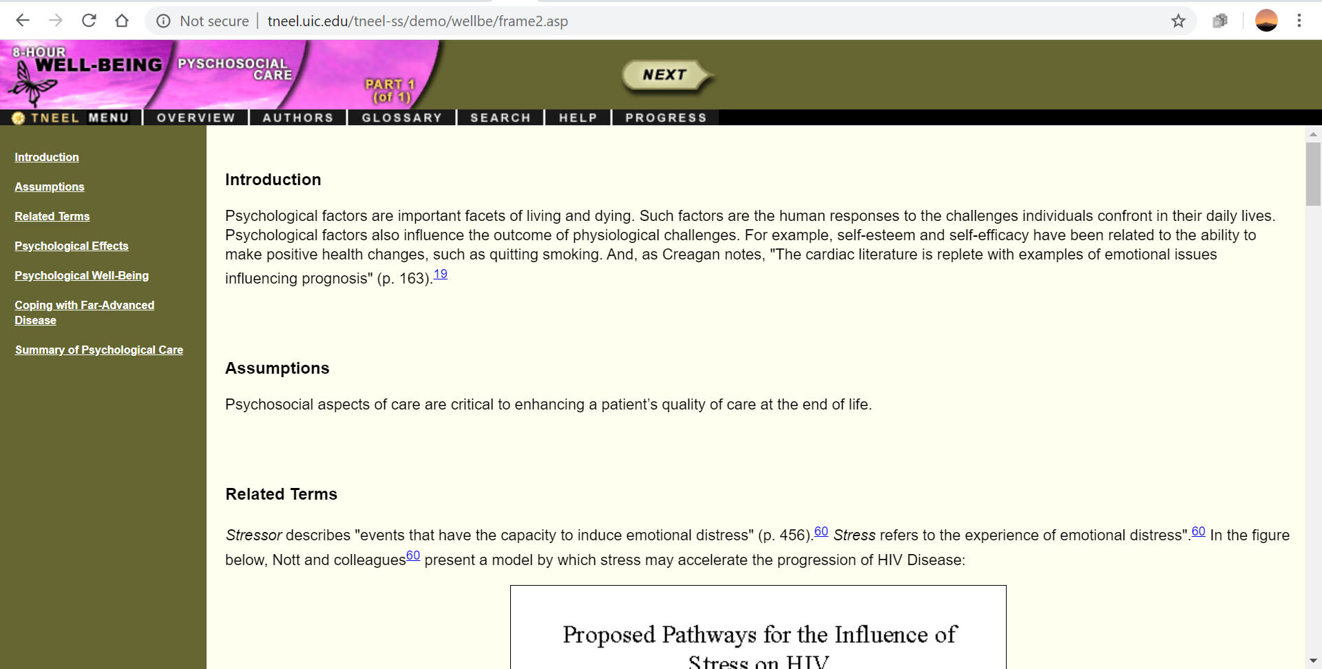
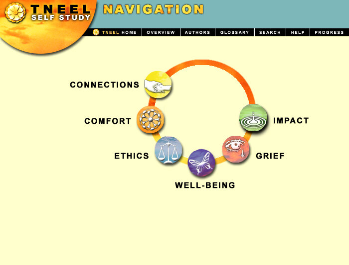
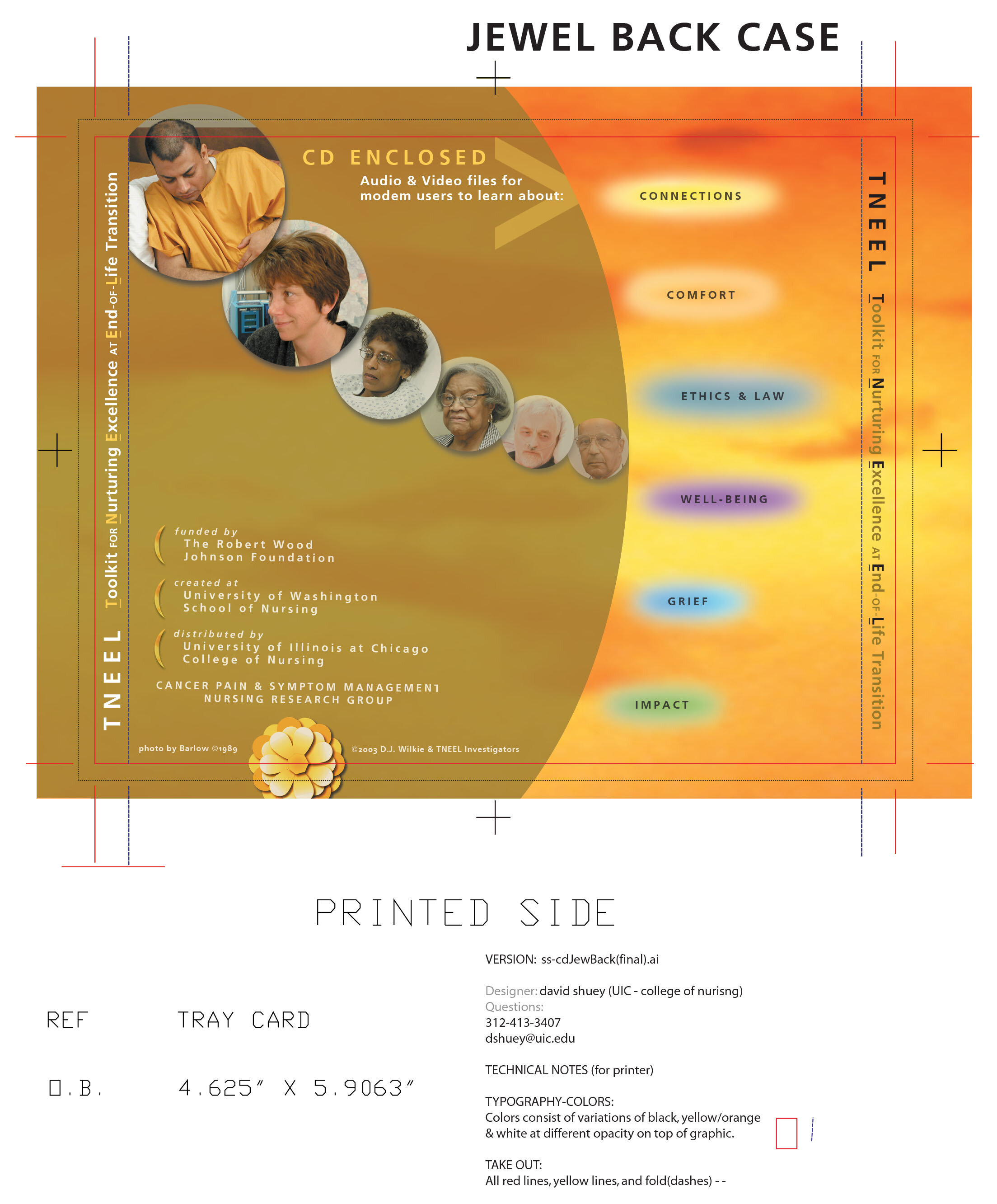
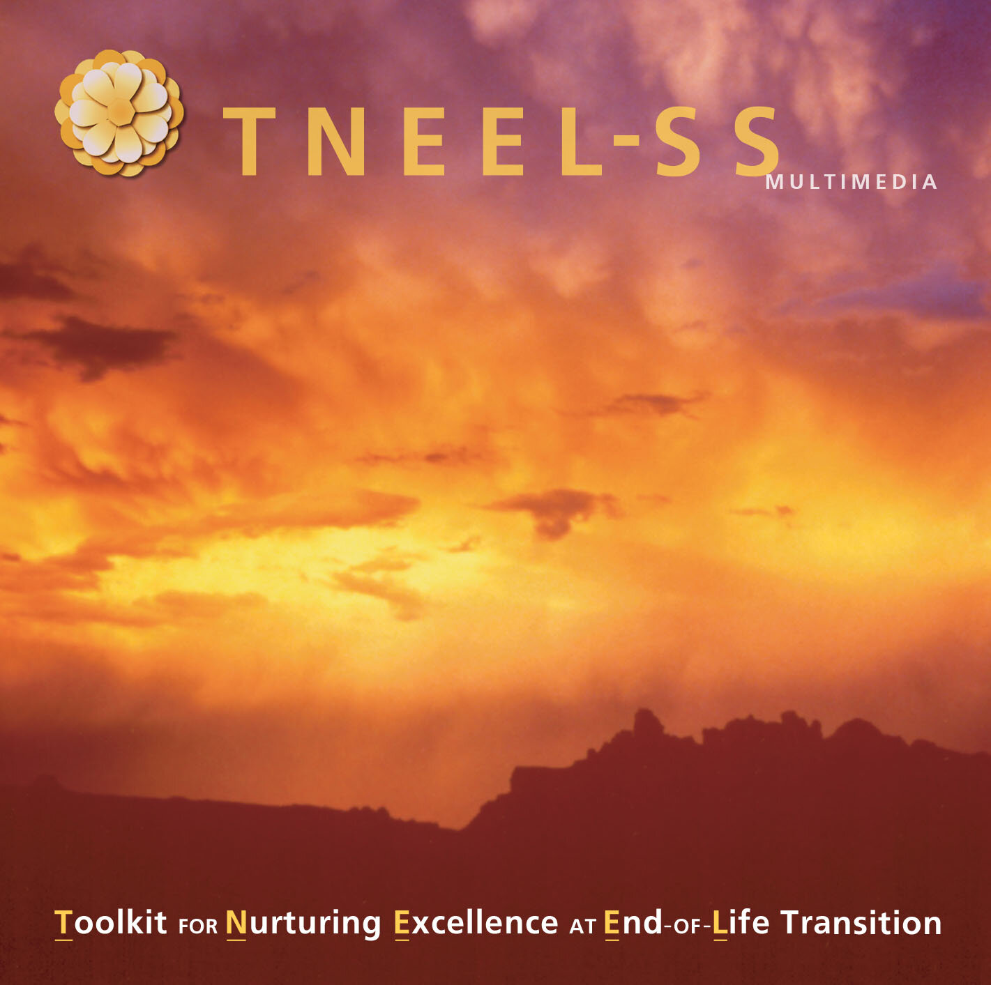
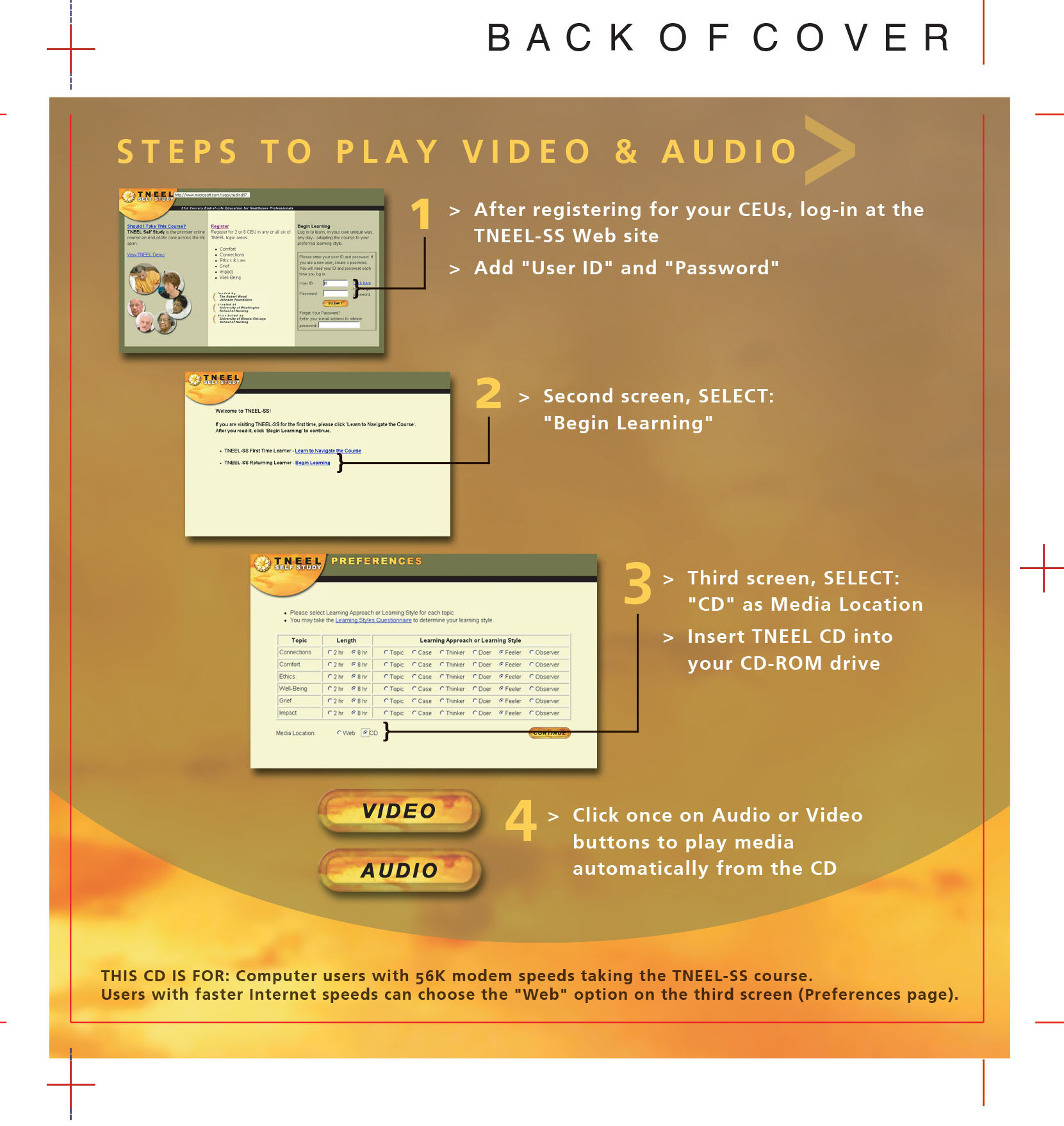
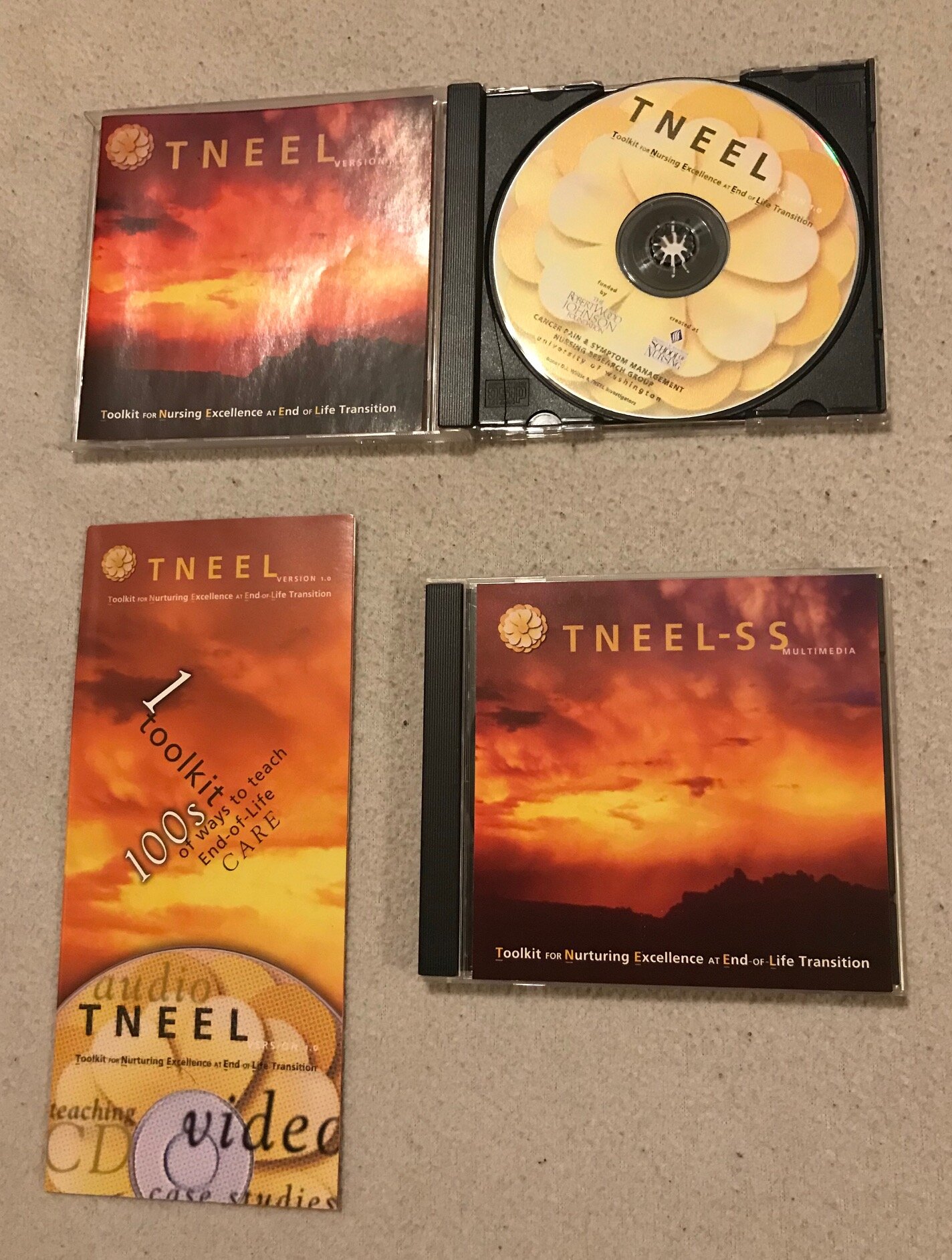
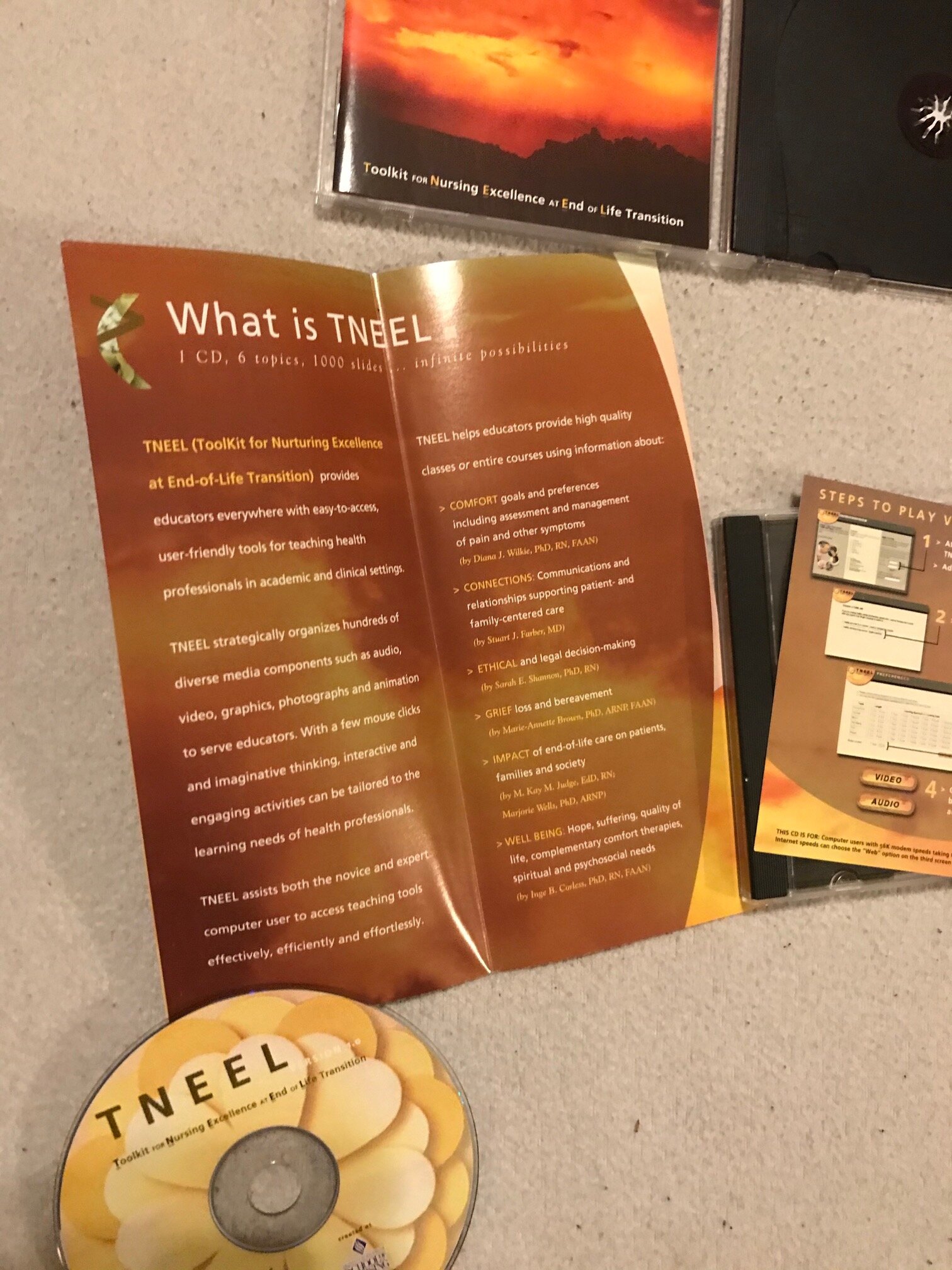
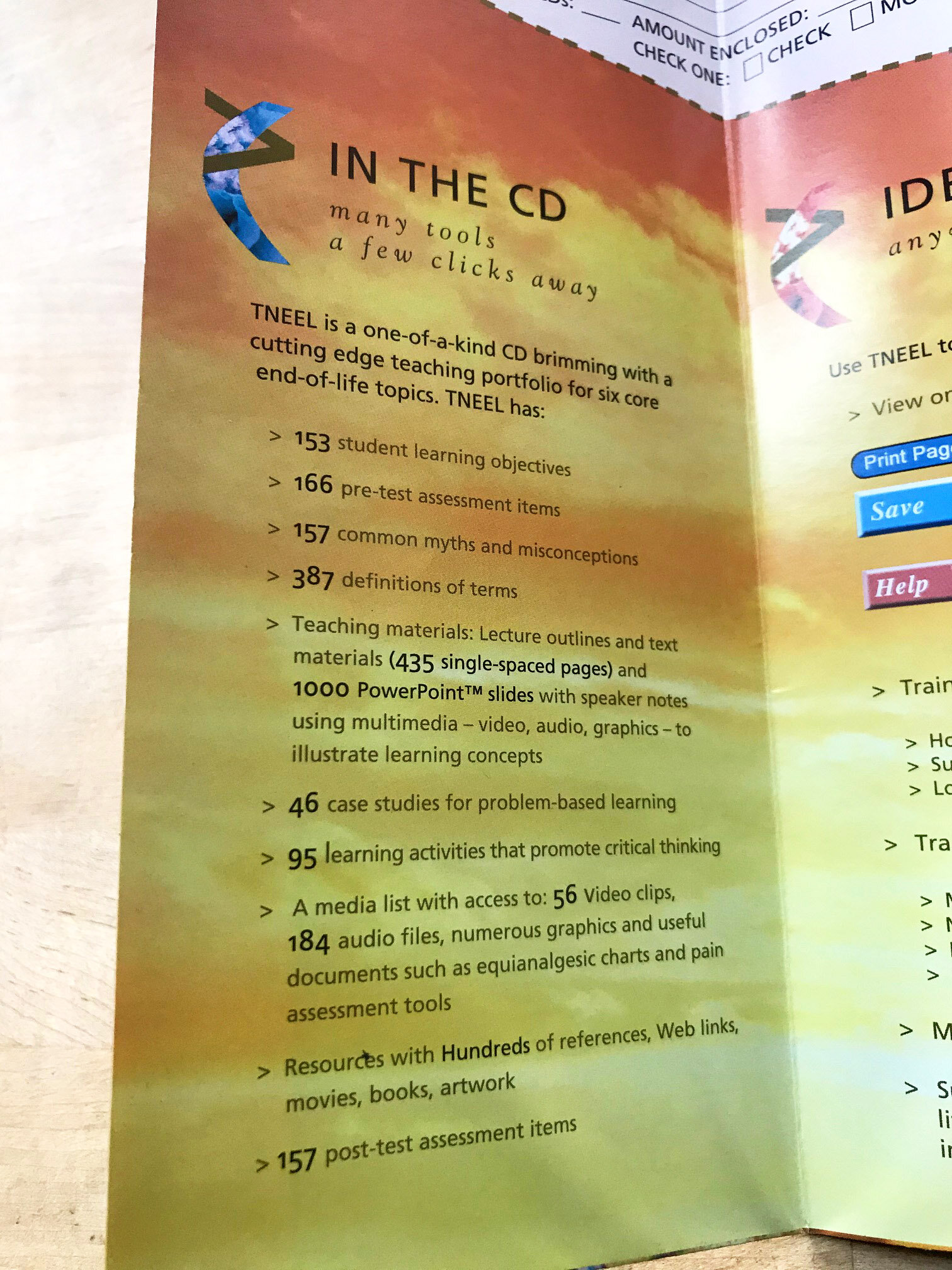
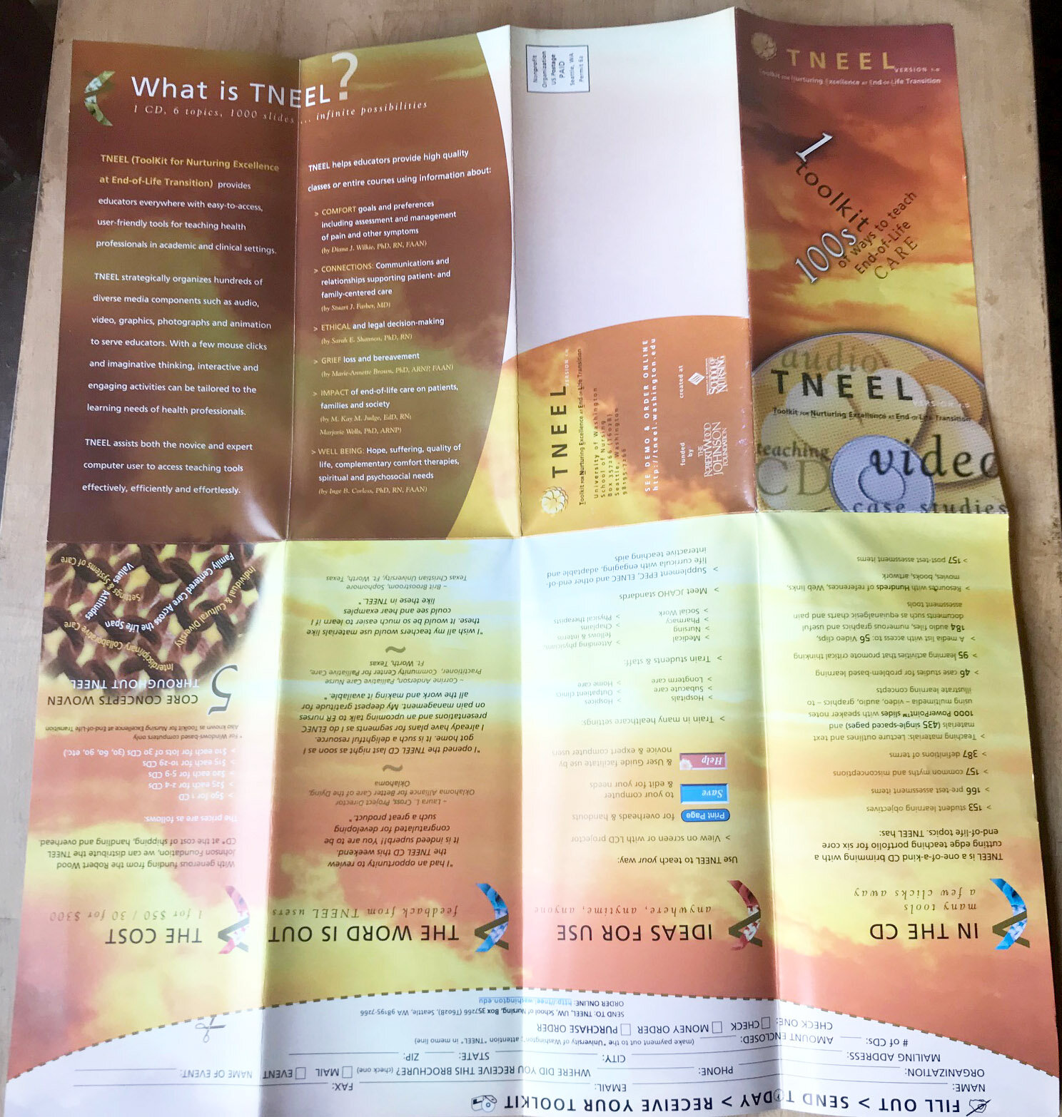
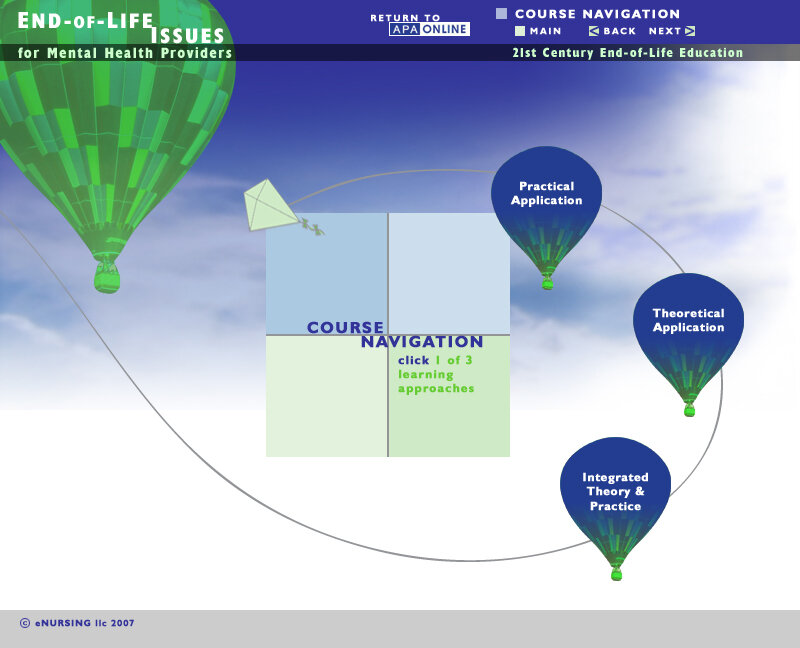
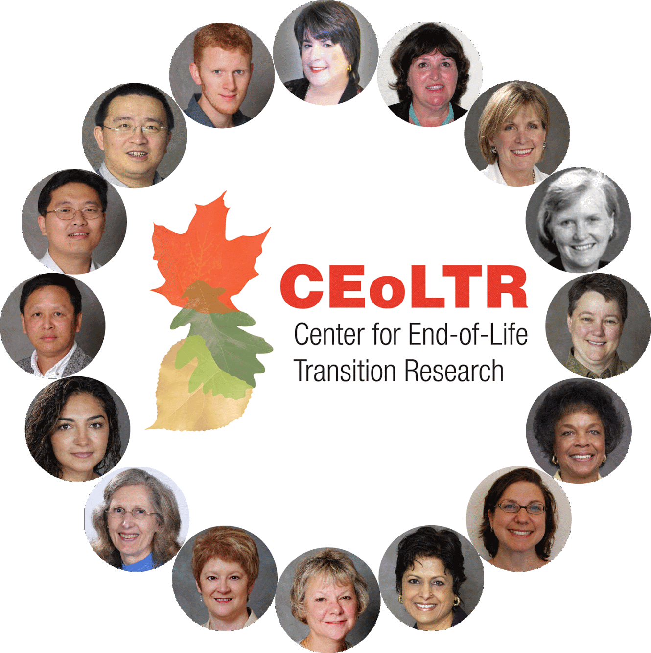
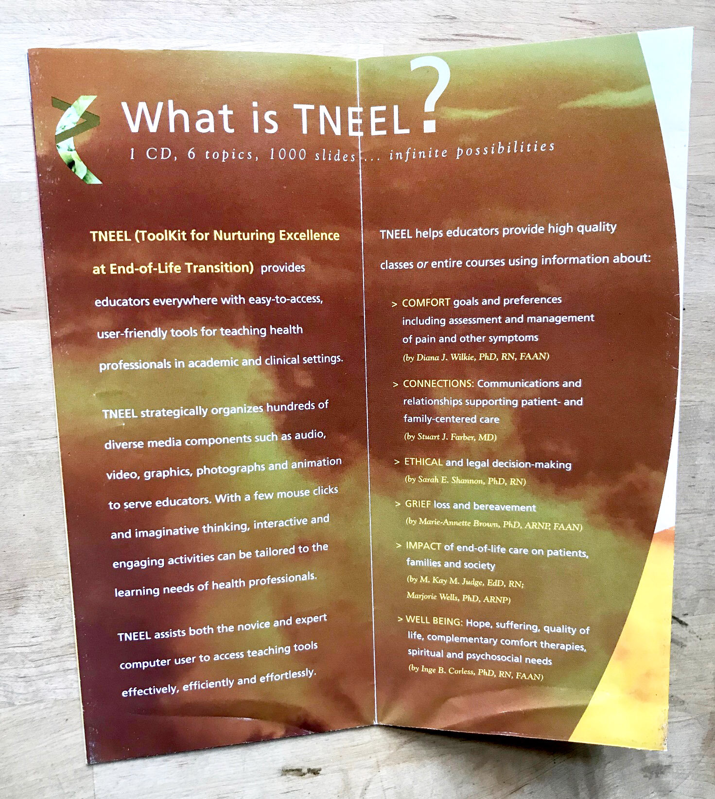
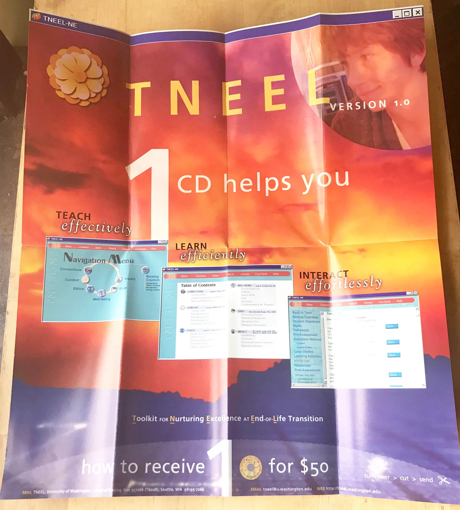
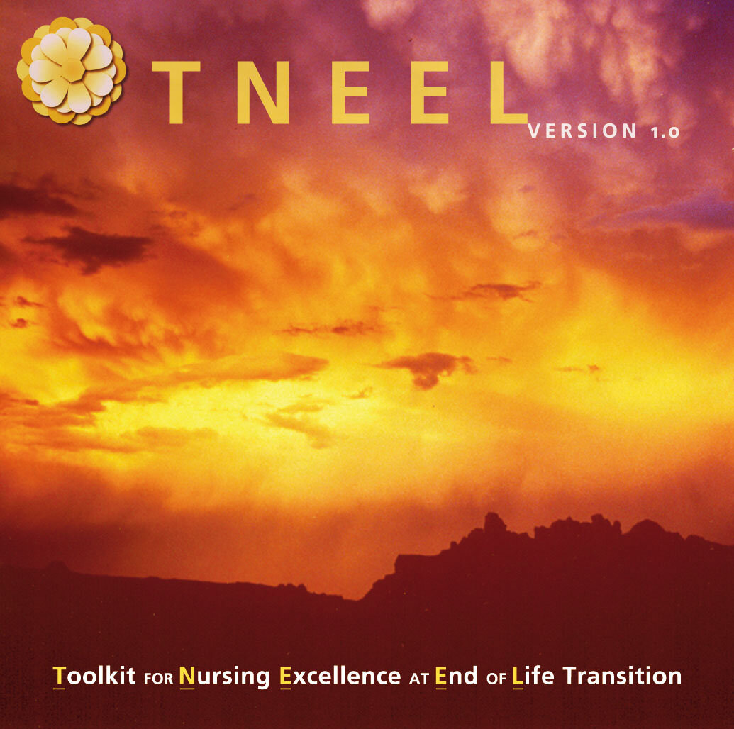
TNEEL
Copywriter & Lead Content Specialist for TNEEL Team
: Finalized easy-to-access, teacher/learner-friendly content for CD-ROM titled Toolkit for Nursing Excellence at End of Life Transition. Created 1000+ individual slides. Wrote copy for all collateral material, technical instructions, as well as scripts for video vignettes. Direct mailer brochure reached tens of thousands nationwide and responsible for high return rate for software sale orders, recouping all costs and making a profit. (The sales money was reinvested back into grant.)

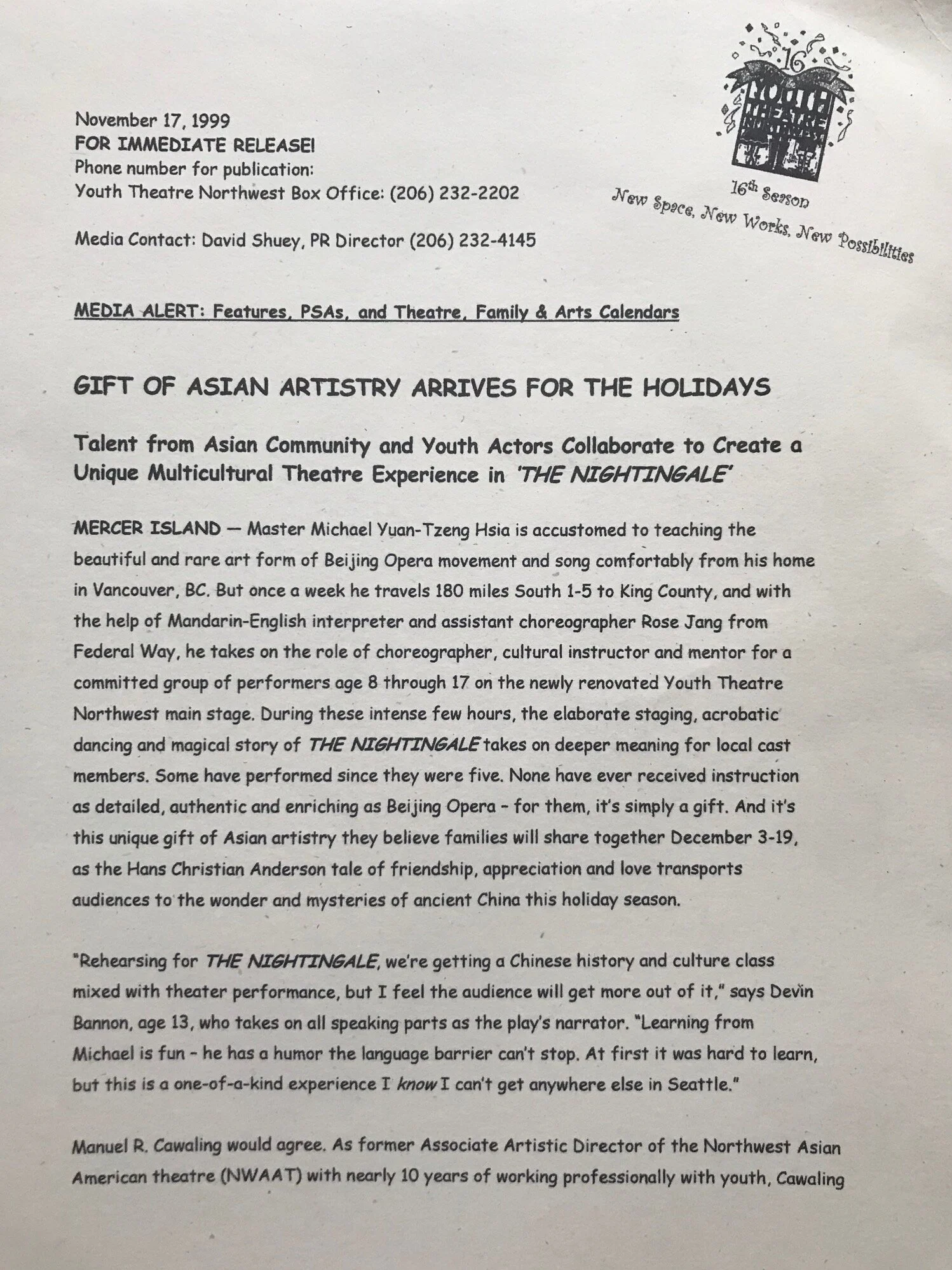
YOUTH THEATRE NORTHWEST
Public Relations & Marketing Director
reaching Seattle regional media with inventive PR campaigns to promote youth theatre productions and educational programs. Wrote press releases for six shows. Record attendance for inaugural show, "Fiddler on the Roof." Coup de grace accomplishment: Surpassed all-time registration record for Summer 2000 camps & classes (375+ students) via targeted online and direct mail marketing with “playful” brochures and messaging.
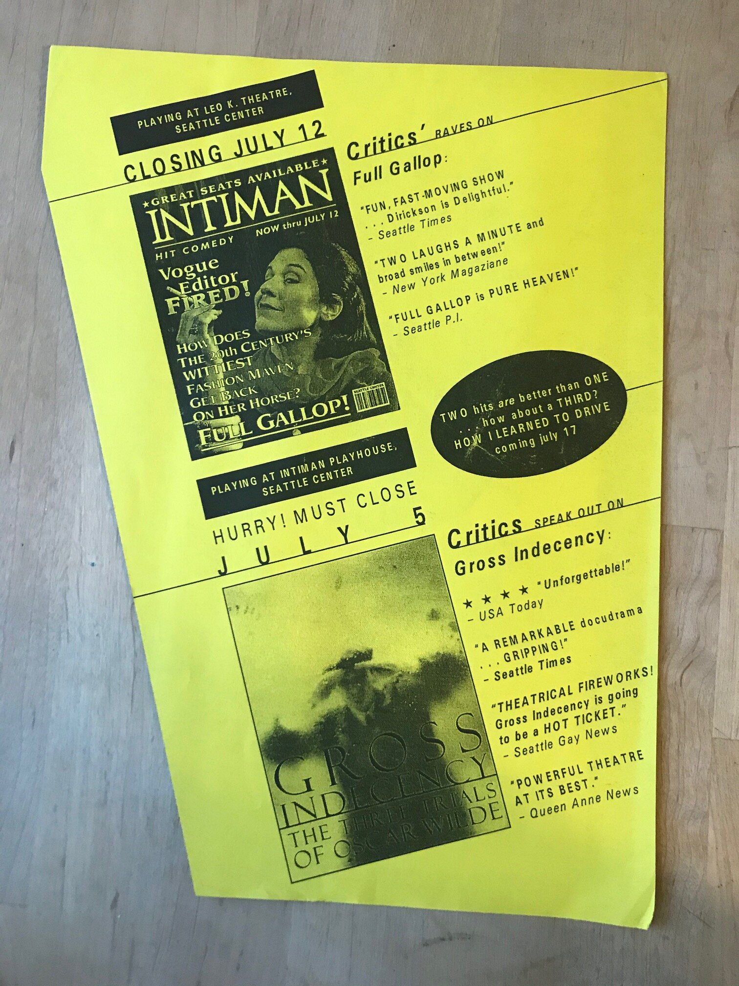
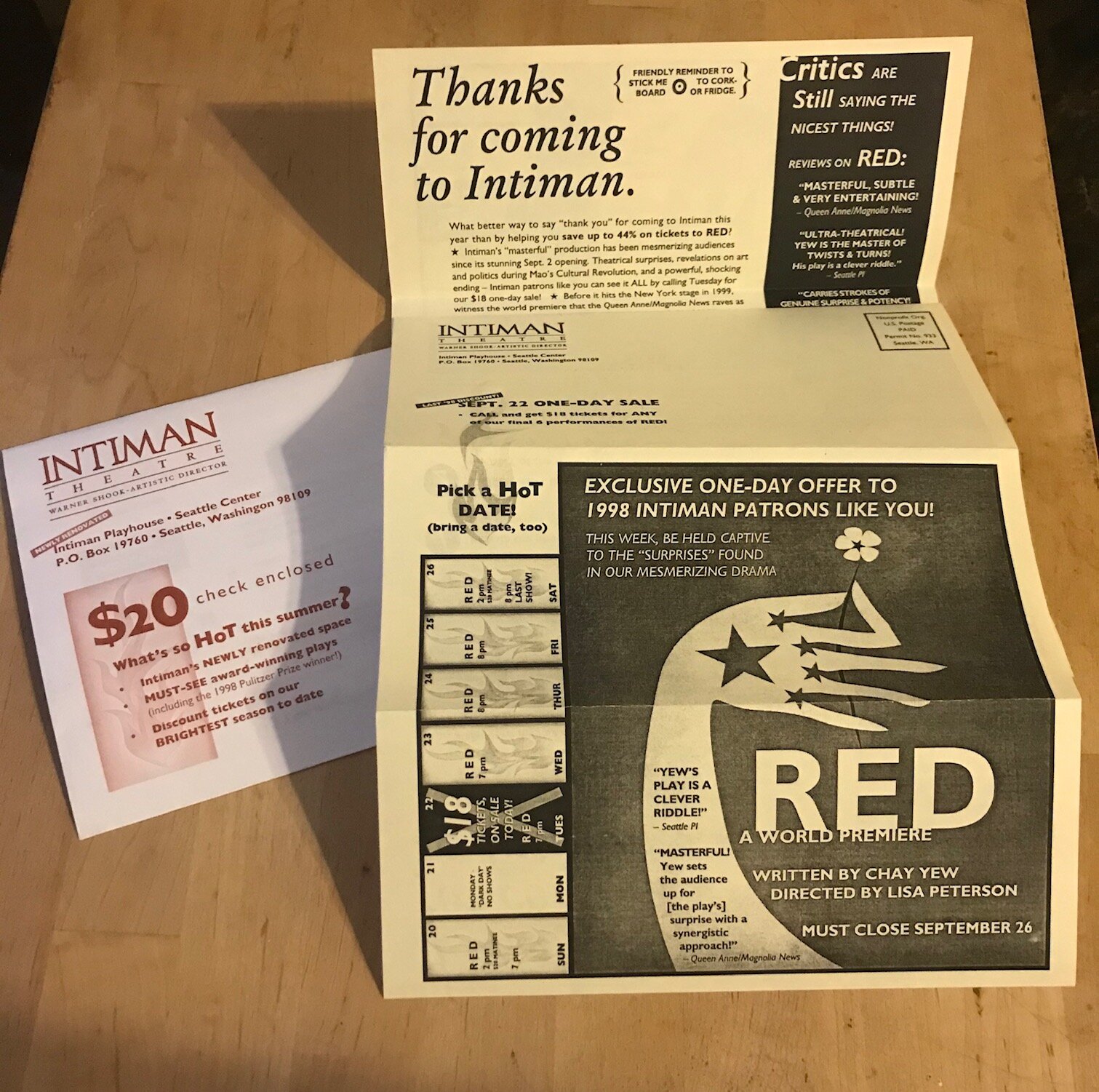
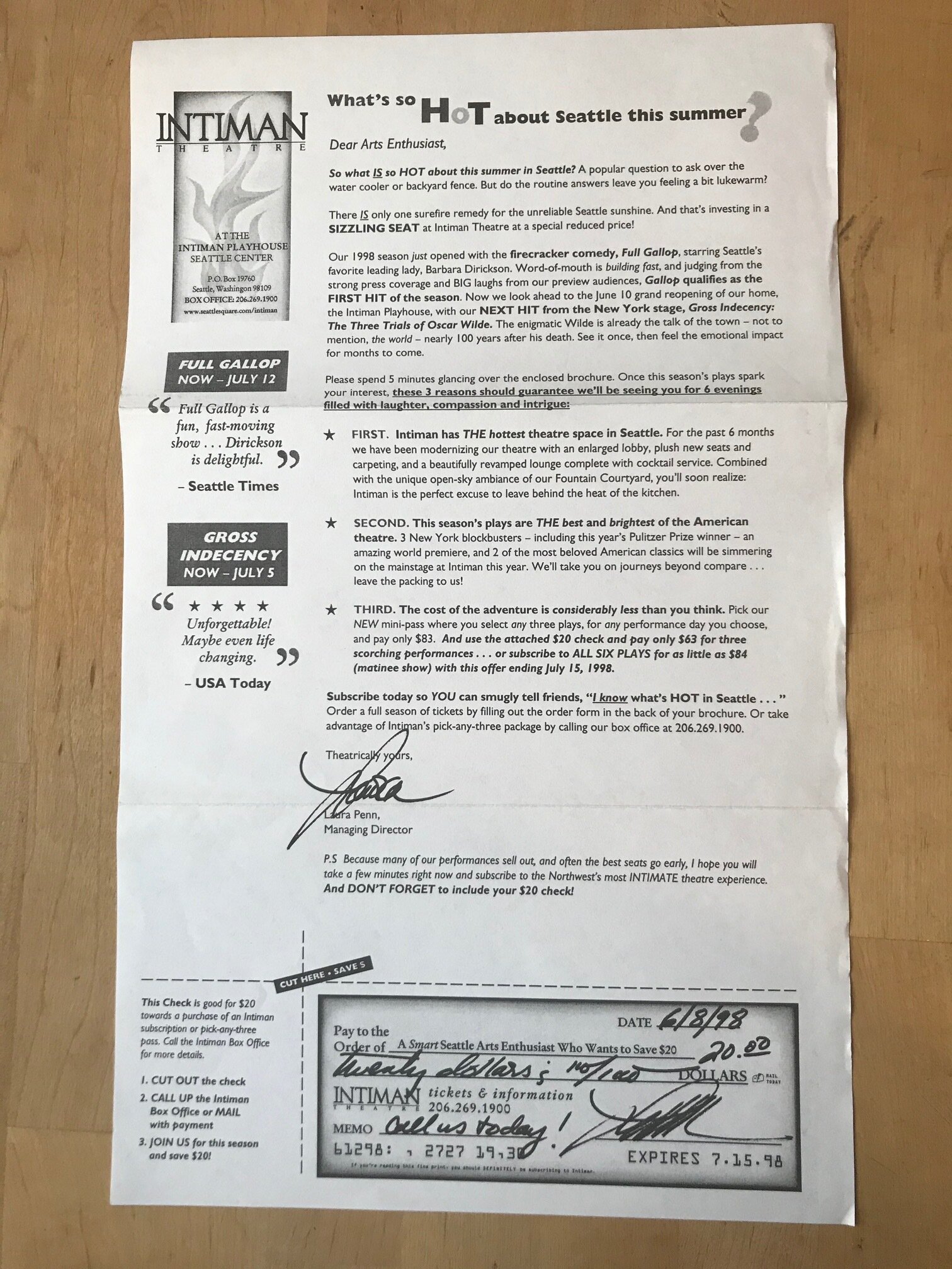
INTIMAN THEATRE
Sales & Marketing Associate
creative position at Seattle Center theatre and handled all graphics in-house and copywriting. As ad placement manager coordinated $70,000+ annual print budget. Led Barnes & Noble in-store promotional events as "face" of the theater. Designed and produced created line art for ads in Seattle Times and Seattle Weekly. Wrote radio copy.

ISTE
Copywriter, PR Liaison & Designer: Successfully rebranded ISTE, including international conference (Tel•Ed '97 & '98), print ads, and online. Rebuilt relationships and networked with 40+ tech leaders and organizations.

Go here for David’s 3-page comprehensive resume

Infinity Tune - Product Detail Page - 2023 (Right Here, Right Now)

My General Motors sample page was updated in 2024, and has most of my new copy examples this past year to check out. We’re talking more than a dozen ecommerce pages and a heap of UX content solutions.

For our revamped product detail approach for 2023, we developed a series of components to best help the customer make a decision. Users are arriving from emails, advertisements, organic and paid search, or other marketing pages. We keep it simple.

Benefits mentioned first. Features shown second. How-to-get component comes third.

chevrolet.com/ownercenter/onstar/shop/infinity-tune

GM dash space copy_background-matches-squarespace.jpg
UX Copy "Win" for Aetna

I won’t talk about the success of this modal copy here — I do on my Aetna sample page. But I will talk about my most recent UX writing experience working for Aetna/CVS.

I took a lateral move from MSK in early 2022 for my recent role as Senior UX Content Strategist for Aetna (a CVS Health Company) where I was a lead responsible for providing human-centered content, quality assurance (QA), micro copy, and A/B copy testing for Medicare plans. As of mid-November 2022, the direct-to-consumer platform AetnaMedicare.com, where I was owner of content for the global and enrollment features (omnichannel save the sale, Medicare application), has reached 500,000+ customers and enrolled thousands of members.

We also committed many hours of UX research along the way with older users to make the product better. For us that was always one thing: Less confusing.

See more about my 10-month content strategist contract role at Aetna here:
davidshuey.space/#/aetna-cvs-content-strategist-ux-writer/

Welcome to "Enroll" (After "Shop" and "Buy")

The key is to empathize with challenges novice digital users and elderly audiences face in decision-making. This includes writing copy of varying fidelity for mobile and desktop platforms. Pro tip: Bite-sized chunks of information presented at a 6th-grade reading level.

To get to this page yourself, just go to AetnaMedicare.com, input your zip code, pick any plan, and then click the CTA primary button “Apply now.” This will take you to the screenshot above.

But what if you don’t want to complete the enrollment application right away?

Save Progress Microcopy Sample

Our UX assignment: Making the journey as simple as possible. And to achieve another connection with the Medicare customer. This omnichannel solution was achieved as Aetna had an increase of users returning to the site after our summer 2022 update of the “Save the Sale” feature. An email link allows them to return at any time they choose.

Aetna dash space copy_background-matches-squarespace.jpg
Content Strategist & UX Writer at Memorial Sloan Kettering Cancer Center

Below is a copywriting example from MSK’s inaugural design system developed on Knapsack in Q3 2021. See more MSK writing here:
tinyurl.com/david-shuey-msk-ux-writing


Our Philosophy: Scaling Growth. Saving Time.

Simplicity is Our Objective

By making your work life easier, this leads to more profound outcomes and manageable solutions for people battling cancer on all touchpoints.

Memorial Sloan Kettering Cancer Center has devoted more than 135 years to exceptional patient care, innovative research, and outstanding educational programs. By saving hours using our scalable design system to build pages for the MSK audience, this frees up time for other work endeavors. The cascading effect benefits the MSK physicians, scientists, and staff who are serving patients and our greater society.

We give you the tools to build — the voice, brand, and style, as well as handy templates — and you give the world products that change lives, in the moments when people are the most stressed and in need. And hopefully you can provide solutions that can add years of new meaningful moments.

This lego metaphor for design systems illustrates focused, deliberate, and efficient ways of building. It is used by Brad Frost in his Atomic Design framework and the lego blocks visual he borrowed from Multiscreen UX Design by Wolfram Nagel. Imitation is a form of flattery, and Frost confirmed this on Twitter.

GM dash space copy_background-matches-squarespace.jpg
Technical (UX) Writer at Salesforce

Below learning material copied & pasted from:
trailhead.salesforce.com/content/learn/modules/systems-design-with-slds

Get Started with Systems Design

After completing this unit, you’ll be able to:

• Understand the main focus of systems design.

• Describe the benefits of systems design.

“A system is an interconnected set of elements that is coherently organized in a way that achieves something.”

–Donella Meadows, Founder, Academy for Systems Change

What Is Systems Design?

To understand our unique design system, the Salesforce Lightning Design System (SLDS), you need to know systems design. Systems design involves designing and combining elements that interact to achieve a common goal. Focusing on how each individual element relates to the overall user experience, the objective is to design systems that satisfy users’ needs as specified in system requirements.

When you take a systems design approach to designing a user experience, you focus on scalability. Scalable elements have multiple uses, support multiple viewpoints, and fit multiple structures. Then you combine those elements to form the full user experience.

Reusable elements benefit designers, who design experiences efficiently by reusing existing interaction patterns. New users also benefit by learning a new interface quickly because they recognize its elements. Consistent appearance, purpose, and placement of elements in an app guide users to build habits, which increase users’ efficiency.

Building: An Analogy

Systems design is an abstract concept so let’s consider an analogy: building a house. When you consider the breadth and scope of a project like building a house, imagine how the material objects, architectural blueprints, and craftsmanship of construction work together to make a usable living space.

Zoom in to a single door. The instructions for your door latch probably match the functionality of millions of others, so there’s no need to invent an entirely new type of handle and lock. Over time, you learn the most basic lesson: Keep it simple by using existing solutions to solve common problems.

The same ideas hold true for systems design. The foundation of systems design is recognizing that the relationships between elements are more important than the individual elements.

The efficiency that systems design offers designers extends to developers as well. When a pattern of elements solves a problem or facilitates completing a task in one area of an app, you can save time by reusing that pattern in your design. The developers implementing the design save time too by reusing the code already written to implement that pattern. Both designers and developers have more time to devote to more complex issues. We cover reuse more in-depth later in this module.

Supercharge User-Centered Thinking by Including Systems Design

User-centered design has revolutionized application and website design since its introduction in 1986 through an ISO standard. It birthed a new mainstream focus area of design that Don Norman coined user experience, or UX for short.

Creating a fantastic user experience requires balancing two activities.

• Consider the patterns (micro and macro) that people learn, through widely accepted UX best practices and unique patterns in your application.

• Ensure that users can accomplish a discrete task on a single page or in a single feature.

Without systems design considerations, you can fall into the trap of neglecting the user’s end-to-end experience. To maintain a holistic view while creating a design system, focus on these key questions.

• What does someone do within the app before they come to your new page or feature?

• How can you use interconnected experiences to supercharge your design?

Focusing on the relationships between the individual elements and the overall user experience produces compelling user experiences. This is systems design.

Aetna dash space copy_background-matches-squarespace.jpg
Marketing Copy 2019 — Keep It Simple

Wilderness Awareness School outside Seattle asked for a quick mock-up in 48 hours, and this was what I delivered.

Converted+from+PDF+on+FB+page.jpg
Yes, I Did Drop this Copy in One Hour

If you were an editor, you could get two more drafts by the end of the day. I write laser quick. And I’m always open to feedback.

GM dash space copy_background-matches-squarespace.jpg
Two Decades of Creative & Technical Writing Experience

Not only do I write the brand marketing copy for online and interactive learning tools, I write the technical instructions for a straightforward user experience. View all technical writing samples here.

Lesson #1 in Promotional Writing: Quickly Solve the Communication Problem

It’s an Oscar party. Dress up or dress down? We wanted to explain to people they could wear whatever they want, but convey that there’s also a costume contest. Kept it simple.

Press Release Prediction: Tying the Underdog Oscar-nominated Movie with Your Theme

Guess what? “Moonlight” ended up winning Best Picture over “La La Land.” I wonder if Warren Beatty and Faye Dunaway have any memories of that.

What we lost by economically keeping the press release to one page we gain by adding the buzz-worthy “Moonlight” visual.

And in terms of smart content and PR strategy, know this: Editors and web managers are busy. On page 2 (see below) we leave the URL links and key information for them to scrape and populate their pages.

Press Release - OscArts of Life 2017 - Nonprofit_PR_2 - North Bar Feb 26.2017-p2.jpg
FIGMENT — 2013-2016
FIGMENT — 2013-2016

Press release and all DIY collateral below created as Communications Director.

Go here for all FIGMENT Chicago press releases and organized Media Kits loaded with curated photos.

FIGMENT Press Release 2014 - 2 _p2.jpg
FIGMENT - 11 x 8.5 Flyer - Poster - Shuey-Graphic-Design  Art-Design-by-Figment.jpg
IMG_4518.jpg
IMG_4532.jpg
PAIN Software Branding for eNURSING and at University of Illinois at Chicago — 2003-Present
PAINReportIt-Brochure - 10 Thousand Print - Mailer Side.jpg
PAINReportIt-Brochure - 10 Thousand Print - Inside Fold.jpg
TNEEL Project at University of Washington — 2001-2003 (continued until 2013)
IMG_7918.jpg
IMG_5269.jpg
IMG_5270.jpg
IMG_5278.jpg
Huge Success for Order Form and Poster Concept: "1 Toolkit, 100s of Ways to Teach End-of-Life Care”

Remember how Microsoft Windows used to look? Kinda clunky. We tried to make it beautiful.

My longtime boss and mentor Diana Wilkie, a nurse and one of the leading experts in pain management nationally, once told me she didn’t mind Microsoft controlled 90% of the operating system market. Why? Because then it meant our software could work on 90% of the computers. (Sorry, not sorry, Apple iOS.)

This innovated brochure design that folded out into a poster meant to convey the technological and creative possibilities of a piece of software used to help healthcare professionals teach, learn, and interact better in regards to palliative care. This direct mailer brochure reached tens of thousands nationwide leading to a high return rate on software sale orders. The grant recouped all all costs and all profits were returned to the grant focused on end-of-life care.

IMG_5281.jpg
Youth Theatre Northwest — 1999-2000
Youth Theatre Northwest - Nightingale Press Release - p.2.jpg
Youth Theatre Northwest's Main Stage Subscription Brochure/Mailer

What you can do with a 2-color limit to your marketing budget. Part of being a Department Head is creatively stretching your dollar. Part of being a good copywriter is directing your target audience to the benefits and the product itself.

YTN - 2-Color 6-Show Season Brochure_Mailer - Celebrating Growth.jpg
YTN - 2-Color 6-Show Season Brochure_Mailer - Order Form.jpg
YTN - 2-Color 6-Show Season Brochure_Mailer - Close-up.jpg
YTN - 2-Color 6-Show Season Brochure_Mailer - Foldout Poster.jpg
YTN - 2-Color 6-Show Season Brochure_Mailer - Proof.jpg
Intiman Theatre — 1998

Intiman Theatre - Flyer - Cutting Edge Front.jpg
This Flyer Caused a Sales Spike AND Directly Led Me to a Fruitful Interaction with Stephen Fry, the Famous British Actor Playing Oscar Wilde

Ask me about it, I’ll tell the tale. Though the gist of it is straight-forward: I connected him to our theatre company and Artistic Director — apparently, they had a "fantastic" conversation — after Mr. Fry introduced his movie “Wilde” to Seattle audiences at an international film festival. (He was fantastic in it, and my hero Roger Ebert agreed.)

After papering the movie house, I boldly went up to the comedian-writer-actor. Fry liked my rapper Ton Loc “Wilde Thing” pun. He then autographed a large-sized Intiman Theatre poster for us. In return the cast of our play autographed a poster for him, which was delivered to his hotel. I was Golden Boy for the day. Fry got great reviews, but he failed to get a deserving Oscar nomination, his only real chance.

Intiman Theatre - Flyer - Cutting Edge Back.jpg
Intiman Theatre - Direct Mail - Mailer and Envelope (separate).jpg
Intiman Theatre - Copywriting Sample - Discount Direct Mailer.jpg
Intiman Theatre - 2 Ads in One Seattle Times.jpg
ISTE — 1996-98
ISTE — 1996-98
Frankly, the Design is Cooler than the Copy

But it’s not bad ad copy for a kid just out of advertising school.

... Then My Supervisor/Mentor Left ISTE and I Alone had to Market and Promote this Conference

Fortunately, the man who hired me out of University of Oregon’s journalism school, Tony Foy, and I had already established the voice and tone for ISTE and Tel-Ed dual-site conference in Texas and Mexico. Tony is still a top reference and great friend, and in 2020 was promoted to director of a major marketing company in Eugene, Oregon. I’ll always be thankful he accidentally allowed me to be Marketing Director for four months — but at the time it was a wee bit overwhelming.

Completely NEW Branding and Copy for ISTE

The dawn of the internet — thanks, Al Gore! — was all about connection. So that literally became our tagline and visual theme as we attempted to reboot all aspects of ISTE’s Marketing & Membership Services division.

Tagline (used in other ads): Connecting People to the Best in Educational Technology 

ISTE - First Membership Ad 1996 - Closeup.jpg
ISTE Catalog Redesign: Art Direction and Copywriting

Had a blast adding a little color and flair — and “Did You Know?” trivia tidbits — in the nonprofit ISTE’s main moneymaker: The ISTE Catalog. Ghostwriting for the Executive Director who’d been there since the 1960s was also a treat.

ISTE Tel-Ed Catalog Redesign - Executive Director Ghostwriting Sample - Closeup.jpg
ISTE Tel-Ed Catalog Redesign - 7 ISTE Benefits Copywriting - Closeup.jpg
ISTE Tel-Ed Catalog Redesign - Tel-Ed Ad Copywriting and Design.jpg
From a Young Age, I Always Loved "Did You Know?" Copy

I made sure these were throughout our catalog redesign, and wrote all the copy.

UIC Study Marketing - Vulvodynia

Go here for more sample designs & video content for vulvodynia study

YouTube Testimonials (directing, editing & animating main titles)

Promotional Branding & Marketing Expert: Created colorful brand identity for NIH (National Institutes of Health) R01 double-blind acupuncture $2 million study for women’s vulvar pain (vulvodynia), including graphic design for Chicago bus and train ads, flyers, web, as well as developer for multimedia content. Executed marketing strategy by optimizing search results and outreach, directing and editing YouTube testimonials efficiently, copywriting, and managing website (vulvodyniastudy.uic.edu). The carefully crafted transit ads were a huge success, increasing significantly the number of women participants in Fall 2019. All deadlines met and work completed before leaving position in June 2019.

The grant also sent me to Japan summer 2019 to pick up acupuncture needles, which was a great adventure by almost any measure.

How Recognizable Were Ads?

My friends started sending me photos when they saw them. This was one of two photos sent by separate friends who saw these ads on Chicago’s Blue Line and a bus route in the same two-week period.

Full 4ft. Banner Chicago Train/Bus Ad (CTA)

Conceptualized closely with primary investigator and project director of federally funded acupuncture study (who just happen to be women). Target audience: Women with vulvar pain. Risk: Alienating women with off-putting ad, but we concluded being direct was imperative — and final goal is to limit debilitating pain if study is a success. Positive result: Transit ads brought in more women faster than all other marketing efforts.

Main Graphic Art Build

Design Problem: How to provide visual unity to several lines of copy meant to establish if women have this unique and under-diagnosed pain. Many in our target audience won’t know what “vulvodynia” is and may not have even talked to doctor about it.

Two Reasons You're Seeing This

I debated including this large-scale component of the design, and some friends are like, “Are you sure?” But there’s a two-part backstory:

1) As a person who’s worked for and around women for most of his 20+ professional years, I’ve learned to be wide open to feedback and empathic to critiques. Frankly, our first photo shoot didn’t “nail it,” and the stock art used earlier was too low-resolution for large-scale advertisements. This is a colleague used as a model, and the photoshoot was co-coordinated with feedback from her (especially style and color of shirt) and my project director and main professional reference Marie. (See what I did there? You now have my references to corroborate all these key details.)

2) I’m actually pretty proud of this efficient and precise Photoshop trim job around the legs and arms. I have several other “job duties” at the University of Illinois at Chicago besides graphic design, so I was pleased with creating a professional design on my own and under deadline.

Vulvodynia Study Flyer

Multiple concepts were presented before settling on this version with the stock art of a woman representing vulvar pain. I added the “pain” red glow, likely inspired by headache ads I’ve seen over the years.

Another Friend Sent Pic from a Chicago Bus

And even I saw it on a Blue Line train New Year’s Eve 2019/2020 coming from O’Hare airport back home. (My picture not included.)

The Co-Inventors of Acupuncture Needles Used in Study

The study also sent me to Japan to pick up the valued needles as a reliable and responsible courier. I was quick to take them up on the offer. I obviously love to travel.

image3 (1).jpeg
DSC01216.jpg
22 Years of Vegetarianism Done Away in One Journey

It was a good run, but I started eating fish and poultry again on this five-city Japan trip. I didn’t even do that in Africa or Central America!

See other adventures, such as when I took a sabbatical and traveled through West Africa for six months: afriquiescence.wordpress.com

FIGMENT & The Arts of Life - Volunteer Work

Everything here I designed , wrote, and/or made — sometimes by hand. I did the work pro bono, collaborating with many talented individuals, because I believed in the goals of both these nonprofits. And it was fun.

FIGMENT CHICAGO (2013-2016): Communications Director for participatory arts weekend event at City of Chicago Parks in charge of all press material, marketing, outreach, social media, and graphics. Handled the Facebook, Twitter and Instagram accounts. Coordinated all photographers and photo content pre-and-post event. Followed the FIGMENT graphics standards in all original graphic design (and DIY aesthetic with hand-drawn signs and media kits). Utilized Customer Relationship Management (CRM) software tools NationBuilder and Salesforce to communicate with audience and measure success.

THE ARTS OF LIFE ASSOCIATE BOARD (2013-2017): Fundraising and outreach promotions efforts helped raise $10,000 annually for artists with intellectual and developmental disabilities. Spearheaded original Associate Board branding effort to cohesively match the Arts of Life "look." Involved in poster graphic design, press release writing, template building, and promotional copy for events, including the annual Oscar fundraiser party, OscArts of Life. Used the web-based project management tool Basecamp for efficient delegation of tasks to team. The Arts of Life is a 501(c)(3) with two professional art studios and represent over 60 artists with varying levels of physical and intellectual disabilities.

Bubble Cropping
Bubble Cropping

Can’t think of a more fun way to spend my after-work time. This is one of my favorite design pieces for FIGMENT.

Handbills and Other Art Promoting FIGMENT Chicago in 2016

Lesson: When you’ve made a solid design before, reuse it again. No need to reinvent the wheel.

Facebook Banner for Volunteer Meet-Up
Art Director Faciltator

I didn’t quite art direct the FIGMENT look. That was done years before in New York City, the original home of FIGMENT. But I facilitated bringing their look to Chicago by respectfully adopting and mirroing their style — even developing a new style guide and templates to share with other cities.

Double-sided Table Placards

As an an all volunteer arts event, donations were key to keep the art (and ball) rolling.

My Goofy Yoga Pose in Front of FIGMENT Founder

FIGMENT Founder David Koren (right, pink shirt) obviously trying to ignore David Shuey, his rogue Chicago Communications Director in Chicago.

Below This: The Contents of the FIGMENT Chicago Media Kit

Includes all information mirrored on a drive accessible to media pre-event (see here): Press releases, postcards, information sheets, letter from the producer, and info pertinent for journalists.

IMG_4519.jpg
IMG_4518.jpg
IMG_4521.jpg
IMG_4522.jpg
IMG_4524.jpg
IMG_4527.jpg
FIGMENT - Chicago 2014 Flyer.jpg
IMG_4530.jpg
IMG_4531.jpg
IMG_4514.jpg
IMG_4532.jpg
IMG_4533.jpg
In Conclusion
In Conclusion

FIGMENT was a lot of fun, and I was proud to be a contributor to its success.

The Arts of Life: Why Not Do Communications + Design for Two Art Nonprofits in Chicago?

Yeah, why not? While both FIGMENT and the Arts of Life involved hundreds of hours of volunteer work, I learned quite a bit. From utilizing Salesforce and Nationbuilder, to leveraging SurveyMonkey, these roles offered opportunities to expand my skills. And I got to spend time with a lot of great artists and creative people.

The First Arts of Life Associate Board Event Poster

The serendipity of creating the inaugural Rock-It Fest fundraiser, with this image in particular, is a story best told in person. So feel free to ask. But for now, here’s the artist of the main image, Alex Scott: artsoflife.org/artists/alex-scott/

Arts of Life North_Face_Promo- 2016 Promo Flyer.jpg
Branding Achievement: Coining "OscArts of Life"

Coming up with a playful name for an Academy Awards event that would take place six years running came from a simple brainstorming session at our monthly Associate Board meetings. It stuck.


OscArts-of-Life-Moonlight-Party- - 2017 fundraiser - final-to-print.jpg
Masterpiece Kitchen Cooking for a Cause_Poster - 2016 fundraiser.jpg
AoL_Art-on-a-Hot-Tin-Roof - 2015 Fundraiser.jpg
I Developed All The Branding Guidelines for the Associate Board...

… Which I did by following the established Arts of Life Branding Guidelines and tweaking for our purposes. Essentially, we kept our own banner above each event image, and we promised we’d always use Arts of Life artist work within the design.

Aol_Associate_Board_Signature_Guidelines_apr18_2015_By_David_Shuey (1).jpg
Arts - Board - Banner_High_Rez.jpg
Associate-Board-MUSTARD.jpg
Always Show Two or Three Options

It means you’ll pick the cream of the crop. This wasn’t quite it. It was the first bubble-lettered one shown above.

Bonus Designs, Art & Inspiration

Every extra design that’s fit to digitally print.

BONUS Design Sample: Digital Album Thumbnail for Digital Distribution and iTunes

One. More. Design. My good friend Alex Castaneda is a Chicago-based producer of house music. Here I designed the main graphic for Alex’s 74-minute “Navigated” house mix which begins with a familiar CTA train announcement.

Occasionally he’ll hit me up for some designs or artist referrals. I connected him with a friend to work out photography ideas, the monumentally talented Simon Rubinstein. Simon executed his website and album photography, which are highlighted in these downtown Chicago bridge shots below. I designed the typography and layout concepts for Alex’s record label, which he approved.

Hear Alex’s music: brickyardmusic.com

Close
Close

Concept #1.

Closer
Closer
Not That "Closer"!
Not That "Closer"!

Side Note: My favorite designer Peter Saville designed Joy Division’s final album (as well as all New Order albums). I’m continually seeking his sleek simplicity in every project I tackle.

1f3a0a337f1e4bc8f5898a9cf83ca703.jpg
Final Website Branding
Album Cover Final Draft
Yves Klein Blue on Window Pane No. 17

Why No. 17? Well, it’s Buffalo Bills QB Josh Allen’s MVP season when I made this, and No. 2 was taken.

Been bleeding Bills blue (and red) lately. Also, while visiting Buffalo, I saw Yves Klein’s copyrighted blue hue in yet another exhibit. It’s almost cliché this intense, otherworldly color is in every other modern art museum.

Now it’s on my wall. For now.

Also, the Color Comes from Lazuli

Basically, this is just a favorite color and I wanted to see how it would work on a window pane I found in the alley.

In the process of making it, I found the connection between one of my favorite 2010s synth pop songs by the band Beach House called "Lazuli.” That song refers to the pigment found also in International Klein Blue.

Alas, I missed a warning when making this art that International Klein Blue is impossible to replicate:

Warning: Distrust all reproductions of IKB paintings. International Klein Blue is a stark, intense blue, without any hint of green, purple or grey. The visual effect of IKB cannot be reproduced on screens or in print; it must be experienced "in the flesh".

Full Disclosure

I never say “I’m an artist” and this was more of a design experiment. To be honest, this is my No. 1 attempt at making a piece of art in eons.

References:

radicalart.info/nothing/space/klein/blue.html

en.wikipedia.org/wiki/Ultramarine

youtube.com/watch?v=BfzFVbkutFE

en.wikipedia.org/wiki/Yves_Klein

Yves Klein Blue no 17 - side-glow.jpg
7fd1c8707d1bee15c8348f5bbf2ffee0.png
yves-klein-hero.jpg
prev / next
Back to UX & Creative Work
Samples from Google: Coming Soon'sh
4
Google/IBM iX - UX Writer
GM logo black - original.v3.jpg
29
General Motors - UX Writer
13
Aetna/CVS Health - Content Strategist & UX Writer
MSK -Logo - Square.jpg
15
MSK - Content Strategist & UX Writer
salesforce porfolio squarev5.png
7
Salesforce - UX Design Systems - Technical Writer
CD Jewel Case Cover & Instructions Design: Where the TNEEL Brand Began
43
TNEEL Software Branding & User Experience (UX) Design
CD Jewel Case Cover Design (with Finger Pointing to Your Pain)
19
PAIN Software Branding & User Interface (UI) Design
Dutch Influence, University Colors
44
University of Illinois at Chicago (UIC) College of Nursing Branding
Overnight Camp Yes You Can - Copywriting-Thumbnail-Portfolio.jpg
60
Writing Samples
How Recognizable Were Ads?
10
UIC Study Marketing - Vulvodynia
Bubble Cropping
32
FIGMENT & The Arts of Life - Volunteer Work
BONUS Design Sample: Digital Album Thumbnail for Digital Distribution and iTunes
11
Bonus Designs, Art & Inspiration

Thanks for viewing 👍 

👩‍💻 Contact me here.