Everything here I designed , wrote, and/or made — sometimes by hand. I did the work pro bono, collaborating with many talented individuals, because I believed in the goals of both these nonprofits. And it was fun.
FIGMENT CHICAGO (2013-2016): Communications Director for participatory arts weekend event at City of Chicago Parks in charge of all press material, marketing, outreach, social media, and graphics. Handled the Facebook, Twitter and Instagram accounts. Coordinated all photographers and photo content pre-and-post event. Followed the FIGMENT graphics standards in all original graphic design (and DIY aesthetic with hand-drawn signs and media kits). Utilized Customer Relationship Management (CRM) software tools NationBuilder and Salesforce to communicate with audience and measure success.
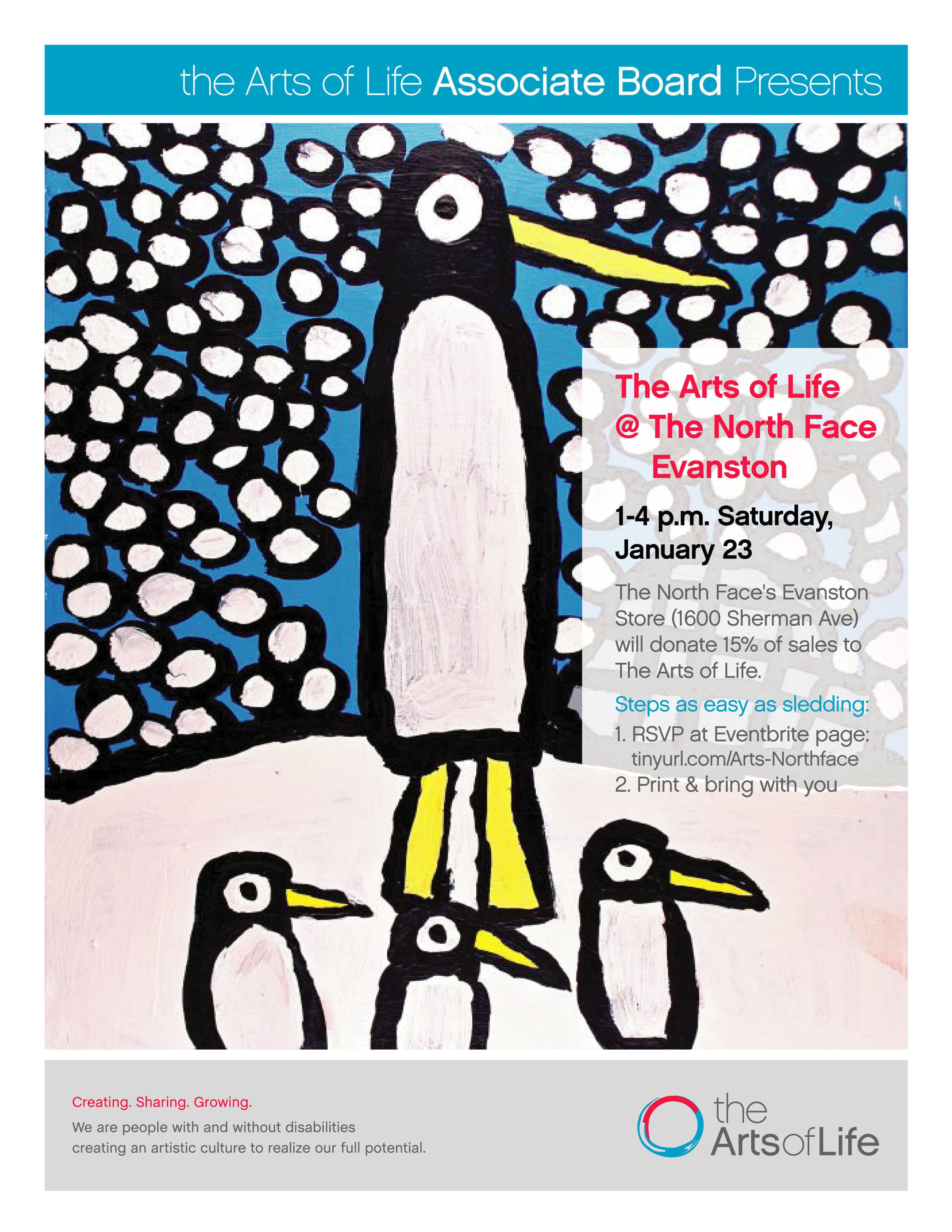
THE ARTS OF LIFE ASSOCIATE BOARD (2013-2017): Fundraising and outreach promotions efforts helped raise $10,000 annually for artists with intellectual and developmental disabilities. Spearheaded original Associate Board branding effort to cohesively match the Arts of Life "look." Involved in poster graphic design, press release writing, template building, and promotional copy for events, including the annual Oscar fundraiser party, OscArts of Life. Used the web-based project management tool Basecamp for efficient delegation of tasks to team. The Arts of Life is a 501(c)(3) with two professional art studios and represent over 60 artists with varying levels of physical and intellectual disabilities.

Bubble Cropping
Can’t think of a more fun way to spend my after-work time. This is one of my favorite design pieces for FIGMENT.

Handbills and Other Art Promoting FIGMENT Chicago in 2016
Lesson: When you’ve made a solid design before, reuse it again. No need to reinvent the wheel.

Facebook Banner for Volunteer Meet-Up

Art Director Facilitator
I didn’t quite art direct the FIGMENT look. That was done years before in New York City, the original home of FIGMENT. But I facilitated bringing their look to Chicago by respectfully adopting and mirroing their style — even developing a new style guide and templates to share with other cities.
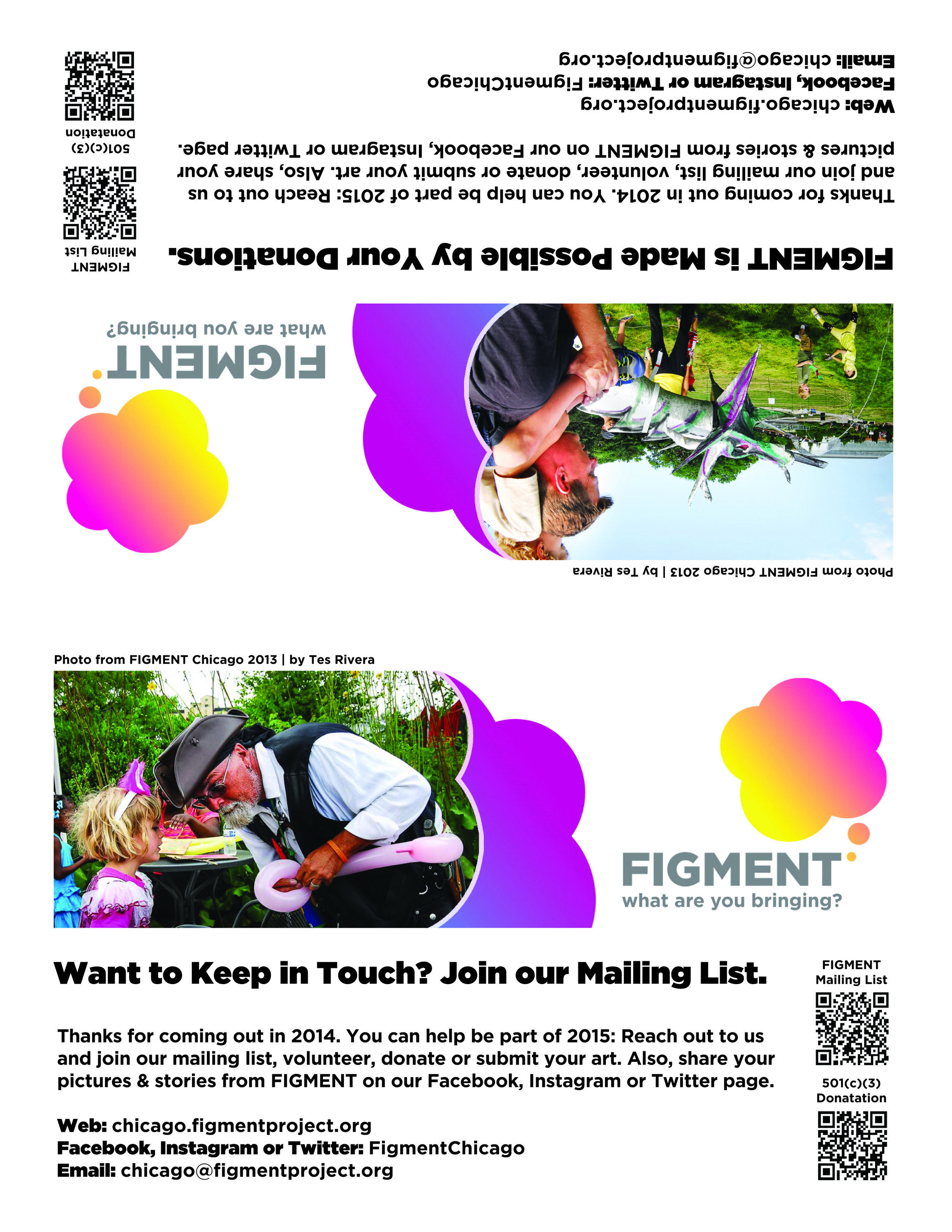
Double-sided Table Placards
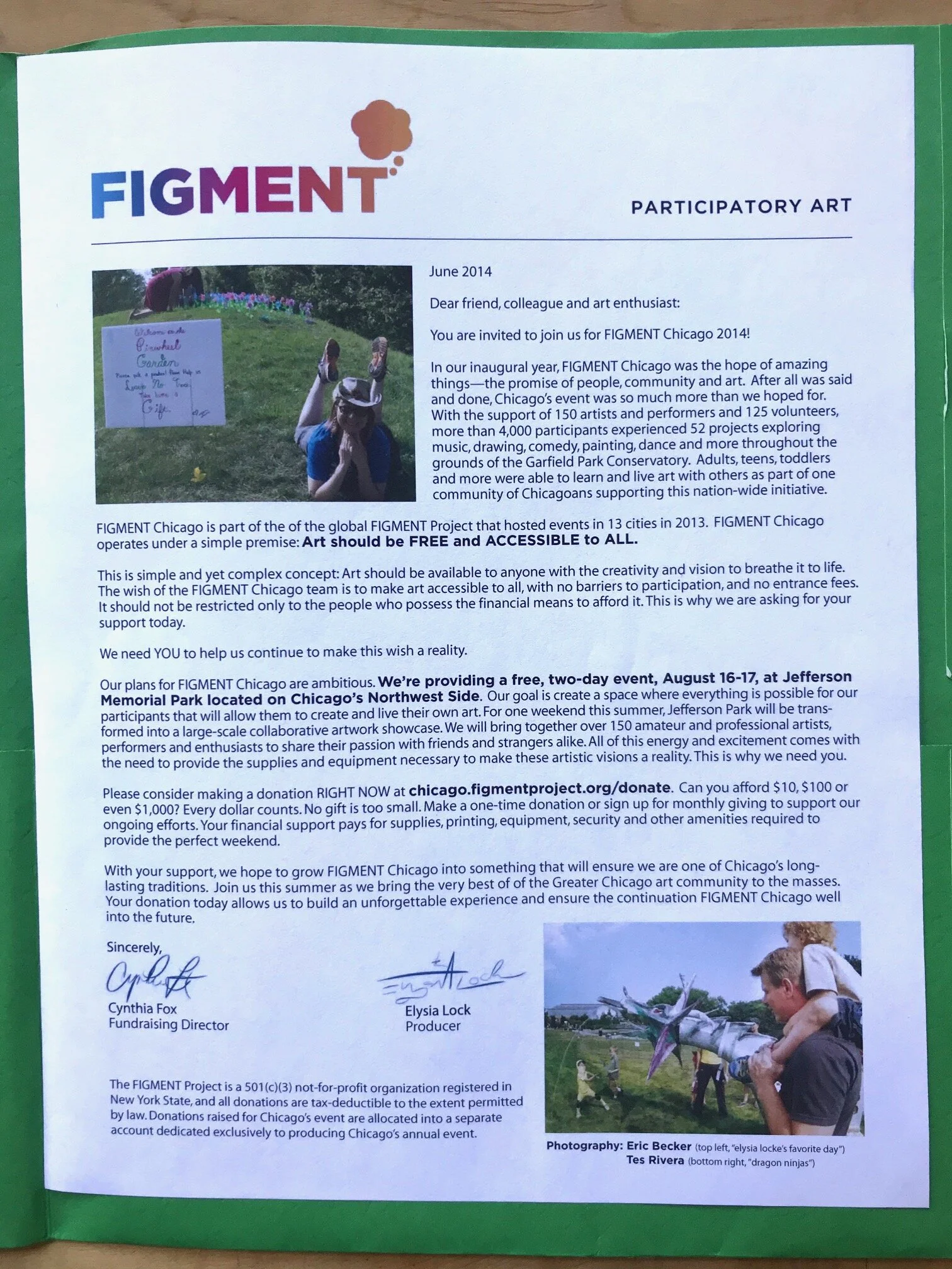
As an an all volunteer arts event, donations were key to keep the art (and ball) rolling.
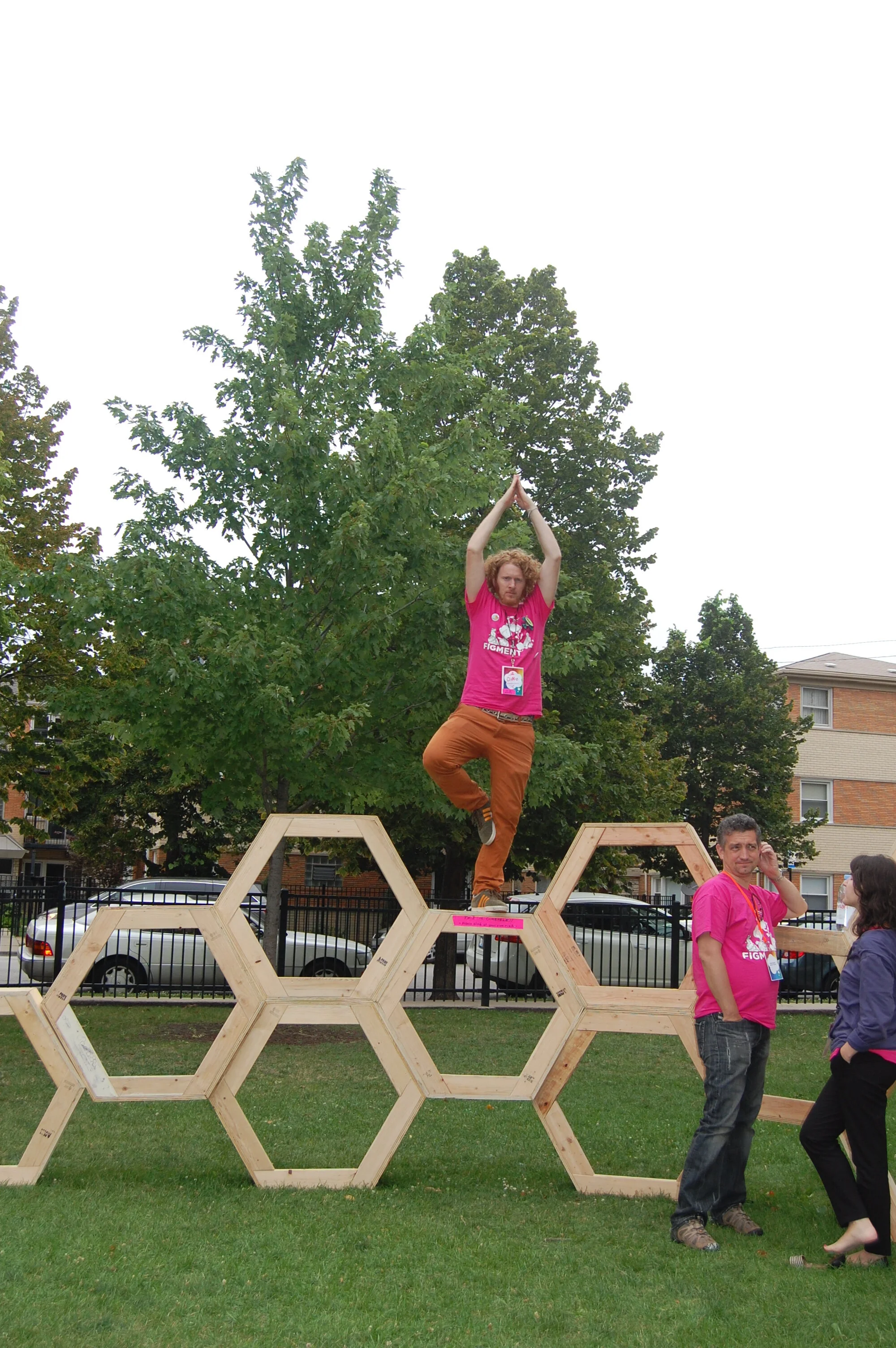
My Goofy Yoga Pose in Front of FIGMENT Founder
FIGMENT Founder David Koren (right, pink shirt) obviously trying to ignore David Shuey, his rogue Chicago Communications Director in Chicago.

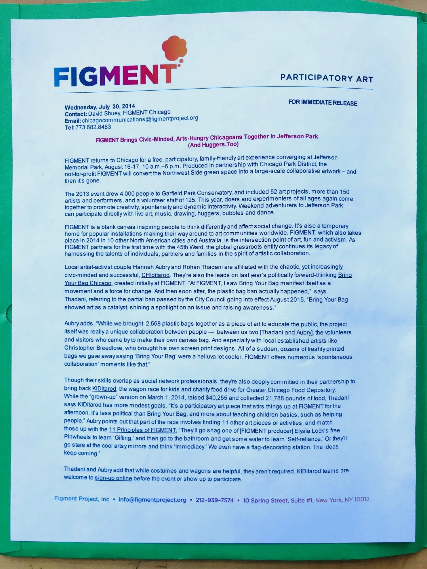
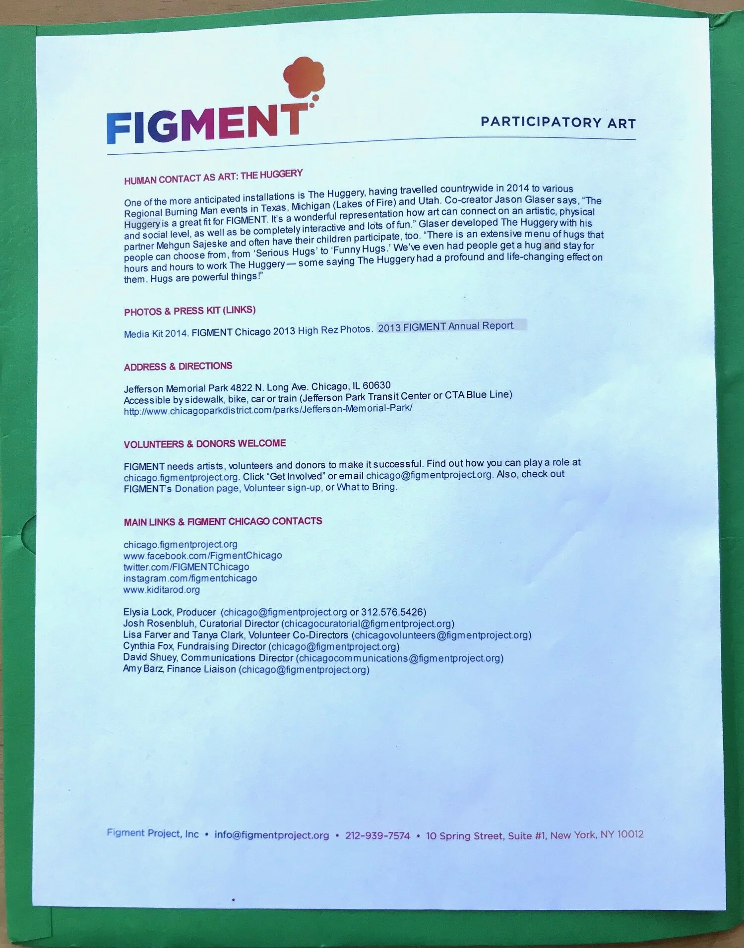
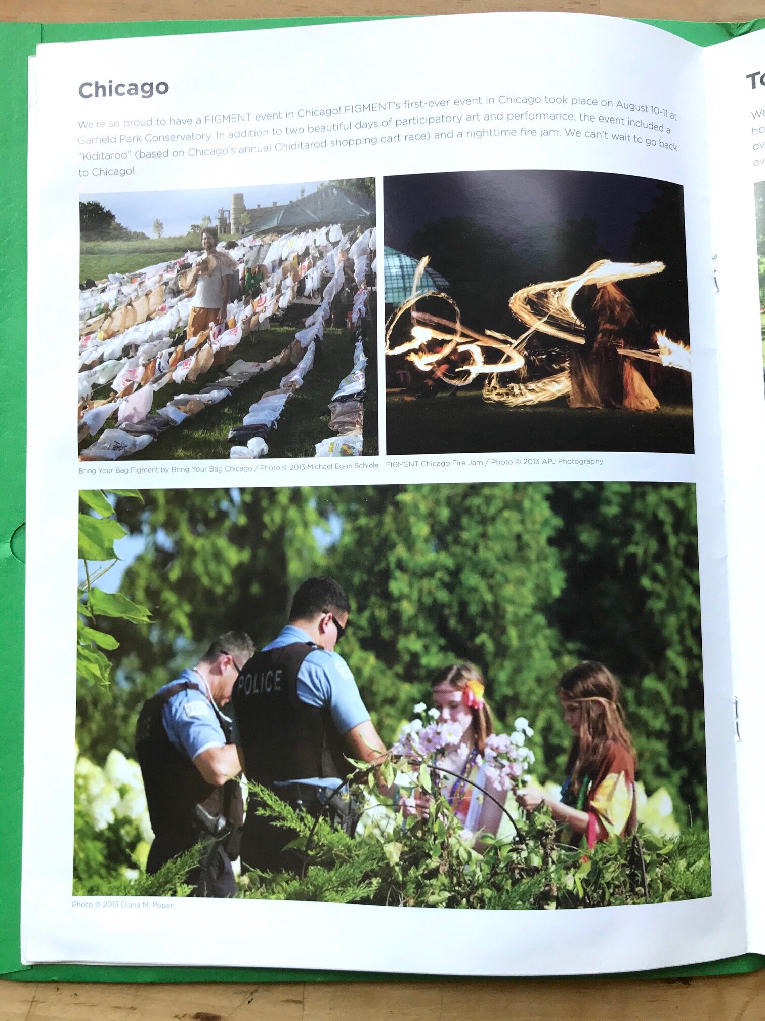
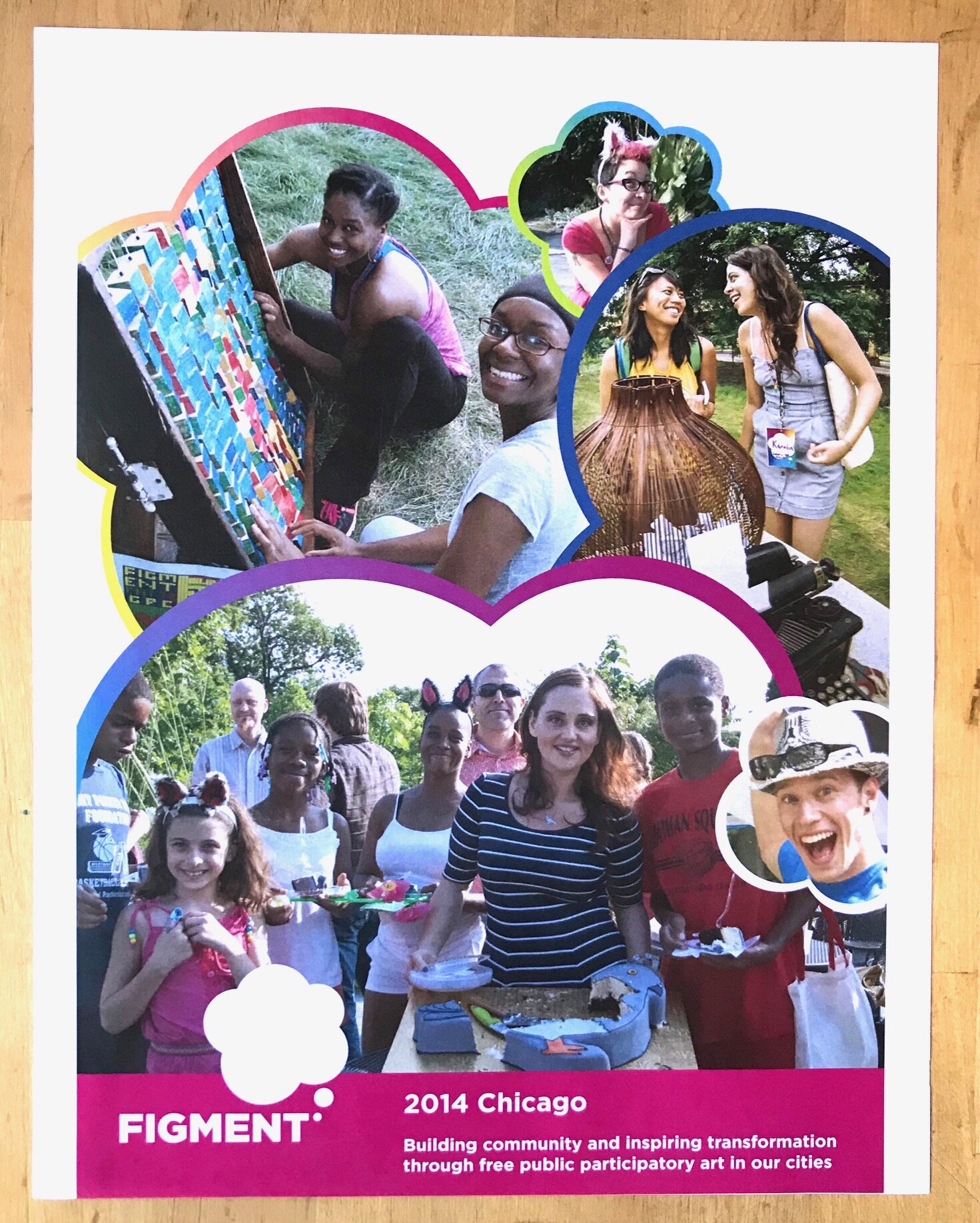
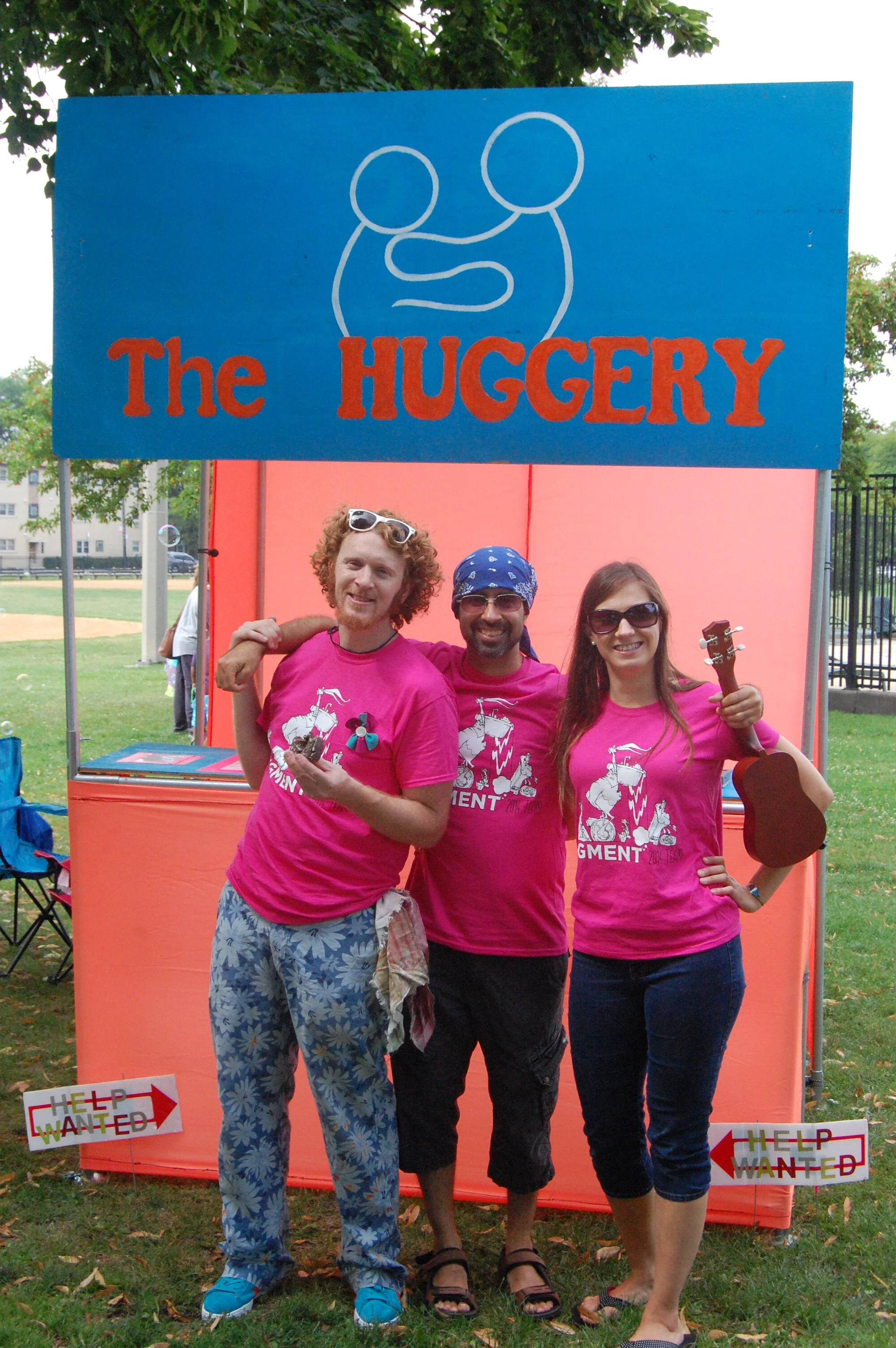
Below This: The Contents of the FIGMENT Chicago Media Kit
Includes all information mirrored on a drive accessible to media pre-event (see here): Press releases, postcards, information sheets, letter from the producer, and info pertinent for journalists.





In Conclusion
FIGMENT was a lot of fun, and I was proud to be a contributor to its success.

The Arts of Life: Why Not Do Communications + Design for Two Art Nonprofits in Chicago?
Yeah, why not? While both FIGMENT and the Arts of Life involved hundreds of hours of volunteer work, I learned quite a bit. From utilizing Salesforce and Nationbuilder, to leveraging SurveyMonkey, these roles offered opportunities to expand my skills. And I got to spend time with a lot of great artists and creative people.

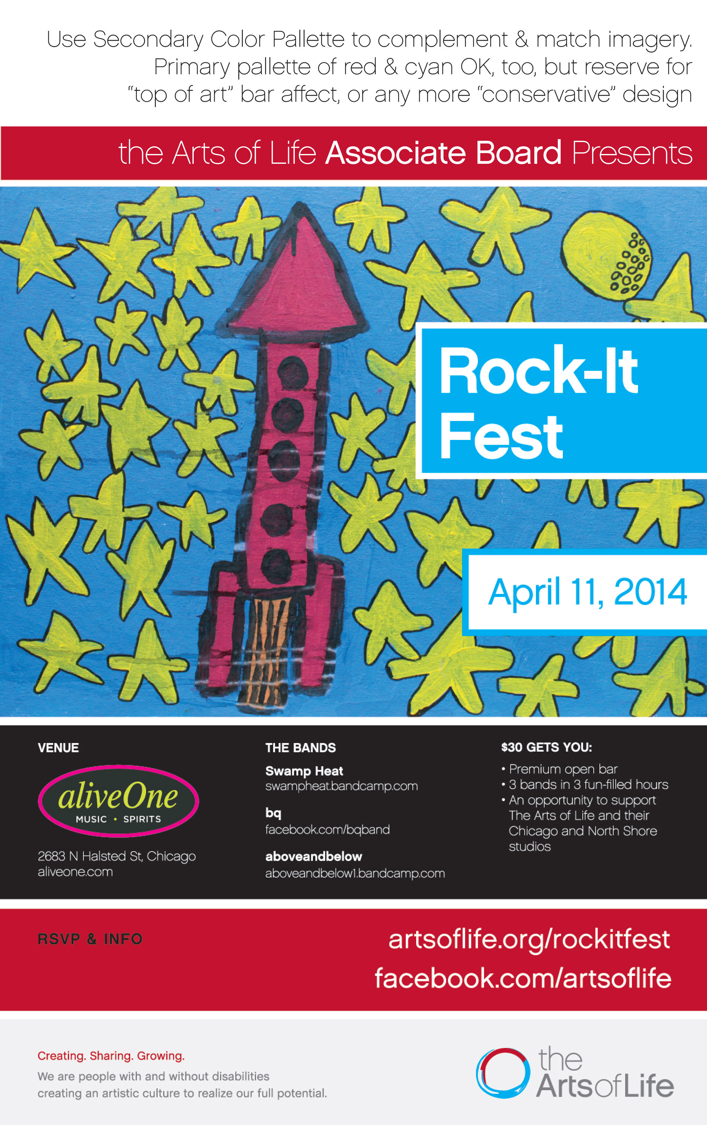
The First Arts of Life Associate Board Event Poster
The serendipity of creating the inaugural Rock-It Fest fundraiser, with this image in particular, is a story best told in person. So feel free to ask. But for now, here’s the artist of the main image, Alex Scott: artsoflife.org/artists/alex-scott/
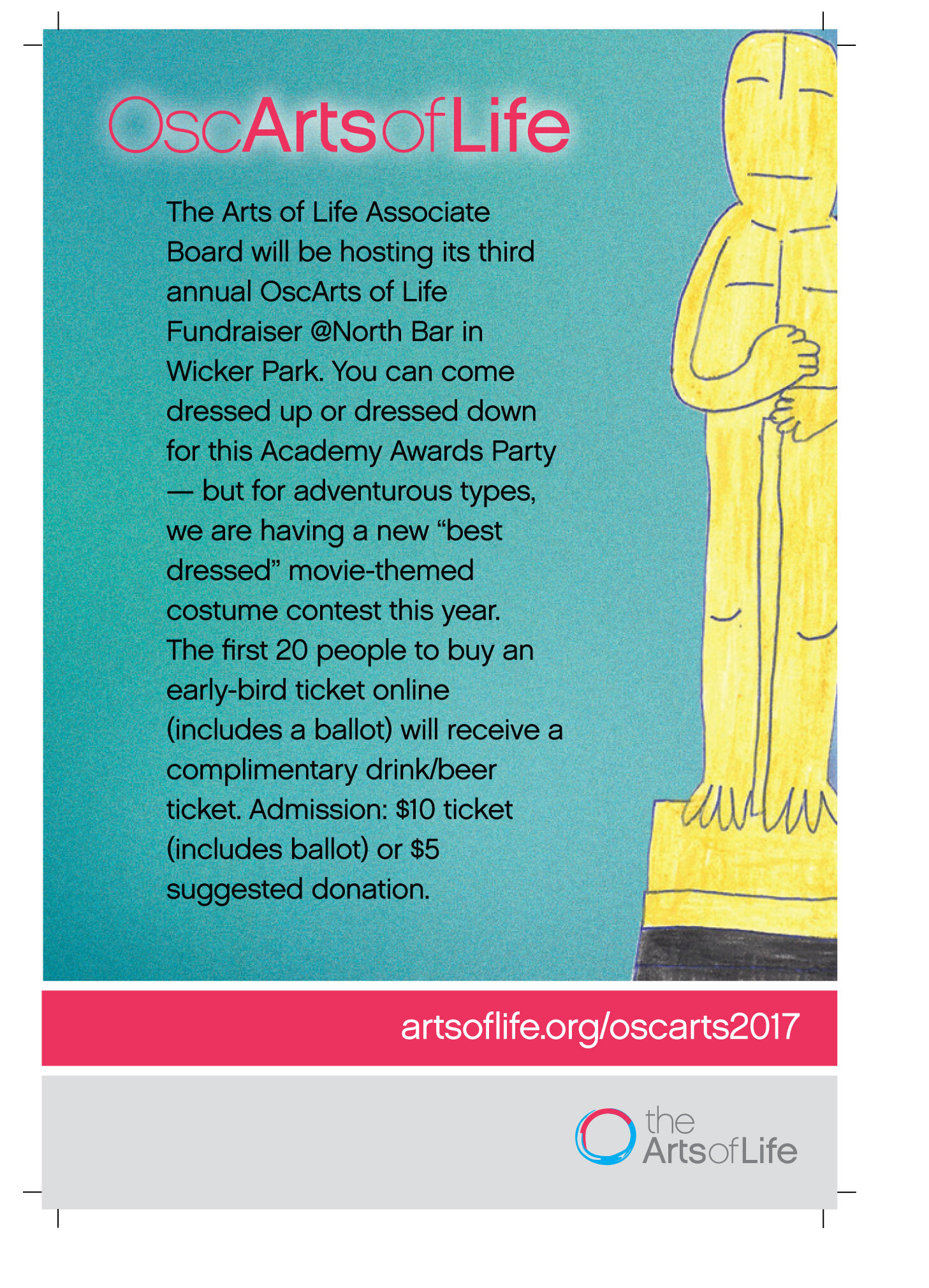
Branding Achievement: Coining "OscArts of Life"
Coming up with a playful name for an Academy Awards event that would take place six years running came from a simple brainstorming session at our monthly Associate Board meetings. It stuck.


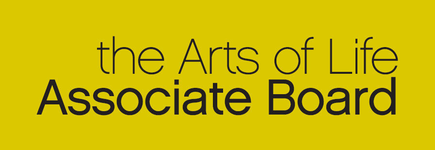
I Developed All The Branding Guidelines for the Associate Board...
… Which I did by following the established Arts of Life Branding Guidelines and tweaking for our purposes. Essentially, we kept our own banner above each event image, and we promised we’d always use Arts of Life artist work within the design.


Always Show Two or Three Options
It means you’ll pick the cream of the crop. This wasn’t quite it. It was the first bubble-lettered one shown above.