Creative Consultant responsible for eNURSING’s successful PAINReportIt, PAINConsultN, and PAINUCope and software product launch (a.k.a. PAINRelieveIt). Minimalist and consistent branding was the key to making a market impact.
Software originally developed at University of Washington and University of Illinois at Chicago.
Additionally, I developed the innovative TNEEL American Psychological Association (APA) online course while working for eNURSING utilizing my unique skills in user experience (UX) and user interface (UI) design. Evidence-based theories and dedicated research informed the user-friendly navigation system of the interface. Design samples for TNEEL APA can be found at the bottom of the TNEEL Software Branding & User Experience page.
Under the company name Organica Design (still my email moniker), I was lead designer for Dr. Diana Wilkie’s private company, eNURSING llc. I served a one-year contract before moving from Seattle to the Midwest to work at the University of Illinois at Chicago (UIC) for Dr. Wilkie. eNURSING’s mission was to create, develop, test, and distribute evidence-based electronic tools — supporting and facilitating patient-centered health care nationwide.
Art Director & Course Designer: Developed original brand identity working closely with principals. Created designs for three individual software tools (CD-ROMs and online) with a unified look and feel. Branding lasted 10+ years. Rebranded TNEEL for American Psychological Association online learning with ethereal "kites" and "balloon" theme, creating a relaxed and colorful interface targeted for psychologists. The user experience of the TNEEL APA course design is based on the Kolb experiential learning theory.
Marketing Creative & Copywriter: Built company website and facilitated marketing campaign to promote eNURSING software. End-to-end implementation of brand and product packaging: Concept, photos, colors, and logos. Wrote all technical and marketing copy, as well as software instructions and workshop presentations.
Graphic Designer: Originated “organic-minimalist” concepts of mixing nature imagery with tested, classical design traditions to simplify visual input process. Printed 10,000+ mailers. Designed conference trade booth.

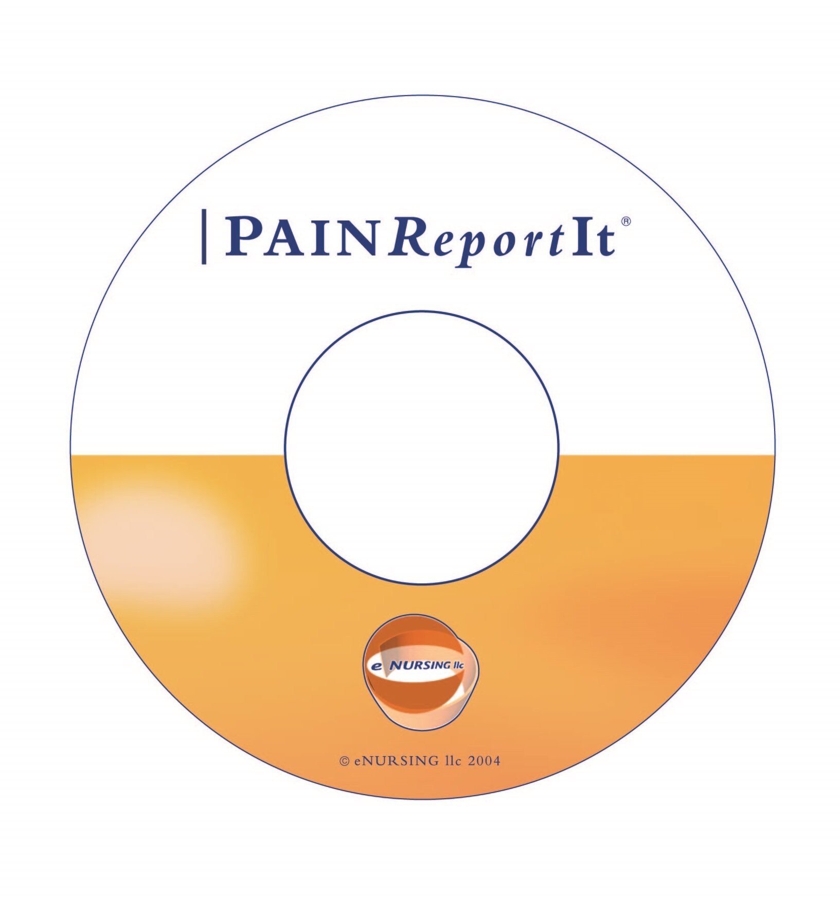
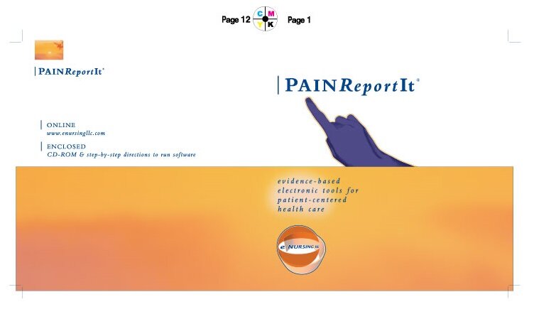
CD Jewel Case Cover Design (with Finger Pointing to Your Pain)
My branding work for this leading-edge interactive software program has arguably stood the test of time, as the technology is still making an impact in health care today. The patient-centered interface and tool helps providers (doctors and nurses) make better decisions. It was developed by Dr. Diana’s Wilkie’s team in the 1990s at University of Washington and is currently in use in research (University of Illinois at Chicago, University of Florida) and in the clinical setting. 2003 was the first year of making these designs back when CD-ROMs were the delivery system for software.


That's My Friend Taryn's Lovely Hand
She modeled for free. Actually, I paid her in a bubble tea on Seattle’s University Avenue where I took this photo.

That Orange Glow? It's Actually a Sunset in Arizona
Keeping with my early 2000s design philosophy or “organic minimalism” where I took textures and colors from nature and placed them into my designs, I added this sunset from a Mount Wrightson 9,456-foot summit hike after a friend’s wedding in Southern Arizona’s Coronado National Forest.

Brand Identity of the PAINRelieveIt Suite
The finger concept I came up with was straight-forward: When people are in pain, they point where it hurts to their healthcare provider. “It hurts here!” Blue for PAINRelieveIt was our first color. Goes well with orange. Just ask The Netherlands or The New York Knicks.

Typography as a Logo
Font: Bembo, inspired by the graphic designer extraordinaire, Peter Saville (New Order, Joy Division, OMD). Where typography begins and ends in my eyes: petersaville.info
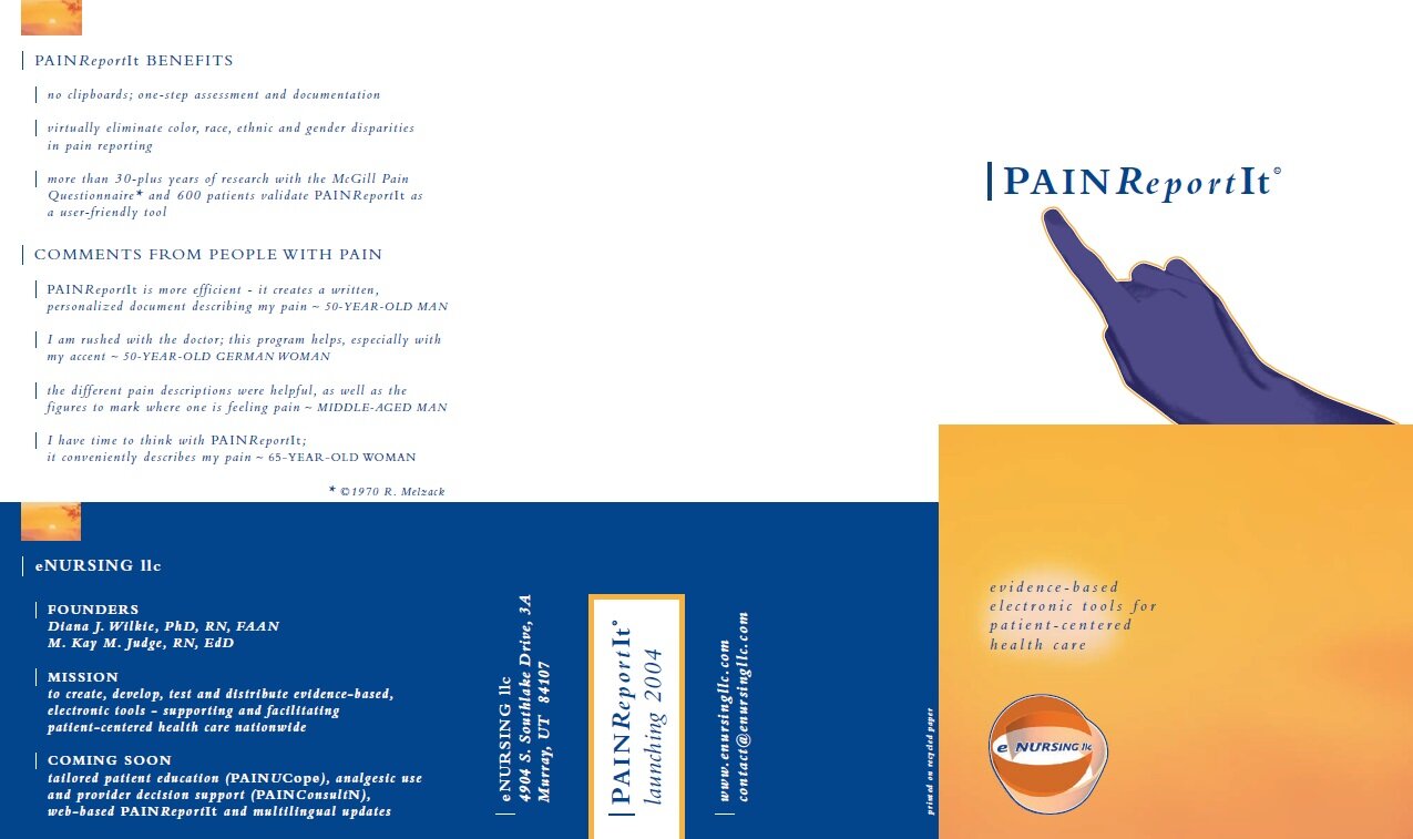


Patient-Centered Care (and Palliative Care Patients) Were Our Focus
The software for PAINRelieveIt was directly tied with a primary goal: To help people dealing with cancer and often in extreme pain. Many individuals going through the dying process benefited from this tool in palliative care. Just as our development team abided by rigorous HIPAA guidelines for privacy, which was paramount in the software’s development, so too was honoring the legacy of our patients in the UI elements of the audio-visual work we added to the product. This also extended to the marketing and branding as well, which I also helped make as the creative lead on this project.
Much research was produced from this important work, leading to several peer-reviewed published papers. Read more studies below from my CV:
https://pubmed.ncbi.nlm.nih.gov/27006391/
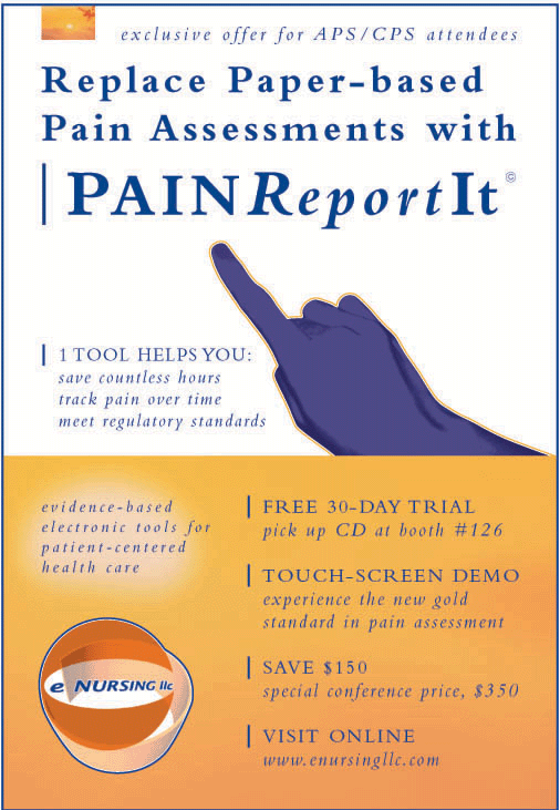

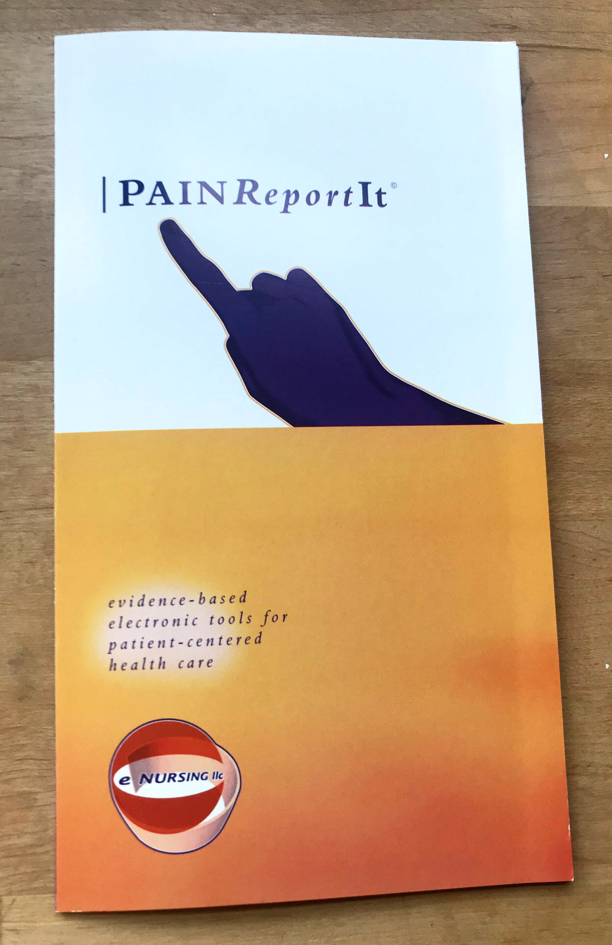
Printed 10,000+ of these at Girlie Press, Seattle
A reputable print shop that hasn’t changed their branding in more than a decade: girliepress.com
Also, I executed all the design work and copywriting, as well as bidding out for a competitive price.


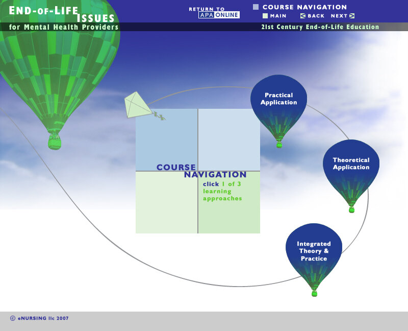
TNEEL APA: User Interface Design Sample
Not to confuse anyone, but most of the TNEEL APA user interface designs are on the TNEEL page of this portfolio. This is because it was an offshoot of the TNEEL end-of-life teaching toolkit originated at University of Washington. However, it was created by me while working for eNURSING llc on contract in Seattle and Chicago. It was the final original TNEEL design project for Dr. Diana Wilkie before I started what would become a 15-year tenure at the University of Illinois at Chicago.
In total, I worked with Diana 18 years — and I still executed freelance projects for her in late 2019.
Bottom line: It’s not always easy to break up your portfolio. But I do connect the dots.