Art Director & Graphic Designer at the University of Illinois at Chicago (UIC):
• Spearheaded popular branding redesign for entirety of UIC College of Nursing
• Implemented new University of Illinois at Chicago logo system and color guidelines
• Facilitated successful rollout of branding tools to 200+ persons
• Managed interns and programmers
• Pioneered modern and cohesive visual design emphasizing consistency in all areas of the college: Website rebuild, advertising, recruitment folder (PDF link), annual report (PDF link), Vital Signs magazine, banners, templates, PowerPoint posters and presentations, as well as photo imagery used by all faculty and staff
• Presided over the rebranding of PNLE nursing leadership conference and the Institute for Healthcare Innovation (IHI, UIC College of Nursing’s marketing arm), including website and collateral
Web Manager: Utilizing HTML, Cascading Style Sheets (CSS), and working within IT ticket system. Updated web and software skills through 2021.
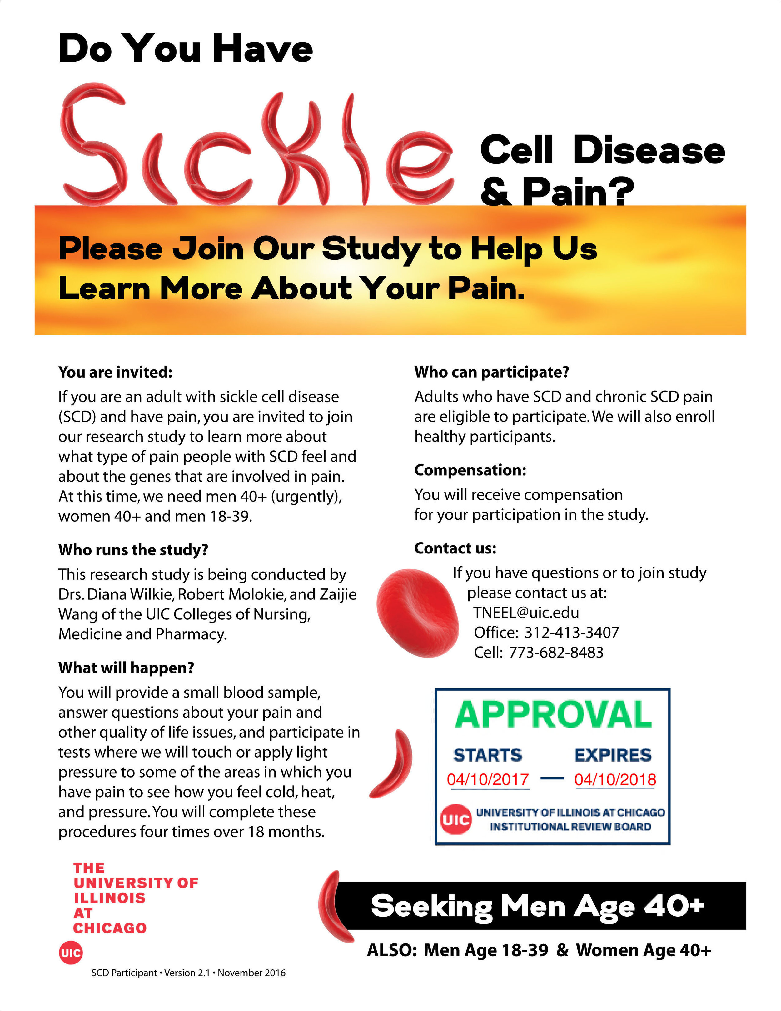
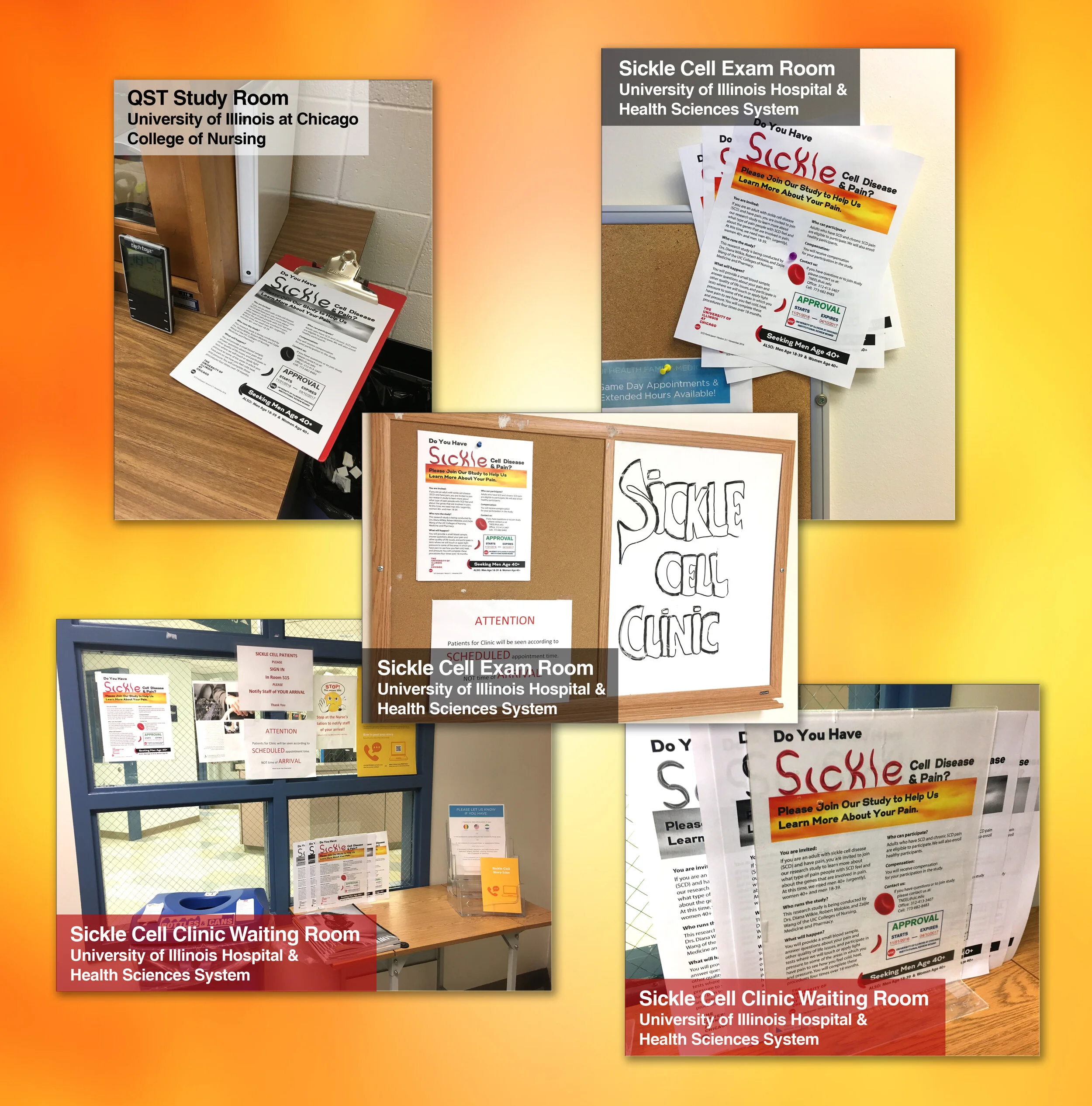
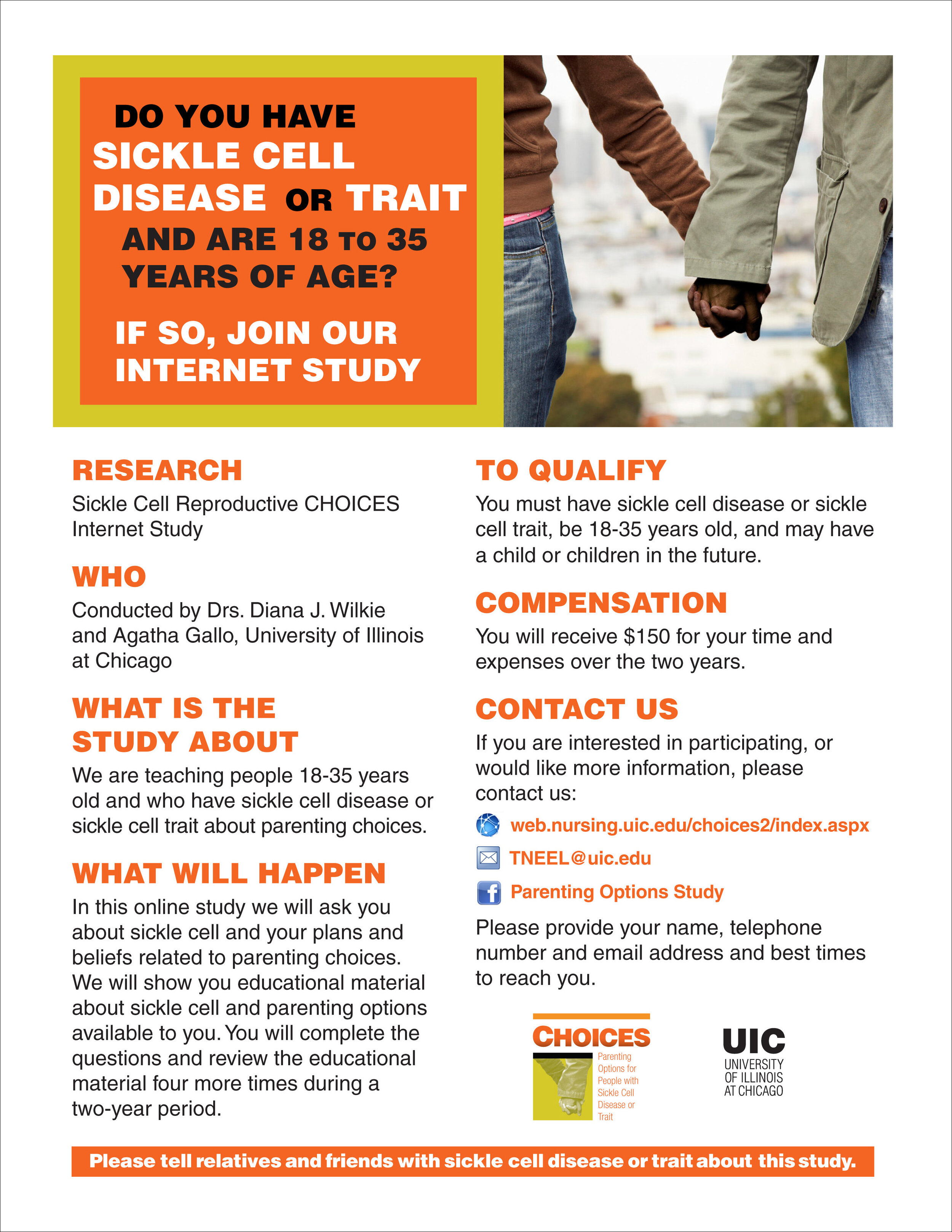
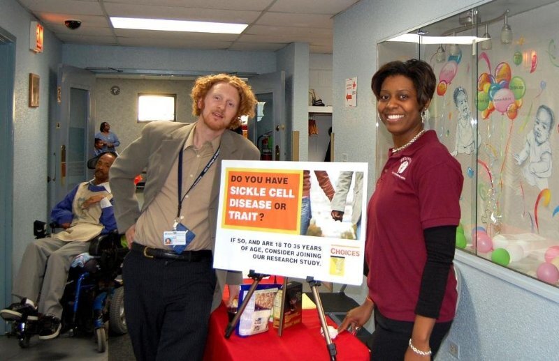
User Experience (UX) Designer, Multimedia Specialist & Researcher: Built NIH-funded online course and intervention, CHOICES: Sickle Cell & Parenting Options, as part of a $2.5 million study grant (2009-2013). Directed and outputted video for online streaming, as well as visual, audio and architecture components for student-friendly courses in palliative care. TNEEL APA site launched while at UIC (developed by eNURSING llc) with format geared toward’s user’s individual learning style and used for additional innovative education websites. Achieved goal of recruiting and retaining 300+ people in NIH-funded $3 million epigenetic study for sickle cell phenotypic pain via colorful marketing and interpersonal skills (2014-2019).
Stayed under budget and kept deadlines.

Dutch Influence, University Colors
Five years of graphics I produced for the UIC College of Nursing directly influenced by Dutch design principles, specifically the abstract artist Piet Mondrian and the De Stijl art movement of the early 20th century.
Inspired by my summer 2003 backpack trek across Europe, including a visit to the Kunstmuseum in The Hague. Seeing a Dutch poster art show in my hometown of Portland, Oregon, soon after also struck a chord in my design brain. The Dean approved of it all, after I asked, “Do you like straight lines, or curves?”
Always give your clients options, I say. And make them happy with professional, clean design.
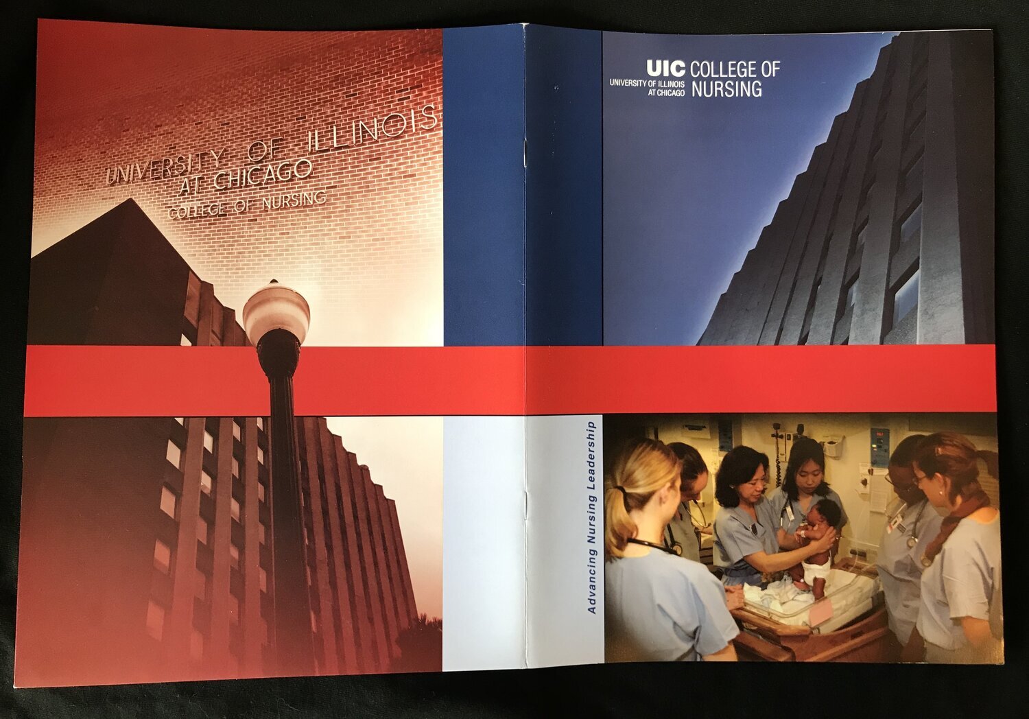
Original Physical Folder
I keep a couple dozen of these lying around. Use them as Pee Chee folders sometimes.

Recruitment Folder: Establishing UIC Nursing Brand
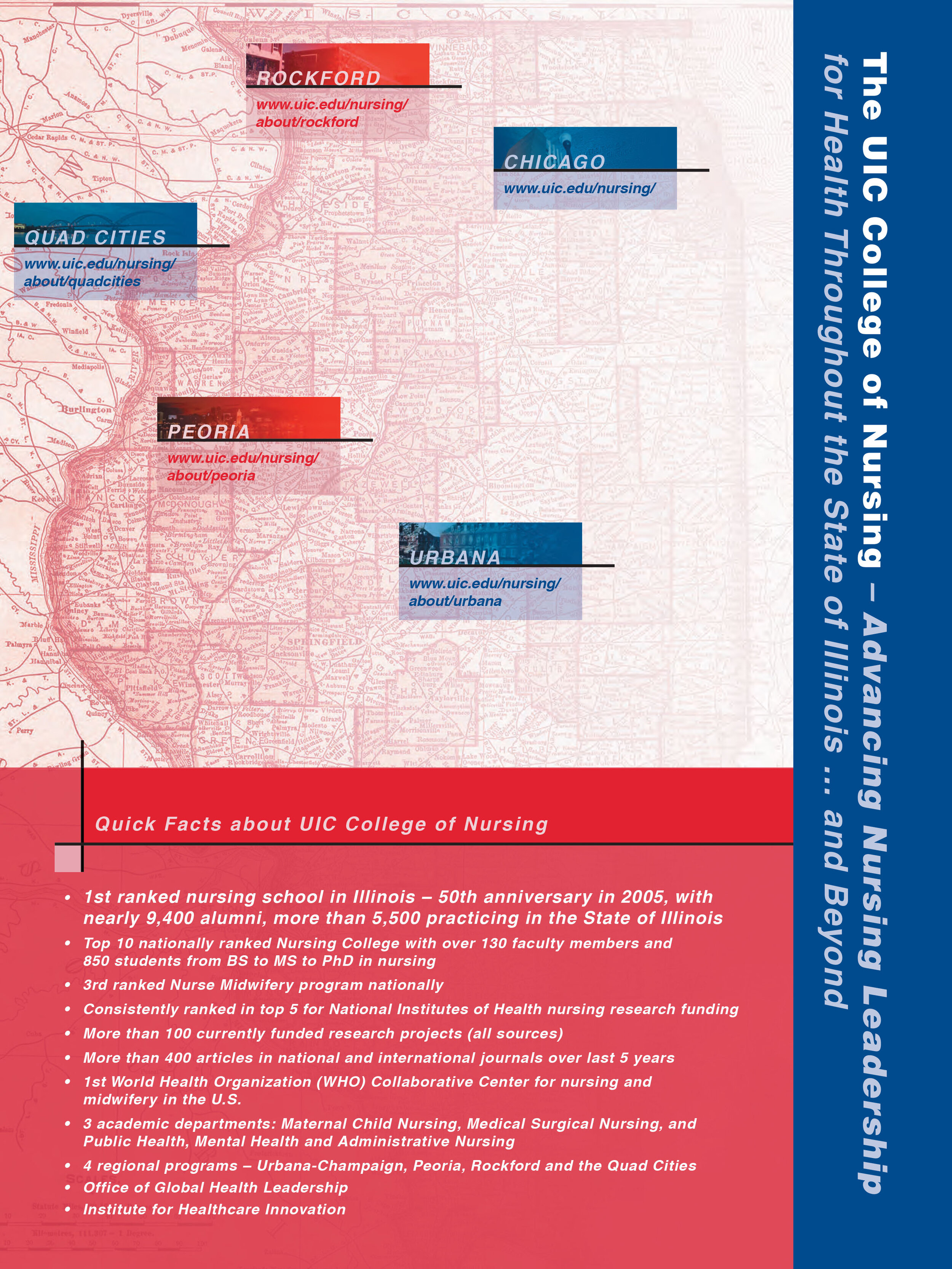
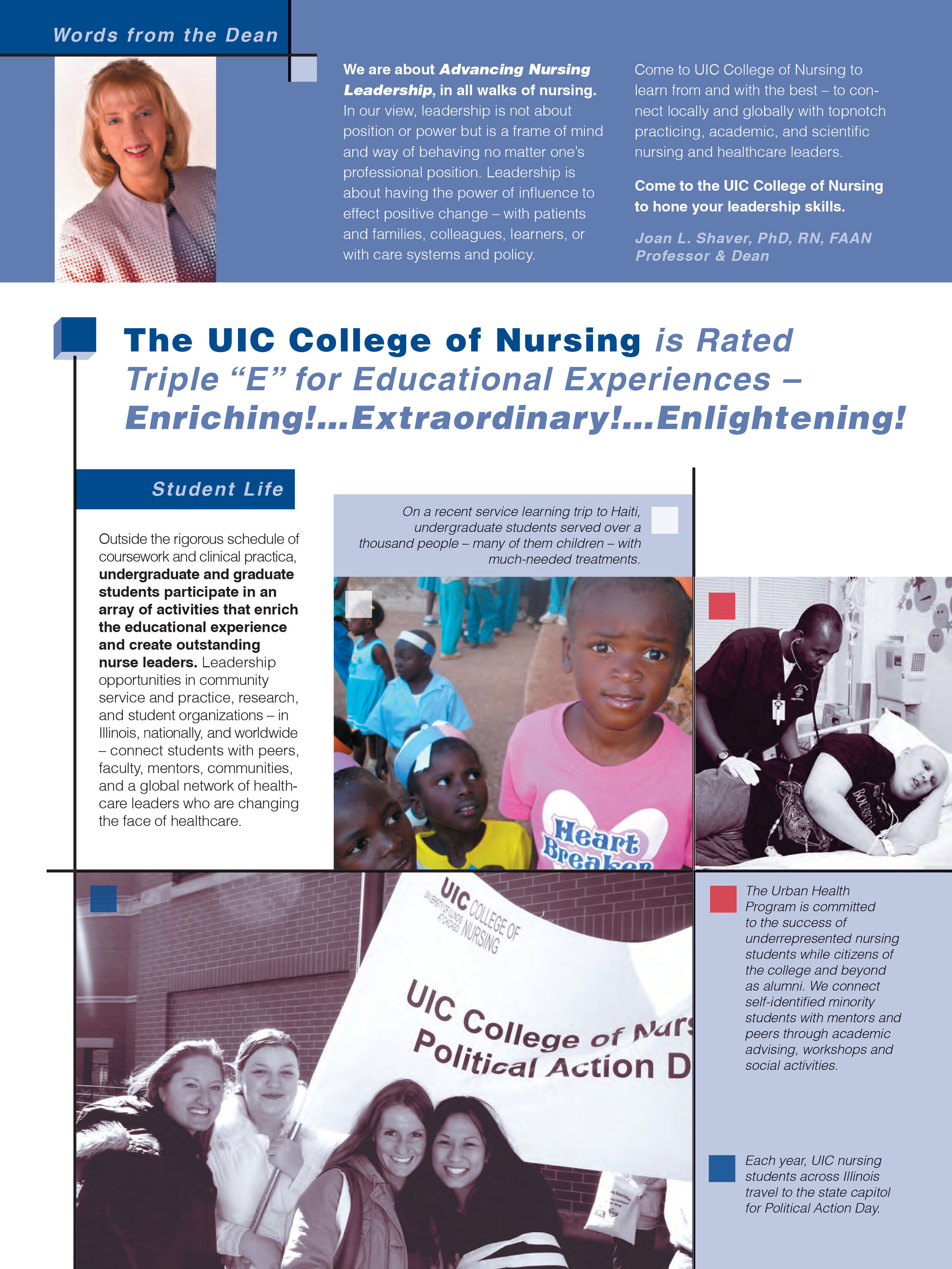
In collaboration with the Dean’s Office decision makers and writers (“Hi, Felicia”) this recruitment folder set the pace for the college’s 5-year look. Ditto our Annual Report and Vital Signs magazine held in its pocket. Full PDF here.


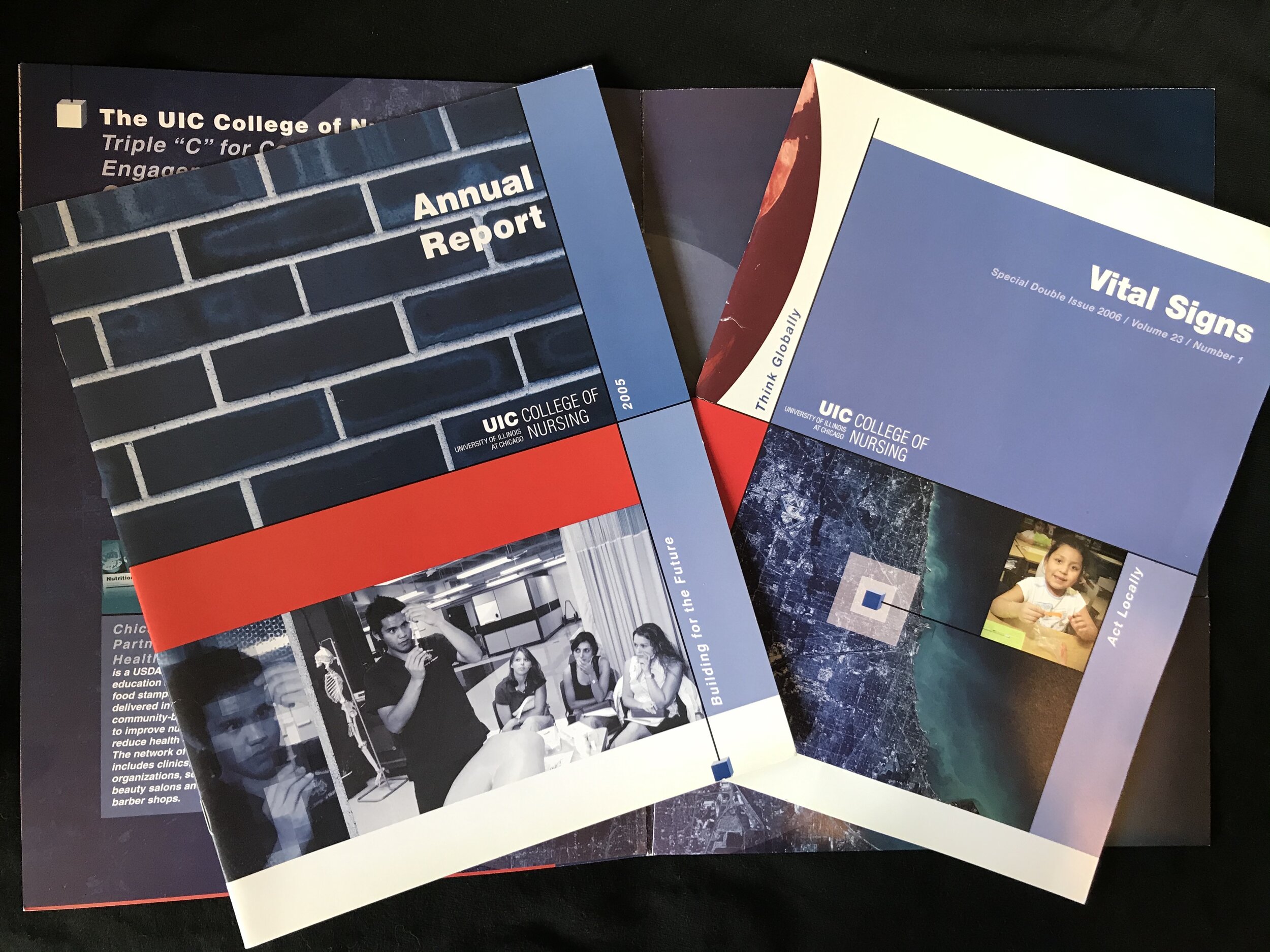
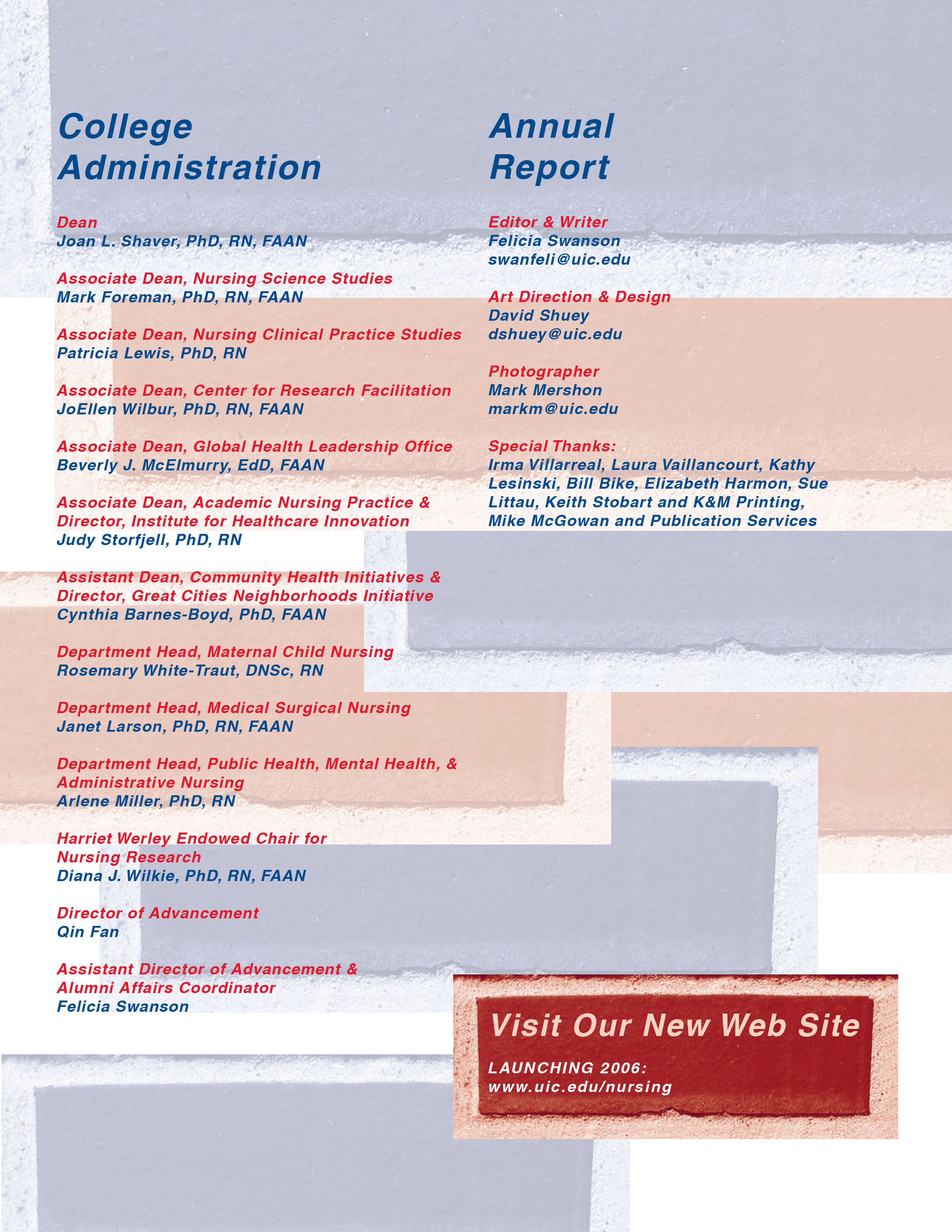
The Annual Report
Every designer should do at least one. It’s perhaps my favorite physical print piece I’ve created. Full PDF here.


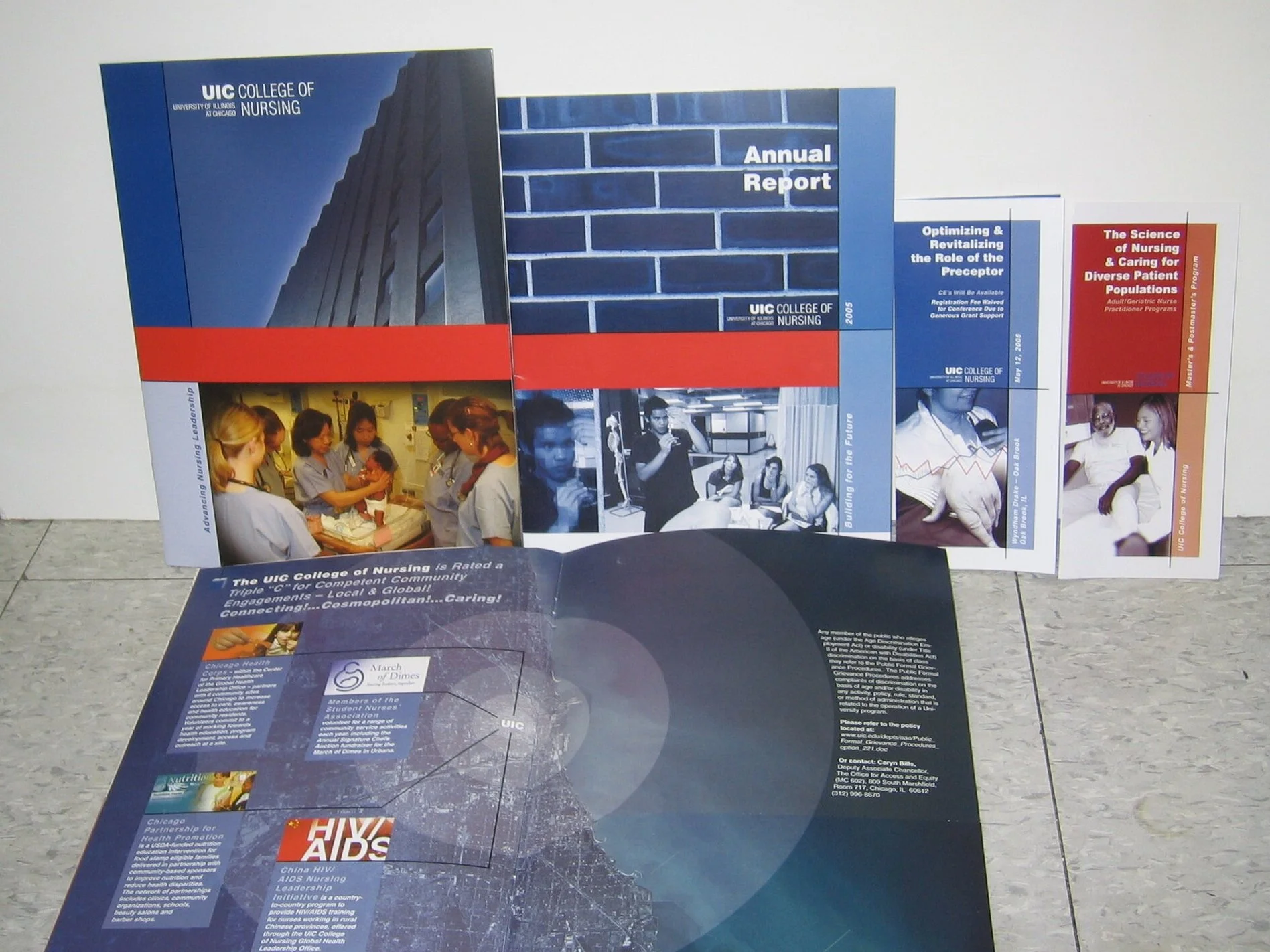
(Most) Everything Was Planned from the Beginning
Making the outputting of new media pieces easier.
The Key: Work closely with stakeholders. Find agreement. Stick to it.
The rules (not many): Red Bars. Lines. Space. What Would Mondrian Do?

The Pantone Colors Remained, The Logos Changed (A Lot)
Color matching your red and blues? Easy. Typography? Well… Don’t get me started on the University of Illinois at Chicago’s administration decision to go along with a student/faculty design team’s plan to replace the original UIC logo designed in the ubiquitous Helvetica typeface to a logo designed in the obscure Theinhardt font. Why is it a design and branding error, in my opinion? Basically, it looks far too similar to the cheap knockoff Arial Black.
OK, we started.
Everyone knows — and by everyone, I mean people who would be interested in a documentary about Helvetica, which I myself saw at the Gene Siskel Film Center — that Arial Black is a mediocre ripoff of Helvetica. The problem I immediately saw in the 2014 redesign was the “C” in the new Theinhardt “UIC” looked exactly like Arial Black. I noticed this because that’s the “typography crime” I caught immediately, and quickly fixed as my first project for UIC’s College of Nursing in 2004, replacing their Arial Black “UIC” with the proper Helvetica “UIC.” The rebuilt logo still looked pretty bad (see top left two brochures). Fortunately, from 2005-2014 the university implemented strict updated logo guidelines, and a brand agency started designing new logos for each college, center, and department at UIC to use. You weren’t allowed to “mock one up” yourself. Smart rules! Beautiful logos ! Thank goodness! You see most of those logos on this page.
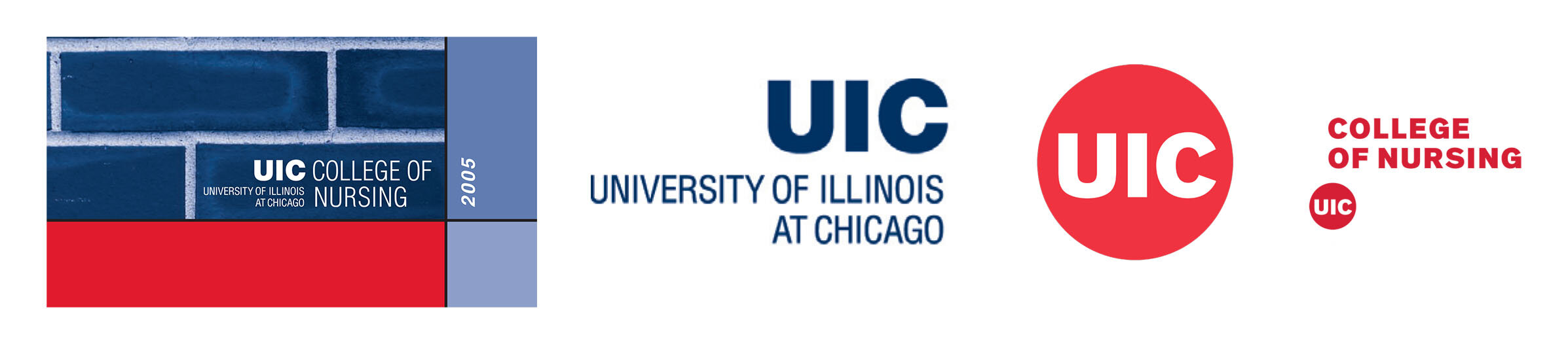
The Typography Switcharoo
(Continued from previous caption)
Then 2014 happened, but thankfully I was only working on grants at this point, far removed from university branding and politics. Still, I shook my head a bit. The fact that the Arial Black “C” looks the same as the Theinhardt “C” makes this decision confounding. Then there’s this infrastructural reality: The UIC logo is set in steel, plastic, and concrete on signage and benches throughout the university. The university had updated some signs, but many of the old ones remained. Did they not foresee this? This creates a visual inconsistency throughout the campus that … frankly, only design nerds with an eagle eye for detail tend to notice.
And from a business perspective, unless you’ve got the money to rebuild every 40’ sign on the side of your buildings — and public universities certainly don’t — then it doesn’t make sense to have the legacy “UIC” hanging around like a graphical ghost.
Let’s be frank: This has a lot to do with the politics around Helvetica itself. Some designers simply hate it. I find it has utility and is a classic.
In my heretic opinion (IMHO), they could have done the entire redesign in Helvetica, and it would have looked essentially the same. At any rate, I did otherwise appreciate the design update in 2014. I did! The sideways type looks like Chicago’s skyline, which is pretty cool, and looks great on a shot glass.
Aren’t you sorry you asked? 😃
But seriously, there’s a lesson here. It’s to forecast all possibilities. And research, research, research.





Branding Expands
White all UIC College of Nursing branding was uniform, various offshoots took on their own flavor. The Power of Nursing Leadership (PNLE) Conference I carried forward the look from past years known for its elegance and high quality speakers.


The Brand Expands to NIH R01 and P01 Grants (BONUS: Also My #1 Favorite Logo I Created)
While some imagery and branding work I did for Dr. Diana Wilkie’s projects and grants differed from UIC Nursing’s look —mostly because many of her projects predate my time at UIC — the Helvetica typeface often remained as visual connective tissue.


Design for Diana Wilkie's UIC Website
Project was eventually put on hold and Dr. Diana Wilkie, my supervisor since the early 2000s, moved on to University of Florida. But I created wireframe, all design work, and prototype: