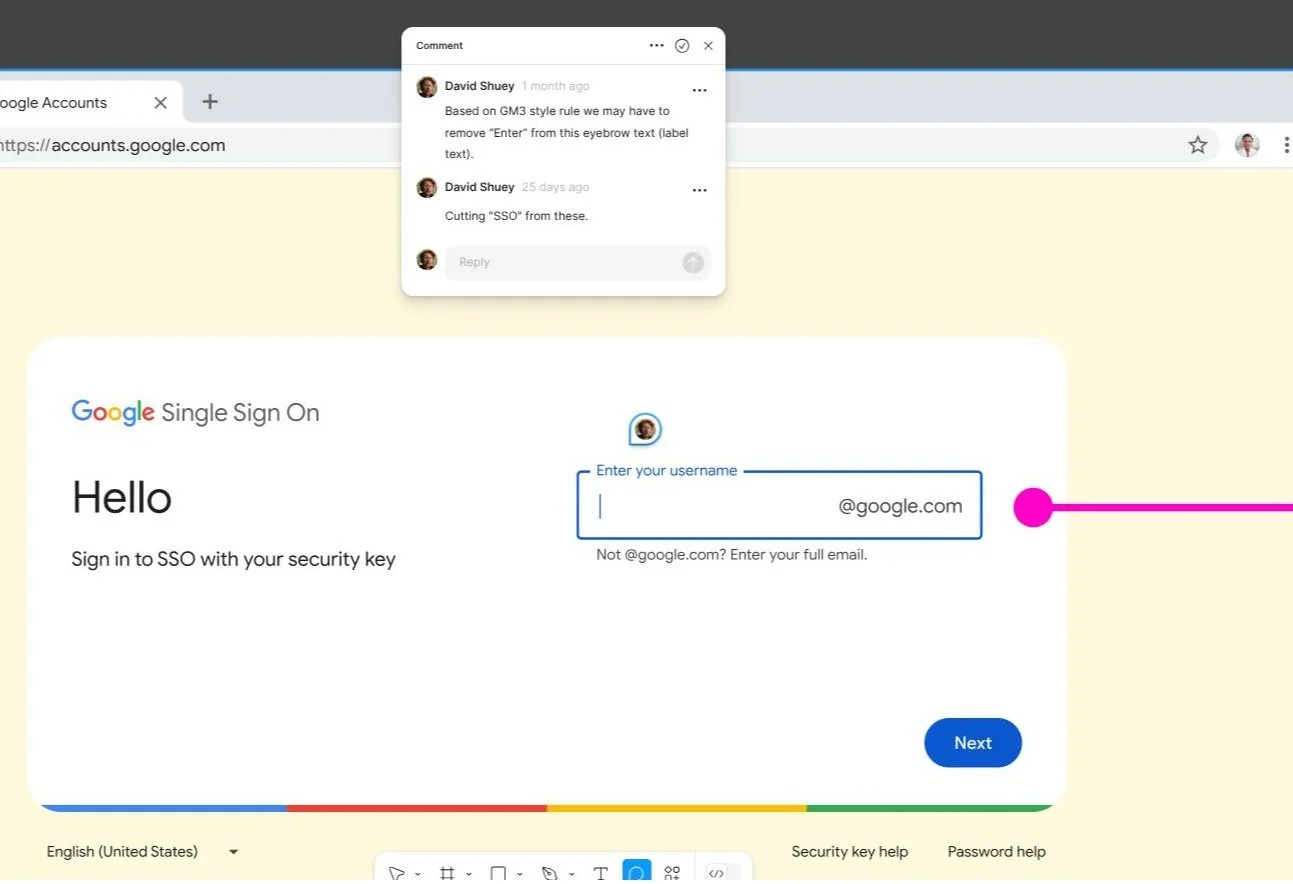
Designing Within Global Standards: Exceptional UX means adhering strictly to foundational design tokens and component specs. This framework leverages Google’s Material Design 3 (GM3) system to ensure systematic compliance, predictable user patterns, and clean, scalable typography hierarchies.
UX writer for Google tasked to “solve some gnarly complex problems” and jumpstart work on corporate logins for Googlers and vendors. As an IBM iX consultant and contractor, I was assigned to the Privacy, Safety, and Security space within the Core UX group at Google.
Specialization: Developing inclusive UI text that meets Google Brand standards.
Goal: Create quality digital experiences at scale that lessen cognitive load.
Reach: Final product to affect 400,000+ daily logins at Google.
—
Core Responsibilities:
• Spearheaded UI content design for Internal Identity and Access Management (IIAM) product area
• Strategized and iterate weekly with UX designer, lead UXW strategist, UXR, and engineers at Google to improve content
• Led nomenclature and term definition initiative to make recommendations and implement in Figma designs
• Key UX member responsible for revamping language and flows for login pages to match Google brand standards of being clear, useful, human, and optimistic
• Utilized top-level Google resources and AI-powered tools (Gemini) for UX/UI decisions to scale company-wide

Samples from Google - Privacy, Safety & Security (Core UX) - 2024-25
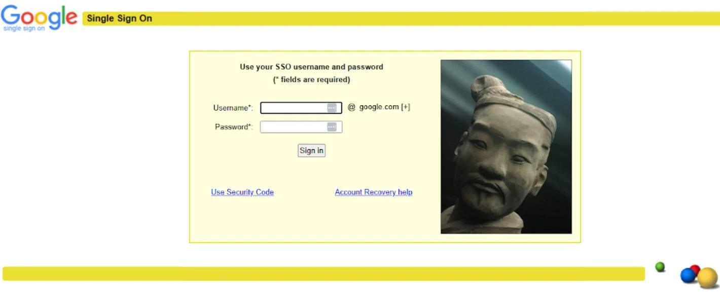
Single Sign On at Google - Before
Here’s a look at two screens showing how corporate logins were before I came onboard Nov 2024. PSS/Core UX was about to tackle a tech debt of moving on from early 2000s user experiences floating around internal tools at Google.
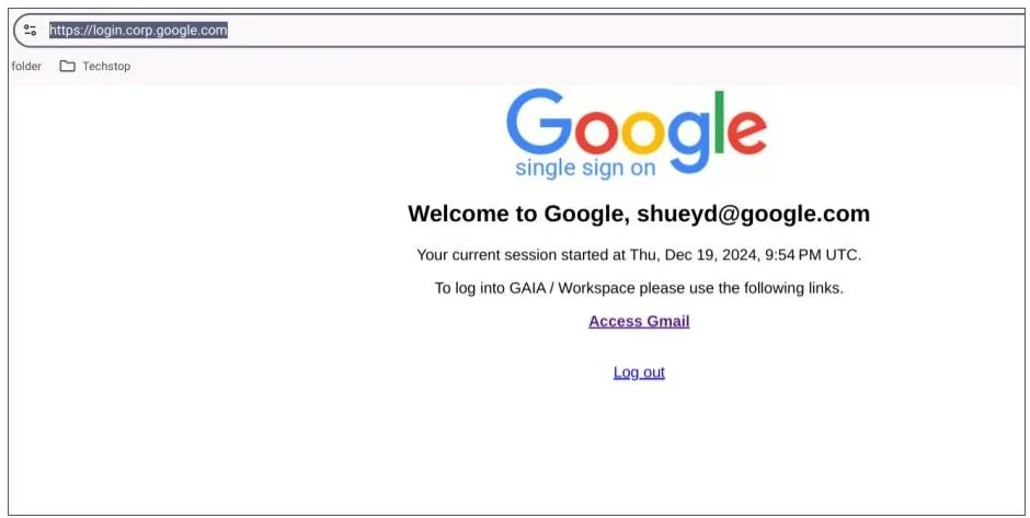
Single Sign On at Google - Before
Next screen after signing in. Still note that older vibe, eh? Let's fix that.
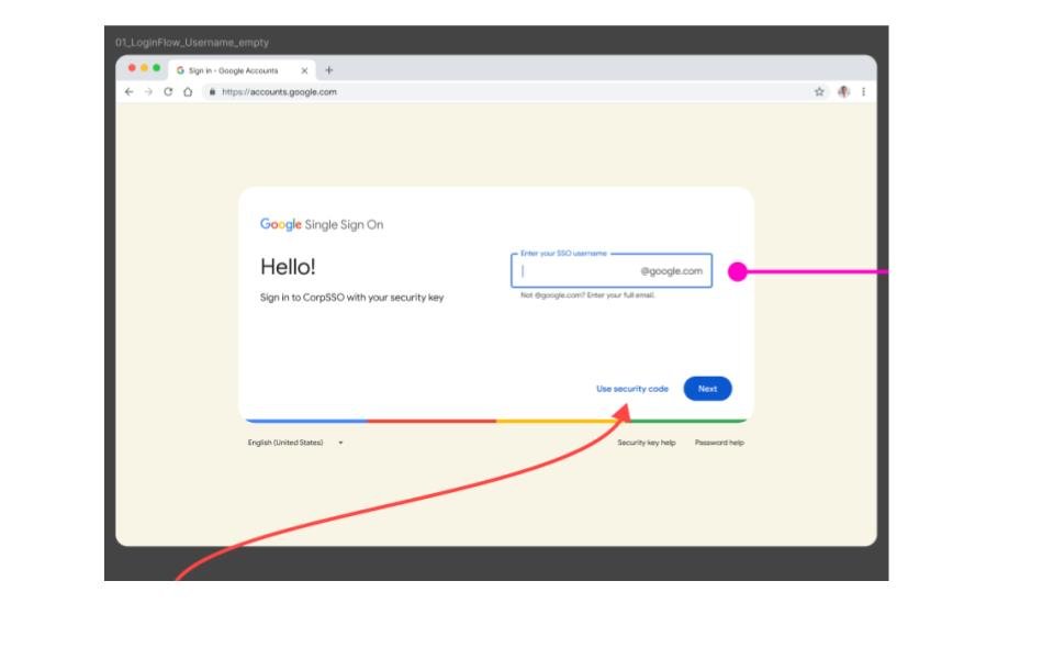
Single Sign On - After
Key UX member responsible for revamping language and flows for login pages to match Google brand standards of being clear, useful, human, and optimistic.
To modernize the Internal Identity and Access Management (IIAM) product area we made a few choices. Mostly, focused on KISS — Keep It Super Simple.
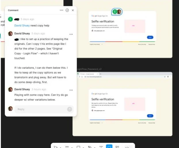
Figma: The Space to Ideate & Iterate ... and Listen
Always taking feedback from UX designers, PMs, engineers, and key stakeholders to make most ideal experience for users.
In this case, it was from Googlers with up to 10+ years experience — so the stakes were high. Figma is where the mess gets sorted. It’s the perfect sandbox for trying things out, seeing what sticks, and polishing it until it’s ready.
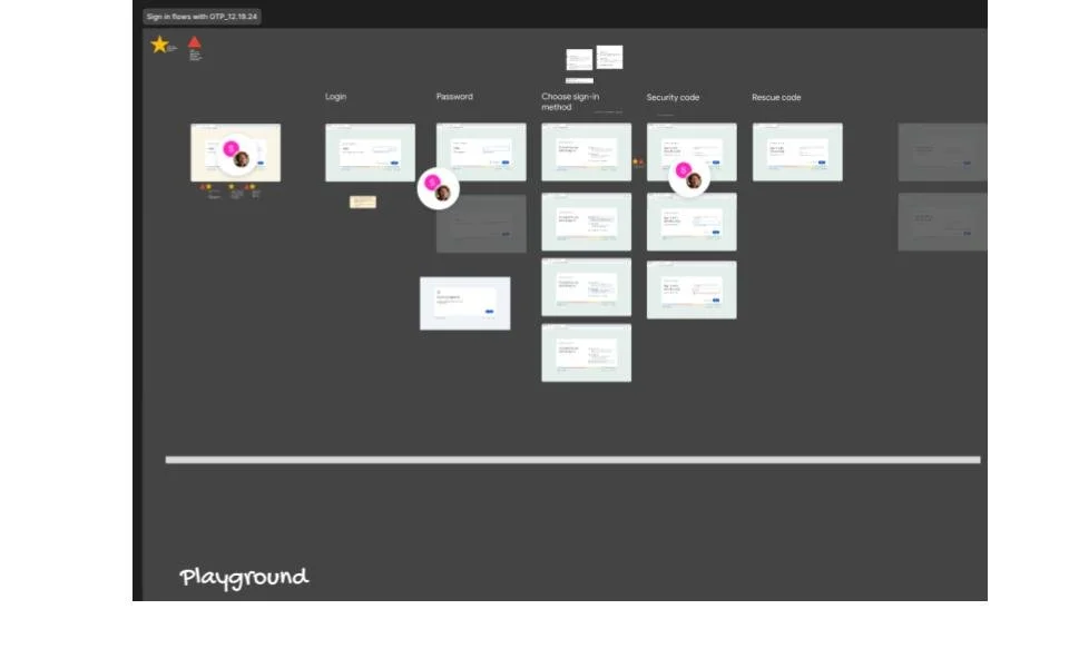
UX Content Sandbox in Figma
Bird’s eye view at Internal Identity and Access Management (IIAM) product area at Google. All my work with UX designers involve me making a “David UXW Sandbox” in Figma for pure creativity and discovery work.
Then I copy finalized work into UXD (designer) final deployment pages.
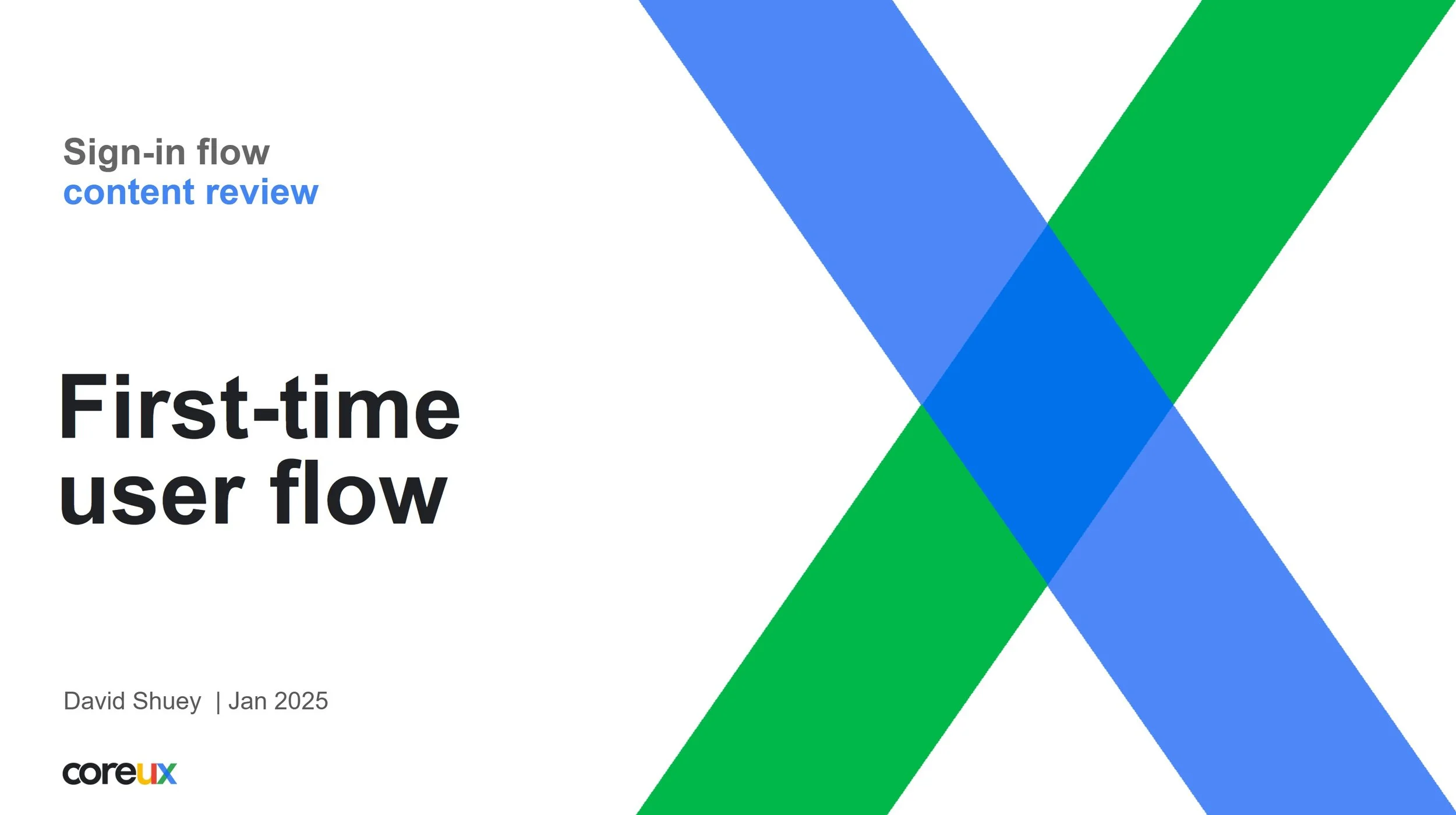
UX Slide Decks for Aligning With Leadership
Small meeting. Large meeting. Either way, I’ll likely bring a deck to clarify any questions, and review any content — improving the work with maximum transparency.
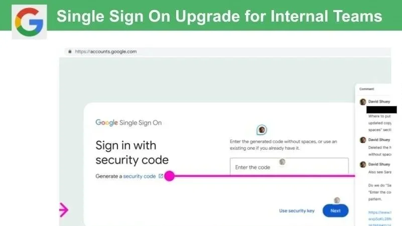
Single Sign On - Final Work
OK to share close-up now after being implemented 12 month later.
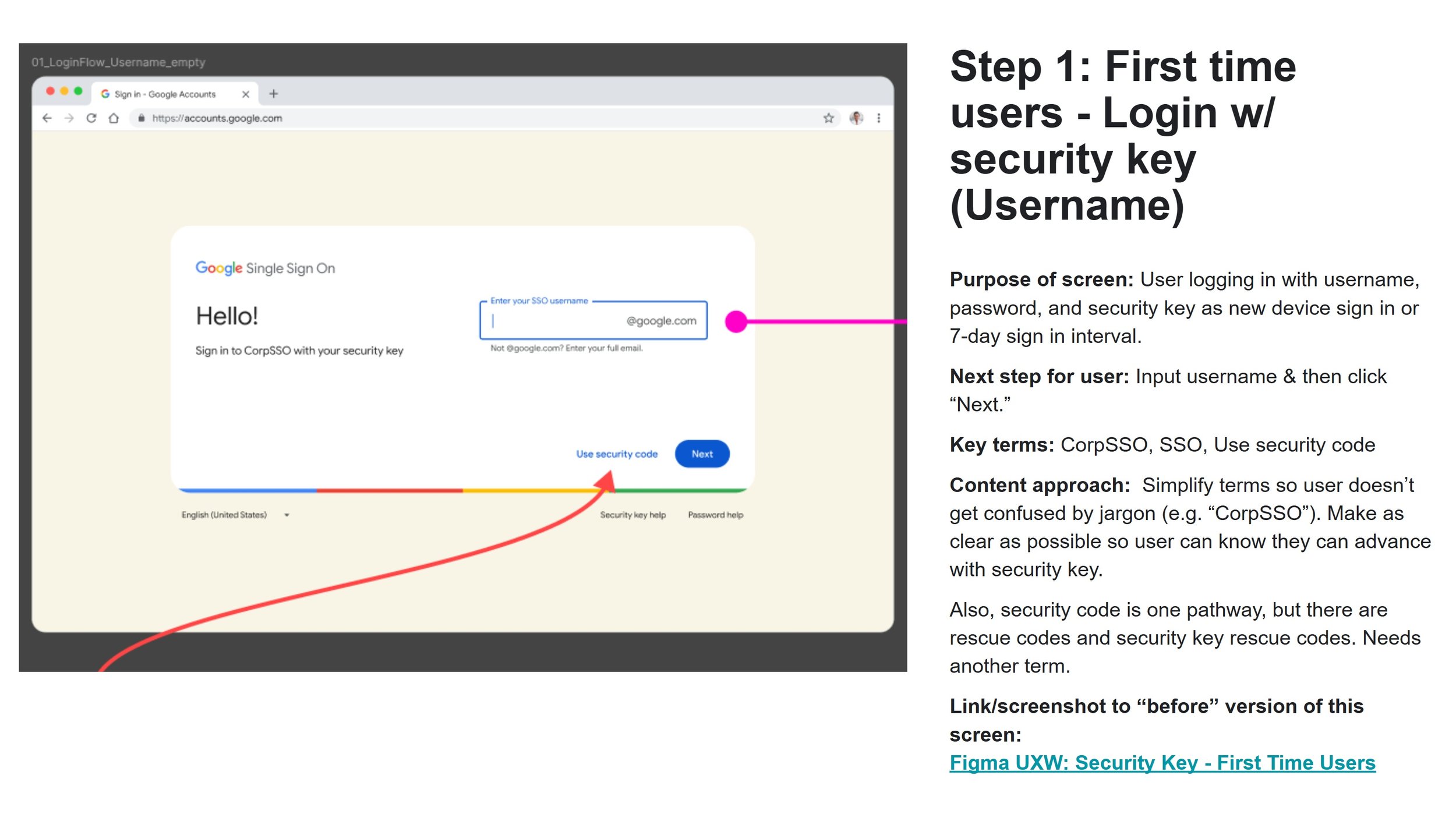
Always Come Equipped with Validated Recommendations
After the discovery work is done.
And the pressure testing is completed on all sections of content. (You worked with engineers, guidelines, resources, and all XFN partners.)
You come equipped with recommendations in a clean, highly visual asset.
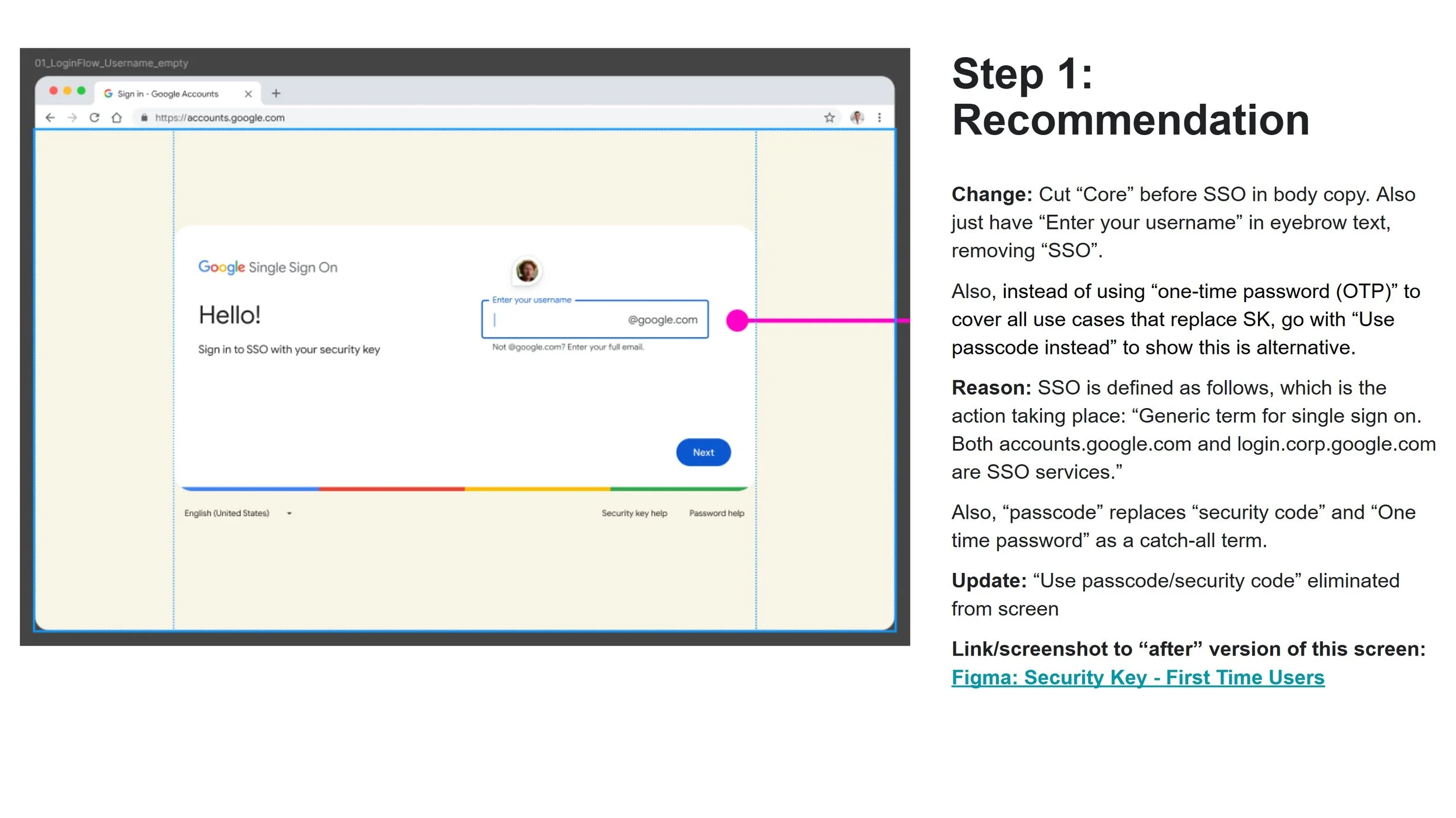
Recommendation: Human, Concise Language
Add very little clutter so stakeholders can make fast decisions.
See slide deck of recommendations from Feb 2025.