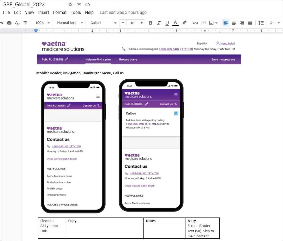
Owned the end-to-end UX copy structure for 100+ pages of product flows, systematically tracking regular legal and compliance sweeps under strict federal CMS guidelines (Centers for Medicare & Medicaid Services). This artifact illustrates the architectural precision needed to scale complex, federally mandated global footer components across multi-device layout restrictions.
Some quick background, just in case you happen to skip the About Me section: I have 8 years UX experience, with a dual focus — sometimes dueling — in design and written content. My passion for being a problem solver in communications goes back even further. At the end of the day, I strive to be a well-researched writer.
And writing takes you places. As of mid-November 2022, the direct-to-consumer platform AetnaMedicare.com, where I was content strategist on the enrollment and global features (save progress, Medicare application, etc.), had reached 500,000+ customers and enrolled thousands of new members in just six months.
We also committed many hours of UX research along the way with older users to make the product better. “Better” for us was always one thing: “Less confusing.”
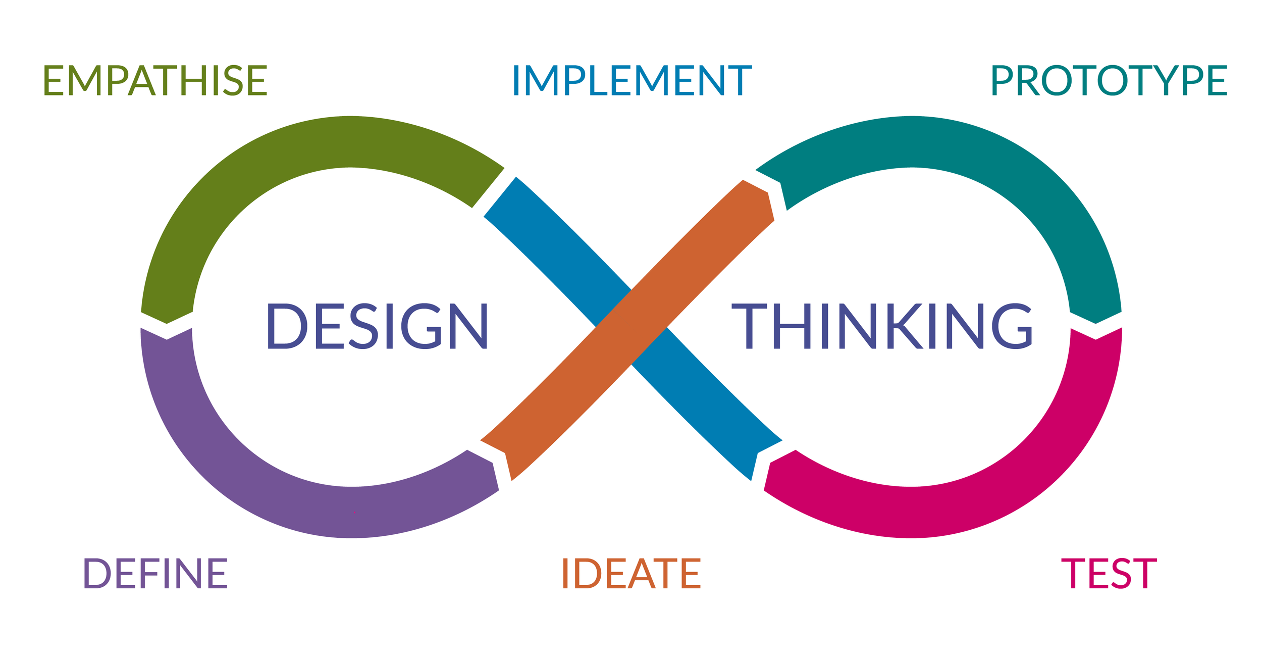
Ideate. Iterate. Implement. Improve.
I was the owner of 100+ pages of content spread over two copy decks, pressure testing and modifying content post-MVP launch and tracking regular compliance submissions to abide by federal CMS guidelines for marketing content. Additionally, I maintained Aetna/CVS Health branding and editorial standards. I even found time to train two new content strategists for their roles on our “Shop, Buy, Enroll” digital product team.
My key contribution was developing digital content that empathized with elderly audiences to help educate, motivate and empower them in this key healthcare decision.

Samples from Aetna - 2022-23

AetnaMedicare.com Starts With a "Welcome!" & Ends With a "Thank You!"
This is the first page users see before entering the “Shop, Buy, Enroll” experience. The Medicare enrollment application I worked on is the last part of the journey. It’s where the potential customer converts into an Aetna Medicare member. We made it easy. And we thank them!
(But who else to bestow gratitude? My amazing enrollment scrum team who solved user challenges daily.)
Key Achievements From My Résumé (PDF):
• Provide human-centered digital content in close collaboration with UX designers, researchers, and developers at CVS Health
• Responsible for content review, quality assurance (QA), UX writing, microcopy, and A/B copy testing
• Expanded WCAG accessibility for omnichannel save the sale and Medicare Advantage (Part C) application
• Led partnerships with with compliance and marketing review team ensuring federal CMS requirements met

Where UX Content Strategy Starts: Journey Mapping & Collaborating
This is one section of a Miro journey map worked on collaboratively at Aetna. I’d show the entire Miro Board, but that’s 100x bigger and proprietary. Same with the 100+ pages of content on the copy decks I was responsible for.
I’ll keep it simple.
This was for a new post-MVP omnichannel “save progress” page (a.k.a. internally as “save the sale”) asked by Aetna business leaders to complete in Q3 2022. Hundreds of thousands of customers would come to the AetnaMedicare.com site in 2022 after our May launch, but what about those who want to save their spot and come back later?
I worked on all content strategy and copy, building digital mockups together alongside two amazing UX designers — hi, Lisa and Shannon — for our Enrollment & Global Features scrum team. We built out the flow together, often with me iterating copy beside their designs in Miro, or providing in real-time via Microsoft Teams for them to add on Sketch.
During some work sessions we would deliver several design or copy variations.

After Iterating Copy on Miro I Move Final Copy to Copy Decks for Compliance Review
Our UX assignment for saving user data: Making the journey as straightforward as possible while not forsaking customer trust. This was done on my end by simplifying the content as much as humanly possible.
This save-the-sale feature was a "big ask" by top management so Aetna could save the progress for users during their enrollment. This would guarantee marketing would gather a multitude of new customer emails they would not otherwise gain. These were coveted and highly valuable leads.
I built close relations with our MRT (Marketing Review Team) at CVS Health, where they would be able to expedite compliance reviews on user decks shown here.
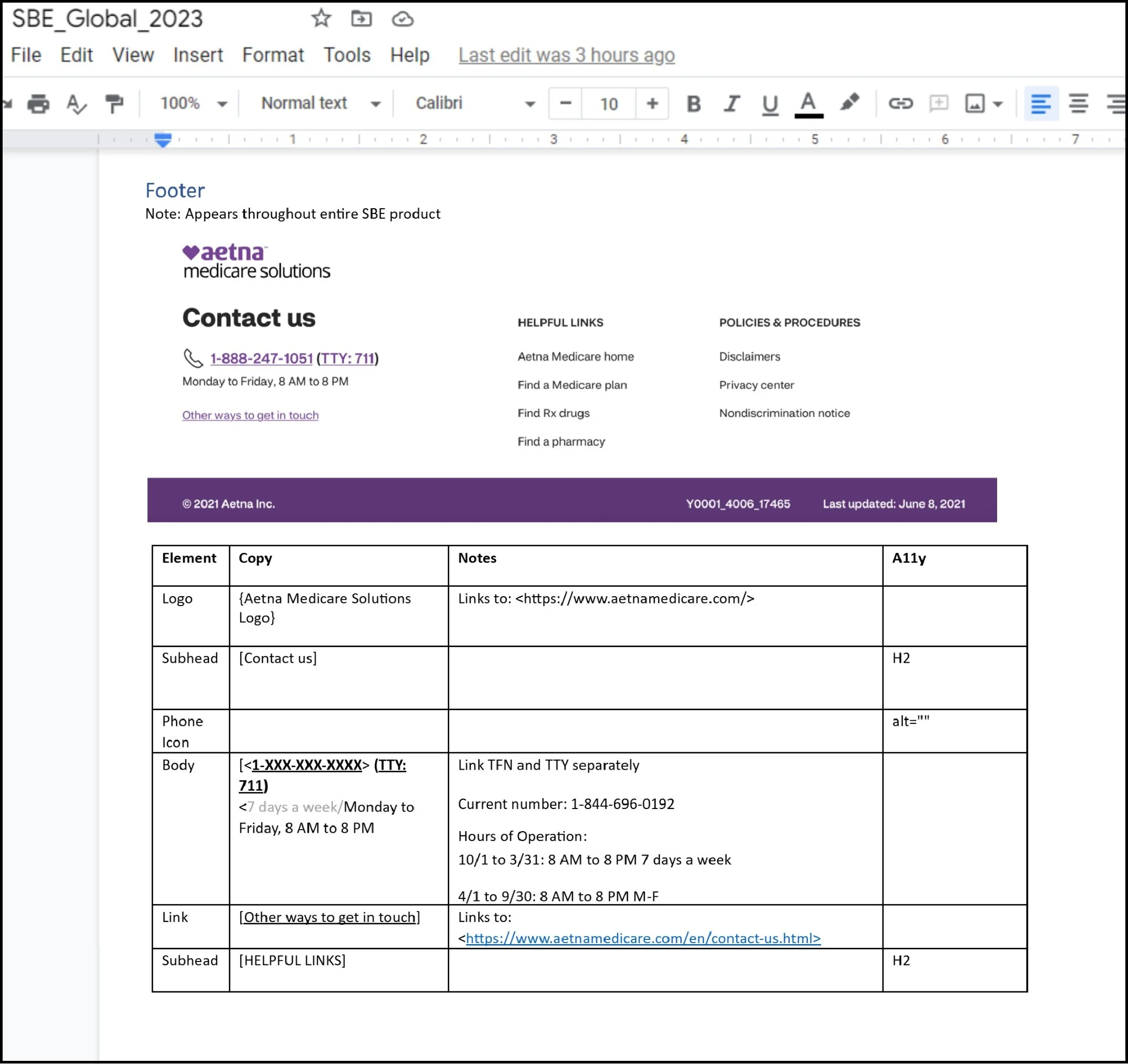
Maintain Global Content: Header, Footer, Pop-Up Modals, Session Time Out, Need Help & More
All copy that was visible on more than one section of the “Shop, Buy, Enroll” experience would be in my wheelhouse under “Global” copy deck. This was still half as long as the “Enrollment” application copy deck.
Copy was tested by our UX Team in collaboration with the UX Research Team. The focused user testing was to see if they could move past pain points on the digital platform. Direct user feedback was recorded, absorbed, and utilized in future updates.
The content also had to adjust for desktop, mobile, and tablet formats.
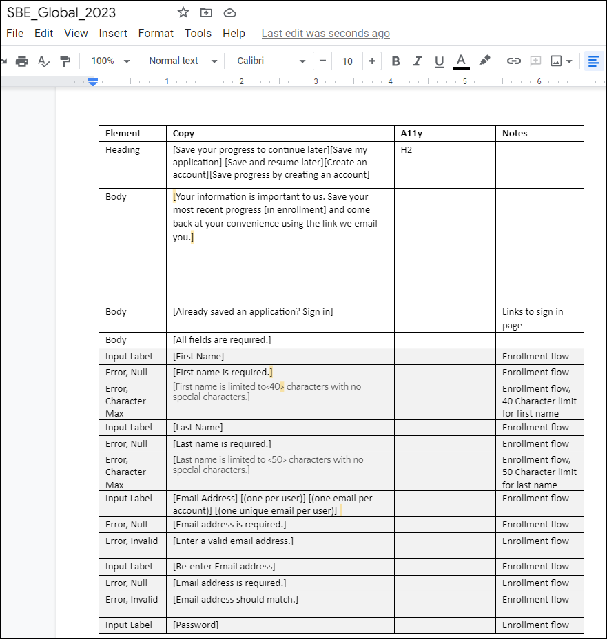
Save the Sale Copy Sample (With Error Message Microcopy)

Welcome to "Enroll" (After "Shop" and "Buy")
The key is to empathize with challenges novice digital users and elderly audiences face in decision-making. This includes writing copy of varying fidelity for mobile and desktop platforms. Pro tip: Bite-sized chunks of information presented at a 6th-grade reading level.
To get to this page yourself, just go to AetnaMedicare.com, input your zip code, pick any plan, and then click the CTA primary button “Apply now.” This will take you to the screenshot above.
But what if you don’t want to complete the enrollment application right away?

What Enrollment Users See After Selecting "Save My Progress" Button
Our UX assignment: Making the journey as simple as possible. And to achieve another connection with the Medicare customer. This omnichannel solution was achieved as Aetna had an increase of users returning to the site after our summer 2022 update of the “Save the Sale” feature. An email link allows them to return at any time they choose.

Field Error Example

Fire Drill: One More UX Copy Sample for Aetna
What’s a fire drill? It’s when a pain point presents itself as a a piece of data. It then trickles its way to stakeholders and they’re told that potential customers are drifting away from the experience at key moments based on this hypothesis: They’re confused when they show up on the enrollment application.
Oh, and they want a solution implemented in two business days. Good luck.
Research and marketing indeed did see that far too many users were lost in terms of what was expected to complete the application. They didn’t know if it would take 7, 10 or 17 minutes.
Solution: Just tell them. Quickly.
This modal would eventually be stripped into a three lines of copy at the top of p. 1 of the enrollment form (under “Let’s get started!”), which you can see a few screenshots above. But when I was asked to present new content as a pop-up modal in four hours, this was the best of several copy options. Within 24 hours I took initiative and mocked up the copy on PowerPoint because … well, I’m the content strategist, not the UX designer. I wasn’t given Adobe Creative Cloud, and we were a a few months away from getting our full Figma license, so this is what you get, folks.
But I am precise about mock-ups. And that was appreciated by product owners and team members alike in pitching this idea.
We fed the content quickly through our Medicare (CMS) compliance team. It put out the fire.

Whoops, Did We Take Too Long?
Thanks for viewing. Feel free to ask any questions during interviews, email, or through the Contact Me portal. The door is open.